Here’s the hard truth: most visitors who land on your site will leave without buying. Some weren’t ready. Some got distracted. Some just needed one more reason to stay.
In fact, the Baymard Institute found in 2025 that 70.19% of shoppers abandon their cart before completing a purchase. That’s roughly 7 out of 10 visitors walking out the door without taking action.
That’s exactly what a well-designed exit-intent popup gives you: one last chance to bring them back.
I’ve been building and testing exit popups for years, and I’ve seen that the difference between one that converts and one that gets dismissed usually comes down to three things: the offer, the timing, and the copy. Get those right, and you can recover a meaningful chunk of visitors who would have otherwise been gone for good.
In this guide, I’m sharing 18 of the best exit-intent popup examples I’ve come across, broken down by what makes each one actually work, not just what they look like.
What Are Exit Intent Popups and Are They Effective?
Here’s why these popups are so successful:
- Personalization: A popup tailored to the visitor’s behavior can speak directly to their needs.
- Relevance: Offering something relevant, like a discount on an item they were considering, catches their attention.
- Urgency: When popups create a sense of urgency (like “Hurry! Your cart expires soon”), visitors are more likely to act quickly.
- Timing: These popups are shown at the perfect time, when visitors are about to leave, so you don’t interrupt their browsing.
18 Best Exit Intent Popup Examples
You’ve seen what exit intent popups can do; now it’s time to see how the best in the business use them.
I’ve arranged the exit popup examples in categories for more clarity. Let’s explore:
- Discount Popup
- Free Shipping
- Lead Generation (Email/Information Capture)
- Lead Generation (Valuable Content/Resources)
- Gamification
- Social Proof
- Cart Abandonment Reminders
Discount Popup
1. Patyka
Patyka turns a standard discount popup into a brand moment. The offer is clear, a free Sun Concentrate with your first order, but what makes it work is how everything feels cohesive. The warm amber tones of the product photography bleed right into the popup design.
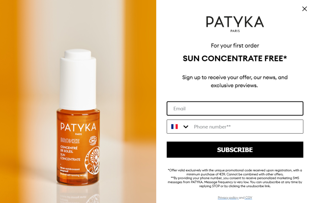
You’re not just being pitched a discount, you’re being welcomed into an aesthetic. The two-field form (email and phone) is a bolder ask than most brands make, but the free product offer justifies it.
Why It Works:
- A tangible free product feels more valuable than a percentage off, even when the monetary value is similar.
- Cohesive product photography and brand color create an immersive first impression.
- Collecting both email and phone in one popup maximizes capture opportunities while the user is already engaged.
2. M.M.LaFleur
Less is genuinely more here. M.M.LaFleur strips the popup down to almost nothing: a portrait photo, a bold headline, one CTA button. No email field upfront, no fine print, just “Unlock 15% off your first purchase” and a “Sign Me Up” button.
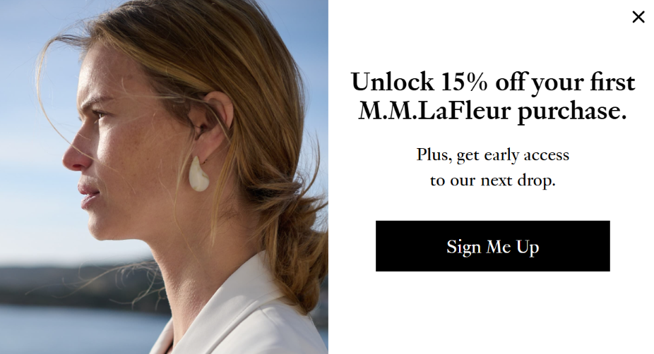
This two-step approach, where you click interest before entering your email, is a well-known conversion trick. Once someone has clicked, they feel committed. The editorial photography says everything about the brand that the copy doesn’t need to.
Why It Works:
- The two-step opt-in (click then email) reduces friction and increases follow-through by leveraging micro-commitment psychology.
- Clean, copy-light design feels high-end, which matches the brand’s positioning.
- Early access to the next drop adds urgency beyond just the discount.
3. OverStockArt
OverStockArt does something smart here: they use a piece of Impressionist artwork as the hero image, which immediately tells you exactly what kind of store this is before you read a word. The headline “Your Home, Elevated with Art” is doing double duty as both a value proposition and an invitation.
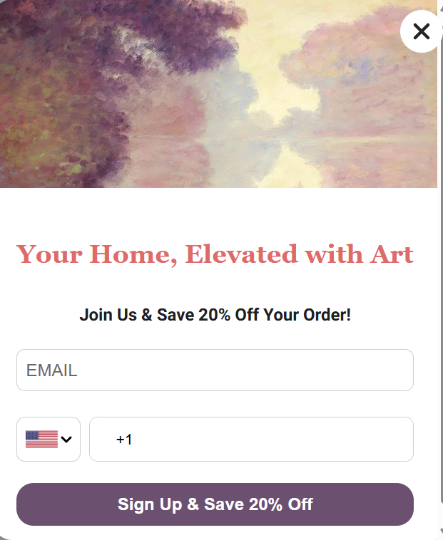
The 20% off offer is solid, and the phone field with country code flag adds a personalization touch that makes this feel less like a generic popup and more like a curated boutique experience.
Why It Works:
- Using actual product artwork as the visual instantly communicates the store’s niche and appeal.
- The headline doubles as an aspirational brand statement, not just a discount pitch.
- SMS capture alongside email gives the brand two retargeting channels from a single interaction.
4. Codage
Codage makes the popup feel like a discovery rather than a sales tactic. “Welcome in your Maison de Cosmetologie” is a genuinely lovely line that frames the brand as a space you’re entering, not just a store you’re buying from.
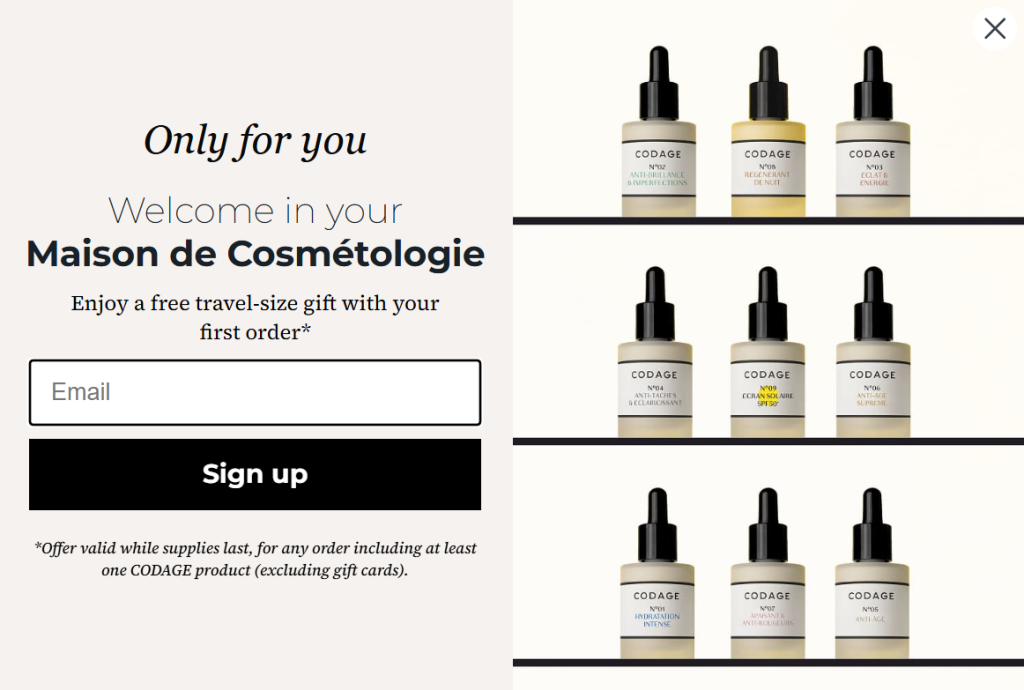
The shelves of serums displayed in the right panel do the visual selling without a single promotional word. The offer, a free travel-size gift with your first order, is smart because it gets the product in your hands, which is really what they want.
Why It Works:
- Framing sign-up as entering a “Maison” creates a sense of exclusivity and belonging rather than a transactional exchange.
- Displaying the full product range visually communicates abundance and quality without extra copy.
- A free product gift drives first-order conversions while also creating a product trial opportunity.
5. Press Cold-Pressed Juice
Press keeps it warm and benefit-focused. The 10% off offer is standard enough, but the subheadline, “a little boost toward a healthier, happier you,” reframes what you’re really signing up for. It’s not just a discount, it’s the start of a lifestyle shift.
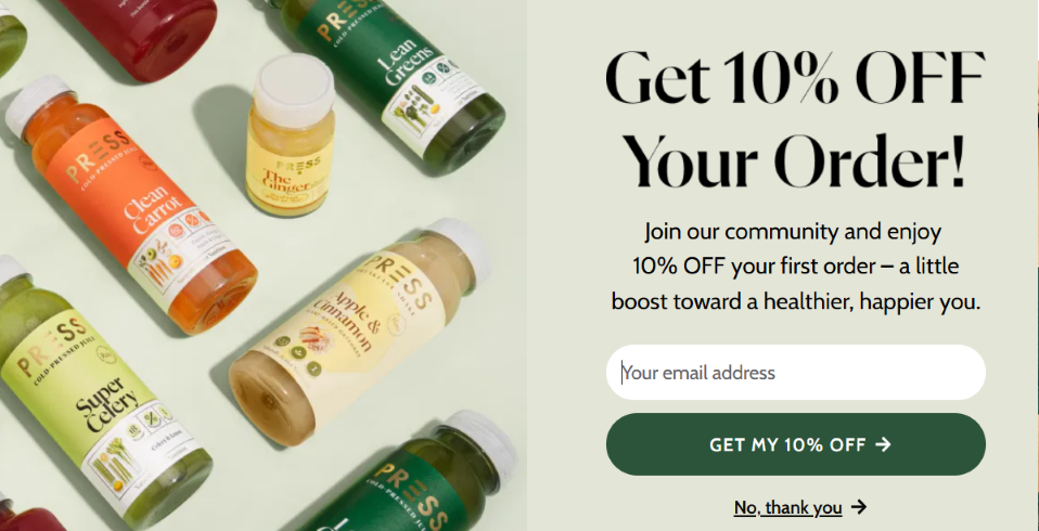
The flat-lay product photography is beautifully shot and lets the colorful juice range speak for itself. The “No, thank you” dismiss option is phrased as a choice, not a rejection, which keeps the tone friendly to the end.
Why It Works:
- Benefit-focused copy (“healthier, happier you”) makes the offer feel aspirational, not transactional.
- High-quality product photography creates appetite appeal that pushes hesitant visitors toward signup.
- A soft dismiss CTA (“No, thank you”) reduces the confrontational feeling that can hurt brand perception.
Free Shipping
6. ThredUp
ThredUp stacks two offers in one popup, and honestly, it’s hard to say no to that. Up to 50% off plus free shipping for signing up? The real genius here is leading with the big number. The “50% Off” sits in massive serif type that you can’t miss, and the free shipping almost feels like a bonus on top.
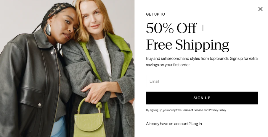
The lifestyle photography of two women in stylish coats does the subtle selling for you, it communicates the brand without saying a single word about fashion.
Why It Works:
- Stacking two offers (discount + free shipping) dramatically increases the perceived value of signing up.
- The large serif typography makes the discount feel premium, not pushy.
- Lifestyle imagery signals the brand’s aesthetic and pre-qualifies the right audience before they even read the offer.
Lead Generation (Email/Information Capture)
7. JewelScent
JewelScent leads with a question: “Want a free ring?” That’s a hard thing to scroll past. The product imagery at the top, three sparkly rings front and center, makes the offer feel immediately real and desirable.
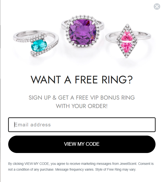
The CTA “View My Code” is a clever choice over something like “Subscribe,” because it makes the user feel like they’re accessing something already set aside for them. There’s a clear sense of personal entitlement baked into that phrasing.
Why It Works:
- An open-ended question headline (“Want a free ring?”) is almost impossible to resist clicking past.
- The CTA “View My Code” creates a sense of ownership before the user has even signed up.
- Featuring the actual product reward prominently makes the offer concrete and visually compelling.
8. Madsen Cycles
Madsen goes big: $200 off your first purchase. That’s not a discount, that’s a statement. For a high-ticket product like a cargo bike, this kind of offer is what converts a browser into a buyer. The real-life family photography is doing a lot of heavy lifting emotionally.
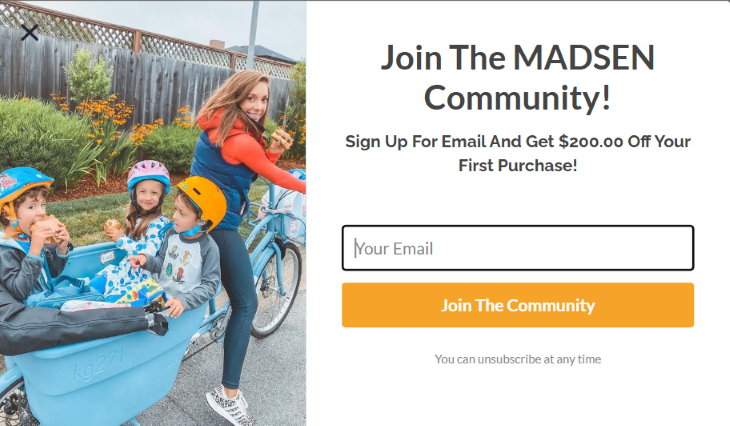
You’re not looking at a product shot, you’re looking at a lifestyle, kids piled into the cargo bucket, snacks in hand, mom smiling. That’s the life the customer is buying, not just the bike.
Why It Works:
- A high-dollar absolute discount ($200) feels more tangible and compelling than a percentage for premium products.
- Authentic lifestyle photography sells the use case and emotional payoff, not just the product.
- “Join the Community” framing positions the brand as a tribe rather than a transaction.
9. Blume
Blume takes a completely different angle with their “mystery discount” approach. Instead of just asking for your email, they ask you to identify your skincare concern first: acne, dark spots, aging, hydration, and so on.
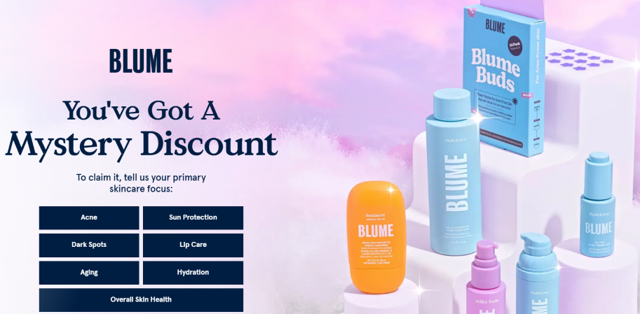
This does two things at once. It gets you invested in the interaction before you’ve given anything away, and it captures segmentation data that makes every future email more relevant. By the time you’ve clicked a category, you almost want to find out what the mystery offer is.
Why It Works:
- The interactive quiz step creates engagement and investment before asking for personal data.
- Skincare focus segmentation enables highly personalized follow-up email sequences.
- The “mystery discount” framing triggers curiosity, which is one of the strongest conversion motivators.
Lead Generation (Valuable Content/Resources)
10. Tim Ferriss
Tim Ferriss knows his audience doesn’t want to feel sold to, so he doesn’t sell. The offer is pure value: free chapters from three of his most popular books. No discount, no coupon code, just content you actually want.

The press quote up top, “The most surprising self-help hit of the decade,” does the credibility work before the offer even appears. The gold “Download Free Chapters” button stands out against the dark photography without feeling out of place.
Why It Works:
- Offering genuine content instead of a discount appeals to an audience that values knowledge over deals.
- Third-party press quotes establish credibility and authority before the reader even sees the opt-in.
- The email capture doubles as both a lead gen and a book sampling strategy that primes purchase intent.
11. Mimochai
Mimochai bundles three things into one welcome gift: a 10% discount, a mini tutorial, and wallpapers. That’s a clever stack for a creative app brand because each reward serves a different motivation. The price-sensitive visitor gets a discount.
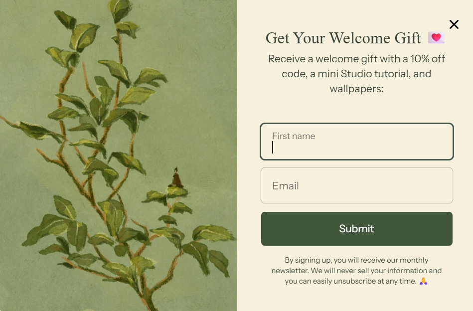
The curious new user gets a tutorial. The brand enthusiast gets wallpapers. By offering all three, they maximize the appeal across different visitor types without needing to guess which one will convert. The botanical artwork on the left is soft, beautiful, and completely on-brand.
Why It Works:
- Bundling multiple incentive types (discount + education + creative assets) widens the appeal across different audience segments.
- The tutorial specifically drives activation, which is the biggest challenge for app and SaaS products post-signup.
- Calming, on-brand imagery sets the emotional tone for what using the product feels like.
Gamification
12. The Knitting Network
The Knitting Network leans fully into the fun with a brightly colored spin-the-wheel popup that feels completely at home for their audience. The prizes are varied enough to feel exciting, free delivery, £3 off, 10%, 15%, and “spin again,” which keeps the outcomes feeling genuinely unpredictable.
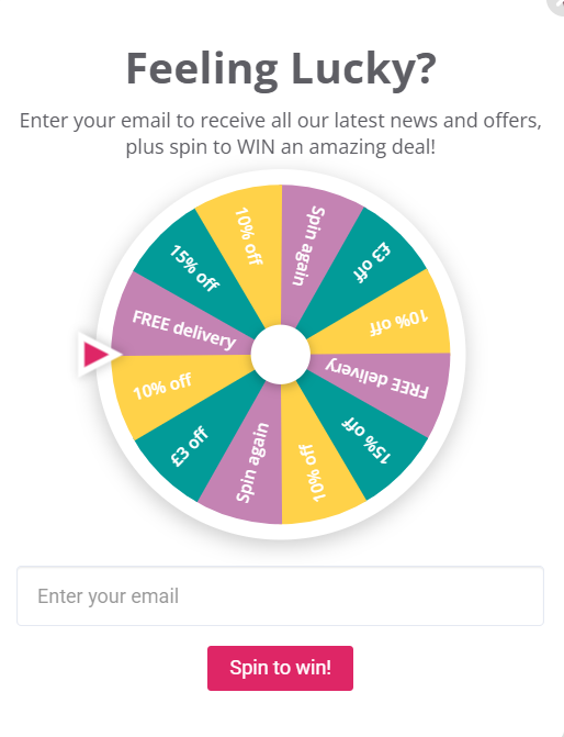
The playful design with a warm, crafty color palette matches the brand personality perfectly. This isn’t trying to be premium, it’s trying to be joyful, and it absolutely succeeds.
Why It Works:
- Variable reward mechanics (different outcomes on the wheel) create excitement and repeat engagement through unpredictability.
- Brand-aligned visuals and colors make the gamified format feel native rather than gimmicky.
- Multiple reward tiers mean no visitor walks away empty-handed, which reduces disappointment drop-off.
13. OddBalls
OddBalls cranks the energy up to eleven. The yellow confetti background, bold pink typography, and prizes ranging from £50 to £250 make this feel more like a game show entry than an email signup.
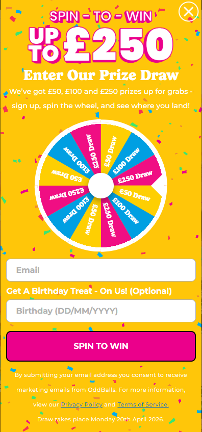
The birthday field is a clever optional addition; it captures a key segmentation moment and gives the brand a reason to reach out again with a personalized treat. The legal disclaimer at the bottom anchors it as a legitimate prize draw, which actually increases trust.
Why It Works:
- High-value cash prizes create much stronger motivation to sign up than typical discount offers.
- The optional birthday field adds a low-friction data capture opportunity that most brands miss.
- Clear legal disclaimers signal legitimacy and increase trust in what might otherwise feel too good to be true.
14. Nguyen Coffee
Nguyen doesn’t bother with a popup at all, and that might be the boldest move on this list. The entire hero banner is the conversion tool. “3,500+ Reviews” sits right at the top, and then the brand just lets the product and the copy do their thing.
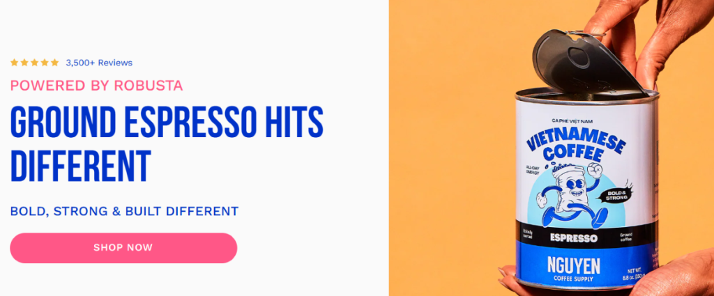
“Ground Espresso Hits Different” is confident, punchy, and speaks directly to a coffee-obsessed audience that’s tired of the same old dark roast narrative. This is social proof used not as a popup crutch but as a core brand message.
Why It Works:
- Placing the review count at the top of the hero makes social proof the first message visitors see.
- Confident, personality-driven copy differentiates the brand in a crowded market without leaning on discounts.
- The direct “Shop Now” CTA reduces path-to-purchase friction for already-convinced visitors.
15. Hallow
Hallow pairs an emotionally resonant illustration with a dead-simple offer: 30 days free. The Easter-themed timing is smart seasonal marketing, showing up with the right message at the right cultural moment.
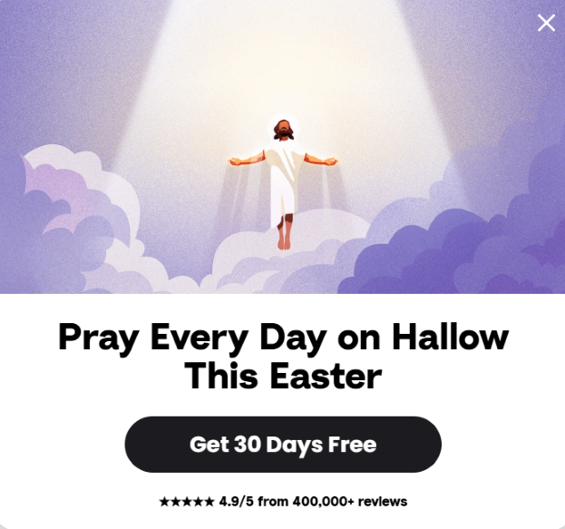
And “4.9/5 from 400,000+ reviews” printed right below the CTA removes any lingering doubt just before the click. For a spiritual app, heavy sales tactics would feel completely off-brand, and this popup understands that. It leads with meaning and follows with proof.
Why It Works:
- Seasonal visual themes tap into existing emotional context without needing extra copy to create relevance.
- Placing the star rating directly below the CTA catches the hesitant visitor at the exact moment of decision.
- A free trial offer removes financial risk completely, which is the most common barrier for subscription apps.
16. Leesa
Leesa earns the trust before they ask for the click. The Wirecutter “Our Pick 2026” badge is front and center, and for a mattress brand where every competitor claims to be the best, a credible third-party endorsement like that is worth more than any headline they could write themselves.
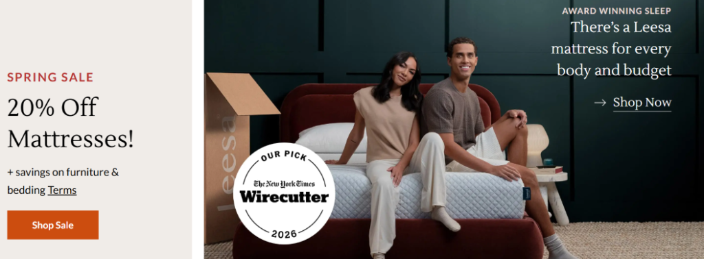
The spring sale 20% off offer layered on top of that proof gives hesitant visitors both the trust signal and the urgency nudge they need to act.
Why It Works:
- Third-party editorial endorsements (like Wirecutter) carry far more credibility than brand self-promotion.
- Layering a seasonal sale on top of existing social proof creates two independent reasons to convert simultaneously.
- The “Shop Now” CTA directs traffic immediately rather than gating it behind an email signup, reducing friction for high-intent visitors.
Cart Abandonment Reminders
17. Death Wish Coffee
Death Wish Coffee leans right into its brand identity even in the cart abandonment moment. “Don’t you want 20% off?” is almost a dare. The entire popup is black, bold, and a little confrontational, which is exactly right for a brand built around the idea of extreme coffee.
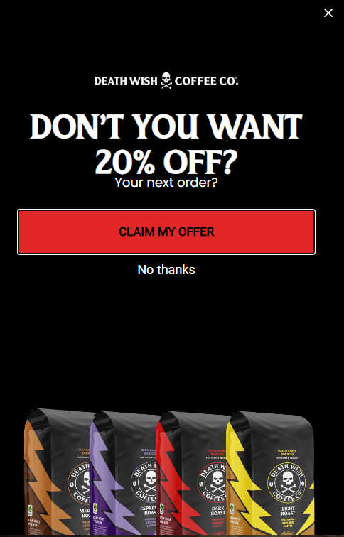
The product bags fanned out at the bottom make sure you remember exactly what you’re walking away from. There’s no soft sell here, and for their audience, that directness is probably why it converts.
Why It Works:
- Brand-consistent design even in recovery popups reinforces identity and prevents the offer from feeling disconnected.
- A direct, bold headline (“Don’t you want 20% off?”) creates mild social pressure that pushes fence-sitters to act.
- Displaying the product lineup at the bottom re-engages purchase intent by reminding the visitor what they almost bought.
18. Porcobrado
I saved the lonely pig sandwich for you here. I absolutely loved the clever storytelling that humanizes the product just enough to make shoppers think twice before bouncing away. This is one of the best exit popup examples showing how adding catchy visuals to your website can increase sales.
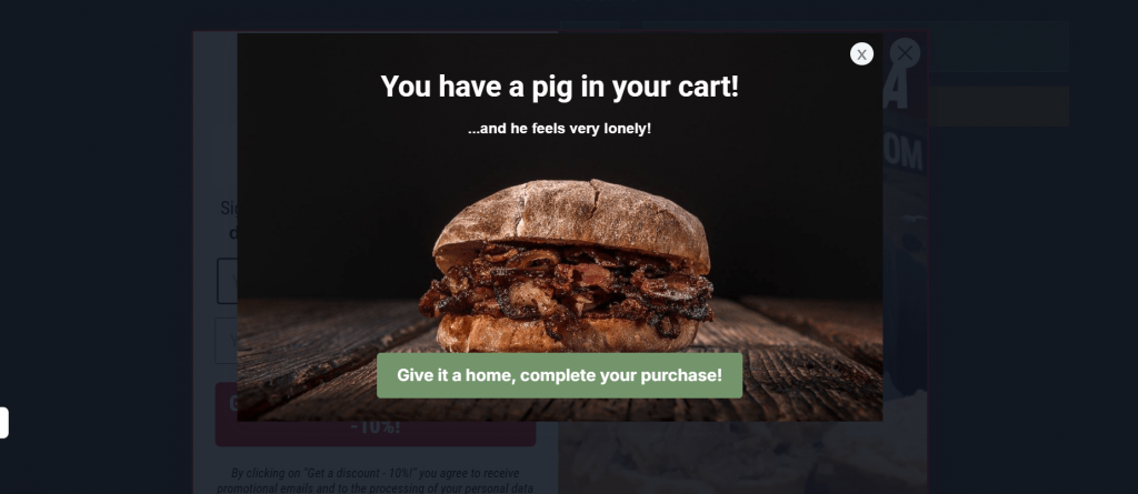
Why It Works:
- The playful “pig in your cart” message immediately grabs attention and makes users smile.
- Emotional appeal turns a simple cart reminder into a personal mission to “rescue” the item.
- Strong visual of the product triggers cravings and boost purchase urgency.
- The CTA (“Give it a home, complete your purchase!”) feels inviting rather than pushy, lowering resistance.
How I Selected These Examples
I didn’t just pick these because they look good. I’ve seen way too many “pretty” popups that do absolutely nothing for conversions.
So instead, I went through examples I’ve either tested myself or studied closely, and filtered them based on what actually drives results. The goal was simple: if I wouldn’t use it on my own site, it didn’t make the list.
Here’s what I looked at:
- Offer relevance: Does the popup give the visitor a real reason to stay? The best ones match intent. A discount for a hesitant buyer, a lead magnet for a reader, or a reminder for an abandoned cart. If the offer feels random, it gets ignored.
- Brand design coherence: I paid attention to whether the popup actually feels like part of the site. The colors, tone, and visuals should match the brand. When it looks out of place, people trust it less and close it faster.
- Friction level: The fewer steps, the better. I looked for popups that ask for minimal effort, like just an email instead of a full form. Anything that feels like work at the exit stage usually kills conversions.
- Documented conversion mechanism: This one matters the most. Each example has a clear reason behind why it works. Whether it’s urgency, loss aversion, social proof, or a simple value exchange, there’s a visible conversion trigger, not just design guesswork.
How Can You Optimize Exit Intent Popups for Mobile?
With more visitors browsing on mobile, mobile exit intent design is crucial for ensuring your popups work well. Here’s how to make sure your popups perform seamlessly on smaller screens:
- Use Mobile-Friendly Triggers: Since mouse hover doesn’t work on mobile, use mobile exit triggers like scroll depth or inactivity (e.g., when a user stops scrolling or taps the back button).
- Simplify Design: Keep popups clean and non-intrusive on mobile. Avoid full-screen popups, which can feel too overwhelming on a small screen.
- Tailor Your Offer: Make sure the offer fits the mobile experience—simple, quick, and easy to claim without being overwhelming.
FREE. All Features. FOREVER!
Try our Forever FREE account with all premium features!
Why Is A/B Testing Crucial for Exit Intent Popups?
A/B testing is key to understanding what works best for your site. A/B testing different popup trigger technology, CTA phrases, or popup designs can provide valuable insights into what drives your conversion rates.
By experimenting with different variables, you can fine-tune your conversion rate optimization efforts to ensure the best possible results.Here are the core elements to A/B test your exit popups:
- Headlines: Does a simple “Save 10%” work better than something more urgent like “Hurry, this offer expires soon”?
- CTAs: Test different call-to-action (CTA) phrases such as “Get Your Discount Now” vs. “Claim Your Offer.”
- Design: Do clean designs work better than bolder, more colorful ones?
How Does Social Proof Increase Exit Intent Popup Conversions?
Adding social proof to your exit-intent popups helps build trust and make visitors feel like they’re making the right choice. Here’s how you can use it to your advantage:
- Show Customer Reviews: Including testimonials or ratings reassures visitors and helps them trust your offer.
- Highlight Popularity: Mention how many people are already using your product or service this taps into FOMO (fear of missing out).
- Use Visual Proof: Showing real-time activity, like “10 people just bought this product,” makes your offer feel even more urgent and appealing.
What Are the Best Practices for Writing Exit Intent Popup Copy?
Effective copy for your exit-intent popups can make all the difference. Here are the best practices I use to keep my messages clear and actionable:
1. Be Direct: Ensure the value of your offer is clear from the start. No one wants to guess what you’re offering.
2. Create Urgency: Use popup time-sensitive phrases like “Last chance” or “Limited time only” to get visitors to act fast.
3. Personalize the Message: Tailor your offer to what the visitor has been doing on your site, such as a discount on items they’ve viewed.
4. Keep it Short: Visitors don’t have time for long-winded messages. A couple of short, punchy lines will do the trick.
What Are the Common Mistakes to Avoid with Exit Intent Popups?
While exit-intent popups can be incredibly effective, there are some common mistakes you’ll want to avoid to make sure they don’t annoy your visitors:
1. Poor Timing: Don’t show the popup right when they land on your site. Wait until they show signs of exiting.
2. Too Aggressive: Avoid in-your-face popups. They should be a gentle side popup or a hello bar nudge, not an annoying push.
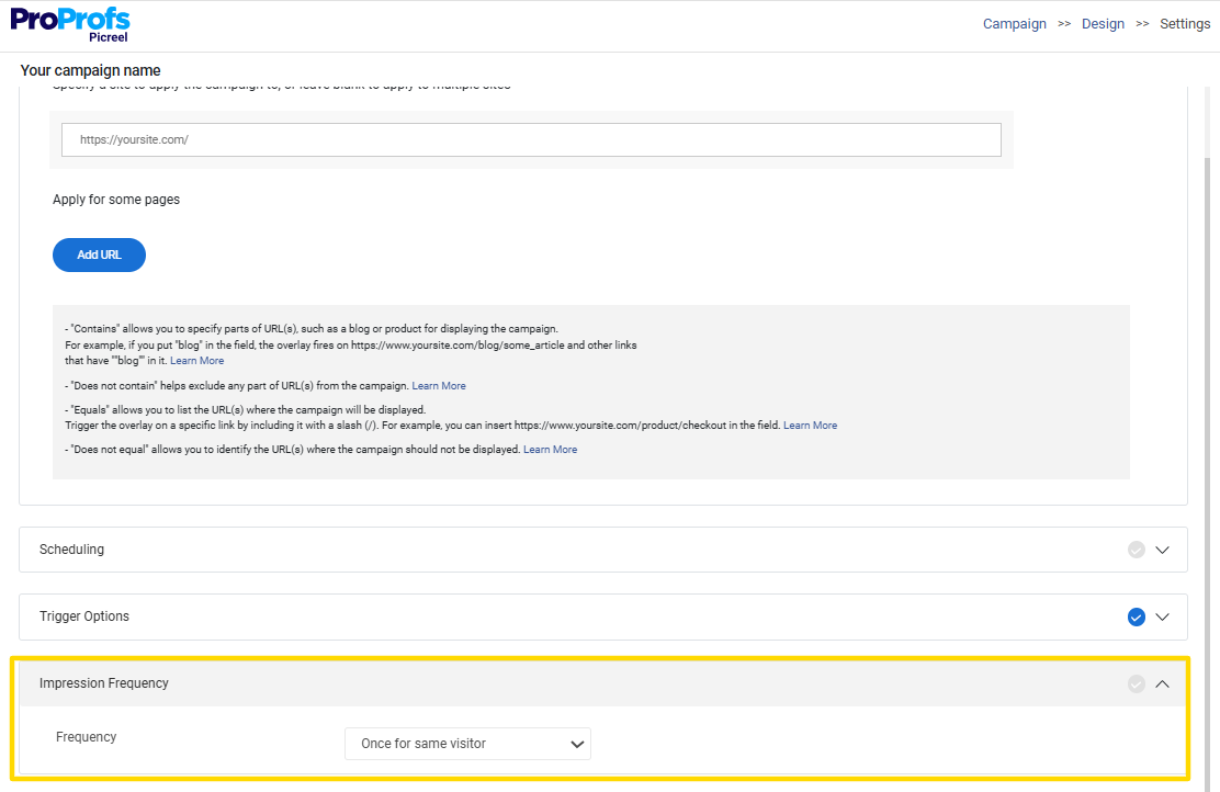
3. Overuse: Don’t bombard visitors with popups during their session. Frequency capping ensures your popups aren’t shown too often.
4. Bad Mobile Experience: Mobile users expect mobile popups that fit their screen. Don’t force a desktop version onto a mobile device.
FREE. All Features. FOREVER!
Try our Forever FREE account with all premium features!
Choose the Right Exit Intent Popup to Win More Conversions
Exit-intent popups are a powerful tool for increasing conversions and capturing leads, especially when implemented at the right time.
By offering relevant discounts, helpful resources, or personalized content at the critical moment when visitors are about to leave, these popups can effectively reduce bounce rates and drive action. Key to success is personalization, urgency, and clear, actionable copy.
A/B testing and mobile optimization are also essential for maximizing popup effectiveness. Tools like Picreel streamline this process by offering easy integration, advanced targeting, and automated A/B testing.
Implementing these popups can provide a measurable boost to your conversion rates. If you’re ready to improve your site’s performance, start testing exit-intent popups today and see the difference for yourself.
Frequently Asked Questions

What metrics measure exit popup success?
To gauge the success of an exit popup, track conversion rates, opt-in rates, bounce rates, and user engagement (such as clicks and time spent on the site). These metrics help you understand how well the popup drives the desired actions.
Exit-intent popup timing strategies for desktop and mobile?
On desktop, exit popups are typically triggered when the visitor’s cursor moves toward the close or back buttons. On mobile, since hover doesn’t apply, popups trigger based on scroll depth or inactivity, such as when the user stops scrolling or taps the back button.
How do exit-intent popups improve conversions and reduce bounces?
Exit-intent popups engage visitors just before they leave, offering something relevant, such as a discount or helpful content. This increases the chances that visitors will stay and complete a purchase, reducing bounce rates and improving conversion rates.
How does social proof increase exit intent popup conversions?
Social proof builds trust at the exact moment visitors are about to leave. Adding reviews, testimonials, or usage numbers reassures them that others value your offer. It also creates urgency through FOMO, especially with real-time activity, making users more likely to stay, engage, and complete the desired action.
FREE. All Features. FOREVER!
Try our Forever FREE account with all premium features!
 We'd love your feedback!
What did you like & how can we make it even better?
 Thanks for your feedback!
 Ask Your Question
Have a question? Get expert help to make your decision easier.