Discount popups are a great way to attract and engage customers, increasing their likelihood of purchasing from your website.
An overwhelming majority of U.S. shoppers, 93% to be precise, consider discounts and offers as crucial factors in their decision-making process when it comes to purchasing from a retailer or brand.
In this blog post, we’ll explore some of the best discount popup examples that can inspire your own popup designs. By leveraging these examples, you’ll be able to create enticing offers, boost customer engagement on your website, and convert more visitors into paying customers.
Are you ready to take your sales to the next level? Let’s dive right in and explore these outstanding discount popup examples!
8 Amazing Discount Popup Examples
Here are some examples of well-designed discount popups you can reference when creating your own:
1. Kitchen Cabinet Kings
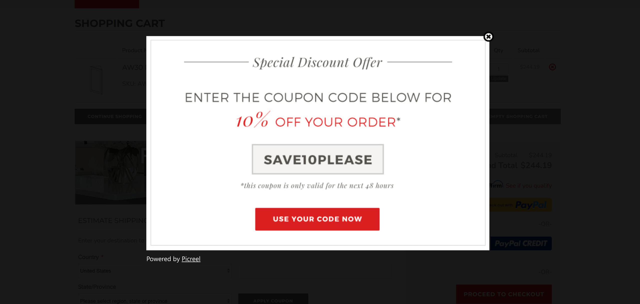
Image Source: Kitchen Cabinet Kings
By using smart discount popups on their website, Kitchen Cabinet Kings achieved an impressive 26.57% boost in their conversion rate.
What’s great about this popup:
The popup has an eye-catching headline that communicates the purpose, along with a visible coupon code.
The coupon is automatically applied when visitors click on the call-to-action, which takes them to their cart. The popups also create a sense of urgency by mentioning a 48-hour deadline.
Kitchen Cabinet Kings’ clever strategy attracts customers and leads them to irresistible offers. They know how to combine simplicity, convenience, and time-limited incentives to capture attention and gain satisfied customers.
What can be improved:
An image can be added to make the popup more visually appealing.
Also Read : How to Create Custom Popups Using Picreel
2. The Children’s Place
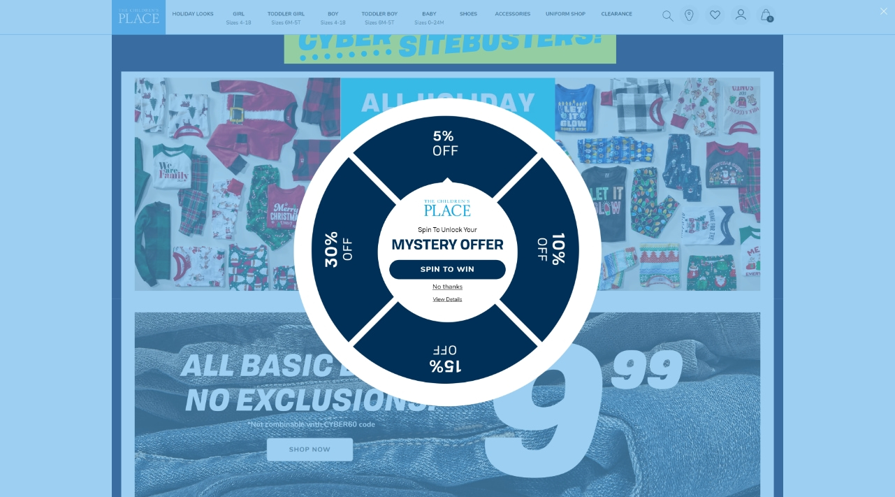
Image Source: The Children’s Place
The Children’s Place attracts customers with an engaging spin-the-wheel discount popup. This interactive feature allows visitors to spin a virtual wheel to win discounts ranging from 5% to 30%.
What’s great about this popup:
With each spin, customers experience a sense of excitement, creating a fun and rewarding shopping experience while enticing them to make a purchase.
What can be improved:
The CTA could be presented in a larger font to make it more eye-catching.
3. Kiss My Keto
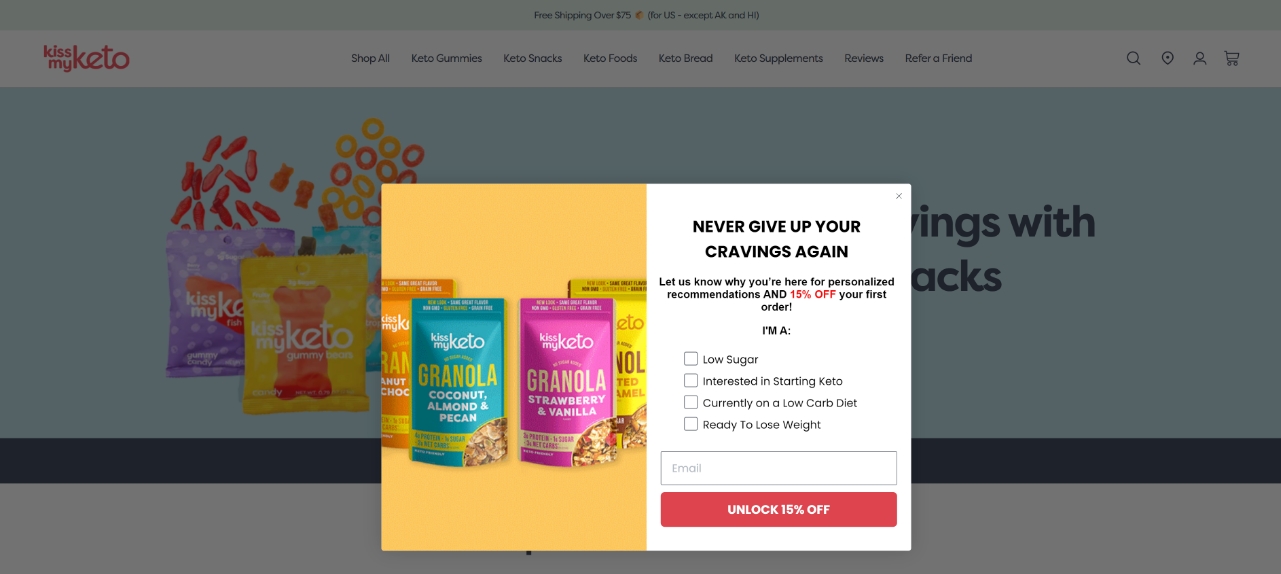
Image Source: Kiss My Keto
A unique popup greets visitors when they enter Kiss My Keto’s website. The popup has a design that conveys an eye-catching and enticing message: “Never Give Up Your Cravings Again.”
What’s great about this popup:
The popup stands out because of its interactive element. It lets the visitor choose their current dietary preference or goal. After the visitor makes their choice, they can receive a discount.
Kiss My Keto’s discount popup gives website visitors a feeling of participation and accomplishment even before they begin browsing. This way, it quickly makes the visitor feel that they are understood and served, building strong customer relationships from the first touchpoint.
What can be improved:
While it’s a minor quibble, the copy could be made more concise.
4. Gangsta Group
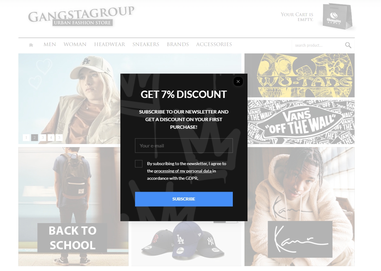
Image Source: Gangsta Group
Gangsta Group, an urban fashion retailer, has a simple and clear discount popup. They offer a seven percent discount in exchange for an email address.
What’s great about this popup:
The popup has only about 30 words, including the text in the email field. It works well because it shows people exactly what they need to know: what they give and what they get. On the other hand, an offer with too many details might be hard to understand or appeal to people.
Another thing working in favor of this popup is that it has a good CTA design. The bold blue color of the CTA makes it stand out in the dark background.
What can be improved:
While the copy is clear and concise, it isn’t very compelling. The message below the heading could be reworked to add more emotion.
5. Hydrant
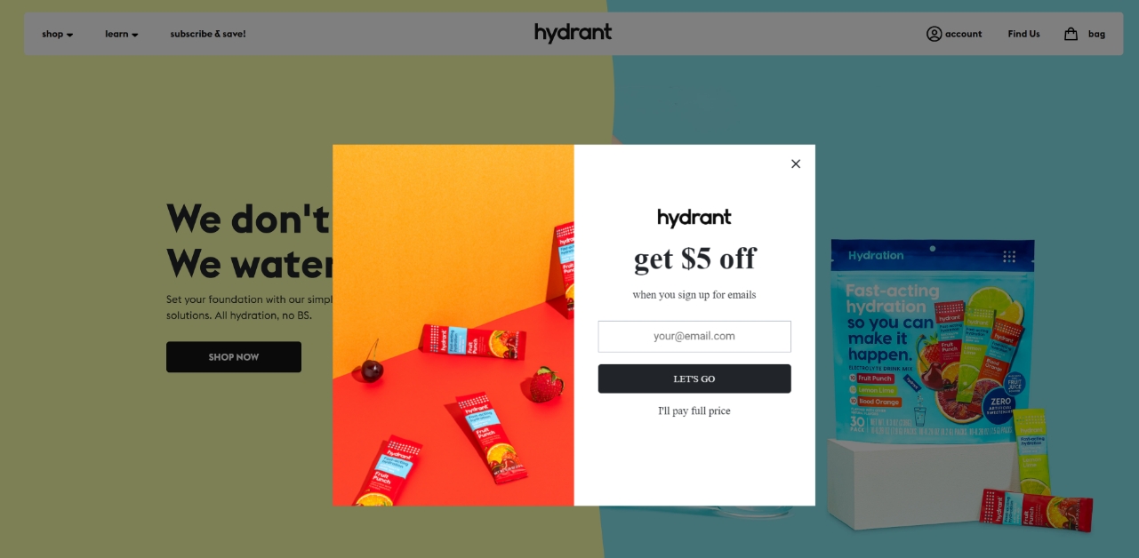
Image Source: Hydrant
Your discount popup’s CTA is crucial—it can persuade the visitor to go for your offer and remind them of what they’re missing out on if they ignore it.
Hydrant’s discount popup has a great main CTA with an appealing black-and-white color scheme. However, its secondary CTA—“I’ll pay the full price”—is what makes this an excellent discount popup example.
What’s great about this popup:
Hydrant’s popup leverages loss aversion bias, where the feeling of losing something is stronger than the feeling of gaining something. Before they close the popup, the visitor has to admit that they’re giving up something.
What can be improved:
Since the secondary CTA plays an important role in this popup, it can be made more noticeable by adding a background to it.
6. Icon Sleep
![]()
Image Source: Icon Sleep
Icon Sleep employs a nano bar popup to promote limited-time discount offers on all of their pages.
What’s great about this popup:
Icon Sleep’s discount popup ticks several boxes when it comes to presenting an engaging discount offer.
- It creates urgency by mentioning that it’s a limited-time offer.
- It’s not intrusive.
- The discount offer is excellent.
- The popup’s colors align with the branding, and it seamlessly blends with the webpage while still being attention-grabbing.
What’s more, the discount popup presents a second, equally attractive offer, alternating between the two offers periodically.
![]()
Image Source: Icon Sleep
What can be improved:
A CTA can be added that takes customers to top-selling products.
7. Varley
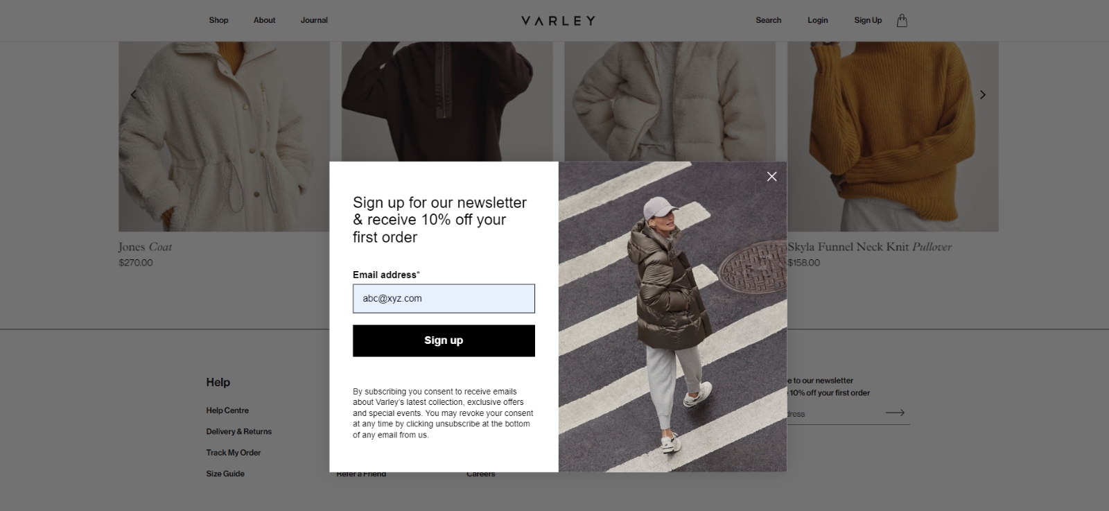
Image Source: Varley
When you visit Varley’s landing page, you will see a stylish and appealing discount popup displayed. The popup has a sleek black-and-white color scheme that immediately catches your eye.
What’s great about this popup:
The combination of the black-and-white theme along with a strategically placed image on the right side enhances the clean and minimalistic design of the popup, making it truly stand out.
The popup message presents a simple but attractive offer: if you subscribe to Varley’s newsletter, you will receive a 10% discount on your first order.
What can be improved:
The CTA button message could be changed to something like “Get 10% discount now” to make the discount offer more prominent.
Also Read : Mobile Exit Intent Popups: Strategies and Best Practices
8. Elvie & Leo
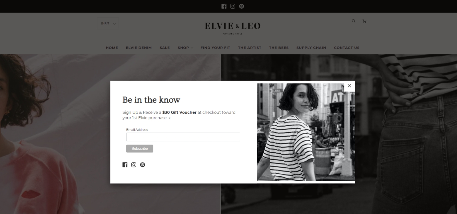
Image Source: Elvie & Leo
If you appreciate the beauty of minimalism, you’ll surely be captivated by Elvie & Leo’s discount popup. The moment you arrive on their page, a popup gracefully invites you to subscribe while offering a $30 gift voucher for your first purchase.
What’s great about this popup:
The popup showcases a tasteful black-and-white design that seamlessly aligns with the overall aesthetics of the website. It has a concise copy presented in beautiful fonts, with a simple “Be in the know” heading that captures your attention effortlessly.
What can be improved:
The CTA button would look more appealing if the background color was changed from gray to black to create a sharp contrast with the white font color and a stronger visual impact.
How to Create a Discount Offer Popup
Creating a discount popup is super easy. All you need is an excellent popup tool.
Watch this video tutorial on how you can create a popup using Picreel:
Let’s look at how you can quickly design an attractive and effective popup with Picreel.
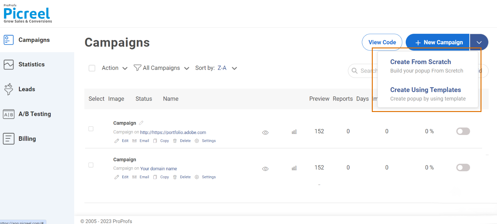
Step 1: Start by signing in and selecting “Campaigns” from the menu on the left.
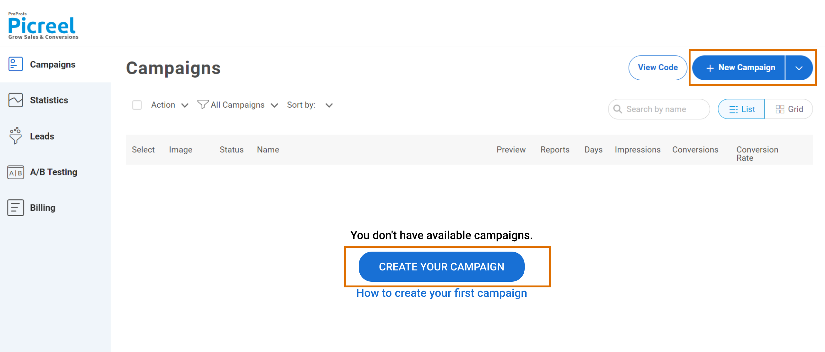
Step 2: Next, navigate to “New Campaign” in the top right corner. Click the drop-down arrow next to it to pick a pre-designed template or start creating your discount popup campaign from scratch.
Step 3: Choose the type of popup you want to create from the template library. The popups are neatly categorized by type, goal, and industry so that you can quickly find what you’re looking for.
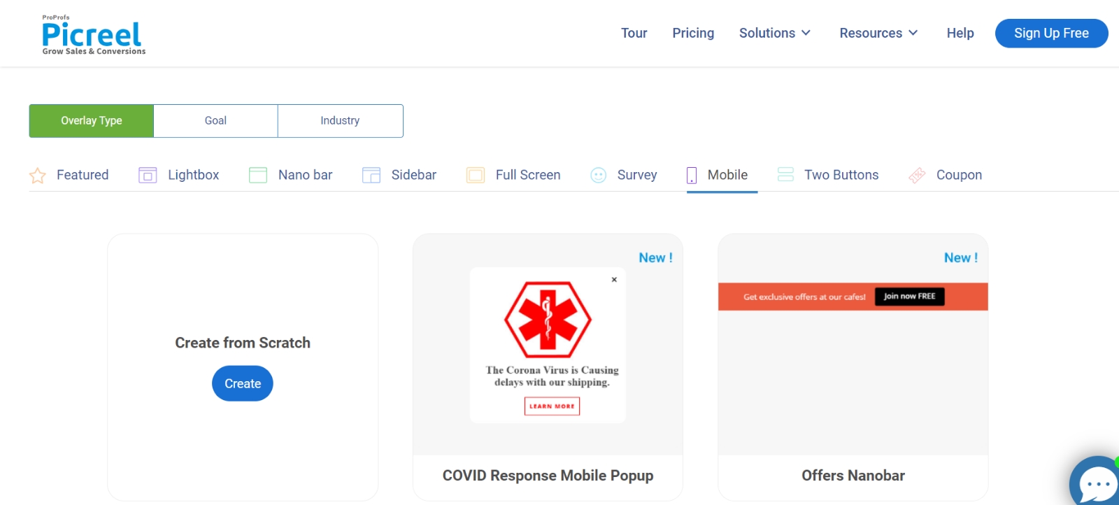
Explore Discount Popup Templates
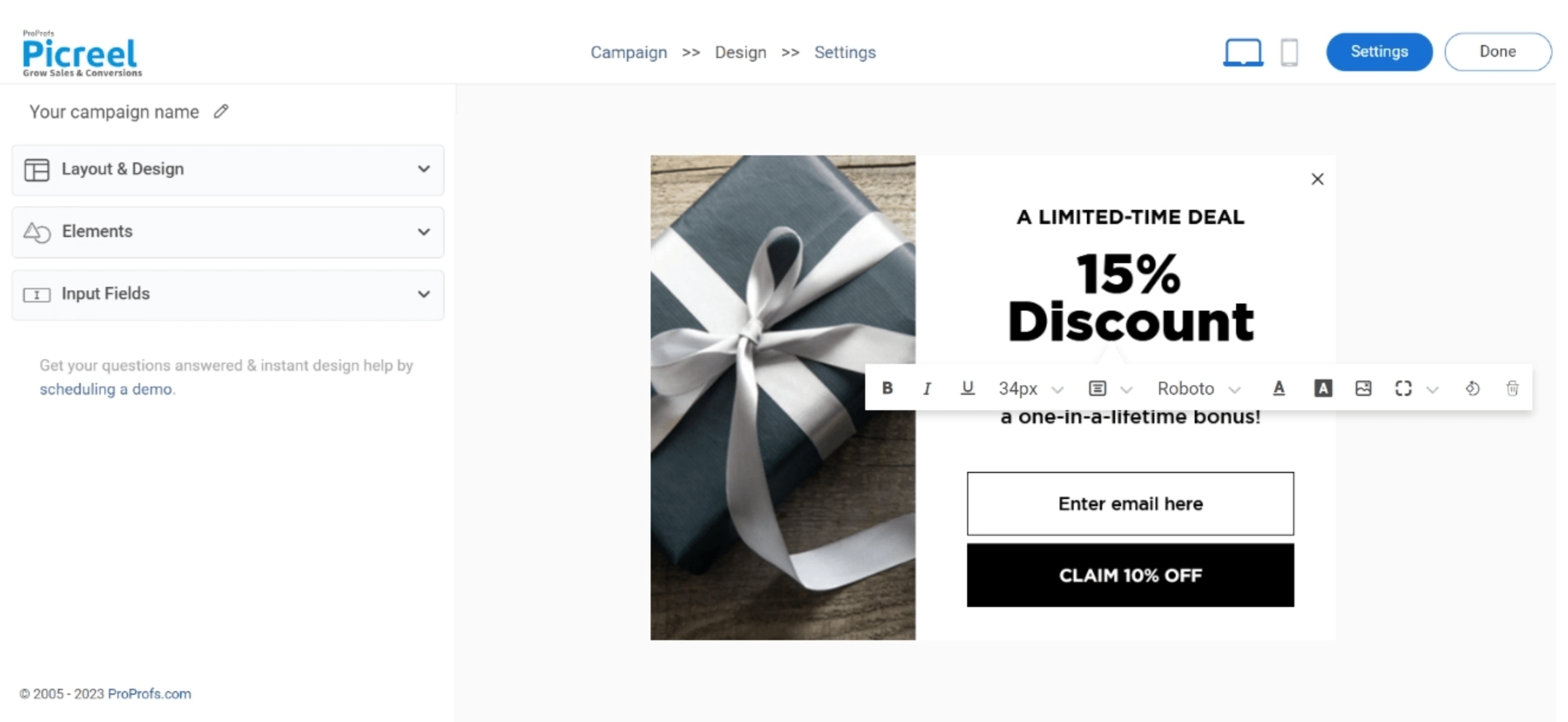
Step 4: Edit the selected template to add your discount offer and personalize it based on your requirements.
You have the flexibility to customize the appearance, structure, content, options, banner settings, and fonts. You can also add a personal touch with on-site data.
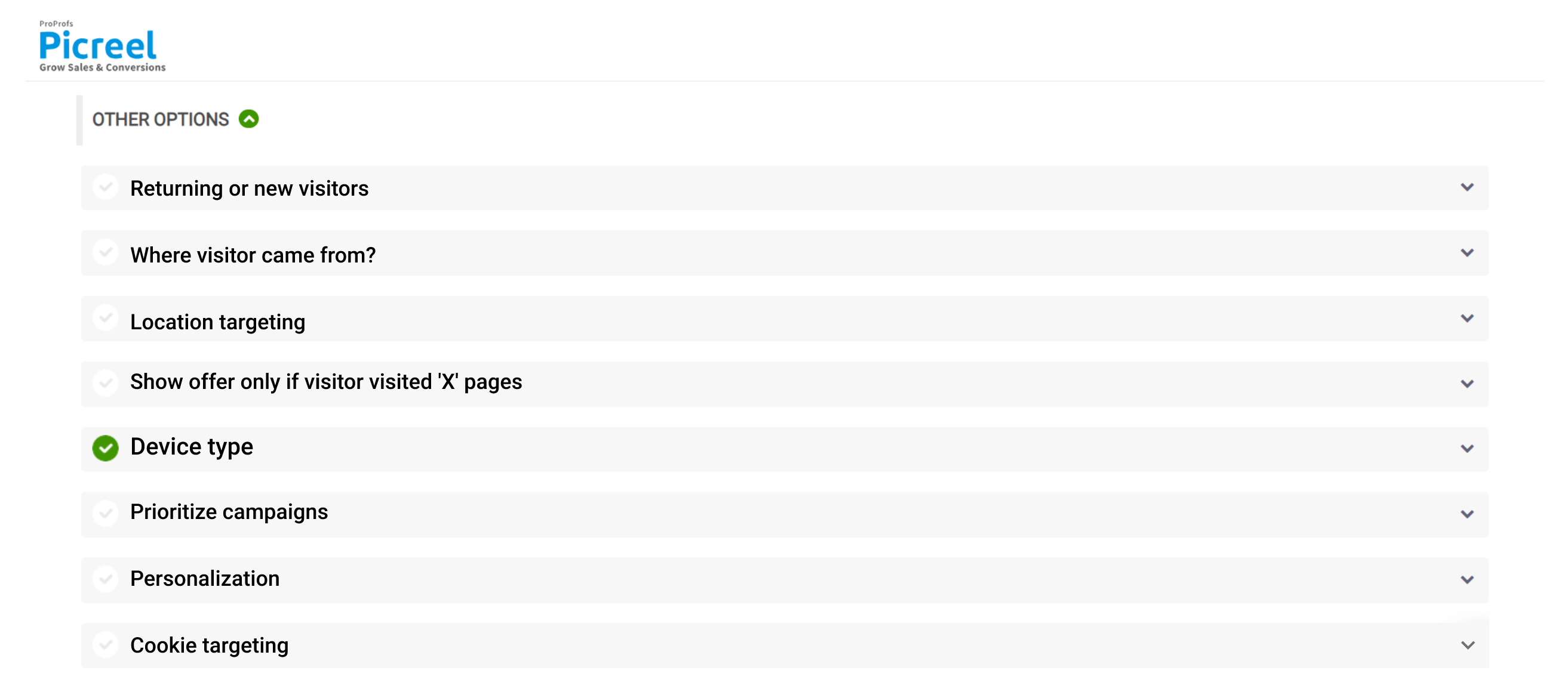
Step 5: Provide the URL of the website you wish to target and indicate whether you would like the popups to appear throughout the site or on specific pages.
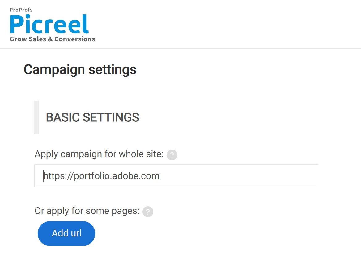
Additionally, you have the option to set your discount popups to appear based on factors such as scrolling depth, time spent on the page, or interaction with website elements.
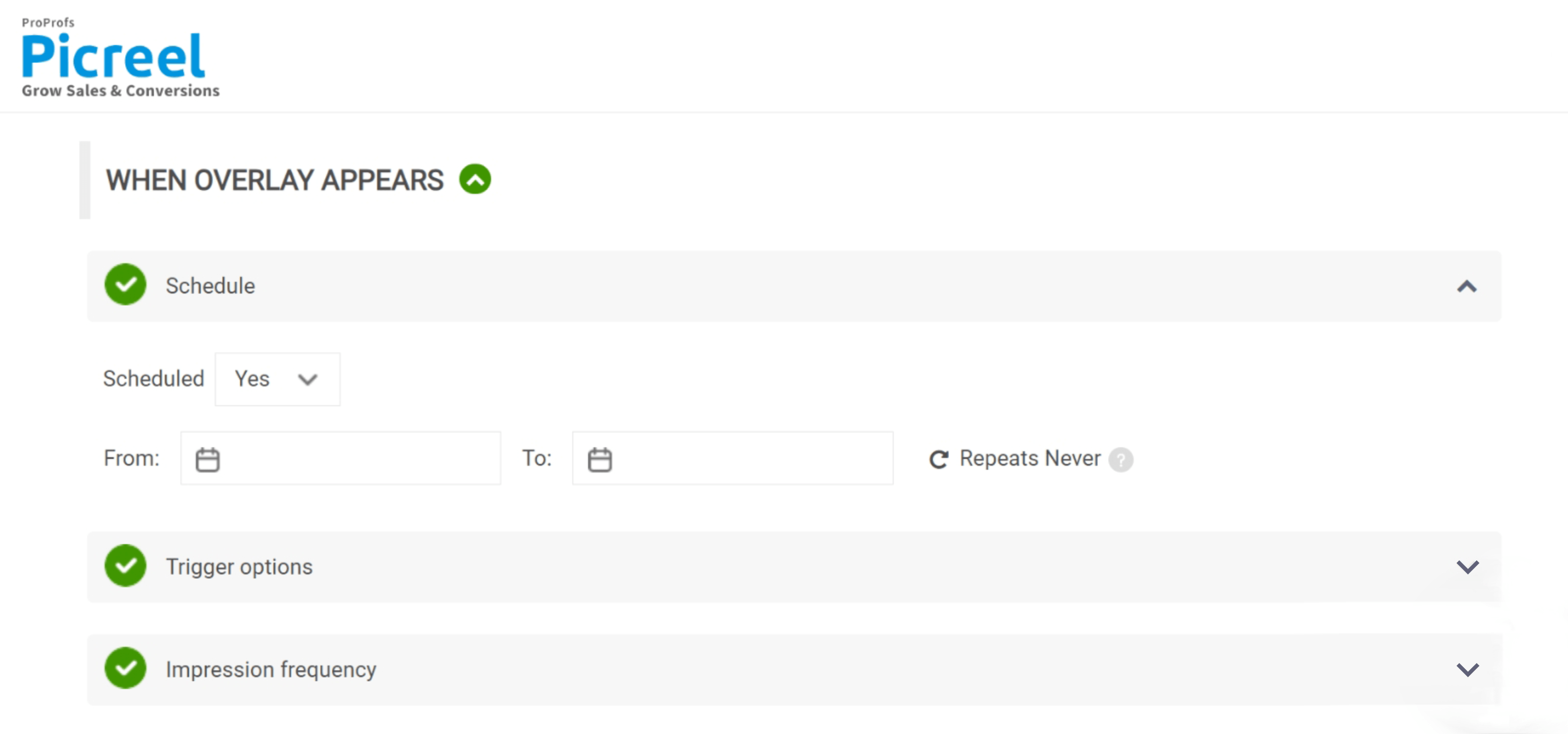
You can also tailor the targeting of your popups in even greater detail.
This includes the option to differentiate between returning and new visitors, as well as target based on the visitors’ origin, their geographic location, the type of device they are using, and even custom cookies.
Step 6: Lastly, simply click the “Save” button to activate your discount popup and make it live on your website.
To learn more, watch this video tutorial:
Increase Your Revenue With Powerful Discount Popups
Discount popups can help e-commerce businesses boost sales and conversions by offering attractive deals to visitors. To make them more effective, businesses should personalize them, create urgency, and optimize them based on data.
Before diving into creating discount offer popups, it’s essential to find a suitable popup tool that aligns with your needs and goals. One highly recommended option is Picreel.
With Picreel, you can effortlessly design custom popups for various purposes. It offers 100+ popup templates and features such as exit popups, advanced targeting, and on-site messages. Picreel empowers you to engage and convert your website visitors seamlessly. It also comes with a forever-free plan that allows you to create and deploy unlimited popups, so you don’t have to think twice before implementing your strategies.
Start creating discount popups today to set your business up for success and enjoy the benefits of increased conversions and revenue. Happy selling!
Frequently Asked Questions
What is the best timing for a discount popup?
The best timing for a discount popup depends on various factors, such as the behavior of your website visitors and the purpose of the discount.
However, research suggests that showing the discount popup after visitors have spent a certain amount of time on your website or when they are about to exit can be effective.
Experimenting with different timing options and analyzing the data can help you determine the optimal timing for your discount popups.
How can I A/B test my discount popups for better results?
A/B testing is a valuable technique for optimizing discount popups. To conduct an A/B test, create multiple versions of your discount popup and randomly show them to different segments of your audience.
Measure the performance of each version by tracking metrics like conversion rate and click-through rate. By comparing the results, you can identify the variations that resonate most with your audience and make data-driven improvements.
Learn more: 9 Simple A/B Tests You Should Perform for Higher Conversions
Why are discount popups important for e-commerce businesses?
Discount popups play a crucial role in e-commerce businesses for several reasons. Firstly, they attract attention and incentivize visitors to make a purchase by offering exclusive deals or promotions.
Discount popups can also help reduce shopping cart abandonment by providing last-minute incentives. Additionally, they can help grow your email list, as visitors often need to provide their email addresses to access the discount.
Overall, discount popups are an effective tool to drive conversions, boost sales, and engage customers.
How can I ensure my discount popups don’t annoy website visitors?
While discount popups can be effective, it’s important to ensure they don’t annoy or disrupt the user experience. Here are a few tips to prevent annoyance:
- Implement frequency capping: Limit the number of times a visitor sees the discount popup within a specific time period to avoid overwhelming them.
- Use exit-intent technology: Show the discount popup when visitors are about to leave your website instead of interrupting their browsing experience.
- Customize the design and messaging: Make sure the discount popup blends well with your website’s overall design and uses persuasive yet non-intrusive messaging.
How can I analyze the performance of my discount popup and make improvements?
To analyze the performance of your discount popup and make improvements, consider the following steps:
- Track key metrics: Monitor metrics such as conversion rate, click-through rate, and bounce rate to gauge the effectiveness of your discount popup.
- Utilize analytics tools: Implement tools like Google Analytics to collect data on user behavior and interaction with the discount popup.
- Conduct user surveys: Collect feedback from visitors to understand their perception of the discount popup and identify areas for improvement.
- Iterate and optimize: Based on your analysis, make data-driven changes to the design, messaging, and targeting of your discount popup to improve its performance over time.
Remember, continuous monitoring and optimization are key to maximizing the impact of your discount popups and driving better results.
FREE. All Features. FOREVER!
Try our Forever FREE account with all premium features!
 We'd love your feedback!
What did you like & how can we make it even better?
 Thanks for your feedback!
 Ask Your Question
Have a question? Get expert help to make your decision easier.