

I spent months watching mobile traffic bounce without converting, and I kept blaming the offer. Turns out, I was solving the wrong problem. The real issue was that I was applying desktop popup logic to mobile users, and those two audiences behave nothing alike.
Once I rebuilt my mobile exit intent strategy from scratch, using the right triggers, design, and timing, conversion rates improved, and user complaints dropped.
This guide covers everything I have learned: how mobile exit detection actually works, how to build and launch a campaign that converts, and which tools support real mobile exit intent functionality.
What Is Mobile Exit Intent?
Unlike a desktop, where leaving the viewport is the exit signal, mobile devices have no cursor. Instead, mobile exit intent tools rely on behavioral signals like back button taps, rapid upward scrolling, tab switching, and extended inactivity to identify departure intent.
Why it matters for CRO:
- Captures visitors at the last possible moment before they leave your website.
- Helps convert abandoning traffic into leads, subscribers, or customers.
- Improves conversion rates by presenting relevant offers based on visitor behavior.
- Maximizes the value of existing website traffic without requiring additional marketing spend.
5 Mobile Exit Intent Popup Examples Worth Studying
I’ve seen brands use mobile popups in dozens of different ways, but the most successful ones all have one thing in common: they offer the right message at the right moment. Here are five examples worth studying.
1. Gymshark (Countdown Timer / Urgency Popup)
Gymshark proves that not every high-converting popup needs to be a popup. Before their sale begins, visitors land on a full-screen countdown experience that builds anticipation long before the purchase decision. The timer becomes the focal point, creating urgency without overwhelming the user with discounts or forms.
Instead of pushing for an immediate conversion, Gymshark uses scarcity and timing to make shoppers return when the sale goes live.

Why It Works:
- A visible countdown creates urgency before the promotion starts.
- The full-screen design removes distractions and focuses attention on the upcoming sale.
- Builds anticipation and encourages repeat visits rather than forcing an immediate purchase.
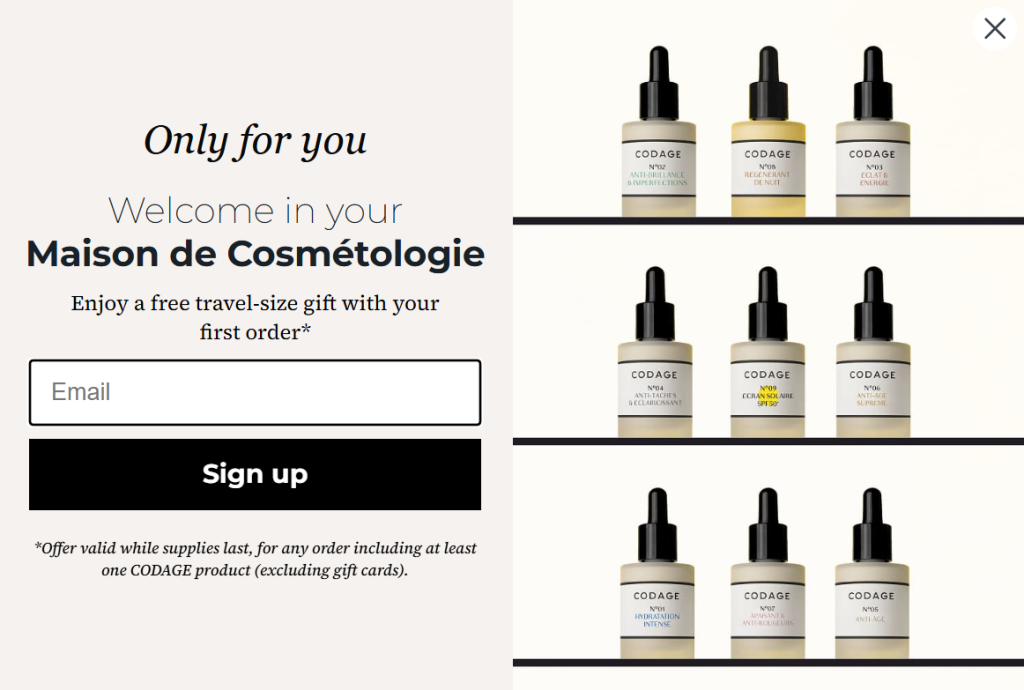
2. Codage (Lead Generation Popup)
Codage takes a luxury approach to lead generation. Rather than offering a discount, the brand rewards first-time visitors with a complimentary travel-size gift.
The popup feels more like a personalized invitation than a marketing form, which aligns perfectly with the premium skincare experience they’re selling. The clean design and single-field email capture keep friction low while still generating qualified leads.
Why It Works:
- A free gift often feels more exclusive than a percentage discount.
- Single-field email capture reduces signup friction.
- Premium visuals reinforce the brand’s luxury positioning.
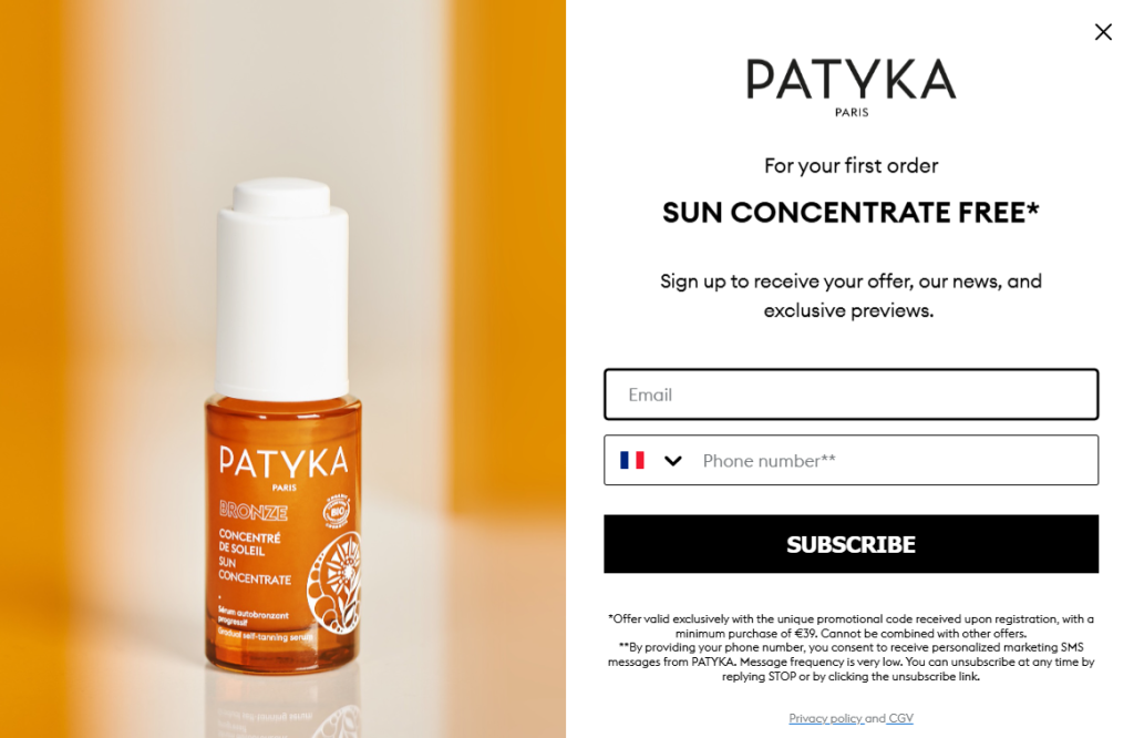
3. Patyka (Free Gift Popup)
Patyka combines product sampling with email and SMS capture in a way that feels valuable rather than intrusive. Visitors receive a free Sun Concentrate with their first purchase in exchange for joining the brand’s community.
The offer is specific, tangible, and directly connected to the products being sold, making it more compelling than a generic discount.
Why It Works:
- A product-based incentive creates stronger perceived value.
- Captures both email and SMS subscribers for future marketing.
- The offer aligns naturally with the brand’s product lineup.
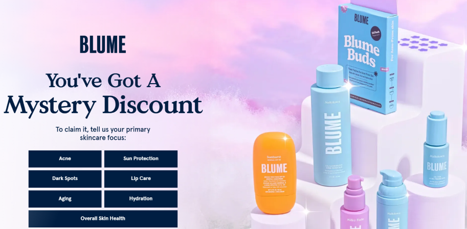
4. Blume (Personalized Lead Generation Popup)
Blume transforms a standard lead capture popup into an interactive experience. Instead of immediately asking for an email address, the popup invites visitors to identify their skincare concerns first. This creates engagement while simultaneously collecting valuable preference data.
By making the interaction feel personalized, Blume increases the likelihood that visitors continue through the signup process.
Why It Works:
- Interactive selection keeps visitors engaged longer.
- Collects zero-party data for better personalization.
- Feels like a recommendation quiz rather than a signup form.
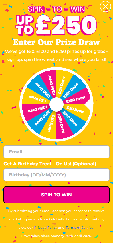
5. OddBalls (Spin-to-Win Gamification Popup)
OddBalls uses gamification to turn email collection into entertainment. Rather than offering a fixed discount, visitors spin a virtual wheel for a chance to win prizes. The uncertainty triggers curiosity and encourages participation.
The bright colors, movement, and prize-driven format make the popup difficult to ignore, especially on mobile devices.
Why It Works:
- Gamification increases engagement and participation rates.
- Variable rewards create excitement and curiosity.
- Collects email addresses before revealing the prize outcome.
How to Create a Mobile Exit Intent Popup Campaign
Before opening any popup tool, I decide exactly what the popup needs to achieve. One goal. Not multiple. That goal directly determines the popup type, trigger, and offer I build. Get this wrong, and the entire campaign underperforms regardless of how polished the design looks.
For most sites, the goal is one of these:
- Growing an email list through lead capture
- Recovering abandoned visitors on product or cart pages
- Promoting a time-sensitive offer or content upgrade
- Capturing feedback or qualifying intent through a survey popup
If you are unsure which goal fits your current traffic, use this prompt before building:
“I run a [type of business]. My goal is [goal]. My target audience is [audience]. Suggest the best mobile popup type, trigger, and offer ideas.”
Once the goal is clear, here is how I build the campaign.
Step 1: Create Your Mobile Popup Campaign
Inside your popup tool, create a new campaign. You have two starting points:
AI popup builder: Enter your website URL and campaign goal. Picreel’s AI generates a ready-to-use mobile popup with layout, copy, and CTA matched to your objective. When using this, specify that you want a mobile-optimized format. The AI will prioritize compact layouts, minimal form fields, and thumb-friendly CTAs suited for small screens. You can try it here:
Template library: Choose from popup templates covering lightbox popups, slide-ins, nanobars, full-screen overlays, exit surveys, and more. When browsing, filter for mobile-specific templates. A template built for mobile will already account for screen proportion, tap target sizing, and close button placement.
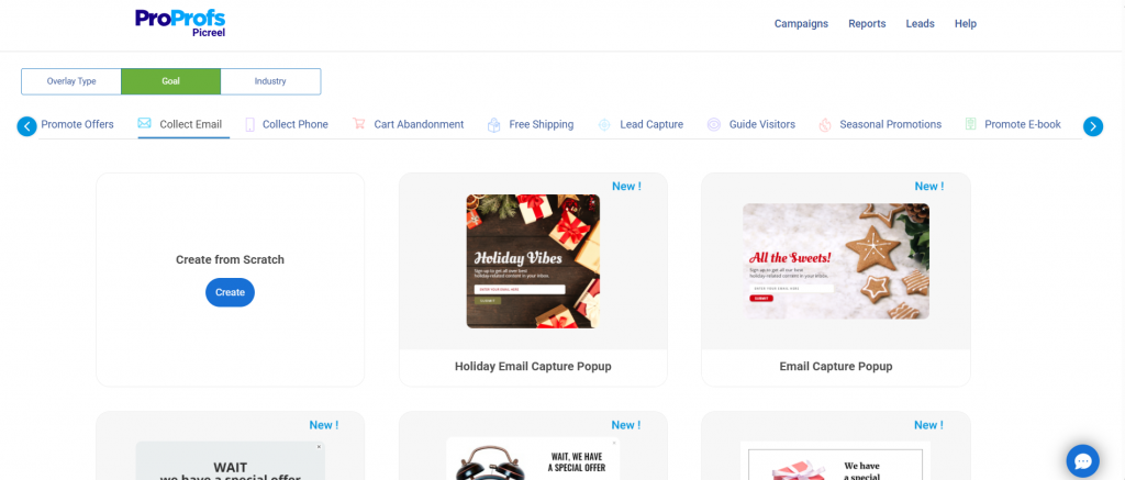
Start with one goal per campaign. A popup trying to accomplish two things at once splits attention and converts poorly.
Step 2: Design for Mobile First
A good mobile popup design looks clean, loads quickly, and doesn’t feel like a roadblock. Here is what I pay attention to:
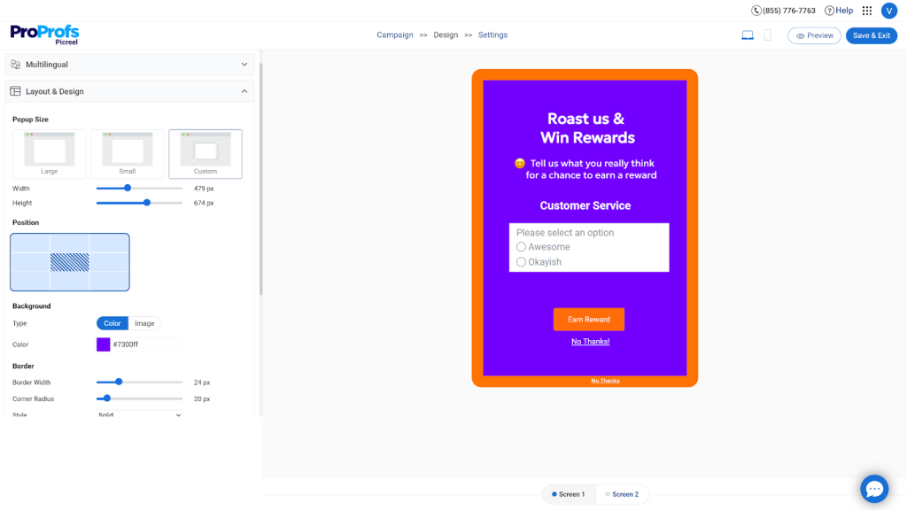
A. Format choice: Full-screen takeovers are risky on mobile. If your popup appears immediately on a landing page from a Google search result, it can trigger Google’s intrusive interstitial penalty. Exit intent popups that fire after user engagement are generally safe, but the safest mobile formats are:
- Bottom sheet popups: slide up from the bottom like a native app modal. Feels native, not disruptive
- Sticky bars: a persistent banner at the bottom of the screen. Low-friction and always visible
- Small overlay popups: cover no more than 60% of the screen
B. Design elements to get right:
- Close button: minimum 44x44px tap target. Always place it visibly in the top-right corner. A hidden close icon creates frustration, not conversions
- CTA button: full-width or near full-width. Single tap, no pinching or zooming needed
- Form fields: name and email are the sweet spot. Every field beyond email reduces opt-in rate. If segmentation matters, add one checkbox (“What topics interest you most?”) rather than a third text field
- Font size: minimum 16px for body copy. Smaller text forces zooming and breaks the experience
- Contrast: high contrast between the CTA button and the background. Mobile screens in sunlight have low visibility
- Load speed: popup assets should be under 100KB. Slow-loading popups fire after the user has already left
- Animation: a gentle fade-in beats a jarring bounce or slide. The smoother the entrance, the less it disrupts the reading flow
C. Copy structure that works on small screens:
- One-line headline stating the exact value (“Get 15% off before you go”)
- One supporting line with specificity (“Use it on anything in your cart today”)
- One CTA with an action verb (“Claim My Discount”)
- One soft decline link (“No thanks, I’ll pay full price”)
Drop generic CTA text like “Subscribe” or “Submit.” Action-based copy that reflects what the visitor actually gets consistently outperforms vague CTAs.
Step 3: Configure Mobile Triggers
This is the step most people underinvest in, and it is where the real conversion difference is made. Timing and targeting are what separate a popup that feels helpful from one that feels like spam.
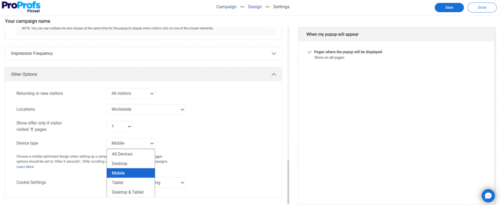
Trigger options and when to use them
- Exit intent (back button + scroll velocity): fires when the user taps back or scrolls up fast toward the browser bar. This is the primary mobile exit signal. Best for cart abandonment, lead gen pages, and product pages
- Scroll depth at 50%+: shows the popup after a visitor has scrolled at least halfway down the page. At that point, they have read enough to be genuinely interested. Triggering at 20% scroll is too early
- Time delay of 15-25 seconds: lets the visitor settle in before anything appears. Less than five seconds is the most common timing mistake I see
- Inactivity after engagement: if a user was scrolling or tapping and suddenly stops for 20+ seconds, fire a re-engagement nudge. Best for pricing pages and long-form product pages
- Cart or form abandonment: if a user added items to the cart or started filling a form and stopped interacting, fire a targeted reminder. This is high-intent abandonment, and the offer should reflect exactly what they were doing
- Tab switch or visibility change: fires when the user returns after switching apps or tabs. Low-friction because it shows on return, not mid-task. Best for high-consideration and comparison shopping pages
Frequency settings I use as a baseline
| Setting | Recommended Value |
| Show popup after X seconds | 15 to 25 seconds |
| Frequency cap per visitor | Once per session |
| Hide after form submission | Always |
| Exit intent delay after the last shown | 3 days |
Step 4: Set Up Targeting and Personalization
Generic popups convert at a fraction of what targeted ones do. Here is how to build relevance at scale on mobile.
A. Page-level targeting: Configure different popups per page type. A visitor on your homepage needs a different message than someone who reached your checkout page. URL-level targeting lets you:
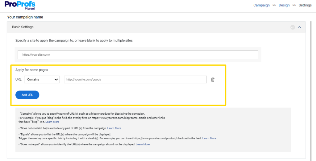
- Show product-specific offers on product pages
- Show lead magnets on content pages
- Show demo CTAs on feature or pricing pages
- Suppress popups on thank-you or confirmation pages
B. Traffic source targeting: A visitor from a paid ad campaign is different from one who found you via organic search. Targeting by UTM parameter lets you:
- Match the popup offer to the ad message the visitor clicked on. Message match increases conversion
- Suppress popups for retargeting visitors who have already converted
- Show a higher-value offer to visitors from high-CPC campaigns to protect ad ROI
C. Audience segment targeting
- Show to new visitors only, or create a separate offer for returning visitors
- Use geo-targeting for location-specific campaigns. “Get deals delivered to your inbox, [City] readers” consistently converts better than a generic message for regionally focused businesses
- Suppress the popup for users who have already subscribed using a cookie rule
D. Behavioral personalization: Show offers based on what the visitor was doing before the exit signal:
- Viewed a product page multiple times: show a low-stock or price-drop alert for that specific product
- Added to cart but did not check out: show a cart recovery offer with a small incentive
- Read 70%+ of a blog post: offer a related lead magnet or content upgrade
- Visited the pricing page: show a free trial or demo CTA, not a generic discount
E. Dynamic text personalization: Popups that reference the visitor’s browsing behavior (“You were looking at our Professional plan”) reduce the psychological distance between the popup and what the visitor was actually doing. Use the visitor’s name if you have it stored via cookie or CRM integration.
Picreel supports URL-based targeting, UTM parameter targeting, visitor location targeting, and behavior-based triggers. You can configure all of these within a single campaign dashboard across multiple domains.
Step 5: Connect Your Email Platform and Go Live
This step determines whether your popup captures leads or just collects names in a vacuum. Getting the integration right from day one saves hours of manual work later.
Connect your popup tool to your email platform. Picreel integrates natively with Mailchimp, Klaviyo, ActiveCampaign, HubSpot, Marketo, AWeber, Constant Contact, Zapier, Make, and 30+ other platforms. Authenticate with your API key and map your form fields to the correct list or audience segment.
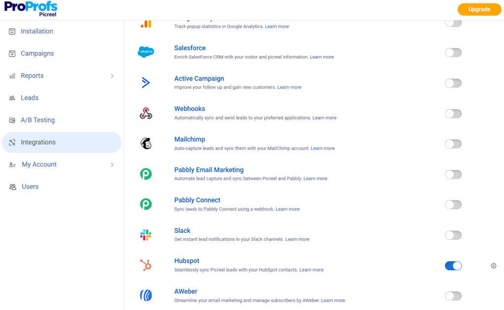
A few things worth doing before you publish:
A. Tag new subscribers at the source: Apply a tag when someone joins via a specific mobile campaign. Tags like “mobile-exit-intent” or “cart-abandonment-popup” let you segment and message these subscribers differently from leads that came through other channels.
B. Set up a welcome sequence before you launch: A subscriber who signs up and hears nothing for two weeks is a subscriber who marks you as spam. Even a two-email welcome sequence makes a measurable difference to early enga
gement. Here is a prompt you can use:
“Create a 2-email welcome sequence for new subscribers who signed up through a mobile exit intent popup. The first email should deliver the promised offer immediately and build trust. The second email, sent three days later, should focus on value and encourage the next step. Tone: friendly, concise, and personalized for [target audience] in [industry]. Include subject lines and clear CTAs.”
C. Add GDPR compliance to the popup form: Any popup collecting personal data from EU visitors must include:

- A consent checkbox that is unchecked by default. Pre-checked boxes are not GDPR compliant
- A visible link to your privacy policy, one tap away
- A single line explaining data use (“We’ll send you your discount and occasional offers. Unsubscribe anytime.”)
- Double opt-in enabled for EU visitors to improve list quality and deliverability
Build this into the form before you launch, not as an afterthought. Picreel has a built-in GDPR consent field in the form builder that you can toggle on per campaign.
Once your integration is confirmed and your welcome sequence is ready, publish the campaign.
Step 6: Track Performance and Optimize
Your first popup will not be your best one. The sites I have seen grow their email lists fastest treat their popup as living campaigns, not set-it-and-forget-it setups.
Metrics to track weekly
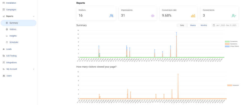
- Popup view rate: what percentage of mobile visitors triggered the popup condition and saw it? Low view rates mean your triggers are too conservative
- Conversion rate: of those who saw the popup, what percentage took the target action? Benchmark for mobile exit intent is 3-8%, depending on offer type and industry
- Exit prevention rate: what percentage of users who saw the popup stayed on-site instead of leaving? This ties your popup directly to revenue
- Close rate: how often do users dismiss without engaging? High close rates signal a relevance problem
- Bounce rate impact: Does showing the popup on a particular page increase or decrease the overall bounce rate? If bounce rate spikes after deployment, your trigger is firing too early
Fix map
| Symptom | Likely Cause | Fix |
| Low conversions | Weak offer or wrong audience | Refine targeting, improve offer specificity |
| High close rate | Wrong timing or irrelevant message | Adjust trigger thresholds, add URL-level targeting |
| High bounce rate | Popup fires too early | Add time-on-page or scroll depth minimum |
| Low view rate | Triggers too narrow | Broaden scroll depth or time threshold |
| Spam complaints | Over-frequency | Cap impressions per session per user |
A/B testing one variable at a time
Run clean A/B tests. Testing two variables simultaneously makes it impossible to know what drove the change.
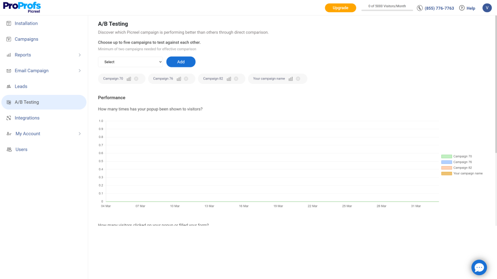
- Round 1: Offer type. Test discount vs. lead magnet vs. free shipping vs. content upgrade
- Round 2: Trigger timing. Test 10s vs. 30s time delay. Test 30% vs. 60% scroll depth
- Round 3: CTA copy. Test “Claim My Discount” vs. “Get Offer.” Test first-person (“Yes, I want 15% off”) vs. second-person (“Get Your 15% Off”)
- Round 4: Decline link copy. “No thanks” vs. “I prefer to pay full price” vs. “Not right now” each signals different brand confidence and affects the close-through rate differently
Do not call a winner until you have at least 100 conversions per variant. Refresh your popup content every six to eight weeks. Returning visitors develop popup blindness to an offer they have seen multiple times.
7 Common Mobile Exit Popup Mistakes
Even a well-designed mobile exit popup can quietly kill conversions if these execution gaps slip through. Here are the mistakes I see most often, along with exactly how to fix them.
1. Firing Too Early
The popup triggers before the visitor has had any real interaction with the page, and they bounce immediately.
Fix:
- Set a minimum time-on-page of 15 seconds before any trigger can activate
- Require at least 40-50% scroll depth before the exit signal is even eligible to fire
- Never fire on page load or within the first two user interactions
2. Ignoring False Scroll Triggers
A visitor scrolls up to re-read a section and gets hit with a popup they did not ask for.
Fix:
- Set a scroll velocity threshold so only fast upward scrolls (departure behavior) activate the trigger
- Combine scroll trigger with a time-on-page minimum to eliminate accidental fires
- Test on real mobile devices, not just browser emulators, which do not replicate scroll physics accurately
3. Designing for Desktop, Not Mobile
The exit intent popup for mobile was originally built for a large screen and then shrunk. Close buttons are tiny, text overflows, and the CTA requires pinching to tap.
Fix:
- Build the mobile campaign separately from the desktop campaign, not as a resized version
- Set a minimum close button tap target of 44x44px
- Use a single-column vertical layout with full-width CTA buttons and a minimum 16px font size
4. Showing the Same Popup to Everyone
Every visitor, regardless of page, source, or behavior, sees the same generic offer.
Fix:
- Configure URL-level targeting so product page visitors see a different offer than blog readers
- Suppress the popup for visitors who have already converted using a session cookie rule
- Create separate campaigns for new vs. returning visitors
5. Offering No Real Value
The popup asks for an email in exchange for nothing specific, or the incentive is vague (“Save more today”).
Fix:
- Make the offer directly tied to what the visitor was doing (cart abandoner gets a discount on their specific cart, not a site-wide offer)
- Quantify the incentive (“$15 off” outperforms “save money” every time)
- Match the lead magnet to the content the visitor was reading
6. Burying the Close Button
The exit intent popup on mobile is hard to dismiss, so users abandon the site entirely instead of dismissing the popup.
Fix:
- Place the close button in the top-right corner, always visible, never hidden behind a scroll
- Add a soft decline link below the CTA (“No thanks, I’ll pay full price”), so users have a second, lower-friction exit
- Never require users to read the full popup copy before they can close it
7. No Frequency Cap
The same visitor sees the same exit intent popup on mobile in every session, sometimes multiple times within a single visit.
Fix:
- Cap impressions at once per session, minimum
- Set a 3-7 day suppression window after a visitor dismisses the popup
- Always suppress the popup permanently for visitors who have already submitted the form
FREE. All Features. FOREVER!
Try our Forever FREE account with all premium features!
5 Mobile Exit Intent Best Practices
Getting the basics right is not enough on mobile. These are the practices that separate campaigns that consistently convert from ones that occasionally do.
1. Define One Goal Per Campaign
Every exit intent popup for mobile should do one thing. Split attention between two actions and you will convert neither.
- Pick a single conversion goal before you build: email capture, cart recovery, demo request, or content download
- Map the offer, CTA, and trigger to that one goal only
- Run separate campaigns per goal rather than combining multiple asks into one popup
2. Match the Offer to Exit Behavior
The offer a visitor responds to depends entirely on what they were doing before they tried to leave.
- Cart abandoner: discount code or free shipping on the specific items in their cart
- Blog reader exiting at 70%+ scroll: content upgrade or lead magnet related to what they were reading
- Pricing page exit: free trial, demo invite, or a limited-time offer on the plan they were viewing
- Homepage exit with no engagement: a low-commitment offer like a quiz or resource guide
3. Treat Trigger Configuration as a Conversion Lever
Most teams set a trigger once and never revisit it. The trigger is not a checkbox. It is where most conversion efficiency is gained or lost.
- Run a dedicated trigger timing test before testing the offer or design variations
- Review trigger fire rate weekly. If under 20% of eligible visitors are seeing the popup, the trigger thresholds are too conservative
- If the bounce rate increases after deployment, your trigger is firing before the visitor is engaged
4. Build Mobile Campaigns Separately
A resized desktop popup is not a mobile popup. The trigger logic, design, and offer all need to be built for mobile behavior from the start.
- Create a dedicated mobile campaign in your popup tool rather than enabling responsive mode on a desktop campaign
- Use mobile-specific trigger signals (back button, scroll velocity, inactivity) rather than defaulting to time delay only
- Test the exit intent popup on mobile devices before publishing
5. Use Behavioral Data to Refine Over Time
Heatmaps and session recordings tell you exactly where mobile visitors drop off, rage-click, or reverse course before exiting.
- Use heatmap data to identify the page depth where most mobile exits occur and align your scroll depth trigger to that point
- Look for rage-click patterns near your close button. If users are struggling to dismiss the popup, resize the tap target immediately
- Review session recordings monthly and adjust trigger thresholds based on what actual exit behavior looks like on your top traffic pages
Build the Conversion System That Retains Mobile Visitors
Mobile exit intent popups work because they give you one last opportunity to engage visitors before they leave. The biggest takeaways are simple: use triggers that reflect real mobile behavior, keep the design friction-free, personalize offers based on intent, and continuously test timing, messaging, and targeting. Small adjustments often produce outsized gains.
If you want to put these ideas into practice, Picreel is worth considering because it supports true mobile exit intent detection, behavior-based targeting, multi-domain campaigns, and integrations with the email and marketing tools most businesses already use. It helps solve many of the implementation challenges covered in this guide.
Your next step is straightforward: choose one high-exit page, create a single-goal popup, launch it, and measure the results for two weeks. Let the data guide your optimization decisions from there.
Frequently Asked Questions
How does exit intent work on mobile without a mouse?
Mobile exit intent tools detect departure signals through browser APIs. The most common signals are back button navigation (browser history API), rapid upward scroll (velocity threshold detection), tab switching (page visibility API), and extended inactivity. Combining two or more of these signals reduces false triggers significantly.
What should a mobile exit intent popup offer? The offer should be specific to what the visitor was doing. Cart abandoners respond to discount codes or free shipping. Blog readers respond to lead magnets or content upgrades. Pricing page visitors respond to free trials or demo invitations. Generic "subscribe to our newsletter" offers consistently underperform on mobile.
How many form fields should a mobile exit popup have? One or two fields maximum. Email only is ideal for lead capture. Adding a name field is acceptable. Every additional field reduces mobile conversion rate because typing on mobile is high friction. If you need more data, capture it post-signup in a welcome email or onboarding flow.
How do I reduce mobile cart abandonment with exit intent popups?
Target users who are abandoning a cart, not all visitors. Offer something directly related to their purchase, such as free shipping, a small discount, or a cart-saving option. Keep the form limited to an email address and trigger follow-up recovery emails quickly, ideally within the first hour.
What is the difference between mobile exit intent and desktop exit intent?
Unlike desktop exit intent, mobile has no cursor to track. It relies on signals like back-button taps, rapid scrolling, tab switching, and inactivity. Since these signals are less precise, combining multiple triggers improves accuracy. Mobile popups also need simpler designs, fewer fields, and easy-to-tap buttons.
Should I use the same exit intent campaign on mobile and desktop? No. Mobile users have different behavioral patterns, smaller screens, higher typing friction, and different intent signals. A desktop popup resized for mobile is not a mobile popup. Build separate campaigns with mobile-specific triggers, mobile-optimized design, and offers that account for mobile user behavior.
Will an exit intent popup on mobile hurt my Google rankings? Exit intent popups that fire after user engagement (scroll, time on page, back button tap) are not targeted by Google's intrusive interstitial penalty. The penalty applies to popups that cover content immediately when a mobile user lands from a search result. Trigger your popup after at least 10-15 seconds of on-page engagement, and you are in the clear.
How do I prevent my mobile exit popup from triggering too often? Set an impression cap per session and per user. A visitor should not see the same popup more than once per session and no more than 2-3 times per week. Use cookie tracking to suppress the popup for users who already converted or dismissed it intentionally.
What popup formats work best on mobile? The three formats that work best on mobile are bottom sheet popups (slide up from the bottom like a native modal, least disruptive), sticky bars (persistent banner at the top or bottom, always visible without interrupting), and small overlay popups (cover no more than 60% of the screen with a clearly visible close button). Full-screen takeovers are the riskiest format on mobile because they are most likely to increase bounce rate and trigger Google's interstitial penalty.
FREE. All Features. FOREVER!
Try our Forever FREE account with all premium features!

 We'd love your feedback!
What did you like & how can we make it even better?
 Thanks for your feedback!
 Ask Your Question
Have a question? Get expert help to make your decision easier.

![8 Best Poptin Alternatives to Boost Website Conversion Rates [Compared]](https://www.picreel.com/blog/wp-content/uploads/2023/12/Feature_2023s-Best-Poptin-Alternatives-Unveiled.jpg)