“Want to turn visitors into customers? It all starts with the right call to action.”
– Neil Patel
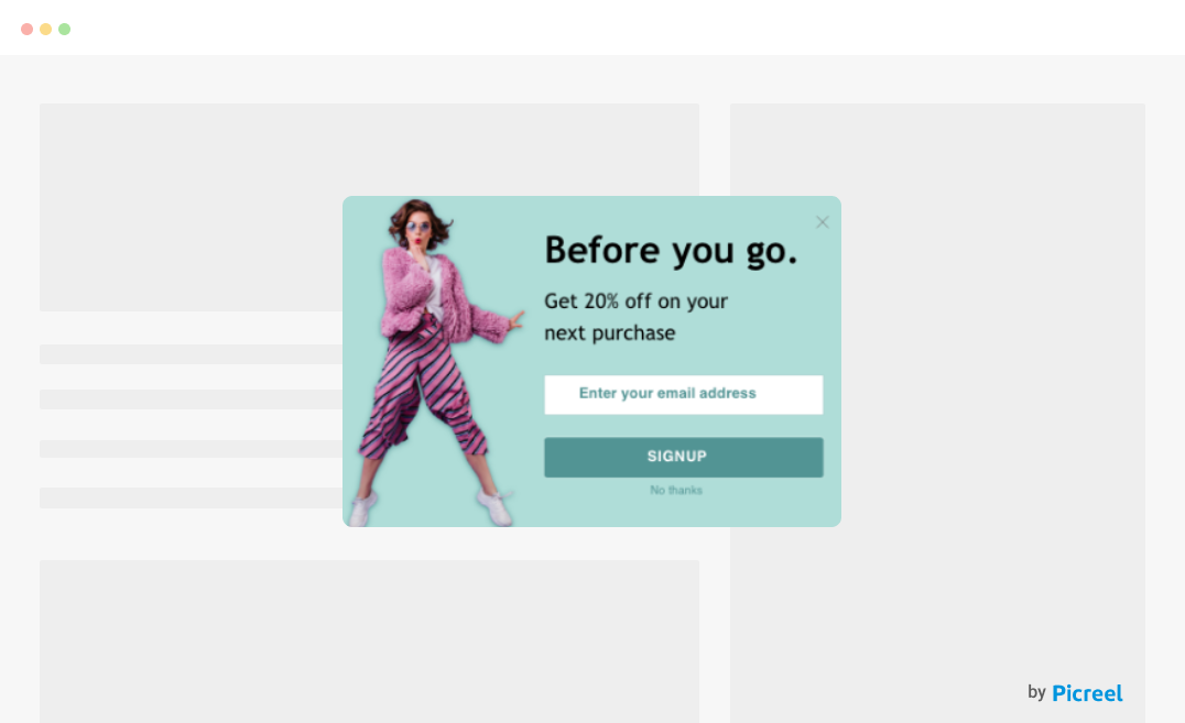
Ever felt like your website visitors are just window shopping? They browse around, maybe read a bit, but then…they just vanish without a trace. The secret to turning those casual browsers into engaged customers? A powerful call to action (CTA) popup.
Whether you’re looking to increase sign-ups, boost sales, or simply encourage more interaction with your brand, the right CTA can make all the difference. But what exactly makes a CTA powerful? In this blog post, we’ll explore 20+ powerful CTA examples and tips that work.
What Is a Call to Action?
A call to action is a prompt that encourages your audience to take a specific action. It’s typically found in marketing content, like websites, emails, or ads, and is designed to guide visitors toward the next step. Whether it’s clicking a button, signing up for a newsletter, or making a purchase, a CTA helps turn visitors into customers by giving them a clear direction.
Think of it as a gentle push that tells you exactly what to do next. For example, common CTAs include phrases like “Buy Now,” “Sign Up Today,” or “Learn More.” These prompts are often short, direct, and easy to understand.
The effectiveness of a CTA lies in its simplicity and ability to create a sense of urgency or curiosity. Want to see some great CTA examples? Keep reading to explore how the right CTA can boost engagement and conversions by making your audience take that crucial next step.
How to Write Effective CTAs
A well-crafted CTA can be the difference between a visitor leaving your page or converting into a customer. Whether you’re aiming for sign-ups, downloads, or purchases, an effective CTA gives your audience a clear direction and motivates them to take action. But how do you create a CTA that gets results? Let’s dive into the best practices to ensure your CTA grabs attention and drives action.
1. Keep It Simple
When writing a CTA, simplicity is key. You want to make sure your message is clear and easy to understand. Avoid overloading your audience with too much information. Stick to short, concise phrases like “Get Started” or “Sign Up Now.” By focusing on simplicity, you’re more likely to create effective CTAs that are easy to follow and act upon.
2. Use Action Verbs
Good call-to-action phrases are powered by strong action verbs. Words like “Download,” “Join,” or “Shop” tell the audience exactly what you want them to do. These verbs create a sense of direction and make it easy for users to follow through. Using active language encourages immediate engagement and helps drive more conversions.
3. Create a Sense of Urgency
CTAs work better when you create a sense of urgency. Phrases like “Limited Time Offer” or “Act Now” push your audience to take action quickly before they miss out. Urgent CTAs make visitors feel they need to act fast, which can lead to increased conversions. Pairing this with a countdown or deadline can make it even more compelling.
4. Be Creative
Your CTA should stand out from the usual phrases like “Click Here” or “Submit.” Be creative and think about how you can make it more engaging. For instance, instead of “Subscribe,” you could say “Join Our VIP Club” or “Get Exclusive Tips.” Creative CTAs are memorable and can grab attention in ways that generic phrases can’t.
5. Make It Personal
80% of customers are more likely to purchase from a brand that offers personalized experiences. Personalization can make your CTA feel more relevant to the user. Examples of call-to-action buttons that personalize include phrases like “Start Your Free Trial Today” or “See Your Customized Plan.” By tailoring the CTA to the user’s experience, you make it feel more personal and specific to their needs, which can increase conversions.
6. Offer Value
Let users know what they’ll get by clicking the CTA. For example, if you’re asking them to sign up for a newsletter, include the benefit: “Get Weekly Tips Straight to Your Inbox.” When you offer value upfront, visitors are more likely to engage because they know what’s in it for them.
7. A/B Testing is the Key
A/B testing is important to measure and compare the performance of your popups. By making changes to the CTA design, copy, button size, font, visuals, color combination, and more, you can see how your visitors are responding to the new CTA.
By analyzing the results, you can see the elements making a positive difference for your conversions. Implement those improvements in different popups and constantly carry out A/B tests to get maximum results.
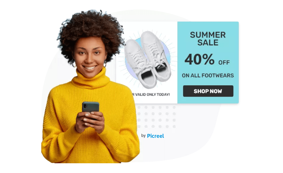
8. Add Graphics to the CTA Button
Your CTA button is something that can leave you with a lot of leads and sales. Therefore, you need to design it in a way that visitors notice it. That means you shouldn’t stick with the simple classic rectangular CTA box.
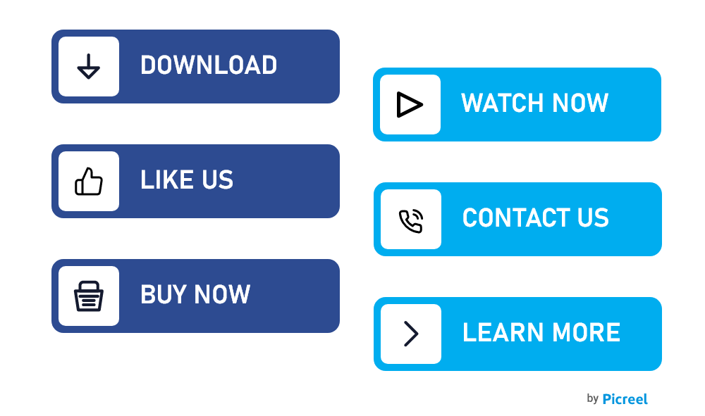
Image Source: Freepik
You can experiment by adding special effects and animations or by designing the box in a unique way to attract visitors’ attention instantly. Place graphics near your CTA button as that entices the visitors to click.
What Are the Types of CTAs?
When it comes to creating effective CTAs, there isn’t a one-size-fits-all approach. Depending on your goals and audience, there are various types of CTAs you can use to drive different actions. Knowing the different types of CTAs will help you tailor your marketing strategy better and choose the most effective prompts for your business. Here are some common call-to-action ideas to consider:
1. Lead Generation CTAs
These CTAs are all about capturing valuable contact information from your website visitors to turn them into potential customers. By offering something valuable in exchange for their email address, such as a free eBook, newsletter subscription, or exclusive content, you can build your subscriber list and nurture leads.
This allows you to stay connected with your audience, keep them informed about your latest offerings, and ultimately convert them into paying customers.
2. Sign-Up CTAs
If you’re aiming to get users to create an account, register for a service, or join a membership program, sign-up CTAs are a powerful tool. These CTAs are designed to guide users through the initial step of engagement, allowing them to access exclusive content, benefits, or services after completing a simple sign-up process.
Phrases like “Sign Up for Free,” “Join Us Today,” or “Create Your Account” are often used to reduce any hesitation by emphasizing the ease and lack of commitment involved.
3. Purchase CTAs
Purchase CTAs are essential when your goal is to drive direct sales and encourage customers to make an immediate buying decision. These CTAs are designed to create a sense of urgency and excitement around your product or service. Phrases like “Buy Now,” “Shop Today,” or “Add to Cart” are some of the best call-to-action examples that prompt users to take action right away.
To further increase conversions, these CTAs can be paired with limited-time offers, discounts, or free shipping incentives. For example, phrases like “Order Now and Save 10%” or “Limited Stock Available—Buy Today” leverage urgency and scarcity to nudge users into completing the transaction.
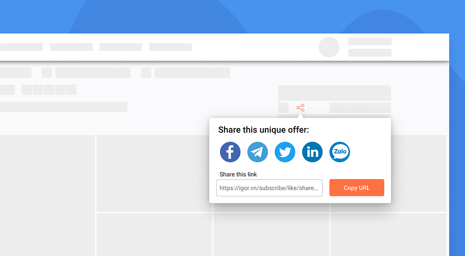
4. Social Sharing CTAs
Social sharing CTAs are designed to encourage users to spread your content across their personal networks, helping you amplify your message and reach a broader audience without additional marketing costs. These CTAs typically feature phrases like “Share on Facebook,” “Tweet This,” or “Pin It,” inviting users to share valuable or engaging content with just a click.
When someone shares your content, it serves as a personal recommendation to their friends and followers, making it more likely that new users will engage with your brand.
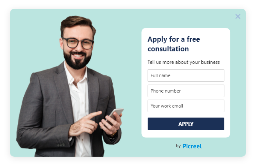
5. Book Your Consultation CTAs
This CTA is ideal for businesses that offer services or require a consultation before making a purchase. It encourages visitors to schedule a meeting with a sales representative or expert to learn more about the product or service and make an informed decision.
This can be especially effective for businesses that offer complex or high-value products or services, as it allows potential customers to ask questions, get personalized recommendations, and address any concerns they may have before making a commitment.
25 Best Call to Action Examples That Visitors Can’t Resist
1. Zappos – Free Shipping on All Orders
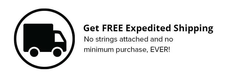
Zappos makes online shopping even sweeter with a call to action that highlights free shipping on every order. This simple but powerful message removes a common barrier for shoppers, making it more enticing to hit that “buy” button without hesitation.
Why it works?
The promise of free shipping is a great motivator, tapping into shoppers’ desire for convenience and value. It’s one of those call to action ideas that immediately draws attention, encourages purchases, and makes customers feel like they’re getting a better deal.
2. Warby Parker – Try on 5 Pairs for Free
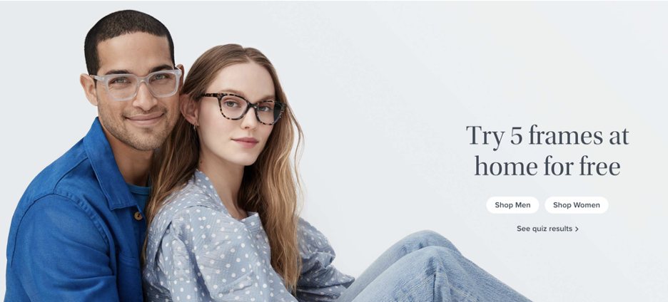
This call to action offers a fun and hassle-free way to shop for glasses. Instead of just asking visitors to browse, it invites them to try on 5 pairs for free—creating a sense of convenience and excitement around the shopping experience.
Why it works?
This is one of the best call to action examples because it removes the pressure of committing to a purchase and makes the process feel personal and easy. It speaks directly to the shopper’s needs while making them feel like they’re getting something special—completely risk-free!
3. Amazon – Add to Cart
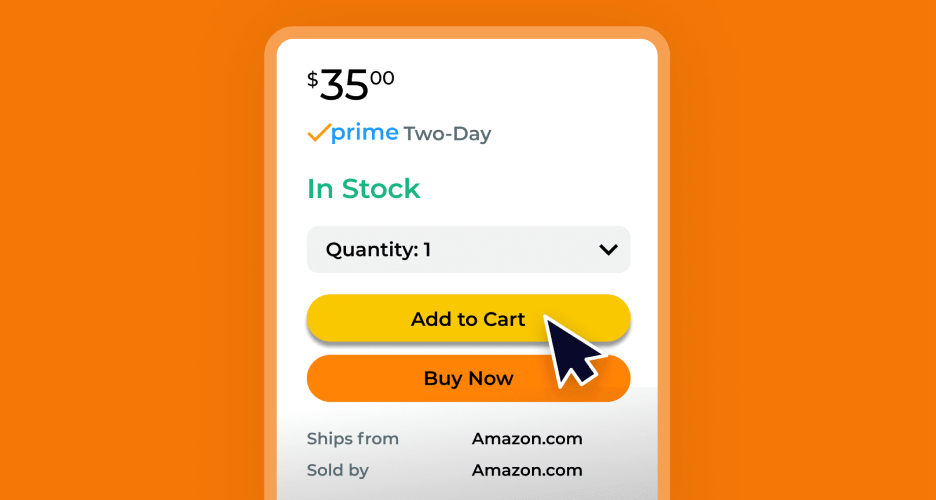
Instead of a standard “buy now” button, Amazon uses the simple and effective “Add to Cart” call to action for their website. This phrase feels less pressuring and gives customers the flexibility to keep shopping while knowing their desired item is saved. It creates a smoother shopping experience and encourages users to engage with more products.
Why it works?
The “Add to Cart” button is inviting and gives customers a sense of control. It feels like a small, low-commitment action, making it easier for people to click without hesitation. Plus, it aligns perfectly with the online shopping mindset of browsing, saving, and deciding later.
4. Sephora – Join Beauty Insider for Exclusive Offers
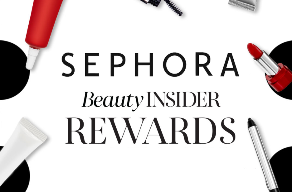
Sephora’s call to action popup invites users to join their Beauty Insider program with the promise of exclusive offers. Instead of a simple sign-up, the phrase “exclusive offers” makes it feel like you’re getting access to something special, which creates excitement and urgency.
Why it works?
This CTA popup works because it taps into customers’ desire for VIP treatment. The language feels personal and rewarding, encouraging you to sign up for perks you won’t want to miss. It’s a great way to turn casual visitors into loyal Sephora shoppers!
5. Shopify – Start Your Free Trial
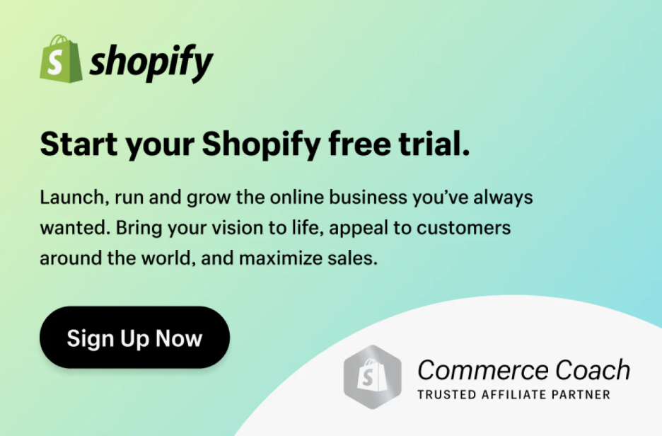
Shopify’s “Start Your Free Trial” CTA pop up uses straightforward and action-driven language to make the sign-up process feel easy and enticing. By focusing on the word “free,” it immediately appeals to users’ curiosity and desire to try something without a commitment. The clean, minimal design lets the offer shine without any distractions, making it easy for visitors to take that first step.
Why it works?
It’s simple and to the point. The clear promise of a free trial removes risk, while the direct language encourages users to act now and explore Shopify’s tools.
6. Etsy – Shop Unique Gifts
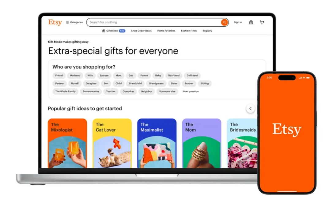
Etsy invites you to explore one-of-a-kind treasures with a simple, yet engaging CTA: “Shop Unique Gifts.” Instead of the usual “Shop Now,” this CTA uses playful language that highlights the special nature of Etsy’s products, encouraging users to discover items they won’t find anywhere else.
Why it works?
This CTA example works because it taps into the desire for uniqueness and personalization. By using specific language like “Unique Gifts,” Etsy makes visitors feel like they’re about to uncover something special, enticing them to click and explore further. It’s clear, creative, and inviting.
7. Nike – Customize Your Gear
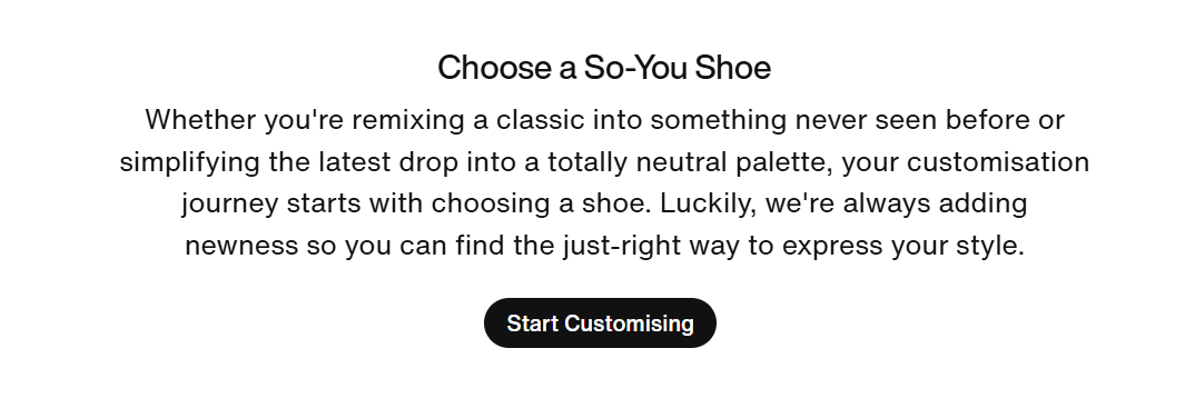
Rather than a standard “Shop Now” button, this call to action invites users to get creative by personalizing their own Nike gear. The phrase “Customize Your Gear” adds excitement and encourages users to make something unique, turning the shopping experience into a creative process.
Why it works?
This CTA is engaging because it speaks directly to Nike’s audience, inspiring individuality. It’s a great example of call to action buttons that motivate users by offering a fun, hands-on experience.
8. ASOS – Get 20% off Your First Order
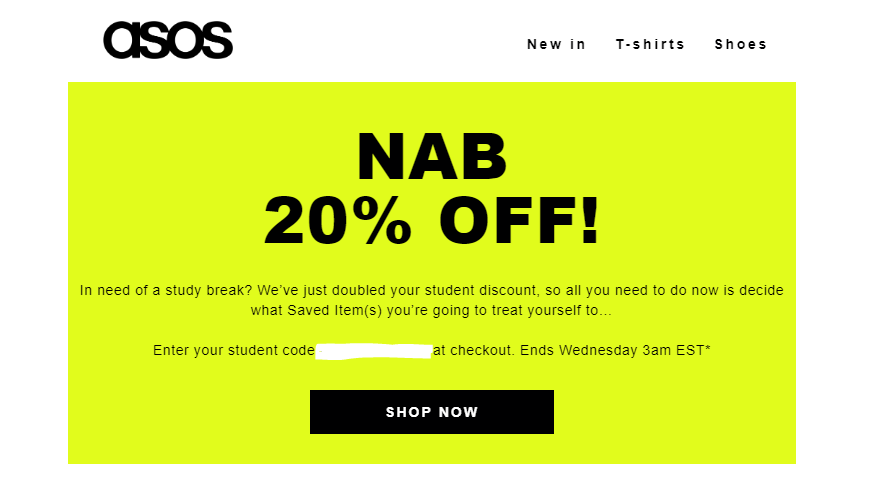
This eye-catching promotion offers a fantastic incentive with a clear benefit: 20% off your first order! By highlighting a discount, ASOS creates excitement and encourages new customers to make a purchase.
Why it works?
It’s all about using good call to action phrases that grab attention. The direct offer appeals to shoppers looking for a deal, making them feel valued right from the start. By presenting an attractive incentive, ASOS not only boosts sign-ups but also cultivates loyalty among new customers. It’s a win-win for both the brand and its audience!
9. Casper – Try It for 100 Nights Risk-Free
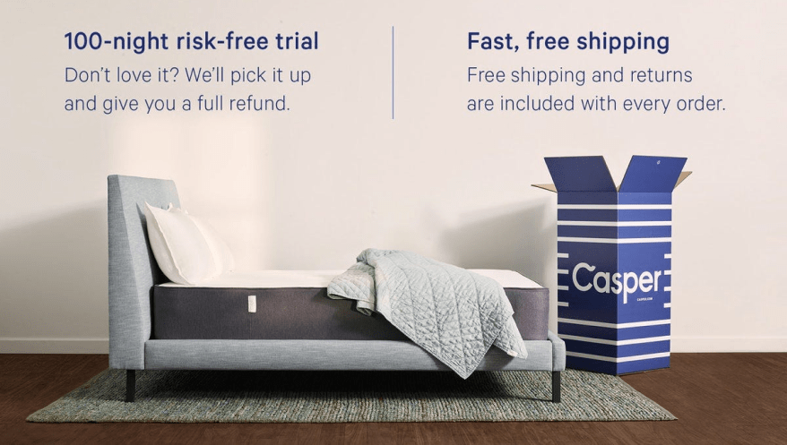
Casper invites you to experience a sleep revolution with its enticing 100-night risk-free trial. Rather than a standard “try it” button, this call to action engages you with a promise of comfort and satisfaction. By offering a generous trial period, Casper builds trust and gives you the confidence to explore their products.
Why it works?
This approach taps into the emotional aspect of sleep, making it relatable and appealing. It’s a smart use of good call to action phrases that creates excitement and encourages you to take the plunge into a better night’s sleep.
10. Blue Apron – Get Your First Meal Free
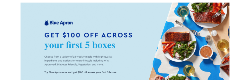
Image Source: My Subscription Addiction
With a captivating offer like “Get Your First Meal Free,” Blue Apron makes it easy to entice new customers. This call to action feels personal and inviting, encouraging visitors to take the plunge and try a delicious meal without any cost.
Why it works?
This approach taps into the excitement of trying something new while minimizing risk. The phrase “first meal free” creates an appealing incentive, making it hard to resist. By incorporating effective call to action ideas like this, brands can boost engagement and attract more customers effortlessly.
11. Bonobos – Get Fit With Our Perfectly Tailored Pants
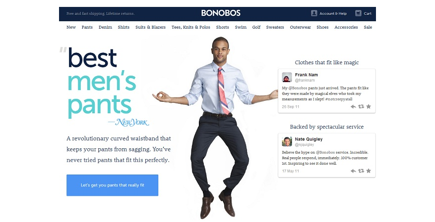
Image Source: Brad Hines
Bonobos invites you to discover the perfect fit with their tailored pants, emphasizing comfort and style. The catchy phrase “Get Fit” encourages you to explore their collection while highlighting the brand’s commitment to personalized sizing.
Why it works?
This approach resonates with shoppers looking for a better fit and enhances the shopping experience. By focusing on tailored solutions and using engaging language, Bonobos connects with customers, making them feel confident about their purchase. It’s all about creating a sense of satisfaction and excitement in finding the ideal pants just for you!
12. Chewy – Set up Auto-Ship & Save
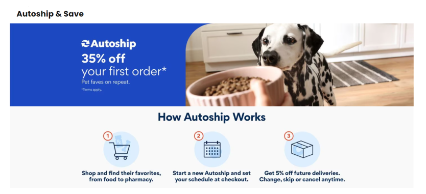
Image Source: ContactPigeon
Forget the hassle of running out of pet supplies! Chewy’s “Set Up Auto-Ship & Save” feature uses friendly language to highlight convenience and savings. With just a few clicks, you can ensure your furry friends never run low on their essentials, all while enjoying discounts.
Why it works?
This approach works because it speaks directly to pet owners’ needs—keeping their pets happy without the stress of remembering to reorder. The playful and inviting tone encourages customers to take action, making it feel rewarding to set up a hassle-free delivery schedule.
13. HelloFresh – Get Cooking With 60% off Your First Box
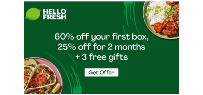
Image Source: Magic Freebies
When you sign up for HelloFresh, you’re not just getting a meal kit—you’re unlocking a world of delicious possibilities at an amazing price! With a whopping 60% off your first box, cooking at home has never been more enticing.
Why it works?
This offer grabs attention with a compelling discount, making it hard to resist. Plus, it highlights the joy of cooking fresh meals at home, appealing to your taste buds and your wallet. Friendly language and a clear value proposition encourage you to take that first step toward hassle-free cooking!
14. Wayfair – Shop Now for up to 70% off
Image source: Wayfair
Wayfair’s call to action pops with excitement, inviting you to discover incredible deals on home essentials. The phrase “up to 70% off” grabs attention and encourages you to explore their vast selection, making shopping feel like a treasure hunt.
Why It Works?
This approach sparks curiosity and creates a sense of urgency. By highlighting substantial savings, Wayfair motivates you to click and shop. The friendly tone and clear offer resonate with your desire for great deals, ensuring that you feel rewarded every time you browse their site. Don’t miss out on fantastic savings!
15. Glossier – Subscribe for Free Samples
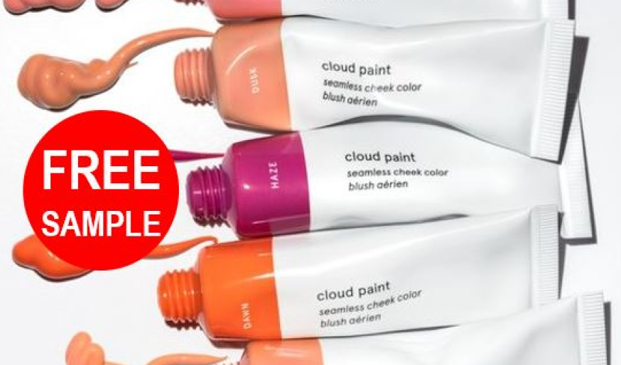
Image Source: Freeflys
Instead of a standard “subscribe” button, Glossier invites you to sign up with an enticing offer of free samples. This approach not only grabs attention but also gives visitors a taste of their products, making the signup feel valuable and exciting.
Why it works?
Offering free samples creates an immediate incentive for visitors to join, appealing to their desire to try before they buy. It makes the signup process feel rewarding and builds anticipation for Glossier’s products. This strategy effectively captures leads and fosters a connection with potential customers right from the start.
16. Target – Sign up for Target Circle & Save
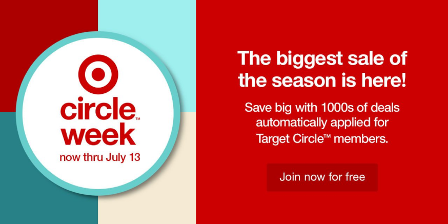
Image Source: Email Tuna
Target invites you to join Target Circle, where savings and rewards await! This enticing call to action encourages visitors to sign up by highlighting the benefits of being a part of the Target Circle community. With playful language and a focus on savings, it makes signing up feel like a smart move.
Why it works?
This approach resonates with customers by emphasizing value and rewards. By using friendly and engaging language, it creates a sense of excitement around the savings potential, motivating visitors to take action and become part of the Target family.
17. Nordstrom – Join the Nordstrom Rewards Program
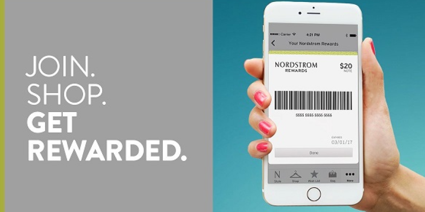
Image Source: The Recessionista
Nordstrom invites you to join their Nordstrom Rewards Program, where shopping becomes even more rewarding! Instead of just signing up, you’re becoming part of a community that values your loyalty. With exclusive benefits, personalized offers, and early access to sales, you’ll always feel appreciated.
Why it works?
This approach taps into the joy of being part of something special. By emphasizing rewards and community, Nordstrom creates a sense of belonging that motivates customers to engage and shop more. It’s friendly, inviting, and makes every purchase feel like a step towards exciting rewards!
18. Old Navy – Get 50% off Everything!
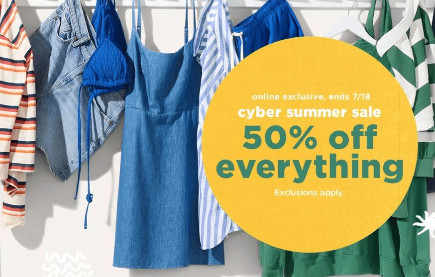
Image Source: Southern Savers
This catchy call to action grabs attention with a bold promise—“50% off everything!” Instead of just a bland discount announcement, it creates excitement and urgency, inviting customers to dive into amazing savings.
Why it works?
This approach uses clear, straightforward language that speaks directly to you. The promise of a significant discount makes the offer feel irresistible, encouraging you to take action. By emphasizing value and immediacy, Old Navy effectively motivates shoppers to click and shop, turning a simple promotion into a compelling invitation to save big!
19. Macy’s – Shop Clearance for Extra Savings
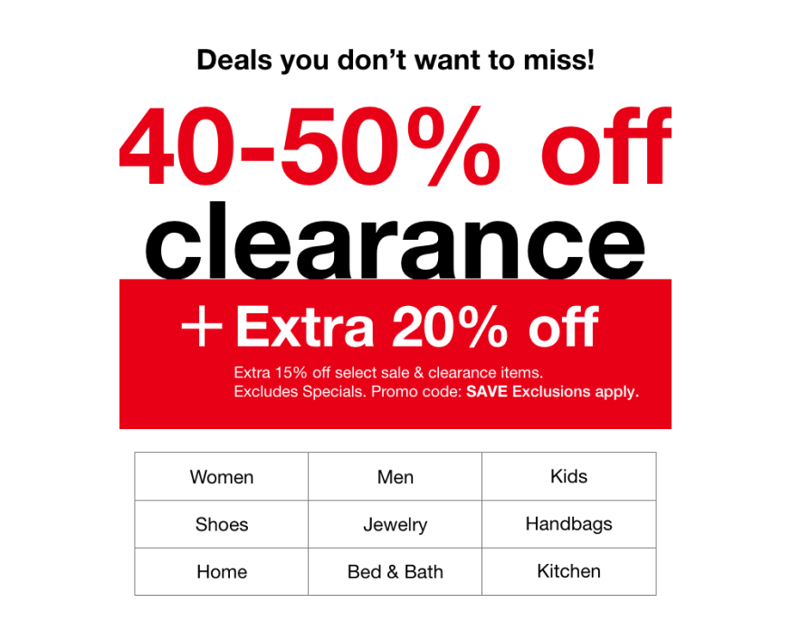
Image Source: Milled
Instead of just saying “sale,” Macy’s uses the word “Clearance!” to draw you in. This approach not only highlights the potential for big savings but also makes the shopping experience feel like a treasure hunt.
Why it works?
This call to action taps into your desire for a good deal. It creates excitement about discovering great finds at a fraction of the price. By using inviting language and emphasizing savings, Macy’s encourages you to explore their clearance section and make the most of your shopping experience.
20. Ulta Beauty – Get 2X Points on Your First Purchase
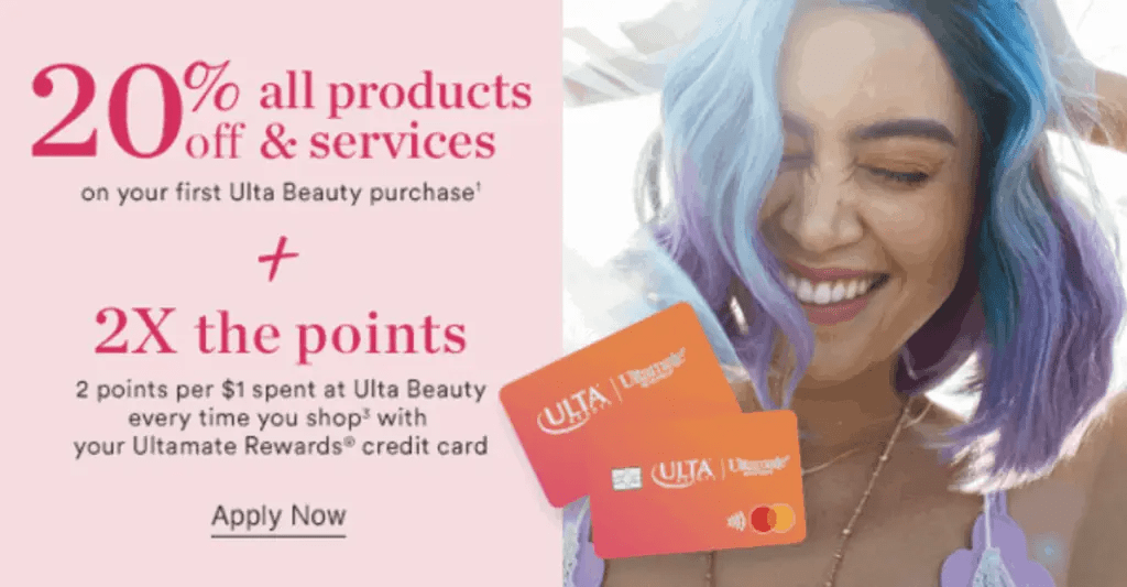
Image Source: Appstle
Ulta Beauty makes signing up for their rewards program extra tempting by offering 2X points on your first purchase. This call to action is simple yet effective, giving customers an immediate incentive to join and start earning points right away. By highlighting a clear, valuable reward, it makes the decision to sign up a no-brainer.
Why it works?
Offering double points from the get-go adds instant value and motivates customers to make that first purchase. It creates a sense of excitement, making customers feel like they’re getting something extra right from the start!
21. Fabletics – Get Your First Outfit for $24
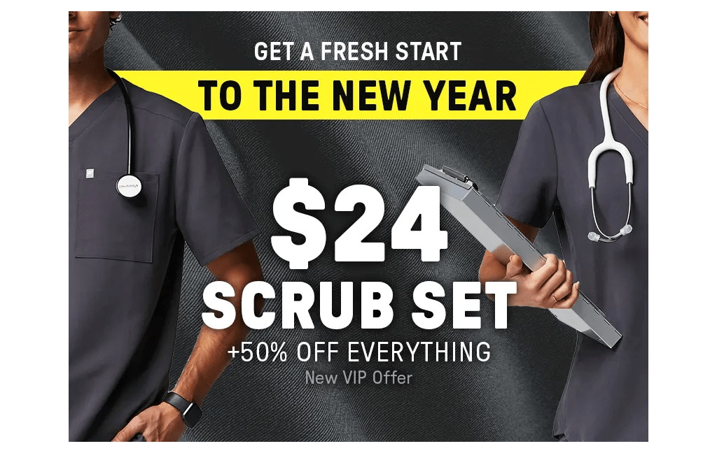
Image Source: Fabletics
Why settle for full price when you can snag your first outfit for just $24? Fabletics uses this irresistible deal to grab attention and draw new customers in. By highlighting a limited-time offer upfront, they make the decision to sign up a no-brainer for anyone looking to refresh their wardrobe without breaking the bank.
Why it works?
This call to action is simple, straightforward, and emphasizes value right away. By offering a deal that’s hard to resist, Fabletics appeals to budget-conscious shoppers, making it easier to convert browsers into buyers!
22. Shutterfly – Get 50 Free Prints
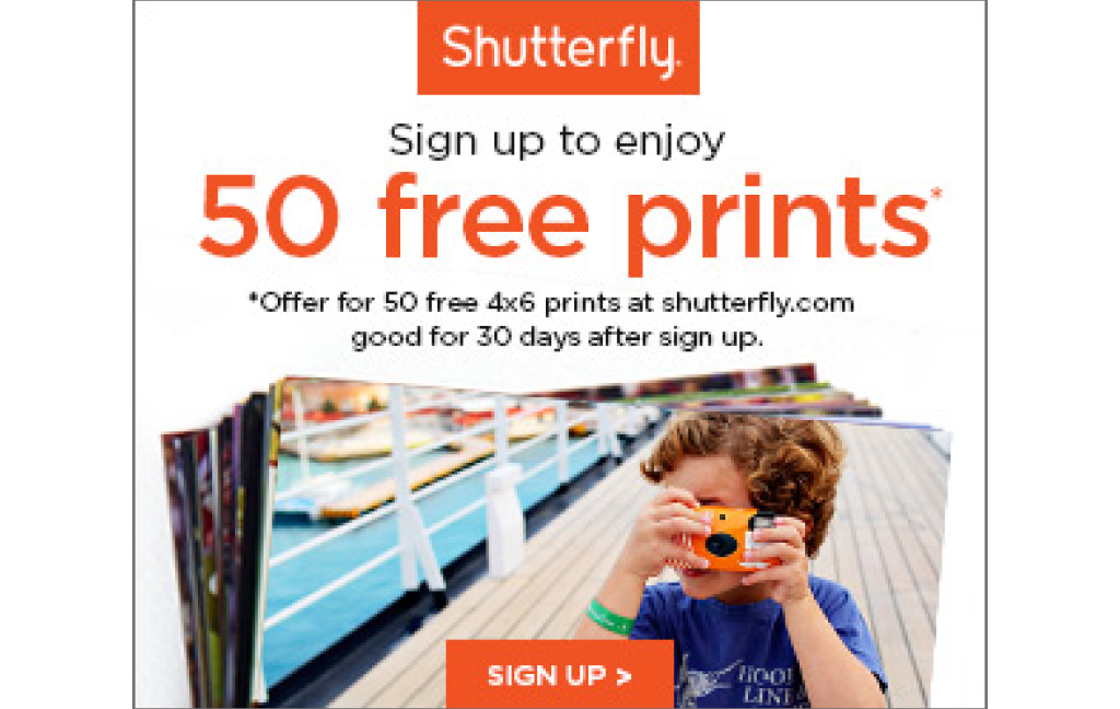
Image Source: Book This Project
Shutterfly’s call to action is simple yet irresistible—who wouldn’t want 50 free prints? Instead of just asking you to sign up, they offer something valuable upfront, making it feel like a reward rather than a task. The promise of free prints taps into a desire to preserve memories, creating an emotional pull.
Why it works?
It’s straightforward and enticing. Offering something for free immediately grabs attention, while the number “50” adds a sense of value. This encourages visitors to take action without hesitation, knowing they’re getting a real benefit right away.
23. ThredUp – Get $10 off Your First Order
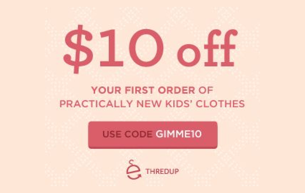
Image Source: Pinterest
ThredUp’s call to action offers an immediate reward—$10 off your first order—which makes it hard to resist. Instead of just asking users to shop, it adds an incentive, making the experience feel like a smart and exciting deal right from the start. The focus on savings taps into the desire for both value and convenience, encouraging visitors to dive into their first purchase.
Why it works?
Everyone loves a good deal! Offering an instant discount gives visitors a reason to act now, turning curiosity into a purchase with minimal hesitation.
24. Grubhub – Get Free Delivery on Your First Order
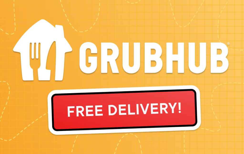
Image Source: Grubhub
Who doesn’t love free delivery? This call to action makes it clear what you’re getting right away—free delivery on your first order! By highlighting the immediate benefit, Grubhub turns a simple perk into an enticing reason to sign up and place an order.
Why it works?
It’s straightforward and to the point, focusing on something everyone loves: saving money! The offer of free delivery right from the start creates a sense of instant value, making it more likely for first-time users to take action and place that initial order.
25. Instacart – Sign up for Free Delivery on Your First Order
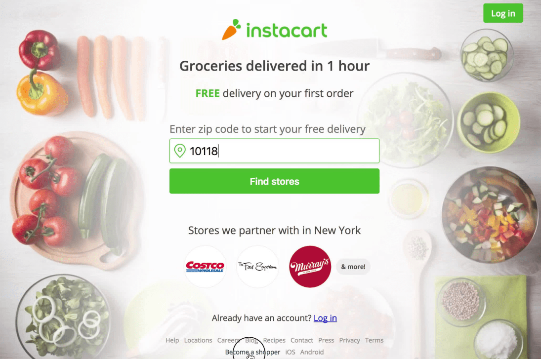
Image Source: Page Flows
Why pay extra when you don’t have to? Instacart’s call to action makes it easy to say yes with the promise of free delivery on your very first order. Rather than using a generic “sign up” message, this offer makes joining feel instantly rewarding, encouraging you to act now and save on your groceries.
Why it works?
It’s simple: who doesn’t love free delivery? By offering immediate value upfront, Instacart taps into what customers want—saving money while shopping conveniently online. It’s a straightforward, enticing offer that encourages people to sign up without hesitation.
FREE. All Features. FOREVER!
Try our Forever FREE account with all premium features!
How to Create a Call to Action Popup With Picreel
Watch this video tutorial to learn how you can create a popup using Picreel:
Here are the step-by-step instructions:
1. To begin using Picreel, you must first sign up for an account and then log in.
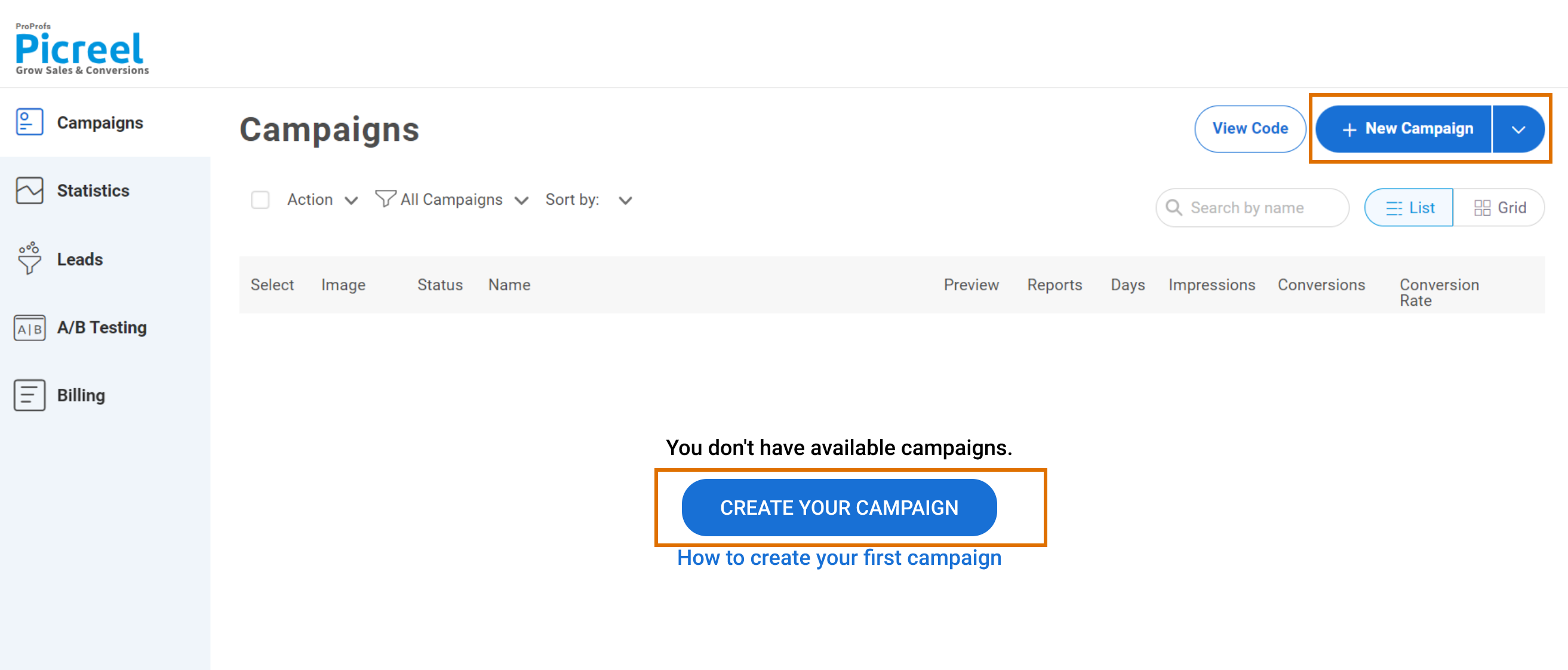
2. Navigate to the “Campaigns” tab, then click on “New Campaign” in the top right corner. Alternatively, you can start with a template by choosing the “Create Using Templates” option from the drop-down.
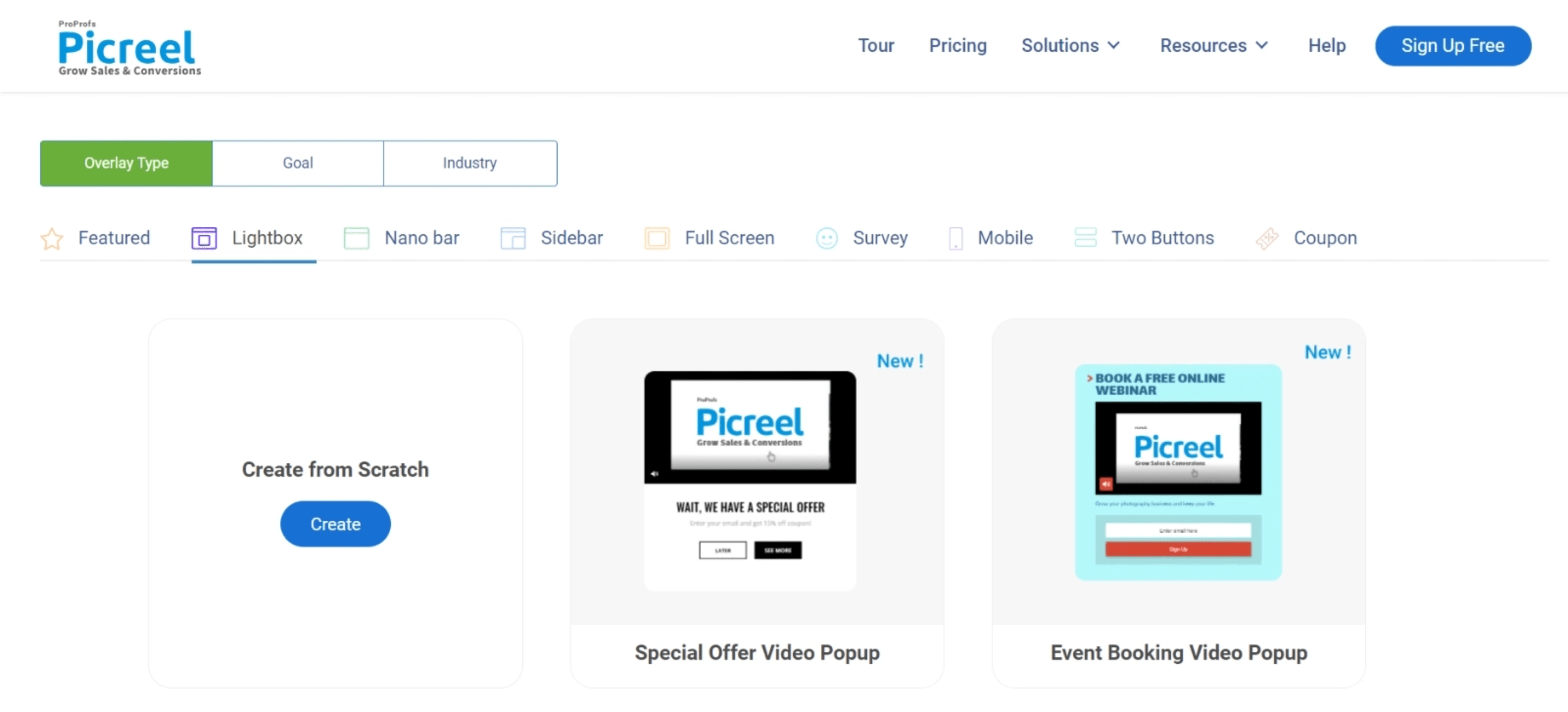
3. Choose the template of your choice.
4. After selecting a design, personalize it based on your preferences.
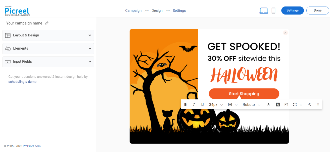
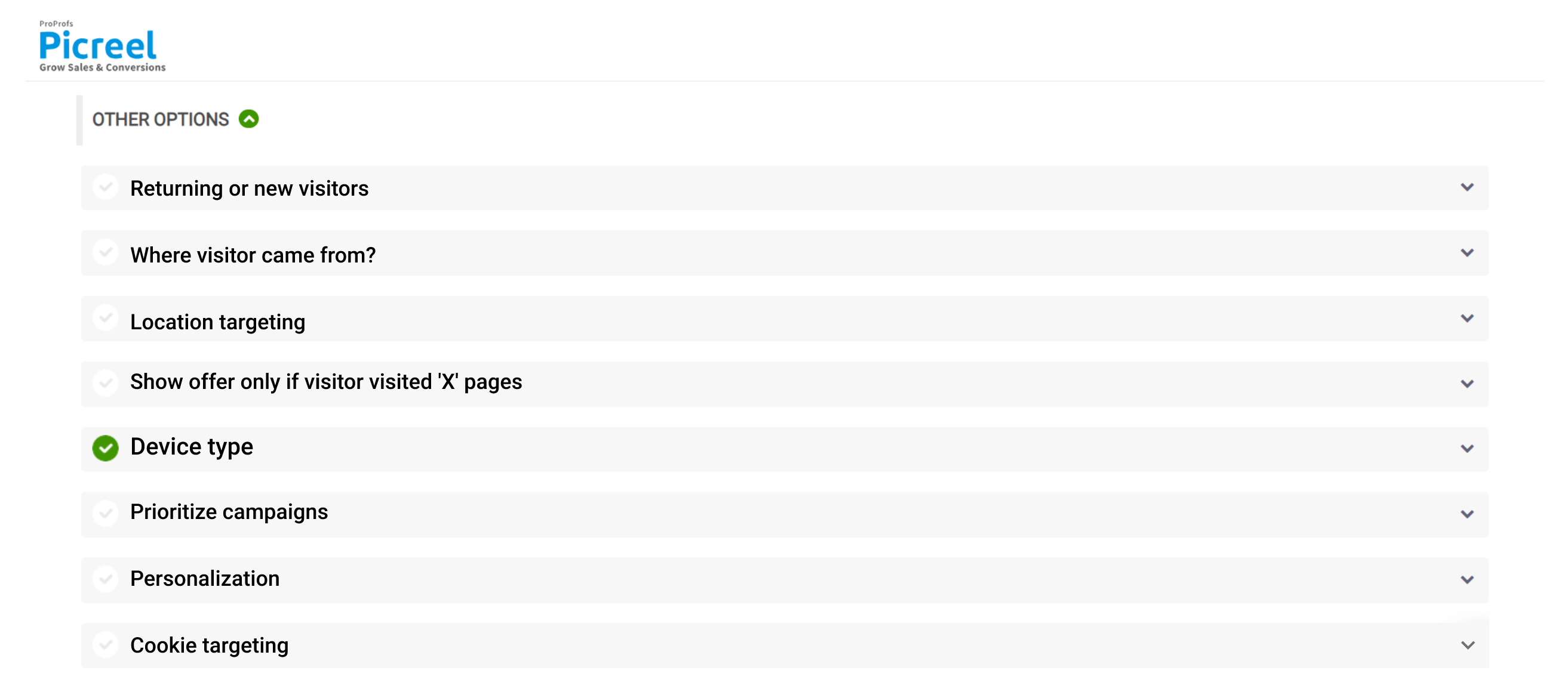
5. Configure the targeting and trigger options to specify the specific conditions and locations for displaying your cookie popup.
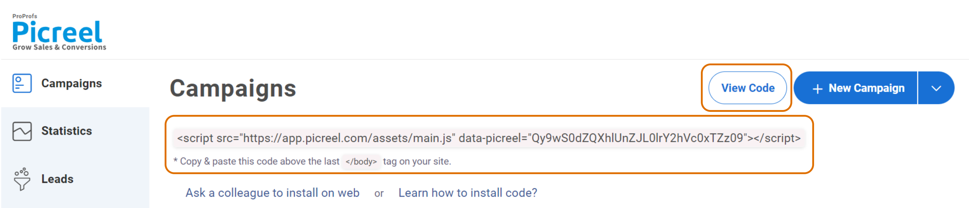
6. Click the “Save” button. Next, integrate the popup with your website.
Make an Impact With a Powerful CTA Popup!
Now that we have shared the best call-to-action examples with you, it’s time to implement them. You can use these above-mentioned points as a guide to assess what needs to be implemented in your campaigns.
Many marketing experts and bloggers follow these practices along with constant A/B testing to boost their mailing lists and sales. As for the software, Picreel is a great marketing companion to design unique CTAs and display exit popups at the perfect moment.
It is now your turn to make a lasting impact on your customers with the right combination of popup elements.
FREE. All Features. FOREVER!
Try our Forever FREE account with all premium features!
 We'd love your feedback!
What did you like & how can we make it even better?
 Thanks for your feedback!
 Ask Your Question
Have a question? Get expert help to make your decision easier.