
Have you ever stumbled upon a website, ready to explore its content, but then been rudely interrupted by a pesky popup form?
We’ve all been there, and let’s be real, it’s not the most pleasant experience.
But what if we told you that popup forms don’t have to be annoying? In fact, they can be an effective way to engage with your audience and capture leads as long as they are designed correctly.
“A properly placed and well-timed pop-up will engage your audience and keep them on the page longer, increasing their conversion chances” – Neil Patel.
That’s why we’re here today to talk about Popup Form Designs. Because, let’s face it, a well-designed popup form can make all the difference between gaining a new customer or losing them forever. From choosing the right colors and fonts to crafting compelling copy and irresistible offers, there are plenty of elements that go into designing a successful popup form.
But why bother with popup forms in the first place, you ask?
Well, for starters, they are a great way to capture your audience’s attention and encourage them to take action. Whether you’re looking to grow your email list, promote a new product, or gather feedback from your users, a popup form can help you achieve your goals.
Plus, with the right design, they can be a seamless and enjoyable part of the user experience.
So, whether you’re a seasoned marketer or just getting started with popup forms, you’ve come to the right place. We’ve got all the best practices and creative examples you need to take your popup form game to the next level. So, let’s dive in and start designing those popups like a pro!
Best Practices for Popup Form Design
There are plenty of tips and best practices that have been tried and tested over the past few years and have been found effective. Here are some of the best ones:
Use Eye-Catching Designs and Color Schemes
Popup forms can be an effective way to engage with your audience and capture leads if they are designed correctly.
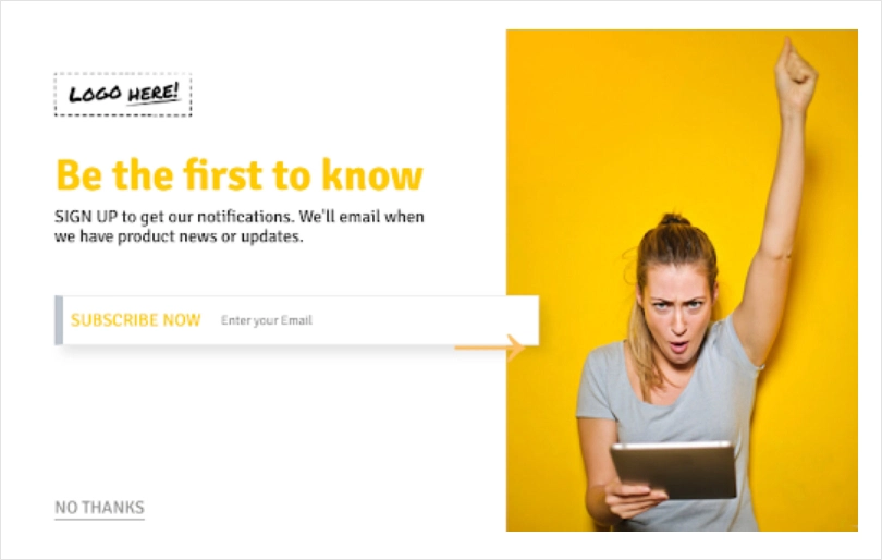
To create a successful popup form, it’s crucial to use eye-catching designs and color schemes. When designing your popup, keep it simple and clean. Avoid overwhelming your audience with too much information or a cluttered layout. Instead, focus on the essentials and make sure your design is easy to read and navigate.
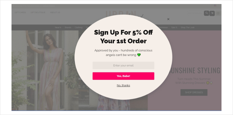
Image Source: Urbankissed
Color is also a powerful tool in design, so choose colors that align with your brand and message. Be careful not to go overboard with colors, and stick to a cohesive color palette. Using too many bright or neon colors can be overwhelming or distracting.
Your popup form should be eye-catching but not obnoxious.
Clearly Communicate the Value Proposition
Communicating the value proposition is a critical aspect of popup form design. A value proposition describes the benefit that your product or service provides to your customers.
To create a successful popup form, start by identifying the core benefits and unique features that set your product or service apart. Communicate this message clearly and concisely in your popup form using simple language and design elements to emphasize key benefits.
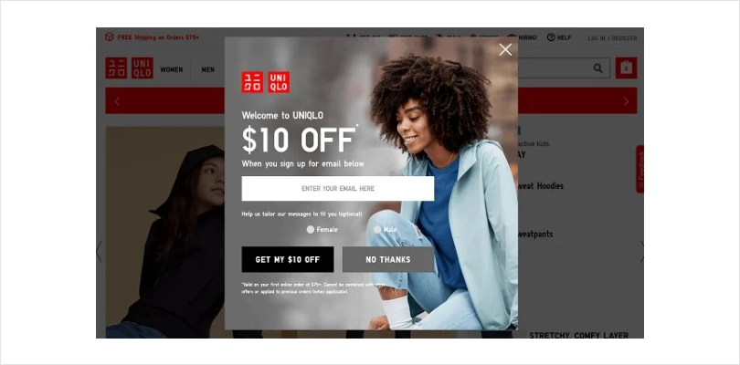
Image Source: Uniqlo
Avoid using jargon or technical terms that could confuse your audience. Instead, focus on the benefits your audience will receive and create a sense of urgency through limited-time offers or bold graphics.
By communicating the value proposition effectively, you’ll increase the likelihood of your audience taking action and converting into loyal customers.
Use Strong and Clear Call-to-Action
To create a successful popup form, it’s crucial to use strong and clear call-to-actions (CTAs). A CTA is a button or message that encourages your audience to take a specific action.
Make sure your CTA is clear and concise, using specific language that conveys the action you want your audience to take. Use design elements such as contrasting colors, bold font, and icons to make your CTA visually stand out.

Consider placing your CTA above the fold so that it’s visible without the user having to scroll down. Also, consider the context of your popup form to make it flow naturally with the content on the page.
By using strong and clear CTAs, you’ll increase the likelihood of your audience taking the desired action and converting into loyal customers.
Optimize for Mobile Devices
Optimizing popup forms for mobile devices is crucial in today’s world. Ensure that your form is responsive, using a simple and clean design that’s easy to read and navigate.
Consider a vertical layout and keep the form short and straightforward, asking only for essential information. Mobile users tend to have shorter attention spans than desktop users, so it’s essential to create a positive user experience that increases the likelihood of your audience taking the desired action.
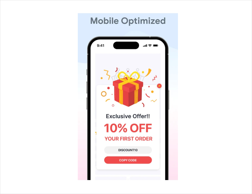
Image Source: Shopify
Optimizing your popup form for mobile devices makes it super easy for users to interact with your form on smaller screens, resulting in a higher conversion rate.
Test and Optimize Your Popup Form Design
Testing and optimizing your popup form design is an ongoing process that involves creating different versions of your form and testing them against each other.
A/B testing, in particular, is a valuable technique that allows you to compare two or more variations of your form to see which one performs better.

With A/B testing, you can test various design elements, such as color schemes, font sizes, images, and text, to determine which one resonates best with your audience. By using A/B testing, you can optimize your popup form design for better conversions and achieve your marketing goals.
Picreel is one of the tools that can help you with A/B testing by providing built-in capabilities to compare the performance of different versions of your popup form. You can test different form designs, headlines, text, and CTA buttons, allowing you to determine which combination works best for your audience.
Also Read - 11 Pop-Up Best Practices to Drive Conversions
Creative Examples of Popup Form Design
At this point, you know enough about popups that these real-world examples would start to make sense to you. Let’s take a look at them:
Meow Meow Tweet
The popup form of Meow Meow Tweet is an excellent example of an effective design. It utilizes vibrant colors, bold typography, and eye-catching imagery, along with messaging that is clear, concise, and focused on a specific offer that appeals to the user’s interests.
On top of that, the popup form is designed to align with the brand’s overall aesthetic and voice. The cat-shaped design and messaging used in the popup form are consistent with the brand’s style and tone, which helps build brand recognition and recall.
However, one area of improvement could be the placement of the popup form. The popup is displayed at the bottom of the screen, which may not be the most visible location. Placing the form in the center or top of the screen could increase its visibility and engagement.
To incorporate similar design elements into your own popup forms, start by identifying your brand’s unique aesthetic and voice. Use vibrant colors, bold typography, and eye-catching imagery to capture the user’s attention.
Also, make sure your messaging is concise and focused on a specific offer or value proposition that resonates with your target audience.
California Olive Ranch
The popup form of California Olive Ranch uses a minimalistic design approach with a white background and simple yet bold typography that captures the user’s attention. The 10% discount is prominently displayed, encouraging users to take action.
The
is also effective, displayed after the user has been browsing for a few seconds. However, there is room for improvement in the use of visual elements.
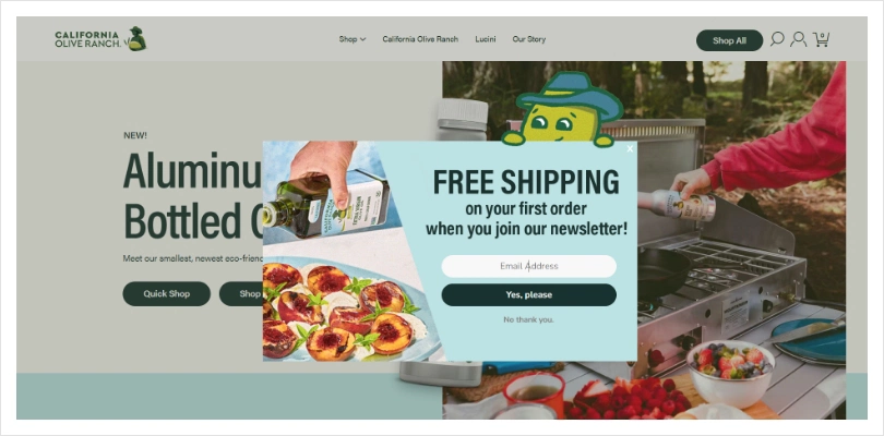
High-quality images or graphics related to the brand’s products could make the popup more visually appealing and engaging.
To inspire your own designs using these examples, you can use a simple yet bold typography approach and display your offer prominently and relevant to your target audience. Consider timing to ensure it’s not displayed too soon or too late.
Also, use high-quality visuals related to your brand’s products or services, but ensure they are not distracting or overwhelming.
FITS
FITS uses a bold and eye-catching color scheme, with a contrasting red background and white text, to draw the user’s attention immediately. The offer of a 15% discount and the clear call-to-action are prominently displayed, encouraging users to take action.
Another aspect that makes the popup effective is the personalized messaging, which addresses the user’s needs and desires. The use of a catchy headline like “15% off your purchase” acts as a clear value proposition that establishes a connection with the user and encourages them to engage with the brand.
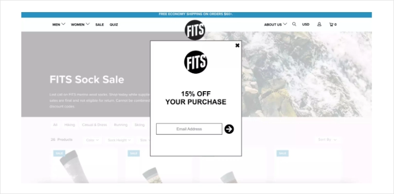
However, there is an opportunity for improvement in the timing of the popup. It is displayed immediately after the user lands on the page, which could be too soon for some users.
Delaying the popup display by a few seconds or after the user scrolls down the page may result in higher engagement rates.
To do the same with your website, use bold and eye-catching colors that contrast with your website’s background. Clearly display your offer and call-to-action, and experiment with the timing of your popup display to ensure it’s not too soon or too late.
Carbon 38
Carbon 38 is a fitness apparel brand that uses popup forms to offer new customers a discount on their first purchase. Their popup form has a clean and simple design that aligns with their brand identity.
The popup form features a high-quality image of their products with a 15% discount code prominently displayed. The call-to-action button is bold and eye-catching, encouraging visitors to take advantage of the offer.
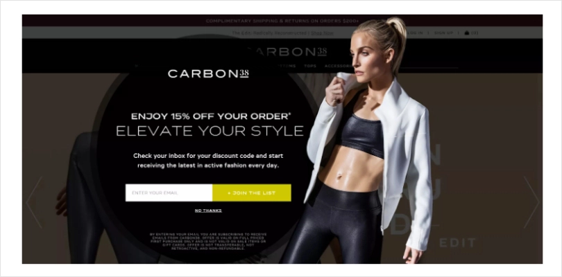
One improvement that could be made to this popup form is to add a clear value proposition. While the discount is a great incentive, it would be helpful to include a brief message about what sets Carbon 38 apart from other fitness apparel brands.
In order to make the best of this example, make sure to use high-quality visuals and a clear call-to-action that stands out. Additionally, consider adding a brief message that communicates the unique value proposition of your brand or offer, which will help you create a popup form that is both effective and aligned with your brand identity.
Taylor Stitch
The popup form of Taylor Stitch is effective because it offers a clear and concise value proposition with a strong call to action.
The use of contrasting colors and bold typography make the form stand out, while the minimalistic design with an attractive background image helps to avoid clutter.
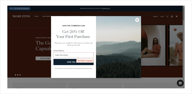
One improvement could be to provide more context about the brand or the offer to further entice the user, as it only gives you the discount code on the first purchase.
You can also make suitable changes to the design. Start by focusing on providing a clear and concise value proposition and using contrasting colors and bold typography to make it stand out. Keep the design minimalistic to avoid clutter and distractions, and consider providing additional context or information to further entice the user.
Also Read - 13 Ecommerce Popup Design Examples to Boost Customer Base
Tips for Designing Specific Types of Popup Forms
Let’s dive into some tips for designing specific types of popup forms:
Popup Signup Form
The classic popup signup form – a staple of many websites. It’s no secret that getting people to sign up for your newsletter, service, or product updates can be a challenge, but a well-designed popup signup form can make a huge difference.
Here are some tips to make your popup signup form more effective:
- Keep it short and sweet: The more fields you have, the less likely people are to fill out the form. Only ask for the information you need, such as name and email address.
- Make it easy to close: People don’t want to feel trapped, so make sure there’s a clear and easy way to close the popup, like a simple “X” button.
- Offer an incentive: Give people a reason to sign up, like a discount code or exclusive content.
- Use attention-grabbing visuals: A well-designed form with eye-catching colors and imagery can make a big difference.
Popup Contact Form
When it comes to designing a popup contact form, there are a few key tips to keep in mind to ensure it’s effective and user-friendly.
Firstly, keep the form simple and concise, only asking for essential information such as name, email, and message.
Secondly, make sure the form is prominently displayed and easy to access, whether it’s through a button on the homepage or a popup contact form that triggers after a certain amount of time on the site.
Thirdly, consider using a conversational tone in the form copy, which can help make visitors feel more comfortable and willing to fill out the form.
Lastly, include a clear and prominent call-to-action button, such as “Submit” or “Send,” to make it easy for users to complete the form.
Exit Intent Popup
An exit-intent popup is a type of popup form that appears when a user is about to leave your website.
Here are some tips for designing an effective exit-intent popup:
- Offer a value proposition: Give your visitors a reason to stay on your website and complete a desired action by offering a compelling value proposition.
- Keep it simple: The exit-intent popup should be simple, concise, and to the point. Avoid overwhelming users with too much information or too many fields to fill out.
- Add a sense of urgency: Use urgency to motivate your visitors to take action before it’s too late. Use phrases such as “limited time offer” or “offer expires soon” to create a sense of urgency.
Exit-intent popups are a great way to capture leads and retain visitors who are about to leave your website. Additionally, using an exit-intent tool like Picreel can help you optimize your popups with built-in A/B testing and other advanced features.
Picreel is known as one of the best exit intent tools in the market due to its advanced targeting and segmentation capabilities, customizable templates, and real-time analytics.
Welcome Popup
A welcome popup is a great way to greet your website visitors and introduce them to your brand. To design an effective welcome popup, it’s important to keep a few things in mind.
First, the popup should be visually appealing and match your website’s overall design aesthetic. Use high-quality images and consider incorporating your brand’s colors and fonts.
In addition to that, the copy should be clear and concise, welcoming visitors to your site and briefly explaining what your brand is all about. Be sure to include a clear call-to-action, such as “shop now” or “learn more.”
Finally, timing is key. The popup should appear quickly after the visitor lands on your site, but not so quickly that it’s interrupting their browsing experience. Consider using a delayed trigger or exit-intent trigger to display the popup at the right moment.
Cart Abandonment Popup
If you’re running an online store, you know that cart abandonment can be a frustrating problem. Luckily, a well-designed cart abandonment popup can help bring those customers back and complete their purchases.
Here are some tips for creating an effective cart abandonment popup:
- Use a clear and attention-grabbing headline that reminds the customer of what they left behind. For example, “Don’t forget your items in the cart!“
- Keep the message short and sweet. A brief message that explains the benefits of completing the purchase can be effective. For example, “Complete your purchase now and get free shipping!“
- Include an image of the product or products that were left in the cart. Seeing a visual reminder of what they are interested in can increase the likelihood of completing the purchase.
- Consider offering a discount or promotion to incentivize the customer to complete the purchase. A small discount or free shipping can be a powerful motivator.
Related Post - Best Website Popup Examples
Tools and Resources for Designing Popup Forms
In this section, we will discuss some popular tools that you can use to design effective popup forms. These tools are specifically designed to help businesses create popup forms that capture leads, increase conversions, and boost sales.
Picreel
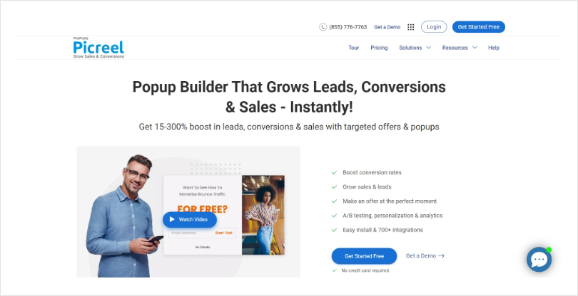
Picreel is an exit intent tool that helps you convert abandoning website visitors into customers. It allows you to create different types of popups, such as exit-intent popups, cart abandonment popups, and more. Features include A/B testing, targeting options, mobile-responsive design, and integration with various marketing tools.
Features:
- Exit-intent technology that displays a targeted popup when a visitor is about to leave your site
- Customizable templates and designs that can be adapted to match your brand
- Advanced targeting options, including geolocation and behavior-based targeting
- A/B testing capabilities to optimize your popup’s performance
- Integration with a wide range of email marketing and CRM platforms
- Real-time analytics and reporting to track the success of your popups
Transform Your Visitor Interaction with Stunning Popup Forms!
Create popup forms that drive conversions and delight users!
OptinMonster
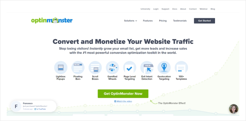
OptinMonsteris a powerful lead-generation tool that allows you to create high-converting opt-in forms and popups. Features include drag-and-drop builder, targeting options, exit-intent technology, A/B testing, mobile responsiveness, and integrations with various email marketing and CRM platforms.
Features:
- A user-friendly drag-and-drop editor to create custom popups without any coding knowledge
- Advanced targeting options, including page-level targeting and referral detection
- Integration with a variety of email marketing and CRM platforms
- Behavior automation features to trigger popups based on visitor actions
- A/B testing capabilities to optimize your popup’s performance
- Exit-intent technology that displays a targeted popup when a visitor is about to leave your site
Optimonk
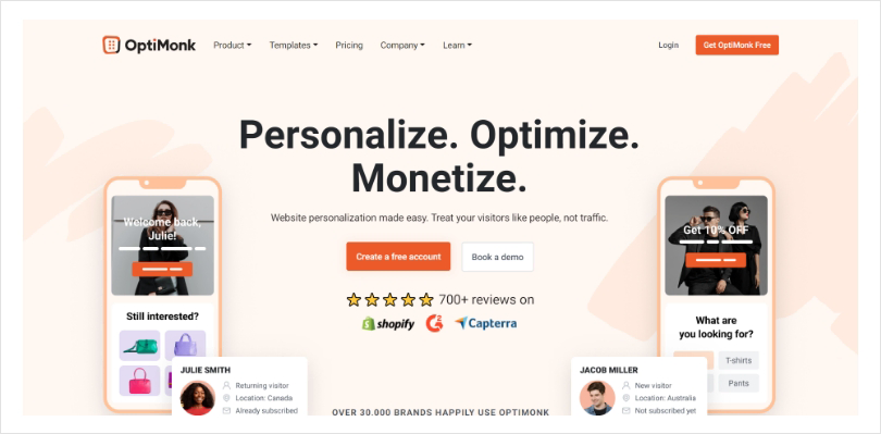
Optimonk is an all-in-one conversion optimization platform that offers a range of tools, including popups, surveys, and personalized recommendations. Features include drag-and-drop builder, targeting options, A/B testing, exit-intent technology, mobile responsiveness, and integration with various email marketing platforms. Optimonk also offers AI-powered features for advanced targeting and personalization.
Features:
- Customizable templates and designs that can be adapted to match your brand
- Advanced targeting options, including geolocation and behavior-based targeting
- A/B testing capabilities to optimize your popup’s performance
- Integration with a wide range of email marketing and CRM platforms
- Exit-intent technology that displays a targeted popup when a visitor is about to leave your site
- Advanced segmentation options to target specific audiences with relevant offers
FREE. All Features. FOREVER!
Try our Forever FREE account with all premium features!
Mastering the Art of Popup Form Design
Popup forms are a powerful tool to capture leads and engage with your audience. By following best practices, such as keeping the design simple, offering value, and providing an easy way to exit, you can create effective popups that convert.
The creative examples we analyzed from companies can serve as inspiration for your own designs. With these tips and resources, you can create popup forms that not only look great but also achieve your business goals.
Additionally, if you’re looking for a popup builder tool, Picreel is definitely worth considering. With its user-friendly interface and a variety of features, Picreel can help you design and implement effective popups on your website. Plus, they offer a forever-free plan, so you can test out the tool before committing to a subscription.
FREE. All Features. FOREVER!
Try our Forever FREE account with all premium features!
 We'd love your feedback!
What did you like & how can we make it even better?
 Thanks for your feedback!
 Ask Your Question
Have a question? Get expert help to make your decision easier.