Most websites lose visitors without ever giving them a reason to stay, subscribe, or buy. I have seen this happen even on sites getting solid traffic. If visitors leave without taking action, the opportunity is gone.
From my experience, the problem is rarely the popup itself. It is usually when it appears, what it offers, and what happens after someone interacts with it.
In this guide, I will walk you through a practical system I use to design lightbox popups that capture attention at the right moment and turn more visitors into leads, subscribers, or customers.
What Are Lightbox Popups and Why Do They Underperform?
I’ve audited hundreds of popup setups. The format is almost never the problem. The same pattern appears every time a popup underperforms; it’s one of five broken components, and teams usually blame the wrong one.
Here’s how to diagnose yours before you build anything new:
| Symptom | What It Usually Means |
|---|---|
| Low views | Trigger conditions are too narrow or only active on low-traffic pages |
| High views, low conversions | Offer is misaligned with what that visitor actually wants |
| Good conversions, poor subscriber quality | Offer is attracting freebie hunters, not buyers |
| Strong email capture, no revenue | Follow-up sequence isn't connecting the popup offer to the product |
| Visitors dismissing immediately | Popup fires before the visitor has any reason to care |
Find your symptom first. That’s your starting point. You don’t need to rebuild everything; you need to fix the right thing.
How To Create Lightbox Popups That Increase Conversions?
Lightbox popups outperform every other passive capture format because of one mechanism: the dimmed background removes competing visual elements and forces a single decision. There’s no navigation bar to click, no sidebar to scroll past, no competing CTA to distract.
When I set these up using tools like Picreel, the difference is immediately noticeable in how focused the interaction becomes.
When a visitor sees a lightbox popup:
- Their attention is isolated to one offer
- The background content is still visible, which signals they haven’t left the page
- The close button is accessible, which reduces psychological resistance
The format works. What breaks it is poor timing, a weak offer, and no follow-up.
To give you a real-world example, I’ll show you how Grivy, a leading consumer services marketplace in Indonesia, used Picreel to turn high traffic into actual leads and conversions.

Step 1: Define the One Goal Your Popup Exists to Achieve
The most common popup mistake I see is trying to accomplish too much with a single overlay. A popup that promotes a sale, asks for an email, and offers a free download simultaneously is not strategic. It is noise.
Before you design anything, write these three lines:
- Visitor: Who specifically will see this popup, in what context, on what page?
- Goal: What is the single action you want them to take?
- Offer: What specific thing will you give them in exchange for that action?
Here is what weak versus strong looks like:
Weak version:
- Visitor: Anyone on the website
- Goal: Get more emails
- Offer: Sign up for our newsletter
Strong version:
- Visitor: First-time blog reader who has scrolled 65% through a post on cart abandonment
- Goal: Email address for a lead nurture sequence
- Offer: “The 5-Email Cart Recovery Sequence We Use to Win Back 14% of Abandoned Orders” (downloadable template)
The strong version talks to one specific person with one specific problem at one specific moment. When that visitor reads the headline, they don’t think “this looks interesting.” They think “I need this right now.”
The one-sentence offer test: Would someone forward this to a colleague because it’s actually useful? If yes, it’s strong enough. If it sounds like something you’d delete unopened, rewrite it before you build anything.
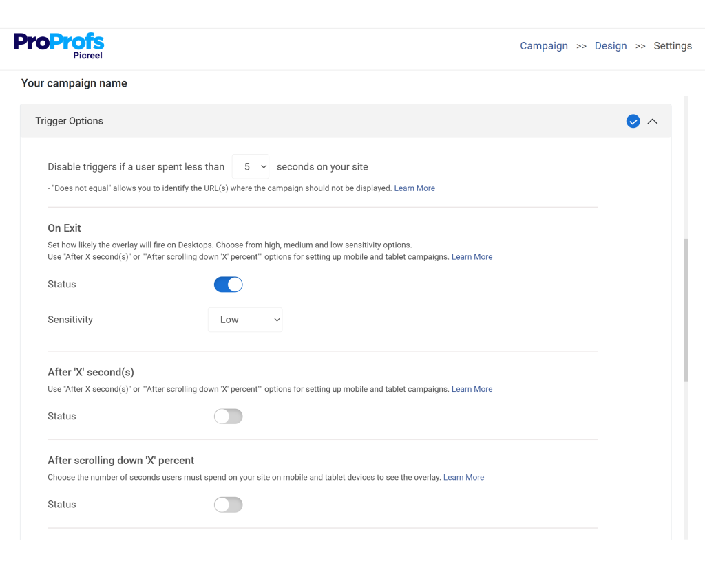
Step 2: Choose the Right Trigger for the Right Visitor Behavior
Trigger logic is where most popup campaigns succeed or fail. The best offer in the world will underperform if it fires at the wrong moment. Here is the decision framework I use.
| Visitor Signal | Best Trigger | Why It Works |
|---|---|---|
| Reading a blog post | Scroll depth at 60–65% | Fires when engagement is demonstrated, not assumed |
| About to leave a product page | Exit intent | Intercepts at the decision moment without interrupting the browse |
| Spending time on pricing page | Time-based at 45 seconds | Indicates comparison behavior, strong conversion intent |
| Clicking a CTA button | Click trigger | Self-initiated interaction with highest conversion rate of all trigger types |
| Returning visitor, never converted | Exit intent with higher-value offer | Second or third visit signals interest; exit is the last capture chance |
| Mobile visitor scrolling rapidly upward | Scroll-up / back-button detection | Mobile equivalent of exit intent |
The trigger rules I never break:
- Never fire a popup in the first 10 seconds of a page load. Not 15. Not 20. At least 30 seconds or 40% scroll, whichever comes first.
- Never show the same popup twice in a single session.
- Apply a minimum 7-day suppression cookie after a dismissal.
- Permanently suppress after a conversion.
Picreel handles all of this natively, including exit-intent detection, scroll triggers, visit frequency rules, and cookie suppression, without requiring development work on your end.
Step 3: Write Popup Copy That Converts in Two Seconds
Your popup headline has roughly two seconds before the visitor’s hand moves to the close button. The copy framework that works every time:
| Element | Formula | Example |
|---|---|---|
| Headline | What they get, in 8 words or fewer | "Get the cart recovery email sequence that works" |
| Subheadline | Why it matters to them right now | "5 plug-and-play emails that win back abandoning shoppers" |
| CTA button | Action + specific outcome | "Send Me the Templates" |
| Microcopy | Remove the last friction | "Free. No spam. Unsubscribe anytime." |
Copy before and after, side by side:
| Element | Before | After |
|---|---|---|
| Headline | "Join our newsletter" | "Get the exact email sequence that recovered $31K in abandoned carts" |
| Subheadline | "Weekly marketing tips" | "5 ready-to-send templates, delivered free to your inbox" |
| CTA button | "Submit" | "Send Me the Templates" |
| Microcopy | None | "Instant download. No credit card." |
The shift from what you are asking for to what the visitor receives is the highest-leverage copy change you can make. Read your headline again. Does it describe your metric or their outcome? If it describes yours, rewrite it.
Fill-in-the-blank popup headline templates:
- “Get the [specific asset] that helps [audience] [achieve outcome] without [common obstacle]”
- “The [number]-step [process] we used to [specific result] in [timeframe]”
- “Stop [losing/wasting/missing] [specific thing]. Here’s exactly how to fix it.”
- “Free [template/checklist/guide]: [Specific outcome] for [Specific audience]”
Step 4: Match the Offer to the Page and the Visitor’s Intent
The most common reason a well-designed popup fails is an offer that has nothing to do with why the visitor landed on that page. Contextual relevance is the most underused conversion lever in popup marketing.
Here is how to map the right offer to the right page:
| Page Type | Visitor Intent | Offer That Converts |
|---|---|---|
| Blog post (educational content) | Learning, researching | Content upgrade: related checklist, template, or guide |
| Product page (ecommerce) | Considering purchase | First-order discount (10–15%) or free shipping threshold |
| Checkout page | About to buy or abandon | Urgency code or free shipping to remove last hesitation |
| Pricing page (SaaS) | Comparing options | Free trial, personalized demo, or side-by-side comparison doc |
| Service or case study page (B2B) | Evaluating a vendor | Free audit, strategy call, or downloadable ROI calculator |
| Resource or tools page | Solving a specific problem | Related tool, swipe file, or deeper resource |
Quick audit before you build: Open each high-traffic page, read it as a first-time visitor, and ask: “What does someone on this page actually want right now?” Build the offer around that answer.
Step 5: Design the Popup for Clarity, Not Creativity
I have reviewed hundreds of popup designs. The most common mistake is treating the popup like a brand moment. It is not. It is a transaction. The simpler and cleaner it is, the higher it converts.
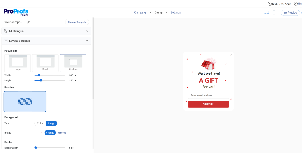
The design rules that move the needle:
- High contrast between the popup container and the dimmed background
- One form field for email capture, two fields maximum for B2B lead gen
- CTA button color that is visually distinct from everything else in the popup
- Close button visible, large enough to tap on mobile, top-right corner
- No stock photography that has nothing to do with the offer
- Mobile popup width at 85–90% of viewport, tested on an actual device
What to remove from most popups:
| Remove This | Because |
|---|---|
| Social media icons | They give visitors an exit route that does not serve your goal |
| Long body copy | Nobody reads three paragraphs in a popup. Cut to the offer. |
| Multiple CTAs | Two choices create decision paralysis. One creates momentum. |
| Auto-playing video or audio | Startles visitors and tanks mobile experience |
| Tiny or hidden close button | Creates hostility, not conversion. Visible X builds trust. |
According to Statista (2025), mobile devices account for nearly 60% of global website traffic. If your popup was designed on a desktop and then “made responsive,” it is not mobile-optimized. Test it on an actual phone. Check that the close button is reachable with a thumb. Check that the form field is large enough to tap. Check that your headline fits on two lines, not four.
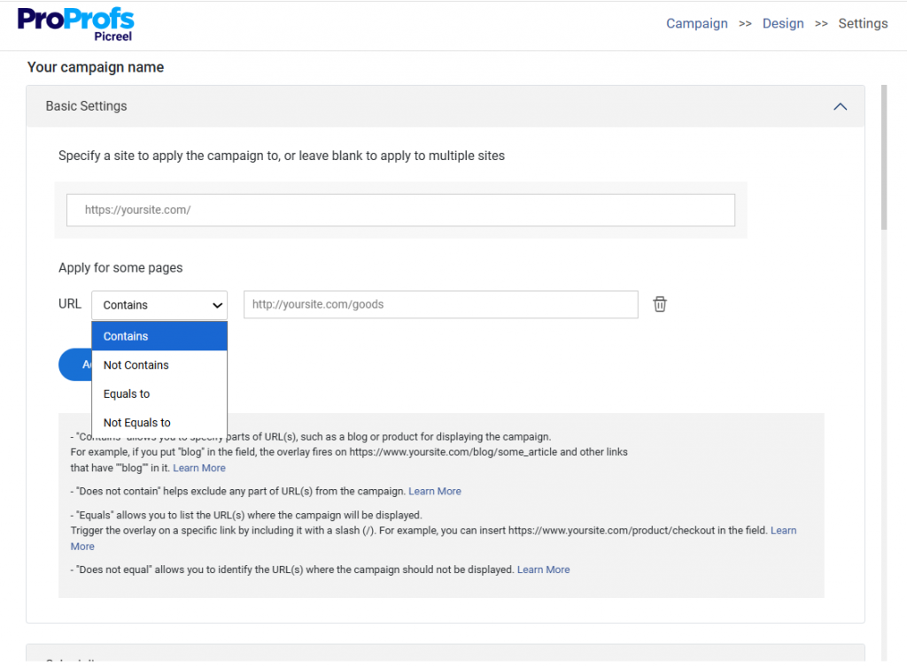
Step 6: Set Up Your Targeting So the Right Visitors See the Right Popup
Showing the same popup to every visitor is the most expensive version of lazy marketing. You have data about who is on your site. Use it.
Segmentation layers to apply before launching:
By visit frequency:
- First-time visitor: Needs social proof and a low-friction offer. Lead with trust signals.
- Second or third visit: Has seen your content before. Ready for a more direct offer.
- Returning visitor, never converted: Highest intent. Use exit intent with your strongest offer.
By traffic source:
- Organic search (cold): Educational offer. They found you through content, meet them there.
- Paid ad traffic: Match the popup offer to the ad they clicked. Continuity increases conversion.
- Email click-through (warm): They already know you. Skip the introduction. Get to the offer.
- Social referral: Context-dependent. Match to the post or campaign that drove them.
By device:
- Desktop: Full popup with supporting copy and image
- Mobile: Stripped-down version, larger tap targets, one field, short headline
By pages visited:
- Viewed one page: Soft offer, low commitment
- Viewed pricing + two features pages: Strong lead gen popup, they are evaluating
- Viewed case studies: Exit-intent with social proof and a consultation offer
Picreel allows all of these segmentation conditions to be combined without code, including visit count, traffic source, device type, pages viewed, and time since last visit.
Step 7: Connect the Popup Directly to Your Email Tool or CRM
A popup that captures email addresses into a disconnected spreadsheet is not a lead generation tool. It is a data collection hobby. Every capture should flow into a relevant, automated follow-up sequence before that visitor loses the context of why they signed up.

The integration checklist before you go live:
- Email platform connected (Klaviyo, Mailchimp, HubSpot, ActiveCampaign, or your stack)
- Subscriber tagged with the popup name or offer so you can segment later
- Welcome email triggered immediately after signup, delivering exactly what the popup promised
- Follow-up sequence active for non-openers (at least 2 additional emails over 7 days)
- Converted visitors suppressed from seeing the popup again
The welcome email that should fire within 5 minutes of signup:
Subject: Here’s your [what you promised] from [your site name]
Hey [First Name],
Here it is: [link to the asset, discount code, or resource]
I built this because [one sentence on why it exists and who it is for].
The one thing most people miss when they use it: [one genuinely useful tip].
If you have questions or want to talk through how this applies to your situation, just reply here.
[Name]
Short. Delivers the promise immediately. Opens a conversation without being salesy.
Picreel integrates with platforms like BIGContacts CRM so that every captured lead flows directly into your marketing stack the moment they convert.
Step 8: A/B Test the One Thing That Moves the Number Fastest
The only opinion that matters is the data. I have seen popups with beautiful design underperform simple text overlays because the headline was wrong. I have seen identical offers with different CTA button text produce 3x conversion rate differences. You can find this out using A/B tests.
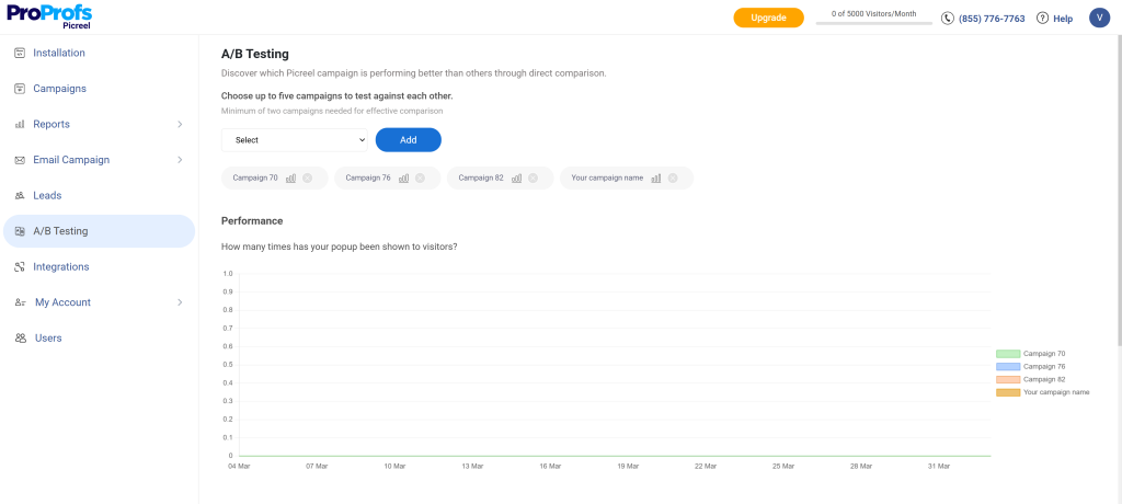
The testing sequence I follow:
Test 1: Headline (highest impact, run first)
- Variant A: Benefit-led headline (“Get the exact 5-email sequence that recovered 14% of abandoned carts”)
- Variant B: Problem-led headline (“Still losing 70% of cart visitors? Here’s the fix.”)
- Run until 300 conversions per variant. Apply the winner immediately.
Test 2: CTA button text (second highest impact)
- Variant A: Action + outcome (“Send Me the Templates”)
- Variant B: First-person framing (“Yes, I Want the Templates”)
- This test often takes less time to reach significance because it is visible to everyone who sees the popup.
Test 3: Offer type (tests the strategy itself)
- Variant A: Content upgrade (free template or guide)
- Variant B: Discount or access offer
- This test is worth running on ecommerce pages where the choice between educational and transactional offers is genuinely unclear.
Test 4: Trigger timing (refines when the popup appears)
- Variant A: 60% scroll depth
- Variant B: 75% scroll depth
- This tells you whether deep readers convert better than mid-page readers for your specific content.
What not to test first: Background color. Font choice. Image versus no image. These are noise until your headline and offer are proven.
Step 9: Measure What Actually Matters for Your Business Goal
A popup that is live is not the same as a popup that is working. These are the four metrics I track and why each one connects to an actual business outcome.

1. Popup conversion rate
This is the percentage of visitors who see the popup and take the action. According to Omnisend (2026), the average popup conversion rate is around 2.1%, with 3–5% considered good and anything above 5% performing at a high level. Healthy benchmarks:
Below 2% almost always means a copy or offer problem, not a design problem. Start debugging there.
2. Subscriber-to-customer rate
Of the emails captured through your popup, what percentage eventually buy? This is the real quality check. If popup-acquired subscribers convert to customers at a significantly lower rate than your other list segments, your offer is attracting the wrong audience. Fix the offer before scaling the volume.
3. Revenue recovered from exit intent
For e-commerce, track revenue directly attributed to visitors who were shown an exit-intent popup and completed a purchase. This is your clearest ROI number and should be reported as a standalone channel metric every month.
4. Email engagement rate by acquisition source
Segment open and click rates by subscriber acquisition method. If popup subscribers engage at half the rate of your organic opt-ins, the popup offer is attracting people who want the freebie, not the relationship. The fix is a more targeted offer that appeals only to people who also want what you sell.
Your Pre-Launch Popup Checklist
Do not publish a popup without running through this list.
Before you build:
- Visitor, goal, and offer written in three specific lines
- Trigger chosen based on visitor behavior, not default settings
- Offer tested against: “Would someone forward this because it is useful?”
- Integration with email platform confirmed
Before you go live:
- Headline tested with at least two alternatives (pick the strongest to launch)
- Mobile version tested on an actual device
- Close button visible and tappable
- Form field count minimized (1 for email capture, max 2 for B2B)
- CTA button text action-oriented and specific
- Cookie suppression active (7-day minimum for dismissals, permanent for conversions)
- Frequency cap set to one popup per session
Within 48 hours of launch:
- Welcome email delivering the promised offer confirmed live and sending within 5 minutes
- Conversion rate checked against benchmark
- First A/B test variant set up and scheduled
Within 30 days:
- Conversion rate reviewed against benchmark
- Subscriber quality check (open rate of popup-acquired subscribers vs. overall list)
- First A/B test result recorded and winner applied
- Second test queued
What Are the Common Popup Mistakes and the Fix for Each One
Even experienced marketers fall into these. Here is the mistake and what to do instead.
| Mistake | Why It Happens | The Fix |
|---|---|---|
| Popup fires on page load | Default tool settings | Set minimum trigger of 30 seconds or 40% scroll |
| Same popup for every visitor | No segmentation set up | Create separate campaigns for first-time vs. returning visitors |
| Generic offer ("Sign up for our newsletter") | No audience research | Replace with a specific asset or outcome the visitor actually wants |
| No follow-up after conversion | Popup treated as standalone | Connect to email platform and build a minimum 3-email sequence |
| Mobile popup overflows viewport | Desktop-first design | Build and QA a dedicated mobile variant before launch |
| Vague CTA button text ("Submit") | Default text left unchanged | Rewrite as action plus outcome specific to the offer |
| No suppression after conversion | Suppression not configured | Set permanent suppression the moment someone converts |
| Testing too many things at once | Eagerness to optimize | Test one element at a time, headline first |
FREE. All Features. FOREVER!
Try our Forever FREE account with all premium features!
Lightbox Popups vs Other Lead Capture Formats: Which One Should You Use?
| Format | Best For | Biggest Risk |
|---|---|---|
| Lightbox popup | Email capture, lead gen, cart recovery | Disruptive if poorly timed |
| Slide-in popup | Soft content offers, low-friction nudges | Easy to ignore |
| Sticky bar | Site-wide promotions, announcements | Competes with all page elements |
| Inline form | SEO-friendly capture on long-form content | Most visitors never scroll to it |
| Full-screen overlay | Mandatory notices, high-stakes offers | Highest bounce risk |
| Gamified popup (spin-to-win) | Ecommerce discount discovery | Brand fit dependent |
Lightbox popups hit the sweet spot between full-screen overlays, which carry the highest bounce risk, and passive formats like sticky bars and inline forms, which most visitors visually tune out. The dimmed background creates focus without blocking the experience entirely, which is why they consistently outperform passive formats for conversion-focused campaigns.
Turn Website Visitors Into Leads With Smarter Lightbox Popups
Lightbox popups work when they respect the visitor’s moment. The strongest campaigns focus on three things: a clear goal, the right trigger, and an offer that genuinely matches the page intent. Timing matters as much as copy.
A popup that appears after engagement, presents one clear action, and connects to a meaningful follow-up sequence can turn casual visitors into subscribers and customers.
The key takeaways are simple. Keep the offer specific. Trigger the popup based on behavior, not page load. Limit form fields. Test headlines first. Measure subscriber quality, not just conversion rate.
If you want to implement this without building complex targeting rules yourself, tools like Picreel help manage triggers, segmentation, and integrations in one place.
Start with one high-traffic page, launch a focused popup, and refine it with real data.
Frequently Asked Questions

How Long Should a Lightbox Popup Campaign Run Before You Optimize It?
A popup campaign should run long enough to collect statistically meaningful data. In most cases, that means at least two to four weeks of traffic or a minimum of 300 conversions per variation before making changes. Optimizing too early can lead to incorrect conclusions based on small data samples.
Should You Use Different Popups for Desktop and Mobile Visitors?
Yes. Mobile visitors behave differently and interact with smaller screens, which changes how popups should be designed. Desktop popups can include more supporting text, while mobile popups should prioritize a short headline, a single form field, and a large CTA button that is easy to tap.
What Industries Benefit the Most From Lightbox Popups?
Lightbox popups work particularly well for e-commerce stores, SaaS products, content publishers, and service-based businesses. These industries rely heavily on capturing leads or converting website visitors into paying customers, which makes targeted popups an effective tool for improving conversion rates.
How Do You Prevent Popup Fatigue for Frequent Visitors?
Popup lightbox fatigue happens when returning visitors repeatedly see the same message. To prevent this, rotate offers periodically, segment audiences by visit history, and set frequency caps so a visitor does not see the same popup every session.
Should Lightbox Popups Be Used on Landing Pages?
In most cases, landing pages should avoid additional popups because they already contain a focused conversion goal. Adding another popup can distract visitors from the primary CTA. However, exit-intent popups can still work well on landing pages to capture visitors who abandon their carts.
How Do Lightbox Popups Fit Into a Larger Marketing Funnel?
Popup lightbox typically operate at the top or middle of the marketing funnel. They capture leads or encourage small commitments such as email subscriptions, which then move visitors into nurturing campaigns like email sequences, retargeting ads, or product education content.
What Tools Are Commonly Used to Build Lightbox Popups?
Marketers commonly use platforms like Picreel, which provides behavioral triggers, targeting rules, analytics, and integrations with email and CRM systems. So captured leads automatically enter follow-up campaigns.
Can Lightbox Popups Be Used for Content Promotion Instead of Lead Generation?
Yes. Some publishers use popups to promote high-value articles, guides, webinars, or product announcements. In these cases, the popup acts as a content discovery tool that helps visitors find important resources they might otherwise miss.
How Often Should You Refresh or Update Popup Campaigns?
Most popup campaigns should be refreshed every three to six months to prevent message fatigue and reflect current marketing campaigns. Updating the offer, headline, or visual design periodically keeps the popup relevant and maintains performance over time.
Are WordPress lightbox popups GDPR compliant?
They can be. If your popup collects emails or uses tracking cookies, you must provide a privacy notice and obtain consent where required. Many GDPR compliant popup tools support consent checkboxes and cookie controls for compliance.
FREE. All Features. FOREVER!
Try our Forever FREE account with all premium features!
 We'd love your feedback!
What did you like & how can we make it even better?
 Thanks for your feedback!
 Ask Your Question
Have a question? Get expert help to make your decision easier.