You’re already getting traffic to your website. People are visiting, exploring a few pages, maybe even checking out your pricing or products. But then they leave without signing up, subscribing, or buying anything.
This happens more often than most businesses realize.
According to Statista reports in 2025, the average website conversion rate across industries stands at just 1.7%, meaning most visitors leave without acting.
That’s why overlay popups work so well. They help you reach visitors at the exact moment they’re about to leave or lose interest, giving you one more opportunity to turn that visit into a lead, subscriber, or customer.
In this guide, I’ll walk you through what overlay popups are, share real examples from brands using them effectively, cover the best practices that actually improve conversions, and show you how to create one step by step.
What Is a Popup Overlay and Why Does It Actually Matter for Conversions?
The reason it works is simple: context and timing. You are not broadcasting to everyone. You are speaking to one visitor, at one specific moment in their journey, with one specific ask.
Here is why overlay popups outperform most other on-site conversion tools:
- Attention capture: The dim background eliminates visual distractions. The visitor’s job is to read the message.
- Behavioral precision: Unlike a static signup form at the bottom of your page, a popup fires when the visitor shows a specific signal, whether that is about to leave, spent 30 seconds reading, or scrolled 60% down the page.
- Offer relevance: You can match the popup content to the page, the traffic source, or the visitor’s history. A returning visitor sees something different from a first-timer.
- List growth at scale: Picreel customers using lead-capture overlays have accelerated list growth by 50% or more without increasing ad spend.
- Cart recovery: Exit-intent overlays catch abandoning shoppers before they close the tab and give them one more reason to complete the purchase.
- Zero extra traffic needed: Every improvement happens with the visitors you already have. No new campaigns required.
8 Overlay Popup Examples That Real Brands Are Using Right Now
These popup overlay examples are not theoretical mockups. These are real overlay popup campaigns from brands that understand what they are doing. I have broken down each one for the design choices, the psychology behind the copy, and the conversion mechanism doing the heavy lifting.
1. Huda Beauty: The “Be First to Know” Welcome Overlay
Huda Beauty greets new visitors with a split-panel popup: the left side is pure copy and a single email field, and the right side features Huda herself alongside the brand’s latest collection. The headline is bold and direct: “Be the First to Know.”
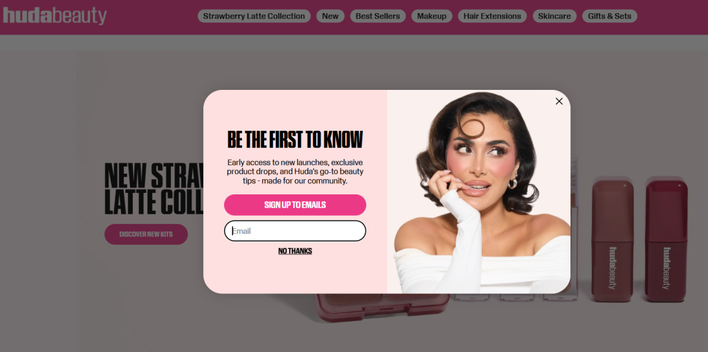
This popup works because it does not feel like a discount grab. It feels like an invitation into a community. The copy under the headline promises early access to new launches, exclusive drops, and Huda’s go-to beauty tips. The brand is not just capturing an email. They are positioning the subscriber as an insider.
Why It Works:
- “Be the First to Know” triggers FOMO without sounding desperate. It speaks to beauty buyers who want to feel ahead of the curve, not behind it.
- Including Huda’s photo humanizes the brand instantly. It turns an email signup into a direct connection with the founder.
- The single email field and a soft “No Thanks” dismissal remove all friction. There is no commitment anxiety.
- The popup appears early in the session, before any scrolling, because the value exchange is so clear that it does not need the visitor to be “warmed up.”
Takeaway for your brand: If your brand has a face, use it. Founder-led popups convert above average because they replace a transactional ask with a personal one.
2. Snif: The Cart-Prompt Cross-Sell Overlay
Snif’s homepage popup is one of the most visually distinct I have seen. The background is a blue shopping basket filled with their fragrance products alongside cereal, limes, and strawberries, complete with sticker-style scent descriptors like “Bright,” “Spiced,” and “Milky.” The question layered on top reads: “What’s in Your Cart?”
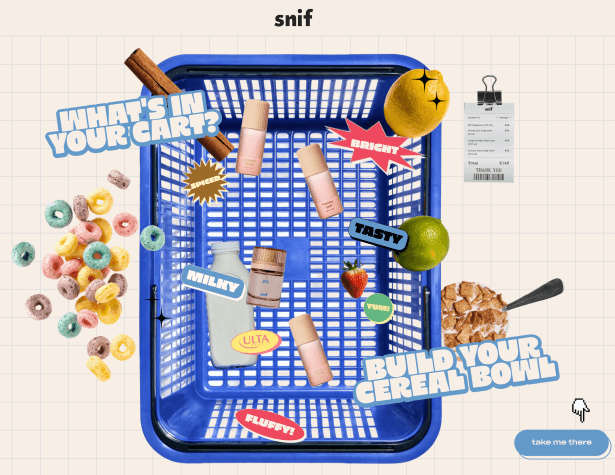
There is no traditional email capture here. This is a product discovery overlay that uses visual storytelling to pull visitors directly into the shopping experience. The CTA is a light blue button that says “Take Me There.”
Why It Works:
- The playful, sensory-rich creative matches exactly what Snif sells: fragrance as personality. The popup does not just promote a product. It demonstrates what the brand experience feels like.
- The “Build Your Cereal Bowl” prompt is a cross-sell gambit. It nudges visitors toward building a multi-product cart, not just buying a single item.
- No email field means zero friction. The only ask is a click to go shopping.
- The visual chaos is deliberate. It holds attention long enough for the visitor to process the brand story.
Takeaway for your brand: Not every overlay needs to capture an email. If your conversion goal is product discovery or average order value, design your popup around that specific action.
3. Brooklinen: The Sale Announcement Overlay
Brooklinen’s popup is straightforward. A full-width hero image shows someone comfortably asleep, hugging their pillow. The overlay text in the lower center reads “25% Off Sitewide Anniversary Sale. And up to 50% off exclusive Bed Bundles.” Below that: a single dark CTA button labeled “Shop the Sale.”
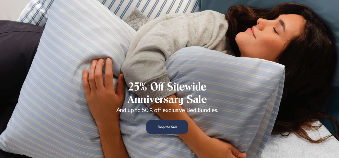
There is no email gate here. No multi-step form. Just an offer, clear context, and a clean path to act on it.
Why It Works:
- Brooklinen chose not to make the visitor give anything to access the deal. The popup serves as a sitewide announcement, reducing decision paralysis by making the offer immediately accessible.
- The lifestyle photo of someone actually sleeping in their product is doing quiet conversion work. It is aspirational without being aspirational.
- The stacked offers (25% sitewide + up to 50% on bundles) increase perceived value. The visitor is scanning for the best deal and finding two.
- The clean close option in the header notification bar above the popup removes any sense of being trapped.
Takeaway for your brand: When you are running a time-sensitive sale, strip the popup down. The offer is the hero. Let it breathe.
4. TOMS: The Lifestyle-First Full-Width Overlay
TOMS uses a full-width image popup where four models are seated in various positions, all wearing the same Carolina Lace-Up shoe in different styling combinations. The overlaid text reads “One and Done” with “These Go with EV-ER-Y-THING” and a CTA: “Shop Carolina Lace-Up.”
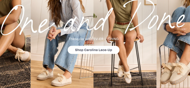
This is brand storytelling deployed as a conversion tool. The product is styled multiple ways to answer the unspoken objection: “But will it actually go with my wardrobe?”
Why It Works:
- Multiple models in one frame show versatility. If you can see the shoe styled four different ways in one image, you do not need to imagine it. The objection is preemptively addressed.
- The “One and Done” headline is a value proposition, not a discount. It appeals to buyers who value simplicity and practicality.
- The CTA is product-specific. It does not say “Shop Now” generically. It says “Shop Carolina Lace-Up,” which creates a sense of direction and specificity.
Takeaway for your brand: High-quality lifestyle images in overlays reduce purchase hesitation. Do not just show the product. Show the product in the context of the visitor’s life.
5. LEGO: The Welcome Segmentation Overlay
LEGO’s welcome popup asks visitors to choose their path: enter the standard LEGO.com experience or step into The Play Zone (the children’s section). A gentle safety overlay also appears if someone navigates from the kids’ section back to the main site.
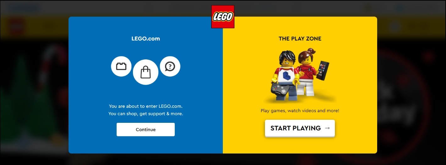
This is audience segmentation done through the popup itself. LEGO is not just welcoming visitors. They are routing them to the most relevant experience before they even start browsing.
Why It Works:
- A choice-based popup creates micro-commitment immediately. The visitor has already taken an action (clicked a button) before they have seen a single product.
- Routing adults and children to separate experiences reduces the bounce risk that comes from mismatched content. A parent buying a gift and a 10-year-old exploring new sets have entirely different needs.
- The playful design and branded language (“Play Zone”) reinforce LEGO’s personality from the very first interaction.
- The safety popup is an earned trust signal. LEGO is protecting its younger audience in a visible way, which matters to parents.
Takeaway for your brand: If your audience spans multiple segments, use your welcome overlay to segment them upfront. A single personalized experience beats a generic one every time.
6. Tim Ferriss: The Content-Led Full-Page Overlay
Tim Ferriss uses a full-page exit overlay that appears when visitors are about to leave his site. The design is a dark photograph of Tim himself, with a bold headline tied to a press quote calling his work “The most surprising self-help hit of the decade.” The CTA offers free chapters from three of his most well-known books.

There is no discount. No coupon. Just pure content value.
Why It Works:
- Third-party social proof (the press quote from Men’s Journal) does the credibility work before the offer even appears. By the time visitors see the CTA, they already trust what they are being offered.
- Offering free book chapters serves Tim’s audience exactly right. These are people who came to his site seeking ideas and frameworks. The popup gives them more of what they came for.
- The gold “Download Free Chapters” button stands out against the dark background without feeling out of place. It earns the click through contrast, not desperation.
- This is lead gen disguised as generosity. Every person who downloads the chapters gives Tim their email and signals deep interest.
Takeaway for your brand: For content-led businesses, the most powerful overlay offer is not a discount. It is more of what your audience already wants. Free resources, guides, templates, or tools convert high-intent visitors extremely well.
7. Blume: The Interactive Segmentation Overlay
Blume’s overlay popup skips the email capture entirely on the first step. Instead, it asks visitors to self-identify their skincare concern: Acne, Sun Protection, Dark Spots, Lip Care, Aging, Hydration, or Overall Skin Health. The headline reads “You’ve Got a Mystery Discount.”
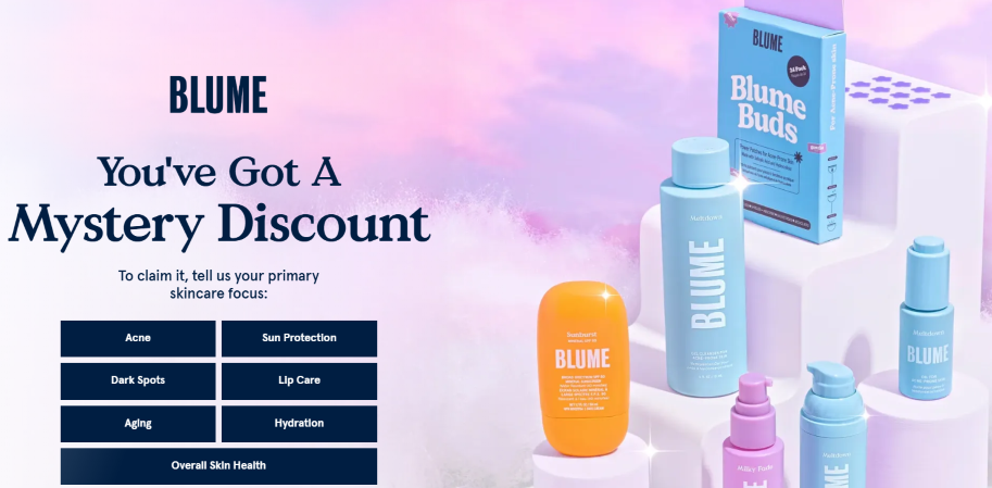
By the time the visitor has clicked a category, they are invested. And they want to find out what the mystery discount is.
Why It Works:
- The interactive first step is genius because it captures segmentation data before it captures an email. Every subsequent email Blume sends can be hyper-relevant to the concern the visitor selected.
- “Mystery discount” is a curiosity trigger. Curiosity is one of the strongest conversion motivators on the internet because the brain genuinely does not like unresolved loops.
- By asking a question first, Blume makes the visitor feel seen and understood before asking anything of them. The exchange feels less like a transaction and more like a consultation.
- The product imagery in the right panel shows Blume’s full range, which quietly communicates that whatever your concern is, they have something for it.
Takeaway for your brand: If you have a product catalog that maps to different customer needs, use your overlay to segment before you capture. Your email open rates and click-through rates will reflect the difference immediately.
8. OddBalls: The Gamified Spin-to-Win Overlay
OddBalls goes all in on gamification. The popup features a spinning prize wheel with multiple outcomes: Free delivery, £3 off, 10% off, 15% off, and “Spin Again.” The background is yellow confetti, the typography is bold pink, and the prizes go up to £250 in their extended version.
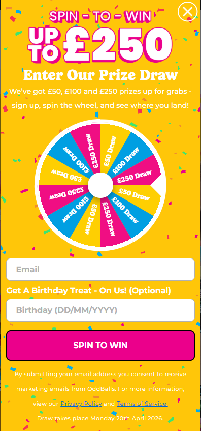
This is not a popup. This is a mini game show entry.
Why It Works:
- Variable reward mechanics are addictive because they create genuine unpredictability. Different outcomes on the wheel mean every spin feels like it could deliver something exceptional.
- No visitor walks away empty-handed. Every outcome on the wheel is a real reward, which removes the disappointment drop-off that can hurt brand perception.
- The brand-aligned visuals make the gamified format feel intentional, not gimmicky. OddBalls is a bold, playful brand, and the popup reflects that perfectly.
- The email capture is embedded naturally into the experience. You enter your email to spin. By the time you have done it, the lead is already captured.
Takeaway for your brand: Gamified popups can increase conversions by up to 13%. Use them for product launches, seasonal campaigns, or any moment where generating excitement is as important as generating leads.
10 Overlay Popup Best Practices (and What to Avoid)
Most brands converting at 9%+ are not doing anything wildly complex. They are executing the fundamentals better than everyone else, and avoiding the obvious popup mistakes that silently kill performance.
| What to Do | Why It Matters | What to Avoid |
|---|---|---|
| Delay your trigger (exit intent, 60%+ scroll, or 20-30s on page) | Visitors who see a popup in the first 2 seconds bounce before they form a brand opinion | Firing a popup the moment someone lands |
| One goal per popup | Asking for an email and a sale in the same popup splits attention and kills both | Multi-objective popups with two CTAs or two form paths |
| Design the dismiss option intentionally | "No thanks, I don't want savings" reduces resentment and signals offer confidence | A tiny, hard-to-find X that makes visitors feel trapped |
| Match popup to the page context | A cart recovery offer on the homepage confuses visitors. Page-level rules in Picreel's Advanced Targeting fix this | Showing the same popup sitewide regardless of page intent |
| Keep form fields to one (email only) | Each additional field adds friction. One field outperforms two. Two outperform three. | Asking for name, phone, and email in a single popup |
| Add a GDPR consent checkbox | It is a legal requirement and a trust signal. Visitors who see transparent privacy messaging convert at higher rates | Skipping compliance and risking both legal exposure and subscriber distrust |
| Personalize using CRM data | Picreel's Personalize Popups feature pulls in visitor name, purchase history, or product interest. Personalized popups generate fewer dismissals and more conversions | Showing a generic discount to a returning customer who already bought last week |
| A/B test your offer before scaling | A free shipping offer can outperform a 10% discount with identical monetary value. You will not know until you test | Assuming your first offer is the best one and never running a variant |
| Audit campaigns monthly | Popup performance drifts. Seasonal offers go stale. Underperforming campaigns drag your averages down | Treating popups as "set it and forget it" tools |
| Test mobile separately | 41%+ of traffic is mobile. A popup that looks perfect on a desktop can have overlapping buttons and an untappable close icon on a phone | Assuming desktop design scales to mobile without testing on an actual device |
How to Design an Overlay Popup Step-by-Step
You have seen what great overlay popups look like. Now, here is how to build your own, even if you have never designed a popup before.
Step 1: Start With Your Goal, Not Your Design
Before you open any builder, write one sentence: “This popup will show [audience] the offer [X] when they [trigger behavior], so they [take action].” If you cannot fill that sentence in clearly, the popup will fail regardless of how good it looks.
Picreel supports exit popups, special offers, overlays, sign-up offers, discount popups, full-screen overlays, 2-step overlays, mobile overlays, Wheel of Fortune popups, and more. Pick the format that fits the goal, not the one that looks coolest.
Step 2: Design Your Popup
Sign in to Picreel and navigate to your dashboard. You have two options:
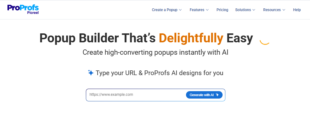
- Picreel also has an AI Popup Builder. Paste in a URL, and ProProfs AI generates a matching popup design automatically based on your site’s visual identity.
- Browse 100+ pre-built templates across categories like lead capture, discount offers, exit intent, and gamification.
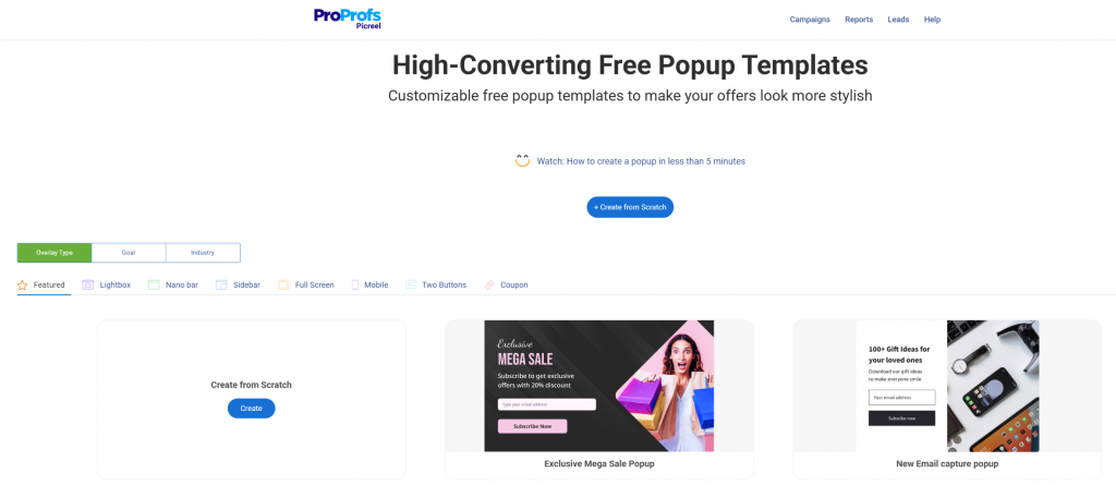
For most teams, templates are the fastest path to live. You can customize every element, including headline, body copy, form fields, CTA button, and colors, without writing a single line of code.
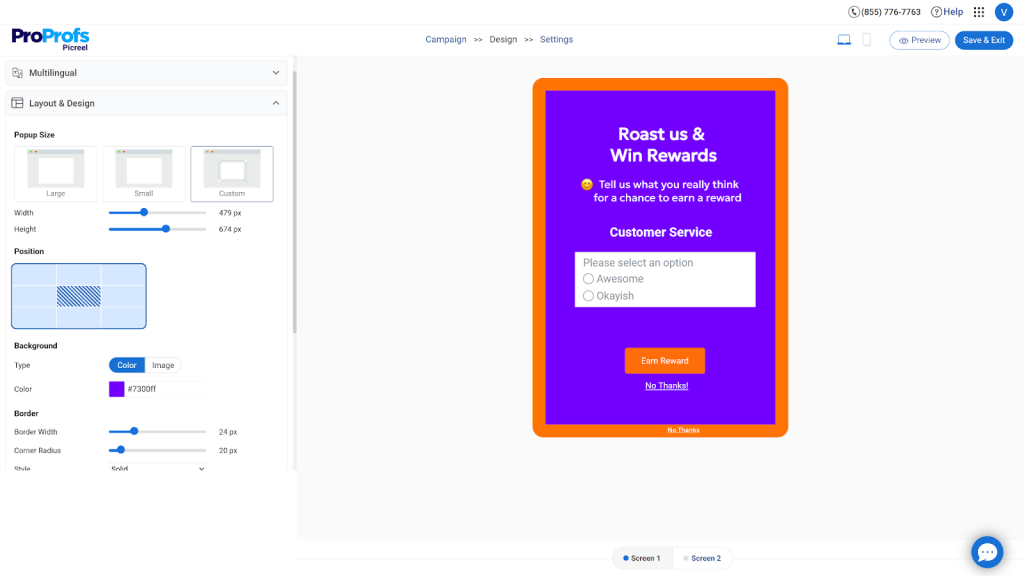
Step 3: Customize Your Overlay Popup Design
A well-designed overlay popup should grab attention without frustrating the user. It should feel intentional, not intrusive.
Your popup copy should answer three questions in under five seconds:
- What am I getting?
- Why should I want it?
- What do I have to do to get it?
Here is what I focus on at this stage:
- Background and contrast: Use a clean, light background so your message stands out clearly. Pair it with a high-contrast CTA button in your brand’s primary color. The goal is simple. When the overlay appears, the action should be obvious within a second.
- Form fields: Keep it minimal. Email alone works best in most cases. If you need more context, add one simple checkbox like “What are you interested in?” instead of adding multiple fields. Every extra step increases drop-offs.
- CTA copy: Avoid generic labels like “Submit” or “Sign up.” Be specific about the value. Phrases like “Get My Free Trial,” “Unlock the Offer,” or “Show Me the Demo” tend to convert better because they set clear expectations.
- Close button: Make it easy to dismiss. Place the close icon clearly in the top-right corner. An overlay that feels forced will hurt engagement instead of improving it.
- Mobile experience: Your overlay popup should not block the entire screen on mobile. Keep it compact and easy to close. If it disrupts content, users will leave and search engines may penalize the page.
- Animation: Keep transitions smooth and subtle. A soft fade-in works better than aggressive animations. The idea is to guide attention, not interrupt the experience.
Step 4: Configure Your Targeting and Triggers
This is where most teams leave money on the table. A beautiful popup shown to the wrong person at the wrong time still fails. But with Picreel you can relax because its exit intent technology doesn’t let that happen.
It is AI-driven which reads cursor velocity and scroll behavior patterns to fire at the precise moment abandonment is likely, not just when the cursor crosses a threshold. That’s what helps you improve your cart recovery.
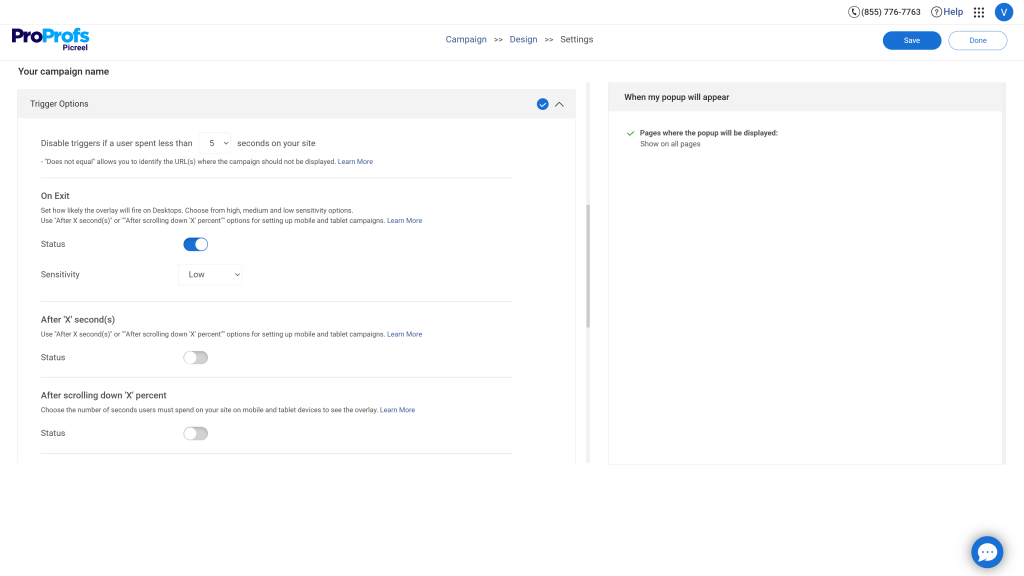
In Picreel’s settings panel, you can also configure:
- Smart Popup Triggers: Time on page, scroll depth, and click behavior. Match the trigger to the conversion moment. For instance, scroll depth for content upgrades and time on page for engagement offers.
- Advanced Targeting: Target by referral source, new vs returning visitor status, geolocation, or specific pages. A visitor landing from a Google ad should see something different from a visitor coming from a blog post.
- Scheduling: Set your popup to run only during a specific campaign window, like a weekend sale or a product launch.
- Frequency capping: Show each visitor the popup once per session. Do not show the same popup to someone who already dismissed it.
Step 5: Optimize for Mobile Separately
According to HubSpot’s Report in 2025, mobile accounts for over 41% of web traffic. Do not assume your desktop popup scales gracefully. In Picreel, you can choose mobile-optimized layouts or set campaigns to run across all devices with a responsive design.
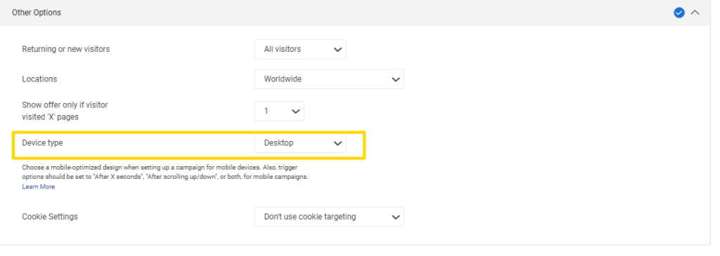
On mobile: use large tap-friendly buttons, keep copy under 20 words, run vertical layouts, and use one-click actions wherever possible. If your popup has a close button, make sure it is impossible to miss.
Step 6: Run A/B Tests Before Scaling
Do not launch once and forget. Picreel’s A/B Testing lets you test different offers, CTAs, trigger timings, and designs against each other. Start with one variable: test your headline first. Then test your CTA text. Then test your trigger timing.
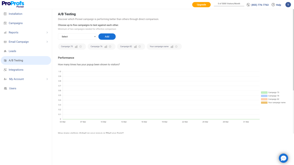
A small shift can make a disproportionate difference. Testing “Get My Discount” versus “Claim 15% Off” on the same popup for the same audience can produce a 20%+ lift in click-through rate.
Step 7: Track Your Results and Optimize
After your popup is live for a few days, open the Real-Time Analytics dashboard in Picreel. Review views, impressions, conversion rates, form submissions, and reward redemptions.
Look for patterns: which pages convert best, which triggers drive the most submissions, which times of day see the highest engagement.
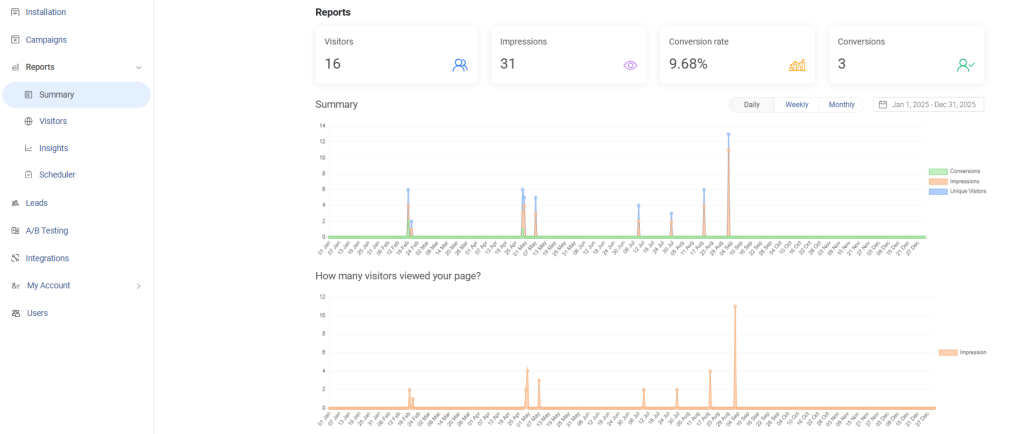
Optimization is not optional. It is what separates a 3% conversion rate from a 9% one.
You can set this up and launch your first website overlay popup in minutes using Picreel’s forever-free plan.
FREE. All Features. FOREVER!
Try our Forever FREE account with all premium features!
Start Converting the Traffic You Already Have
Website overlay popups work when they respect timing, context, and intent. The biggest takeaway is simple. Do not treat them as interruptions.
Treat them as well-timed nudges that guide visitors toward action. Keep your message clear, your design clean, and your targeting precise. Small changes like better timing or sharper copy can make a noticeable difference in conversions.
If you are getting traffic but not enough leads, getting inspired from the best website overlay examples is one of the fastest areas to improve. Tools like Picreel make it easier to test ideas, personalize experiences, and scale what works without adding complexity.
Your next step is straightforward. Pick one goal, launch a single popup, and start testing. The data will tell you what to improve next.
Frequently Asked Questions

What is a good conversion rate for overlay popups?
The industry average for popup conversion rates sits around 3.09%. Top-performing popups convert at 9.28% or higher. The difference typically comes down to offer relevance, trigger timing, and visual design. Exit-intent overlays with personalized offers consistently outperform generic welcome popups shown to all visitors.
How do overlay popups affect SEO?
Google penalizes popups that block the main content on mobile devices immediately upon page load. These are called intrusive interstitials. To stay in Google's good books, use time-delayed triggers, exit-intent triggers, or scroll-depth triggers rather than loading popups that fire the moment a visitor lands. Picreel's Smart Popup Triggers let you configure timing rules that keep your popups compliant.
When is the best time to show an overlay popup?
It depends on your goal. Exit intent works best for cart recovery and last-chance offers. Scroll-depth triggers (60-80% of page scrolled) work well for content upgrades and email captures on blog pages. Time-on-page triggers (20-30 seconds) work for welcome offers. The worst time to show a popup is immediately on page load, before the visitor has decided if they care about your brand.
How many form fields should my overlay popup have?
For lead generation, one field (email) consistently outperforms multi-field forms. Each additional field adds friction and reduces conversion rate. If you need more data like name or phone number, consider a two-step flow where you capture the email first, then ask for additional information in a follow-up sequence.
Can overlay popups be GDPR compliant?
Yes, and they should be. A GDPR-compliant overlay popup includes a clear consent checkbox, a link to your privacy policy, and transparent language about how subscriber data will be used. Picreel has built-in GDPR compliance options that can be added to any campaign without custom development.
What is exit intent detection and how does it work?
Exit intent detection tracks cursor movement on desktop. When the cursor moves toward the browser's close button, back button, or address bar at a certain velocity, the exit intent trigger fires and displays the popup. On mobile, exit intent is typically simulated using scroll-up behavior or inactivity detection. Picreel's Exit Intent Triggers use this technology to catch abandoning visitors in the final seconds before they leave.
How do overlay popups help reduce cart abandonment?
Exit-intent overlay popups intercept shoppers who are about to leave a cart page or checkout page. By presenting a relevant offer at that exact moment, such as a discount, free shipping, or a reminder of what is in the cart, you can recover a meaningful percentage of those visitors. The Baymard Institute reports that 70.19% of shoppers abandon their cart before purchasing, which means the recovery opportunity is significant.
Should I use the same overlay popup on every page?
No. Matching the popup message to the page context dramatically increases relevance and conversion rate. A visitor reading a blog post about skincare has different intent than a visitor who is on a product page or a checkout page. Use Picreel's Advanced Targeting to set page-level and behavior-level rules for each campaign.
How often should an overlay popup be shown to the same visitor?
Once per session is the standard best practice. Showing the same popup multiple times in one session is one of the fastest ways to frustrate visitors and increase bounce rate. Use frequency capping in Picreel's campaign settings to limit impressions per visitor per session and per day.
What makes a popup CTA button convert better?
Action-specific language outperforms generic labels. "Get My 15% Off" converts better than "Submit." "Unlock Free Chapters" converts better than "Sign Up." "Claim My Offer" converts better than "Click Here." The more specific and benefit-driven the CTA language, the more likely a visitor is to click. Always A/B test your CTA copy as a standalone variable.
How do I make overlay popups mobile-friendly?
Use vertical layouts, large tap-friendly CTA buttons, minimal copy (under 20 words for the headline), and a clearly visible close option. Test on actual mobile devices, not just a desktop browser simulation. In Picreel, you can design mobile-specific versions of your popups and set device-level display rules to avoid forcing a desktop layout onto a mobile screen.
What is A/B testing for overlay popups and what should I test first?
A/B testing means running two versions of a popup simultaneously to identify which one converts better. Start with your headline, since it is the first thing visitors read and has the highest impact on whether they stay or dismiss. Then test your CTA copy. Then test trigger timing. Change one variable at a time so you can isolate what is actually driving the difference.
Can overlay popups integrate with my email marketing tools?
Yes. Picreel integrates natively with Mailchimp, ActiveCampaign, Klaviyo, Marketo, Constant Contact, and AWeber, as well as CRMs like Salesforce, HubSpot, and Keap. New leads captured through your overlay popups can flow automatically into your email sequences or CRM without manual export or import.
How long does it take to see results from overlay popups?
Most popup campaigns generate visible results within 48-72 hours of launch, assuming you have sufficient site traffic. Picreel's Real-Time Analytics dashboard shows live data on impressions, conversion rates, and form submissions so you can monitor performance from day one. Picreel customers using optimized lead capture overlays have reported a 15-300% increase in inbound leads and conversions after launch.
FREE. All Features. FOREVER!
Try our Forever FREE account with all premium features!
 We'd love your feedback!
What did you like & how can we make it even better?
 Thanks for your feedback!
 Ask Your Question
Have a question? Get expert help to make your decision easier.