When I first started experimenting with popups, I assumed more meant better. I’d launch multiple variations across a site, expecting a flood of leads. Instead, I got high bounce rates, frustrated users, and few conversions. That was my crash course in how not to use popups.
Fast-forward around 8 years, speaking to 200+ founders, and a lot of testing later, and I’ve seen the kind of conversions a well-timed, well-crafted popup can be. Whether it’s nudging a first-time visitor toward a discount or capturing signups before exit, popups can quietly drive real growth when done right.
The truth is, the difference between a popup that converts and one that repels comes down to execution. I’ve learned that the best popups feel like an extension of the user experience, not a disruption.
In this post, I’m sharing 10 of the most common popup mistakes brands make with popups and, more importantly, how to avoid them.
Let’s get into it.
9 Common Website Popup Mistakes (+How to Fix)
We’ve all seen popups that make us want to exit a site immediately. If your visitors are doing the same with yours, you might be committing these mistakes. I have also listed the fixes for all the website popup mistakes, the best implementation methods, and real-world examples.
1. Triggering Popups Too Soon
When popups are triggered when someone lands on your site, they disrupt the natural flow and feel like an unsolicited interruption, especially on mobile devices. This frustrates users, hurts trust, and lowers your chances of engagement or conversion.
How to Fix This Mistake:
Instead of showing popups instantly, set them to appear when visitors scroll 50% through the page, stay idle for 15+ seconds, or move their cursor toward the browser bar (exit intent). These cues indicate higher engagement and intent.
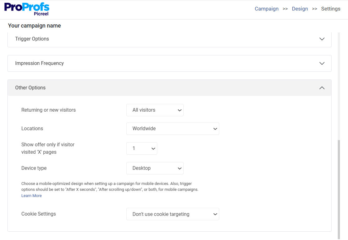
Find these trigger options in Picreel’s campaign settings:

Pro Tip: Run A/B tests to compare conversion rates between instant popups, scroll-based triggers, and exit-intent setups. Let the data guide you.
2. Showing Too Many Popups per Session
Displaying multiple popups within a single browsing session frustrates visitors. Why? Because popups constantly block the content while they are still exploring your products or reading the content. This disrupts their browsing flow and ultimately compels them to abandon the website.
How to Fix This Mistake:
Show only one popup per session by setting the display frequency to “once for the same visitor,” and trigger it after a user has spent at least 30 seconds on your site or scrolled halfway down the page. Most popup builders like Picreel let you adjust these settings with a click.
3. Using Irrelevant Offers
Popups with the same bland message to everyone, like “Subscribe now!” or “Check out our latest deal!” tend to fall flat. It’s obvious because when offers don’t match a visitor’s interests, behavior, or stage in the buying journey, visitors ignore or dismiss them immediately.
How to Fix This Mistake:
The best way to avoid irrelevant popups is by personalizing popup offers for each visitor.
Here are some suggestions on how you can do that:
- Trigger messages for maximum impact at the right moment, like exit intent or cart abandonment.
- Use dynamic site content like cart items or location to make popups feel personalized and relevant.
- Segment visitors by behavior to show tailored popups, like a loyalty bonus to returning customers and welcome discounts for new visitors.
- Show popup offers based on page type, like using lead magnets on blogs and discounts on product pages.
Pro Tip: Use targeted popups to guide visitors to the right offers and products so every deal feels made just for them.
Here’s a fantastic example of a relevant offer:
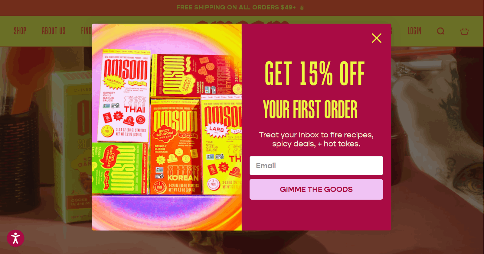
I like how Omsom displays this vibrant 15% off popup exclusively to new visitors after they’ve spent around 30 seconds on the site, just when interest starts to peak. It’s relevant because it rewards engaged first-time visitors with a first-order discount and recipes, perfectly catering to their interests. This not only encourages sign-ups but also boosts sales.
4. Poor Mobile Optimization
If your popups aren’t optimized for mobile, they can cover the entire screen, be hard to close, or load slowly, frustrating visitors. This will lead to losing valuable leads right at the top of the funnel.
How to Fix This Mistake:
Try using responsive mobile popup templates that auto-adjust to screen size and orientation with just one simple click.
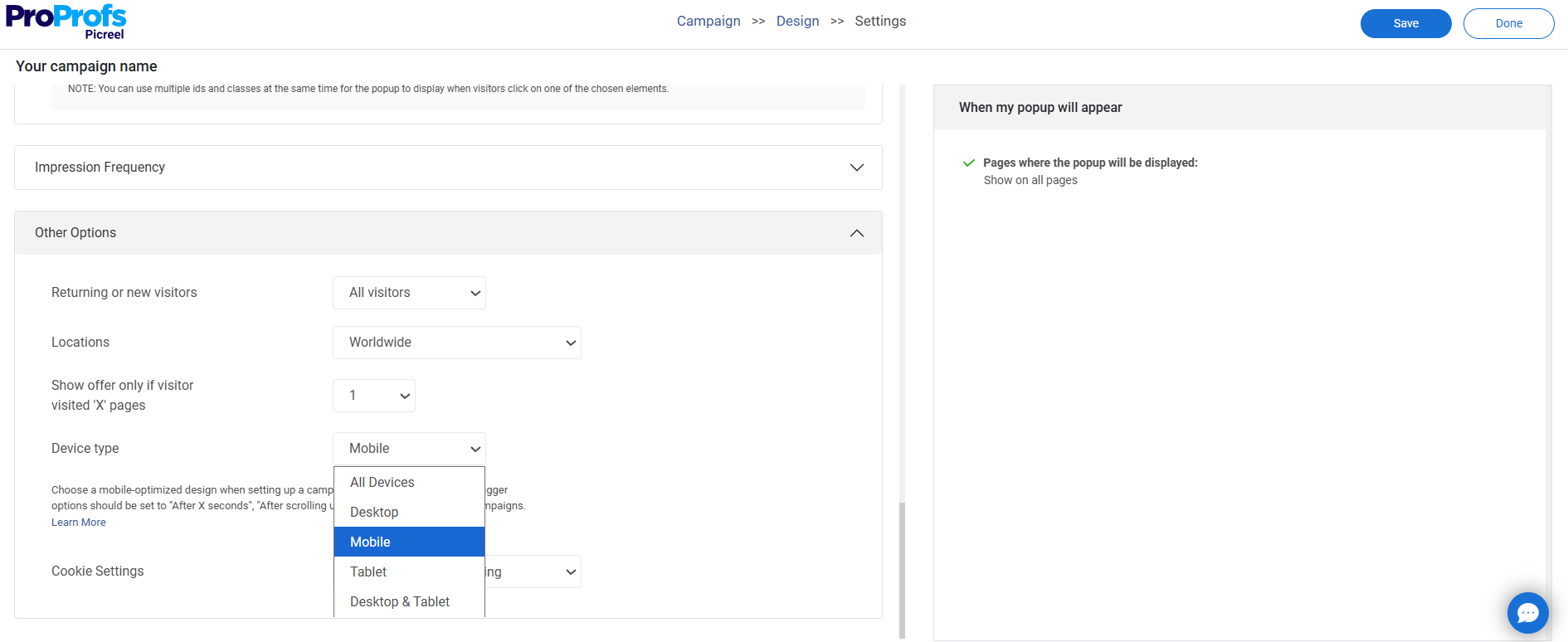
You must also consider these design and display best practices:
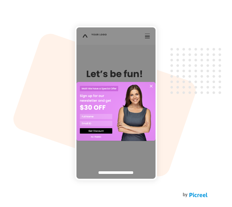
- Avoid full-screen overlays. Instead, use slide-ins or sticky bars for mobile devices so it doesn’t block any content.
- Make sure the close button is visible, tappable, and easy to find.
- Preview your popups across multiple devices and browsers before going live.
- Keep copy short and CTA buttons large enough for easy mobile tapping.
- Choose popup tools like Picreel that offer mobile-specific display settings and previews.
Here’s a good example of a mobile-optimized popup:
5. Difficult-to-Close Popups
Nothing frustrates users more than a popup that refuses to go away. Whether it’s a tiny, barely visible “X”, no close button at all, or a design that disables clicking outside to dismiss, this kind of intrusive experience feels like a trap. It not only interrupts browsing flow but also leads to higher bounce rates and erodes trust, especially when users feel forced into an action.
How to Fix This Mistake:
- Use a clearly visible and accessible close button on all popups.
- Allow users to dismiss popups by clicking outside the modal for a smoother experience.
- Preview your popups for user-friendliness on both desktop and mobile before going live.
- Give users an alternative way to dismiss the popup by including a clear “No Thanks” option.
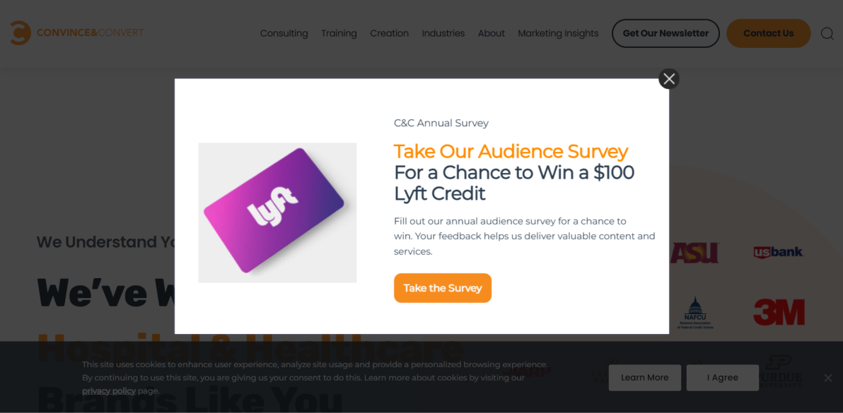
Here’s a superb example of Convince & Convert’s welcome popup with a clear close button. Visitors who are not interested in participating in the survey and winning $100 Lyft Credit can easily close the popup and move on to explore their services. This reduces bounce rates and maintains a good user experience.
6. Over-Collecting Information in Forms
Asking for too much information up front like a 10-field form for a simple discount can overwhelm visitors. Users today expect quick, low-effort interactions and may abandon forms that feel too demanding. This not only results in lost leads but also damages the overall user experience.
How to Fix This Mistake:
Leverage no-code popup builders to easily customize form fields without technical hassle. Start with a simple, low-commitment question on the first popup screen to ease users in, and gather additional details on the second screen.
If you’re using a single-step popup, limit it to just one or two essential fields like name and email. To further streamline the experience and reduce friction, offer quick signup options through Google or Facebook.
Here’s an outstanding example of how you can ask questions and collect email addresses while keeping your popup form simple.

When the visitor selects their skincare focus, they see an email field where they have to type their email address to get their discount code. This simple approach brings in more signups. If they had incorporated this field on the same page, the popup would have looked overwhelming, leading to more abandonments.

7. Lack of Audience Targeting or Segmentation
One-size-fits-all popups that ignore user behavior or context tend to feel intrusive and irrelevant. Without proper targeting, even the most visually appealing popup can disrupt the user experience and lead to poor conversions or site abandonment, especially when shown to the wrong visitor at the wrong time.
How to Fix This Mistake:
- Use behavioral triggers, such as showing a discount popup to visitors who view multiple products and triggering an exit-intent popup with a special offer for leaving users.
- Consider creating popups like sticky banners for mobile audience, and a detailed lightbox to desktop users.
- Tailor popups based on purchase history. For instance, first-time buyers see “Get 10% off your first order,” and returning customers see “Thanks for coming back! Here’s 15% off.”
- Connect your site with HubSpot to pull CRM data and trigger popups based on user attributes.
- Use geolocation to show location-specific popup messages like “Hey, New York shoppers! Free shipping for you today!”.
You can segment your audience based on all the above criteria using advanced targeting features that a smart popup builder like Picreel offers.
8. No A/B Testing or Performance Tracking
Many marketers launch popups without ever testing what works or tracking performance metrics, leaving potential conversions on the table. Without A/B testing or analytics, you can’t tell which headlines, offers, designs, or triggers resonate with your audience. This results in wasted impressions, lower engagement, and poor user experience across browsers and devices.
How to Fix This Mistake:
To fix this mistake, run A/B tests on different popup variations using your popup tool’s built-in A/B test feature, like the one Picreel offers. I recommend experimenting with headlines, CTAs, and designs to see what actually converts.
Then, analyze user behavior for each campaign to understand how visitors interact with your popups. You’ll know which one they ignore or sign up for the fastest, so you can refine your future popup designs and campaigns. Here’s a quick example of a simple A/B test I ran for my client:

Use your popup builder’s built-in popup analytics dashboard to monitor views, conversions, and bounce rates for each popup in real time. Check which popups are getting the highest number of impressions and leads. Take inspiration from them to tweak content, timing, or triggers and roll out high-converting campaigns faster.
Pro Tip: Track popup performance over time to spot peaks, dips, and behavior shifts, so you can fine-tune campaigns for lasting success.
9. Ignoring GDPR Compliance
Even though GDPR is a European regulation, many U.S.-based businesses still attract global visitors, including from the EU. Failing to comply with GDPR when collecting user data via popups (like emails or preferences) can lead to fines and damage your brand’s trustworthiness. It also signals a lack of transparency, which turns users away, especially today when data privacy is non-negotiable.
How to Fix This Mistake:
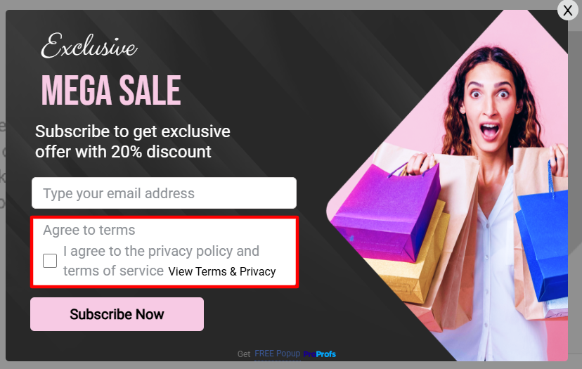
To fix this popup mistake, use GDPR-compliant popup templates that clearly present consent options and avoid pre-ticked checkboxes users should be able to opt in explicitly. Always include a visible link to your privacy policy within the popup to maintain transparency and build trust. Here’s what a GDPR-compliant popup looks like:
How to Create the Right Popup in Simple Steps
Now that we’ve discussed the most common popup mistakes and how to fix them, you might wonder how you actually implement all of this. Sure, it sounds great in theory, but building popups that work (without frustrating your visitors) can feel like a chore.
You’re not wrong on your part because outdated tools and clunky workflows can make one feel this. With Picreel, though, it’s refreshingly simple. You can design, target, and launch popups that look great, perform well, and plug right into your CRM with zero hassle.
Here’s a step-by-step guide on creating the right popup within 10 minutes:
Step 1: Create a New Campaign
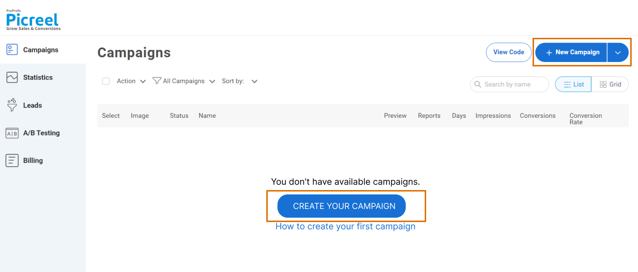
Once you’re inside the Picreel dashboard, click on “Campaigns” in the menu on the left side.
Step 2: Choose a Template or Build From Scratch
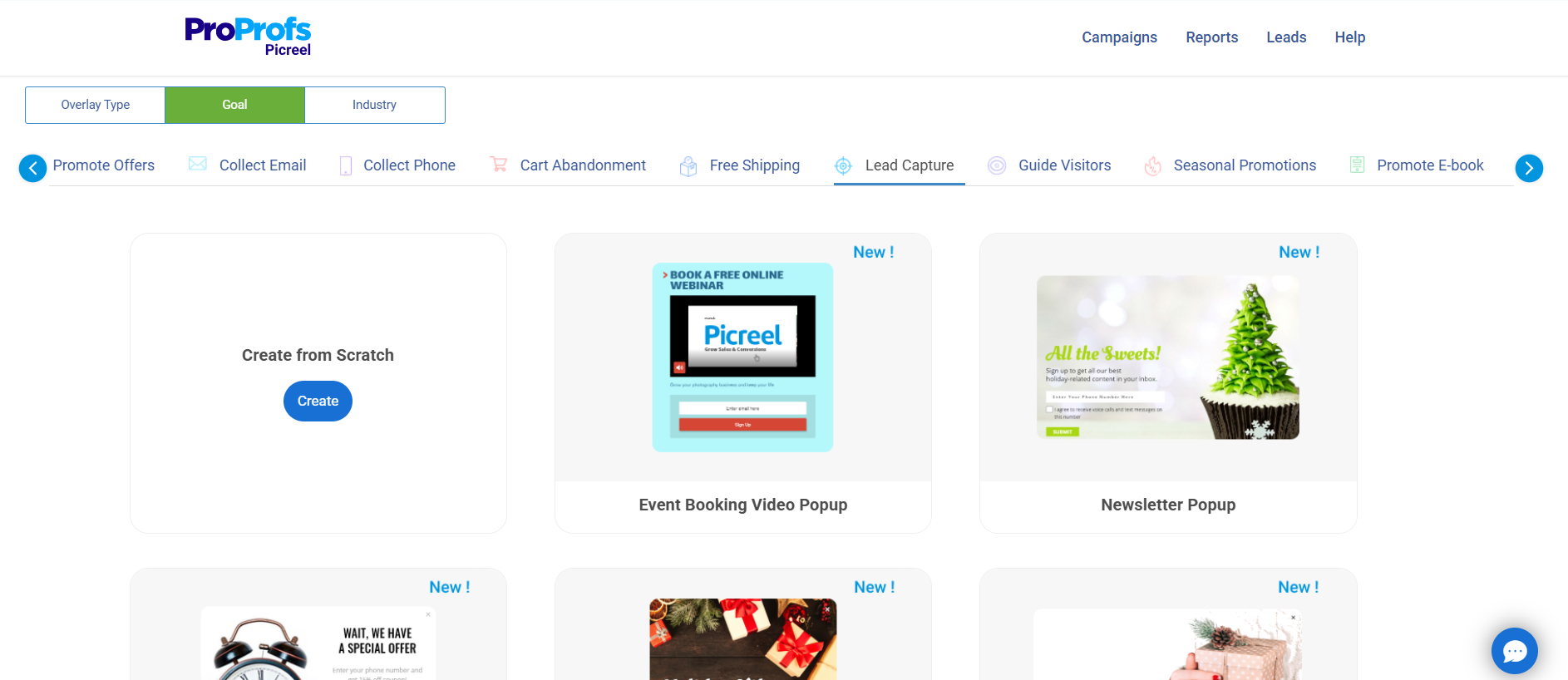
Next, click the small arrow next to “New Campaign” in the top right corner. Tap the goals option and select your desired one to find a massive variety of website popup ideas as templates.
Step 3: Customize the Selected Design
Tweak the layout, design, fonts, fields, and copy to match your brand.

Here’s a breakdown of creating an appealing popup design:
- Layout: Use a centered lightbox popup layout to keep attention on the signup offer.
- Design: Stick to clean, brand-aligned colors with high contrast for visibility.
- Fonts: Choose readable fonts like Open Sans, Roboto, or Lato for clarity.
- Fields: Limit to 2 fields – Name and Email – to reduce friction and improve completion rates.
- Copy: Write a short, benefit-driven headline (e.g., “Get 10% Off + Exclusive Content”) and a clear CTA like “Sign Me Up”. You can use this ChatGPT prompt to create a popup copy in seconds: “Write a persuasive popup copy to [achieve specific goal] for [target audience], offering [incentive or value], using a friendly and action-oriented tone.“
- Interactive Elements: From the elements section, add a countdown timer. Set a relevant date and time to create urgency and encourage quick action.
- Visuals: To boost engagement, use free high-quality images from Unsplash or videos from Pexels or Vimeo. You can also add engaging GIFs using Tenor or GIPHY.
Step 4: Set Targeting & Triggers
Go to the campaign settings section and set up targeting and trigger options to decide when and where you want to display your signup popup.
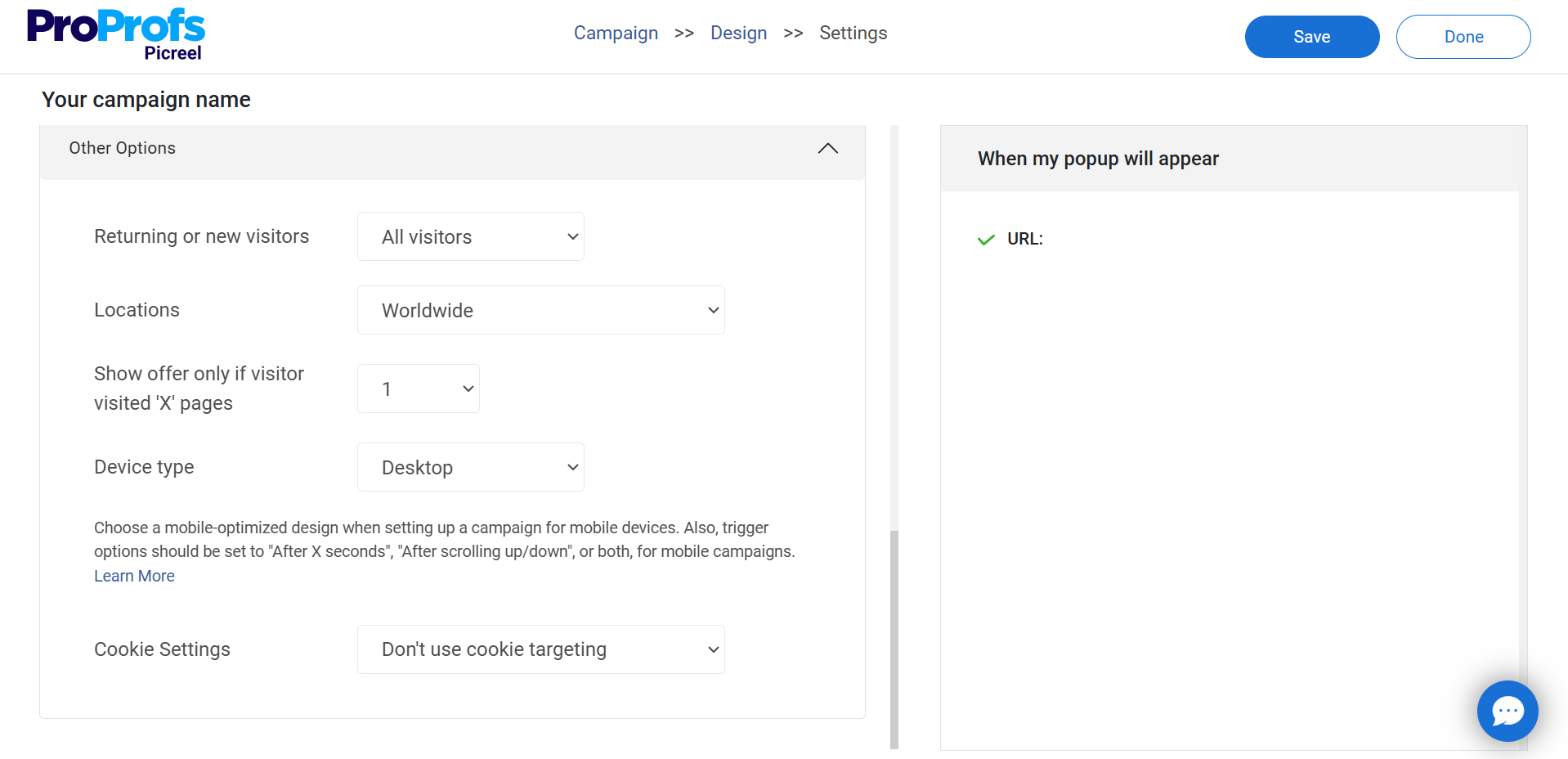
Based on my experience and research regarding website popups, here’s how you should target your visitors:
- Target by Audience: Set “Visitor Type” to New Visitors and enable Geo Location to target regions that bring you the most sales.
- Show by Behavior: In “Trigger Settings,” set popup to show at 40% scroll depth, after 10 seconds on page, or on exit intent to capture high-intent users.
- Optimize for Mobile: Enable “All Devices” to keep your signup popups responsive for the 63% of traffic on mobile.
Step 5: Preview, Save & Publish
Once you’re done creating your popup click “Save”, then head to the “Install Campaign” section to copy your JavaScript snippet. Paste it into your website’s HTML, and your popup will go live!

Step 6: Analyze & Optimize With Data
A few days after launching your signup popup, go to the “Reports & Analytics” section in the sidebar to monitor its performance and uncover insights for improvement.

Don’t overthink the numbers too much; rather, focus on improving these results by leveraging the built-in A/B testing feature to test and tweak CTAs, offers, or designs based on real-time insights.
For more clarity, watch this quick video to see the full process of creating a website popup from start to finish.
Fix These Website Popup Mistakes & Boost Conversions Today!
After finding all the solutions, now I hope you are feeling confident about fixing your website popup mistakes. When popups are timed right, easy to close, and actually helpful, people engage with them instead of instantly hitting that “X” button.
If your popups aren’t performing well, don’t stress! This blog has all the fixes you need, whether you need to tweak the timing, shorten forms, or make sure your popups work on mobile. A few small changes can turn popups from conversion killers to boosters.
And if you want an easy way to do all this without trial and error, Picreel has your back. With smart targeting, A/B testing, analytics, and exit-intent popups, you can create popups that work without annoying your visitors. Give it a try and start turning more visitors into customers!
Frequently Asked Questions
What is the best time to show a popup?
The best time to show a popup is when the visitor has had a chance to engage, typically after 5–10 seconds, 50% scroll, or on exit intent. Timing it around user behavior makes it feel helpful rather than disruptive.
FREE. All Features. FOREVER!
Try our Forever FREE account with all premium features!

 We'd love your feedback!
 Thanks for your feedback!


