Are you tired of low conversion rates on your website? Do you feel like your leads are slipping through your fingers?
Look no further than good popup designs – the ultimate conversion-boosting tool!
Yes, we know what you’re thinking. Popups can be annoying and intrusive, and no one likes to be bombarded with them while browsing.
But before you write off popups completely, hear us out. When used correctly, popups can be a powerful tool to engage with your website visitors, capture their attention, and ultimately increase your sales and leads.
But with so many popup options out there, how do you know which ones are the best popups for your website?
In this blog post, we’ll be exploring the best popup examples and their designs that can help you achieve your conversion goals. From exit-intent popups to countdown timers, we’ll be showcasing the most effective and engaging popups that have been tried and tested by leading marketers.
So, get ready to take your website’s conversion rate to the next level with these top popup designs!
The Role of Popup Design in Driving Conversion: Why It’s Essential for Success
Popups have been around for ages, and while they may have gotten a bad rap over the years for being intrusive, they’re actually an essential tool for driving conversions on your website.
That’s right – if you’re not utilizing popup design, you could be missing out on a major opportunity to increase your sales and leads.
Think about it – popups are a great way to capture your visitors’ attention and get them to take action. Whether it’s signing up for your newsletter, making a purchase, or downloading a free resource, popups are a powerful tool for nudging your visitors toward conversion.

Image Source: Tim Blog
But the key to success lies in the design of your popups.
A poorly designed popup can be a major turnoff for your visitors, causing them to bounce from your site altogether. On the other hand, a well-designed popup that’s eye-catching, relevant, and non-intrusive can make all the difference in the world.
That’s why it’s essential to invest in effective popup design if you want to drive conversions and succeed online. From the timing and placement of your popups to the copy and visuals, every aspect of your design should be carefully crafted with the goal of conversion in mind.
So, if you’re looking to boost your website’s success, don’t overlook the power of popup design. With the right popup examples and designs, you can capture your visitors’ attention, build trust, and ultimately drive conversions like never before.
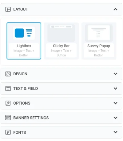
Optimize Your Popup Design for a Positive User Experience
Designing popups is one thing, and optimizing them for the best performance is another. You need to ensure that your popups are optimized in a way that they offer the best user experience.
Here are some ways to do that:
1. Make Sure Your Popups Blend Seamlessly With Your Website Design
Have you ever clicked on a popup only to be taken to a completely different-looking page that throws you off?
It’s a jarring experience that can leave a bad taste in your mouth and make you less likely to engage with the popup or even the website itself.
That’s why it’s so important to ensure that your popup forms blend seamlessly with your website design. Your popups should look like a natural extension of your website rather than a disjointed afterthought.
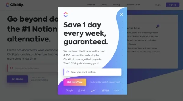
Image Source: Clickup
To do that, first, consider the color scheme and fonts of your website, and use them in your popup design. This creates a sense of continuity and familiarity that helps your visitors feel more comfortable and at ease.
Next, make sure your popup placement and sizing are consistent with your website design. If your website has a lot of white space, for example, your popups should be similarly spacious and not overwhelm the page.
Also, be mindful of the tone and messaging of your popups. Make sure they align with the voice and values of your brand and avoid using language or imagery that could be off-putting or confusing to your visitors.
2. Make Your CTA Stands out and Convert More Customers
When it comes to converting customers on your website, the call-to-action (CTA) is one of the most important elements.
But here’s the thing – if your CTA doesn’t stand out, your visitors might not even notice it, let alone click on it. That’s why it’s crucial to design your CTA in a way that catches your visitors’ attention and compels them to take action.

You can start by considering the color and placement of your CTA. Your CTA should be a contrasting color to the rest of your website, making it easily noticeable. Additionally, it should be placed prominently on your page, preferably above the fold.
Then, make sure your CTA copy is clear, concise, and action-oriented. Use language that conveys a sense of urgency and emphasizes the value of taking action. For example, instead of “Submit,” use “Get Your Free eBook Now!” to give visitors a clear idea of what they’ll get when they click the button.
3. Exploring the Power of Formatting
Did you know that formatting can have a powerful impact on the user experience of your website?
It’s true! By using effective formatting techniques, you can make your content easier to read, more engaging, and, ultimately, more effective at achieving your goals.
Let’s explore a few:
- Use headers and subheaders: Breaking up your content into sections with clear headers and subheaders can make it much easier for your visitors to scan and find what they’re looking for.
- Utilize bullet points and lists: Bullet points and lists are a great way to present information in a clear and concise way. They make it easy for your visitors to digest information quickly and can even help improve your retention rates.
- Incorporate images and visuals: Visual elements like images, videos, and infographics can make your content more engaging and memorable.
Read More - Top 20 Personalization Software for Customer Retention in 2026
4. Microcopy Can Help Ease Customer Concerns and Build Trust
Microcopy refers to the small bits of text that appear throughout a website or app, providing guidance, clarification, and feedback to users. These little snippets of text can be incredibly powerful in easing customer concerns and building trust.
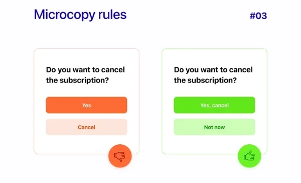
Image Source: Dribbble
So, how can you use microcopy to improve the user experience on your website or app? Here are a few examples:
- Use friendly and reassuring language: When customers are feeling unsure, use microcopy to let your customers know that they’re in good hands and that you’re here to help them every step of the way.
- Provide clear instructions and feedback: Microcopy can be used to provide clear instructions and feedback, letting customers know when they’ve completed a task successfully or if they need to try again.
- Address common concerns and questions: Are there certain concerns or questions that come up frequently? Microcopy can address these concerns directly, providing clear and concise answers that can help put customers’ minds at ease.
5. Customizing Your Approach: The Benefits of Personalization
Personalization refers to the practice of tailoring messages, offers, and experiences to the specific needs and preferences of individual customers. By customizing your approach, you can create a more engaging and effective user experience that resonates with your customers on a deeper level.
So, what are some benefits of personalization for a better user experience?
- Increased engagement: Personalization can help increase click-through rates, conversion rates, and other key engagement metrics.
- Improved customer satisfaction: When customers feel like you understand their needs and preferences, they’re more likely to be satisfied with their overall experience.
- Higher conversion rates: Personalization can help you move more customers down the funnel and ultimately drive more revenue.
- Better data and insights: Data can be incredibly valuable in helping you optimize your user experience over time and create even more effective personalization strategies.
10 Popup Form Examples That Boost Conversions
There are tons of popup designs that brands all over the world use to boost conversions. Let’s take a look at some of the best popup form examples:
1. Picreel
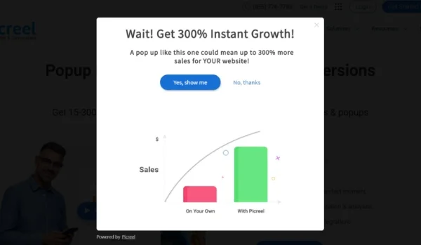
Picreel presents one of the most excellent exit popup ideas that encourages visitors to take action. It provides customers with a free trial to help them become familiar with the tool before making a commitment, providing them with value. On top of that, the popup begins with a straightforward question about boosting business growth and backs up its claims with attractive numerical data that emphasize the potential to enhance inbound leads and conversions.
2. California Olive Ranch
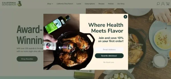
California Olive Ranch’s newsletter popup is a simple and effective way to encourage website visitors to sign up for their email list. The popup appears after a few seconds of browsing and offers a 10% discount on the customer’s first order in exchange for their email address. The design is clean and eye-catching, with beautiful popup images of olive oil and cooked food in the background. The copy is concise and compelling, making it easy for customers to understand the value of signing up.
3. Scarpetta Pasta
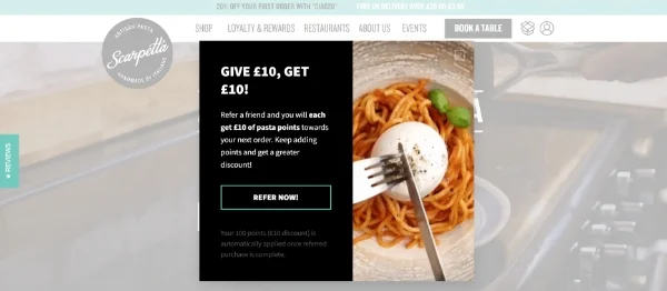
Scarpetta pasta’s referral popup is a clever way to incentivize existing customers to refer their friends to the brand. The popup appears on the checkout page, offering a £10 discount on the customer’s order in exchange for referring a friend. The design is simple and attractive, with a dark background accompanied by contrasting popup images and a friendly message encouraging customers to share their love.
4. Perk Clothes
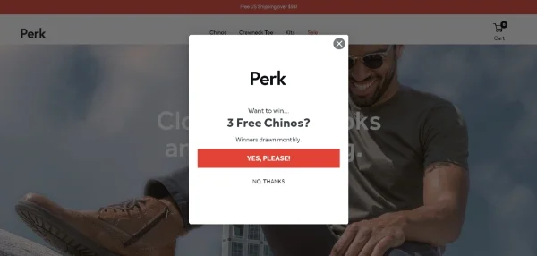
Perk’s slide-in incentive popup slides in from the side of the screen after a few seconds of browsing, offering a 50% discount to customers for testing their beta products. This is one of the most effective popup ideas as the design is eye-catching, with a colorful background and a clear call-to-action button. The smart popup view is concise and persuasive, highlighting the value of the discount and making it easy for customers to take advantage of the offer.
5. Silverlake Wine
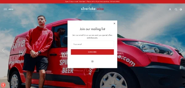
Silverlake Wine’s email list popup is one of the best popup ads examples to build a loyal customer base and keep customers informed about new products and events. The popup appears after a few seconds of browsing, offering special offers and discounts to customers in exchange for signing up for the email list. The design is clean, simple, and minimal, with a clear call-to-action button and a message highlighting the value of being on the email list.
6. Who Gives a Crap
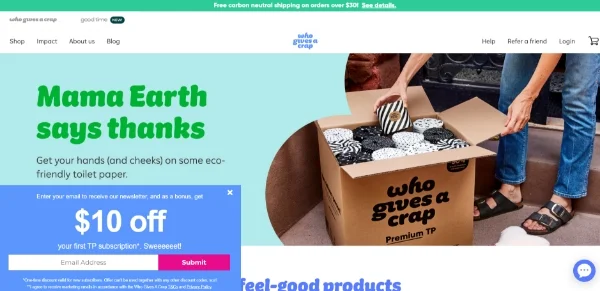
The discount popup from Who Gives a Crap is a smart way of motivating customers to buy their products. The smart popup view provides a $10 discount on the customer’s purchase in return for subscribing to the email list. The popup window design is visually appealing, featuring a colorful backdrop and a clear website popup message that urges customers to avail of the offer. The text is compelling, emphasizing the discount’s worth, thereby making it a powerful instrument for increasing conversions and enhancing sales.
7. Nike
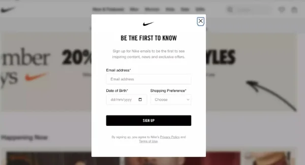
Do you want to gather additional information from your website visitors apart from their email addresses? Adding more fields to your popup form might discourage visitors from filling it out. Nevertheless, you can overcome this obstacle by prioritizing user experience when creating your website popup design. Nike presents one of those popup ads examples that serves as an excellent illustration of how to achieve this goal successfully.
8. MeUndies
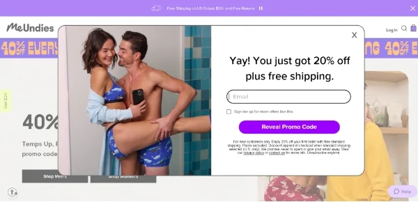
MeUndies’ countdown timer popup is a clever way to create a sense of urgency and encourage customers to make a purchase. The popup features a timer counting down to the end of a limited-time sale with 15% off. This popup window design is simple and attractive, with a clear call-to-action button and a bold website popup message encouraging customers to act fast.
9. Uniqlo
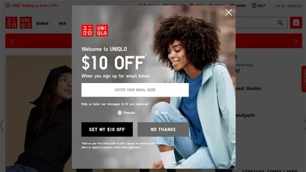
Uniqlo’s welcome popup is a great way to encourage first-time customers to make a purchase. The popup appears when a new visitor lands on the site, offering a $10 discount on their first order in exchange for signing up for the email list. The call-to-action button further strengthens this website popup message by presenting a compelling CTA that says, “Get My $10 Off“.
10. Turkish Souq
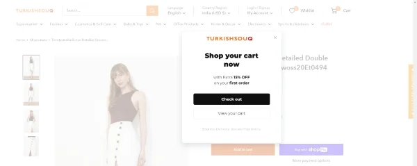
Turkish Souq’s exit intent popup is a smart way to capture the attention of website visitors who are about to leave the site. The popup appears when the visitor’s mouse moves towards the back button, offering a 10% discount on their order in exchange for staying on the site. The promotion will appear as a popup only when a customer adds a product to their cart and begins to leave the website without completing the purchase.
Revamp Your Popups: Implement These Popup Window Designs for Boosting Sales
It is evident that popup designs can have a tremendous impact on driving conversions, boosting sales, and collecting leads. The best website popups are those that are designed with the user in mind and provide genuine value to them.
It’s worth noting that popups must be used judiciously and appropriately. An excessive amount of popups or poorly designed ones can lead to a negative user experience and harm your brand’s reputation.
So, if you’re looking to boost sales and leads on your website, consider incorporating these website popup designs into your marketing strategy.
Also, with tools like Picreel, businesses can create popups that target specific audiences, such as first-time visitors, returning customers, or cart abandoners. This allows for a personalized approach to marketing, which can greatly improve the user experience and increase the chances of a successful conversion.
FREE. All Features. FOREVER!
Try our Forever FREE account with all premium features!
 We'd love your feedback!
What did you like & how can we make it even better?
 Thanks for your feedback!
 Ask Your Question
Have a question? Get expert help to make your decision easier.