
Most marketing managers don’t have a traffic problem. They have a conversion problem. Visitors land on the website, browse pages, read content, and even click through campaigns, yet many leave without taking the next step.
Every one of those exits is a missed opportunity to start a relationship with a potential customer. According to the HubSpot State of Marketing Report 2026, 40% of marketers say lead quality and marketing qualified leads (MQLs) are their most important success metric.
That makes converting the right visitors just as important as attracting them. The good news is that you don’t need a website redesign or a larger ad budget. You need a smarter lead capture strategy that delivers the right offer at the right moment with minimal friction.
In this guide, I’ll show you the methods, strategies, and best practices that consistently turn more visitors into qualified leads.
What Is Lead Capture?
Lead capture sits at the heart of every demand generation system. Without it, your traffic stays anonymous, and your marketing investment stops at the click.
Why it matters for your growth:
- Converts anonymous website visitors into identifiable contacts you can market to
- Lets you build a list of people who have already shown interest in your offer
- Gives your sales team qualified leads to work with instead of cold prospects
- Improves the ROI on every traffic source you’re already paying for
- Creates a feedback loop that tells you what offers and messaging your audience responds to
What Are the Best Lead Capture Methods?
I’ve tested most of these methods across multiple campaigns, and what I can tell you is that the method itself rarely fails. What fails is deploying it on the wrong page, at the wrong moment, with the wrong offer. Here’s what each one does, where I’d use it, and exactly how to get it working.
1. Popups and Overlays
Popups are triggered overlays that appear based on visitor behavior, time on page, scroll depth, or exit intent. In my experience, they’re one of the highest-converting lead capture popup formats when timed and targeted correctly.
The key is behavioral targeting. A generic popup that fires on load performs poorly. A popup triggered when a visitor is about to leave a pricing page, or when they’ve scrolled 70% through a blog post, performs significantly better because it’s contextually relevant.
Best for: Email list growth, discount offers, content downloads, demo requests, cart recovery.
How I set it up:
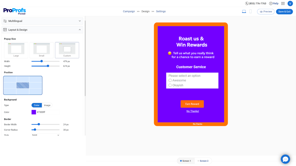
- Add Picreel to your site by pasting a single script tag or installing via Google Tag Manager, no developer needed
- Tell AI your popup requirements, answer a few prompts, and sit back to get an on-brand popup ready in minutes.
You can try it here:
- Set your trigger: scroll depth (e.g., 60%), time on page (e.g., 30 seconds), or specific URL pattern (e.g., only on /pricing)
- Add your offer headline, form fields, and CTA button copy
- Under targeting, restrict the campaign by UTM source, visitor location, device type, or returning vs. new visitor as needed
- Connect to your email platform or CRM using a native integration or Zapier so every submission goes directly into your nurture flow
- Launch the campaign and check the conversion dashboard after 200 impressions before making changes
One thing I always get right from the start: set a cookie duration so a dismissed popup doesn’t reappear on every page visit. Seven to fourteen days is a reasonable interval for most campaigns.
2. Embedded Forms
Embedded forms sit directly within the page content, usually within a blog post, on a landing page, or in a sidebar. They’re passive and non-intrusive, which makes them a good fit for visitors who are already engaged and reading rather than just scanning.
Best for: Content upgrades, newsletter signups, mid-article lead magnets, contact pages.
Where they underperform: On high-bounce pages or pages where visitors are scanning rather than reading. Passive forms require the visitor to notice them, which doesn’t happen if they’re in a rush.
How I set it up:
- Place the form where it naturally fits within the content, not just in the footer.
- Keep the form short with only two or three essential fields.
- Write CTA copy that clearly states what visitors will receive.
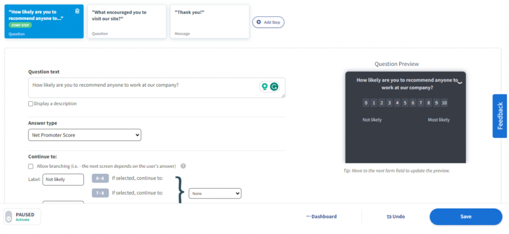
- Use an in-page survey to collect feedback and segment leads simultaneously.
- Track scroll depth and adjust the form’s position based on visitor behavior.
3. Landing Pages
A lead-capture landing page is a standalone page designed to convert a specific type of visitor for a specific offer. No navigation links, no distractions, just a headline, a value proposition, a form, and a CTA.
Landing pages consistently outperform regular website pages for paid traffic because they eliminate every exit option that isn’t the form submission.
Best for: Paid ad campaigns, webinar registrations, free trial signups, downloadable offers.
When I build a landing page, I focus on a few principles that consistently improve conversions:
- Match the headline word-for-word to the ad or email that brought the visitor there. Message mismatch is one of the biggest reasons landing pages underperform.
- Write a sub-headline that explains the specific outcome the visitor will get, not just what the offer is called.
- Position the form above the fold on desktop so visitors don’t have to scroll to find it.
- Add three to five trust signals near the form, such as review counts, customer logos, security badges, or short testimonials.
- Remove all navigation links from the header and footer. The only clickable elements should be the CTA button and any required legal links.
- Write CTA button copy in the first person and tie it to the outcome, such as “Get My Free Audit” instead of “Submit.”
- Optimize the mobile experience with vertically stacked elements, a single-column form, and a full-width CTA button that’s easy to tap.
Anatomy of a high-converting lead capture landing page:
| Element | What to Do |
| Headline | Match the source ad or email exactly |
| Sub-headline | State the specific outcome, not the offer name |
| Form position | Above the fold on desktop |
| Field count | 2-3 for content offers, 4-5 for demos |
| Trust signals | Reviews, logos, or a single strong testimonial |
| CTA copy | First person, benefit-oriented |
| Mobile layout | Single column, full-width CTA button |
| Exit options | Remove all navigation links |
4. Exit Intent Popups
Exit intent popups detect when a visitor’s mouse moves toward the browser’s close button or address bar and trigger an offer before they leave. They’re one of the few lead capture methods that target visitors at peak abandonment risk, which is exactly when a well-timed offer has the highest impact.
Well-designed exit-intent pop-ups can recover 10-15% of visitors who would otherwise leave without converting. For high-traffic pages, that’s a significant number.
Best for: Cart abandonment recovery, gated content offers on blog pages, free consultation offers on service pages, discount codes on product pages.
How I set it up:
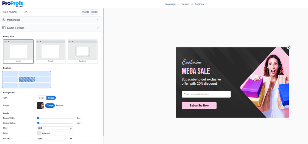
- Create an exit-intent campaign and choose the pages where it should appear.
- Prioritize high-intent pages such as pricing, product, and cart pages.
- Tailor the offer to match why visitors are leaving that specific page.
- Keep the form to one or two fields to minimize friction.
- Display the popup only once per session and suppress it for repeat viewers.
- Pair cart exit popups with an easy-to-redeem discount or free shipping offer..
5. Quizzes and Interactive Forms
Quizzes ask visitors a series of questions and deliver a personalized result in exchange for an email address. They work because the visitor is invested in the outcome by the time they reach the email gate. They’ve answered several questions, and they want to see the result.
That investment dramatically increases form completion rates compared to a static download offer.
Best for: SaaS onboarding flows, ecommerce product recommendation, B2B qualification, coaching, and service businesses.
When I create a lead generation quiz, I follow a simple structure that keeps visitors engaged and helps me collect more qualified leads:
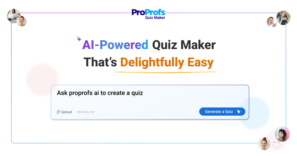
- Use ProProfs Quiz Maker to build the quiz. It supports scored quizzes, personality quizzes, and assessment formats, all of which work well for lead capture.
- Map out four to six questions that guide visitors toward a meaningful result. For a B2B audience, this could start with “What’s your biggest marketing challenge?” and gradually narrow down their needs.
- Place the email gate right before the results page, not at the beginning. Visitors who complete the quiz are much more likely to share their email to view their results.
- Write email gate copy that builds anticipation, such as “Your results are ready. Enter your email to see your personalized recommendation.”
- Use the quiz results to automatically segment leads. For example, someone identified as early-stage can enter a different nurture sequence than someone who’s ready to buy.
- Embed the quiz on a landing page or blog post, or share it as a standalone URL in paid social campaigns.
6. Chatbots and Conversational Forms
I’ve found conversational capture replaces a static form with a back-and-forth message flow that feels far more natural to the visitor. Instead of presenting five fields at once, you ask one question at a time.
Completion rates for longer qualification sequences tend to be higher because each question appears only after the previous one is answered, which makes a six-question flow feel like a quick conversation rather than an interrogation.
Best for: Demo request flows, consultation booking, multi-step qualification, customer support lead capture.
Instead of treating chat as just another support channel, I design it to guide visitors naturally toward becoming qualified leads. Here’s the approach I follow:
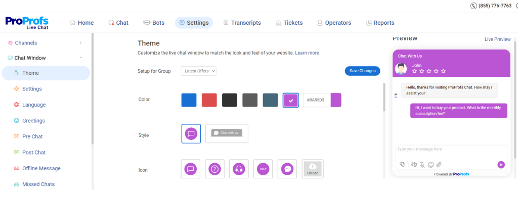
- Start with ProProfs Chat to add a live chat or chatbot widget. The no-code bot builder makes it easy to create guided conversation flows.
- Plan the conversation journey first. Define the opening question, possible follow-up paths, and where the conversation should end, whether that’s a live agent, meeting booking, or form submission.
- Tailor the first message to the page. For example, a pricing page might ask, “Have a question about pricing? I can help,” instead of using a generic greeting.
- Ask for an email after building engagement. Collect contact details only after one or two qualifying questions, when visitors are more invested in the conversation.
- Sync every conversation with your CRM so new contacts and chat transcripts are automatically saved for your sales team.
- Offer the right next step based on availability. During business hours, route high-intent visitors to a live sales representative. Outside business hours, direct them to a meeting booking page.
7. Banners and Sticky Bars
Sticky or Hello bars are one of the most underused formats I see. They sit at the top or bottom of the page, stay visible as the visitor scrolls, and don’t interrupt anything.
Because they’re always present, they work particularly well for time-sensitive offers or site-wide promotions where I want every visitor to see the message without disrupting their browsing.
Best for: Site-wide offers like free shipping thresholds, limited-time discounts, newsletter signups, webinar registrations, and new feature announcements.
For simple, site-wide promotions, I prefer a sticky bar because it stays visible without interrupting the browsing experience. Here’s how I configure it:
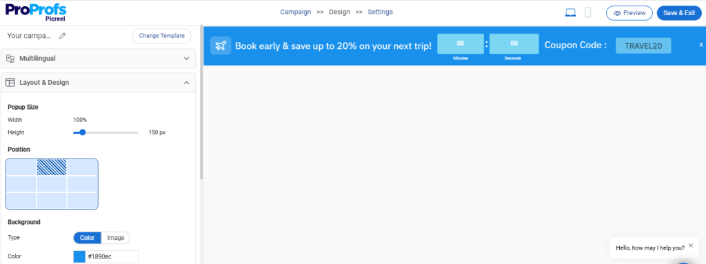
- Choose the “Bar” or “Sticky Bar” campaign type or simply tell your requirements to AI, and it will create a persistent announcement across the site.
- Keep the message short and action-oriented. A single line like “Get 20% off your first month. Offer ends Friday. [Claim It]” is easy to scan and encourages clicks.
- Limit the action to one click or one field. Use a CTA button or an inline email field instead of a longer form to reduce friction.
- Control where the bar appears. Display it across the entire website or target specific URL patterns when the offer is page-specific.
- Make the bar stand out without overwhelming the design. Adjust colors, fonts, and sizing in Picreel so it catches attention while staying on-brand.
- Schedule the campaign to end automatically by setting an expiry date for time-sensitive promotions, eliminating the need for manual updates.
7 Lead Capture Strategies That Actually Increase Conversions
Knowing the methods is only the start. How you deploy them determines whether they generate leads or create friction. These are the strategies I see working consistently across B2B and B2C campaigns.
1. Use the Breadcrumb Technique for Multi-Step Forms
Single-page forms with five or more fields intimidate visitors before they even start. Multi-step forms solve this by showing only one or two questions at a time, starting with the least threatening ones.
The logic is simple. Once someone clicks “Next” on the first step, they’ve committed. The psychological cost of abandoning increases with each completed step. By the time you ask for name and phone number, they’re three steps in and unlikely to quit.
How to implement it:
- Step 1: Ask the easiest question relevant to the offer (“What’s your primary goal?”)
- Step 2: Ask a qualifying question (“How many employees does your company have?”)
- Step 3: Ask for contact information (name and email)
- Optional Step 4: Ask for phone number only if needed
Multi-step forms can convert 86% higher than single-step forms for comparable offers. Lead quality also improves because the steps filter out casual visitors who won’t engage beyond the first click.
2. Match Trigger Timing to Visitor Behavior
The single biggest conversion killer I see in popup campaigns is timing. Firing a popup the moment someone lands on a page before they’ve read a single line is the fastest way to get it dismissed.
You can target the audience precisely with a click using Picreel:
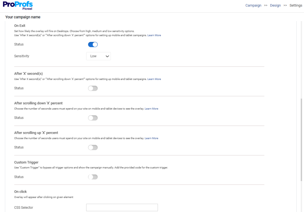
Timing framework by page type:
| Page Type | Recommended Trigger | Why |
| Blog Post | 60-70% scroll depth or 45 seconds on page | Visitor has consumed the content and has context |
| Pricing Page | Exit intent | Visitor is leaving without converting, highest intent signal |
| Product Page | 30 seconds on page OR exit intent | Visitor is evaluating, either reinforce or recover |
| Homepage | 20 seconds on page | Visitor is exploring, a low-friction offer works best |
| Cart Page | Exit intent only | Interrupting mid-checkout before exit damages completion |
3. Deliver Value Before You Ask for Anything
The biggest shift in modern lead capture is the move from “give us your email, and we’ll give you this resource” to “here’s something genuinely useful, and if you want more of this, here’s where to start.”
Formats that convert because of genuine value:
- ROI calculators or cost estimators (deliver a specific number, not generic advice)
- Quizzes with personalized results (not just “thanks for taking our quiz”)
- Assessments that diagnose a specific problem and recommend a specific fix
- Templates and checklists that are immediately usable, not conceptual
The key difference between a lead magnet that converts and one that doesn’t is specificity. “10 Marketing Tips” doesn’t convert. “Conversion Rate Calculator: See exactly how many leads you’re leaving on the table” does.
4. Qualify Leads While You Capture Them
Capturing more leads is only valuable if your sales team can do something with them. One of the patterns I see across community discussions is marketing teams generating high volumes of leads that sales write off as unqualified, which creates friction and wastes budget on both sides.
How to qualify for capture:
- Add a company size selector to your form and set minimum thresholds for sales routing
- Include a “biggest challenge” dropdown that helps segment leads into nurture tracks automatically
- Use conditional logic so your form shows different follow-up questions based on initial answers
- Ask a budget or timeline question for high-intent pages like pricing or demo request forms
This reduces the volume on paper but increases the close rate on every lead you do capture.
5. Target by URL, UTM, and Visitor Segment
A visitor reading your pricing page has a completely different intent than someone reading a top-of-funnel blog post. Showing them the same popup offer is a missed opportunity.
Picreel’s targeting lets you configure campaigns by URL, UTM source and medium, visitor location, device type, and behavioral signals. That means your paid traffic from Google Ads sees a different offer than your organic blog visitors. Your returning visitors see something different from first-time sessions.
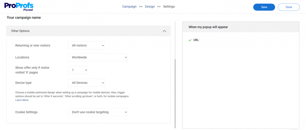
Segmentation scenarios that improve conversion:
- UTM source = “google” and page = “/pricing”: Show a demo offer with an urgency CTA
- First-time visitor on a blog post: Show a content upgrade offer related to the post topic
- Returning visitor who hasn’t converted: Show a different angle on the offer they’ve already dismissed
- Mobile visitor on a product page: Show a simplified two-field form instead of a five-field desktop version
6. Reduce Form Friction Everywhere It Exists
Form abandonment is a real problem, and most of it is avoidable. Visitors don’t abandon forms because they changed their minds. They abandon because the form asked for too much, loaded slowly, wasn’t mobile-friendly, or felt irrelevant.
Friction reduction checklist:
- Limit required fields to what you actually need right now (you can ask for more later)
- Use inline validation so errors appear as they type, not after they submit
- Autofill where possible using browser data
- Make your CTA button copy specific (“Get My Free Audit” converts better than “Submit”)
- On mobile, use large tap targets and a single-column layout with appropriately sized input fields
- Include a short trust statement near the submit button (“No spam. Unsubscribe anytime.”)
- Remove navigation links from high-intent landing pages so there’s only one thing to do
7. Personalize Based on Traffic Source and Behavior
Generic campaigns underperform personalized ones, not because the offer is worse, but because the message doesn’t feel relevant. Personalization at the lead capture level doesn’t require complex technology. It requires using the signals you already have.
Practical personalization moves:
- Match your popup headline to the page topic or the ad that brought the visitor there
- Reference the visitor’s traffic source in the offer copy (“Since you came from [partner site], here’s an exclusive offer”)
- Show different offers to mobile vs. desktop visitors based on what converts for each
- Suppress popups for visitors who have already converted, so they don’t see offers for things they already have
Lead Capture Form Design (What to Include and What to Drop)
The form itself is where leads are won or lost. Here’s a practical breakdown of form design decisions that affect conversion.
1. How Many Fields Should You Ask For?
The right number depends on what you’re offering and where the visitor is in the funnel.
Field count by offer type:
| Offer Type | Recommended Fields | Rationale |
| Newsletter signup | Email only | Lowest friction, highest volume |
| Content download | Name + Email | Minimum viable contact for nurturing |
| Free trial | Name + Email + Company | Needed for onboarding |
| Demo request | Name + Email + Company + Phone + Role | High intent, justifies a longer form |
| Consultation | Name + Email + Phone + Specific question | Personalization improves conversion |
2. What CTA Copy Actually Works
The biggest CTA mistake is using passive, generic copy. “Submit” and “Sign Up” tell the visitor nothing about what happens next.
CTA copy patterns that convert:
- Benefit-focused: “Get My Free Audit”, “Show Me My Results”, “Send Me the Template”
- Urgency-anchored: “Claim My Spot”, “Get Instant Access”
- First person: “Start My Free Trial” outperforms “Start Your Free Trial” in most A/B tests
- Specificity: “Download the 2026 Conversion Checklist” outperforms “Download Now”
3. Privacy, Trust Signals, and Compliance
A lead capture form without trust signals loses conversions it should be winning, especially in B2B, where buyers are skeptical by default.
Trust elements to include:
- A short privacy statement below the form (“We never share your data. Unsubscribe anytime.”)
- Social proof near the form (“Joined by 12,000+ marketers”)
- Security badge if you’re collecting sensitive information
- A clear explanation of what they’ll receive and when
- GDPR-compliant consent checkbox if you’re targeting EU visitors
FREE. All Features. FOREVER!
Try our Forever FREE account with all premium features!
Lead Magnets That Still Work
The era of the generic ebook as a lead magnet is over. Visitors have seen thousands of them and know they’re rarely worth reading. A lead magnet that converts now is immediate, specific, and useful.
1. High-Converting Lead Magnet Formats
- Calculators and tools: An ROI calculator, a cost estimator, or a benchmark tool gives the visitor a specific number they couldn’t easily get elsewhere. They complete the form because the result is useful to them right now, not because they intend to read something later.
- Swipe files and templates: Ready-to-use assets that save time and perform significantly better than educational resources. A fill-in-the-blank email template converts better than an ebook on email marketing.
- Assessments and audits: A free website conversion audit, a lead-generation health check, or a marketing stack assessment works because they diagnose a problem the visitor already knows they have.
- Mini-courses and email series: A five-day email sequence that teaches a specific skill converts better than a single download because the visitor gets value delivered over time, which also keeps your brand top of mind in their inbox.
- Free trials and demos: For SaaS, the highest-converting lead magnet is the product itself. A frictionless trial signup that asks for minimal information upfront outperforms any gated content offer.
2. Industry-Specific Lead Capture Ideas
- SaaS companies: Free trial with two-field signup, ROI calculator, feature comparison quiz, use-case assessment.
- E-commerce: Exit intent discount offer, cart abandonment recovery popup, loyalty program signup, gift guide quiz.
- Agencies: Free audit offer, case study download, strategy session booking form, benchmark report.
- B2B services: Whitepaper download gated behind company information, webinar registration, and consultation booking.
- Education and online courses: Free lesson or module, curriculum download, readiness assessment.
Where to Place Lead Capture on Your Website
I don’t place lead capture in the same spot on every page because visitors have different goals depending on where they are. Here’s how I decide where each type of lead capture fits best.
| Page | Visitor Intent | What I Place | Why It Works |
| Blog Pages | Learning and researching | • Content upgrade (checklist, template, guide)• Inline form after a relevant section• Exit-intent popup• Sticky newsletter bar | Matches the educational intent of blog readers and offers additional value without interrupting the reading experience. |
| Pricing Pages | Comparing options and deciding | • Demo request form• Live chat• Exit-intent offer like “Get a free walkthrough” | Encourages high-intent visitors to start a conversation instead of leaving without taking action. |
| Homepage | Exploring the business | • Footer newsletter signup• Announcement bar with an offer• Time-delayed popup (around 20 seconds) | Introduces a low-commitment offer that helps first-time visitors engage at their own pace. |
| FAQ & Support Pages | Looking for answers | • “Still have questions? Talk to our team” form | Positions lead capture as helpful assistance, making it feel like a natural next step rather than a marketing interruption. |
Turn Your Website Into a Lead Machine
Lead capture isn’t about collecting more email addresses. It’s about creating meaningful opportunities to continue the conversation with people who have already shown interest.
Throughout this guide, you’ve learned how to choose the right lead capture method, match offers to visitor intent, reduce form friction, personalize campaigns, test what matters, and nurture leads after conversion.
The biggest gains often come from improving existing traffic rather than buying more of it. If you want to put these strategies into practice, Picreel is a strong choice because it combines behavioral targeting, AI-powered campaign creation, A/B testing, and seamless CRM integrations, making it easy to launch and optimize high-converting campaigns without developer support.
Now, audit your top five traffic pages, implement one high-impact lead capture strategy, measure the results, and start your free Picreel trial to turn more visitors into qualified leads.
Frequently Asked Questions
What is lead capture and why does it matter?
Lead capture is the process of collecting contact information from interested website visitors so you can nurture and convert them into customers. It helps turn anonymous traffic into qualified leads, improving the ROI of your marketing efforts.
What's the difference between lead capture and lead generation?
Lead generation attracts potential customers through channels like SEO, ads, and content marketing. Lead capture is the step where you collect their contact information using forms, popups, landing pages, or other conversion tools.
What are the best lead capture methods?
The most effective methods include popups, embedded forms, landing pages, exit intent popups, quizzes, chatbots, sticky bars, and lead magnets. The right choice depends on your audience, page type, and conversion goal.
How many fields should a lead capture form have?
Use only the fields needed for the next step. One field works well for newsletters, two to three for content downloads, and four to five for high-intent actions like demo requests or consultations.
When is the best time to show a lead capture popup?
Timing depends on visitor intent. Blog posts perform well with scroll-based or timed triggers, while pricing and product pages benefit most from exit intent popups that appear just before visitors leave.
What lead magnets generate the most leads?
Interactive tools, calculators, templates, quizzes, assessments, free trials, and checklists typically outperform generic ebooks because they provide immediate, practical value.
How do I reduce lead capture form abandonment?
Keep forms short, use clear benefit-focused CTA buttons, optimize for mobile, show trust signals, and consider multi-step forms for longer qualification flows. Every unnecessary field increases the chance of abandonment.
How do I measure lead capture performance?
Track form completion rate, popup conversion rate, lead quality, cost per lead, lead source attribution, and follow-up speed. These metrics help identify which campaigns generate qualified leads instead of just more submissions.
How quickly should I follow up after capturing a lead?
Follow up within five minutes whenever possible. Immediate responses significantly improve the chances of engaging and qualifying a lead before their interest declines.
What are the most common lead capture mistakes?
Common mistakes include showing popups too early, asking for excessive information, using the same offer for every visitor, ignoring mobile optimization, and failing to nurture leads after capture.
FREE. All Features. FOREVER!
Try our Forever FREE account with all premium features!

 We'd love your feedback!
What did you like & how can we make it even better?
 Thanks for your feedback!
 Ask Your Question
Have a question? Get expert help to make your decision easier.