Over the past several years, working with digital marketers, SaaS teams, and e-commerce brands, I have consistently encountered one challenge: how do you get more newsletter signups without disrupting the user experience?
The answer often lies in how you design and deliver your pop-up. When done right, newsletter popups don’t just collect emails—they drive qualified leads, boost engagement, and support long-term growth.
For example, Vanity Fair’s newsletter readers consume 2x content as any other audience segment. Meanwhile, Vox’s newsletter readers spend an average of 110 seconds on their site. That kind of engagement begins with a thoughtful signup experience.
In this post, I share 15+ high-performing newsletter signup examples and discuss real-world strategies based on my experience to improve targeting, boost opt-ins, and create better user experiences.
Let’s dive in.
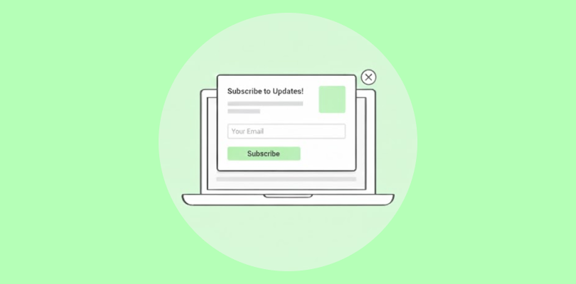
Why Use Newsletter Signup Popups?
Capturing attention online is no small feat. With constantly shrinking attention spans and digital distractions, pop-ups step in to cut through the noise and grab focus quickly.
Here’s why businesses trust newsletter popups as a go-to growth tool:
1. Instant Visibility: Newsletter signup popups appear when visitors are most engaged, such as on scroll, before they exit, or during high-intent moments, ensuring your visitors see your subscription offer.
2. Higher Signup Rates: People ignore forms buried in footers. Newsletter popups show up mid-journey, catching their attention and leading to more email signups, especially on traffic-heavy pages.
3. Easy Setup & Syncing: With a good pop-up builder, you can publish your newsletter pop-up and automatically sync new subscribers directly to CRMs and email marketing databases with a few clicks.
4. Personalized Experiences: Newsletter popups let you tailor messages, design, and offers based on visitor behavior, location, or language, making each signup feel relevant and timely.
5. Own Your Audience: Once someone signs up, you no longer rent their attention through ads or algorithms. You can nurture that relationship through emails around updates, offers, and content that keeps them returning.
15+ Converting Newsletter Signup Examples
Here are some newsletter signup examples that you can model your own pop-ups on:
1. Ultraviolet
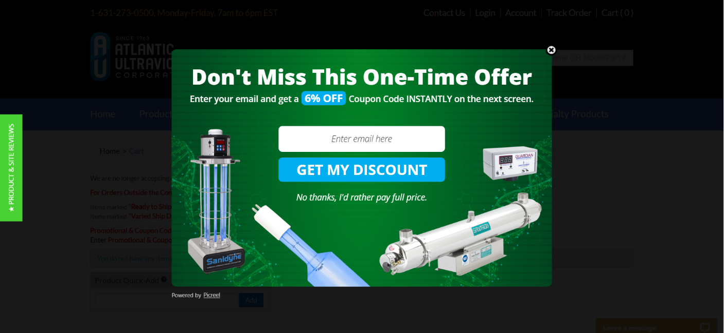
Atlantic Ultraviolet, a leader in UV-based air and water purification systems, uses a pop-up built with Picreel. By offering 6% off in exchange for an email, they instantly give new visitors a reason to subscribe.
It appears at just the right moments—on exit, after 2 seconds of idle time, or once the visitor scrolls 5% down. These early popup triggers ensure the form is seen before users leave or disengage.
Why This Works:
- Early triggering ensures the pop-up is seen before the visitor drops off, capturing more emails
- The 6% discount adds immediate value, giving visitors a strong reason to join the list
- Bold headline and clean visuals pull focus to the offer, increasing form engagement
- Only asking for an email keeps the barrier to entry low, boosting completion rates
- Instant delivery of the coupon builds trust and encourages more people to subscribe confidently
2. Maven Imaging
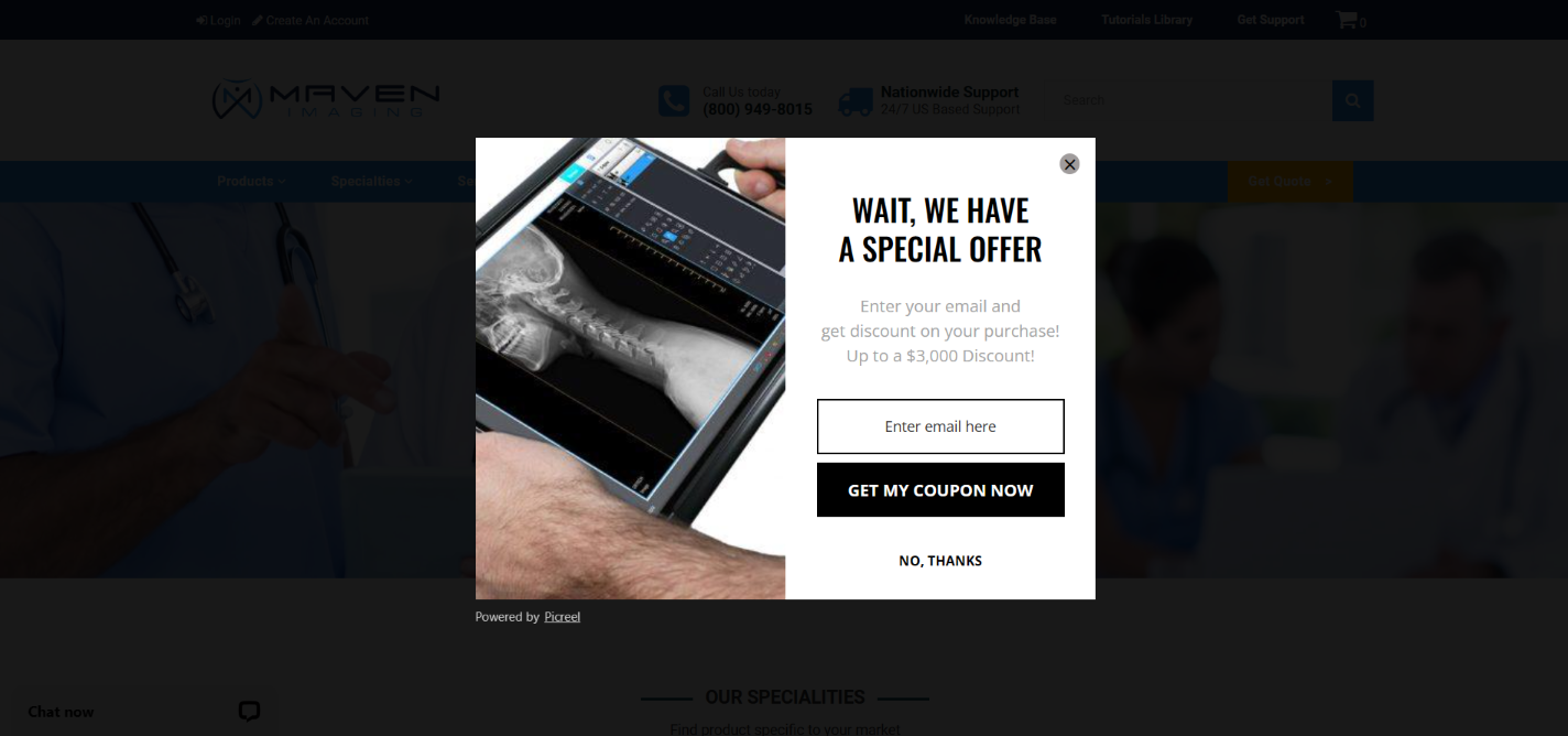
Maven Imaging sells digital X-ray and imaging equipment, and its pop-up is built to turn exits into opportunities. The $3,000 discount instantly grabs attention, especially from high-value visitors close to buying.
The message is simple and fast to digest, making it easy for users to drop their email and claim the deal before leaving the site.
Why This Works:
- Exit-intent targeting gives one last chance to collect emails before bounce
- High-dollar incentive makes subscribing feel like a no-brainer
- Concise message lowers hesitation and drives quick decisions
- One-field form removes effort, increasing signup completion rates
3. Aviso
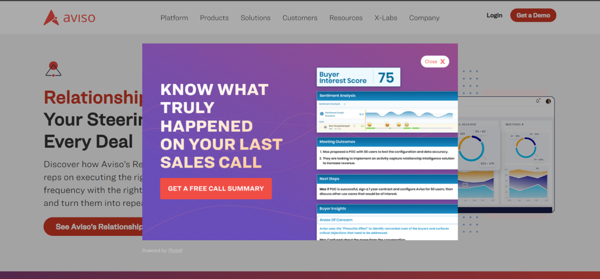
Aviso, an AI-driven revenue forecasting platform, leverages this exit-intent popup to hook users with relevance and urgency.
The bold headline, “Know what truly happened on your last sales call,” and a preview of high-value insights like sentiment trends and buyer intent scores give visitors clarity about the offer. This encourages them to sign up and access the data.
Why This Works:
- Offers instant value in exchange for an email—no guesswork, just a tangible win.
- The “Free Call Summary” doubles as a lead magnet and product teaser, priming interest in future emails.
- Exit timing aligns perfectly with decision fatigue, nudging users when they’re most open to shortcuts.
- The visual report builds trust fast, making newsletter content feel data-rich and worth subscribing to.
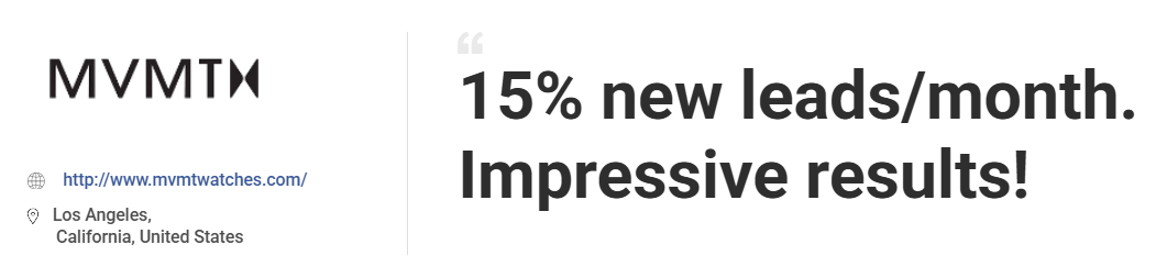
4. MVMT
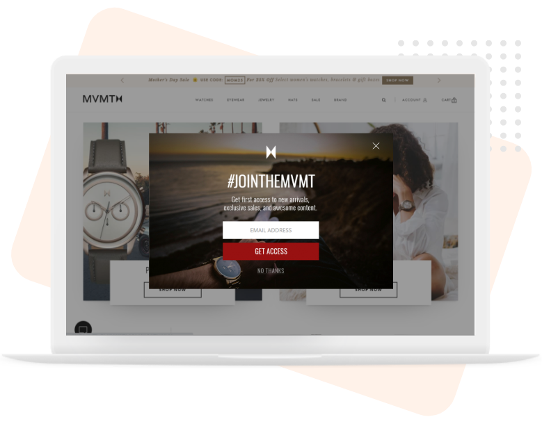
MVMT is an online store for watches and fashion accessories that shows you a pop-up just as you’re about to leave, inviting you to “#JoinTheMVMT” and getting early access to new drops and exclusive deals.
The dark background gives it a premium feel, and the red “GET ACCESS” button creates urgency. All these elements make the offer feel personal, aspirational, and too good to scroll past. They created this pop-up using Picreel, and it helped them grow email leads by 15% in just a month.
Why This Works:
- Exit-intent trigger catches attention at the moment of decision, reducing lost opportunities.
- Premium look builds trust as people are more likely to share emails with brands that look high-quality.
- Red CTA adds urgency, nudging users to act now rather than later.
- “Join the MVMT” turns a simple signup into an invitation to be part of something more exclusive.
5. Sage x Clare
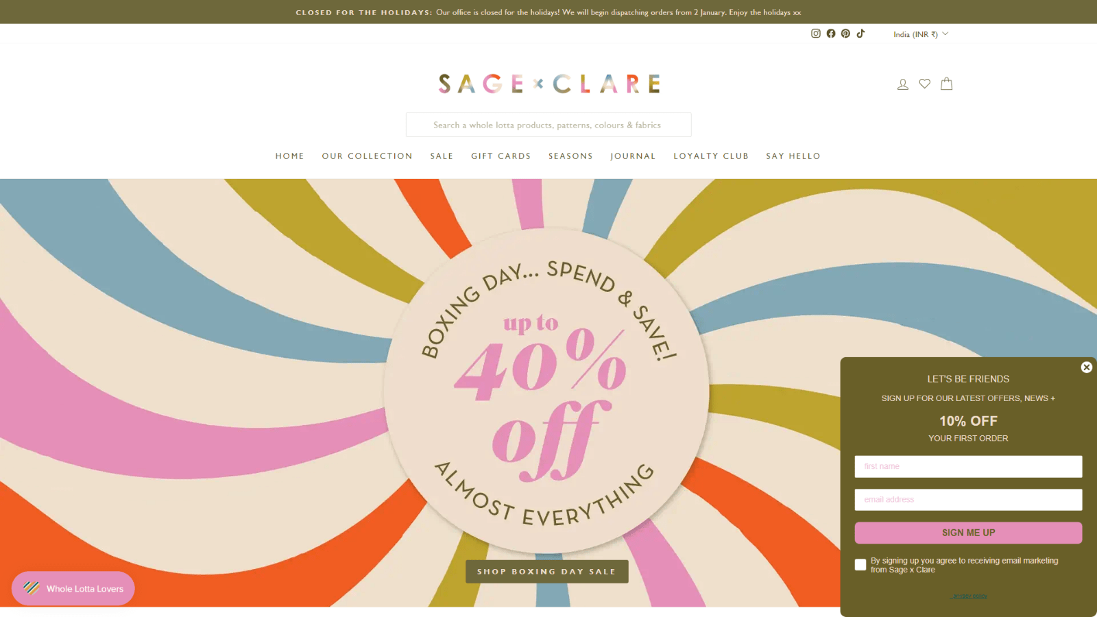
Sage x Clare’s side message doesn’t scream for attention; instead, it gently invites you to stay awhile. A soft-toned box offers 10% off the first order as visitors explore their playful, pattern-rich homewares.
The colors match the brand’s vibe, and the message looks very warm and inviting. It quietly builds curiosity and trust, making signups feel like a natural next step.
Why This Works:
- Side placement keeps the experience smooth without interrupting browsing.
- Soft color palette blends with brand visuals, creating a seamless and inviting feel.
- Upfront discount gives a clear incentive to subscribe without sounding pushy.
- Conversational tone (“Let’s be friends”) makes the ask feel warm and personal.
6. Love Home Decor
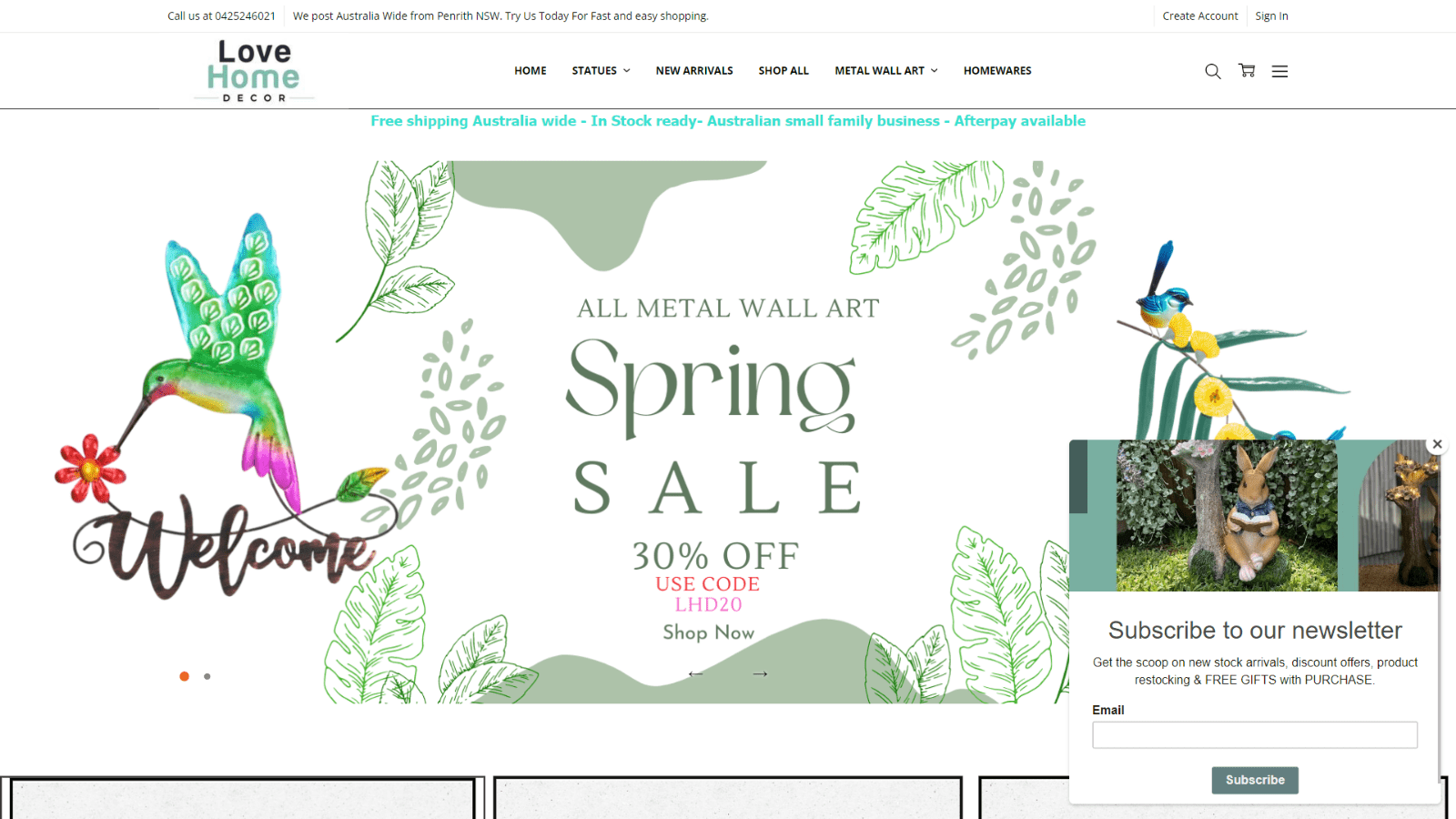
Love Home Decor’s exit newsletter pop-up design gently slides in without interrupting the user’s browsing flow. Known for charming, handcrafted home accents, the brand offers a simple email form paired with a tempting hook, “free gifts with purchase”.
The images add warmth, making the message feel personal and on-brand. It’s friendly, informative, and just persuasive enough to encourage users to hit “subscribe.”
Why This Works:
- Incentive-driven offer (free gifts) makes subscribing feel like a bonus, not a chore.
- Visuals of home décor create an emotional connection, nudging decor lovers to engage.
- Focused copy tells users exactly what they’ll gain by subscribing, such as offers, restocks, and the inside scoop.
- Side popup placement feels natural and low-pressure, boosting interaction.
7. Omsom
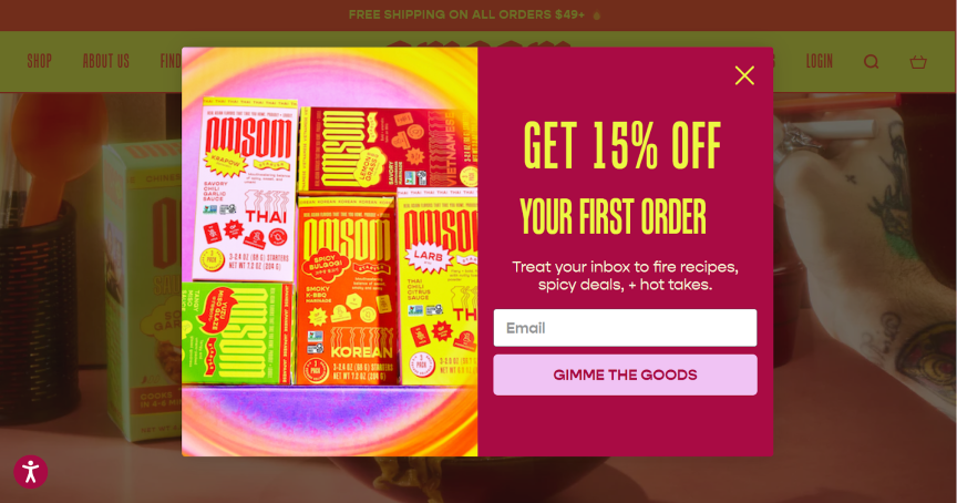
Omsom’s scroll-triggered pop-up makes signing up value-packed by offering 15% off on Asian food kits, exclusive recipes, and spicy content just for an email.
The loud visuals and “GIMME THE GOODS” CTA match their bold brand personality, making the pop-up feel like a community invitation.
This playful, high-energy approach excites users and adds value beyond discounts, turning casual visitors into subscribers.
Why This Works:
- The on-scroll trigger engages users who are already interested, raising the chance of conversion.
- 15% discount + bonus content creates a layered incentive, giving users more reasons to subscribe.
- Visually loud and energetic design commands attention and keeps visitors from skipping past.
- Playful language and tone build emotional resonance, making signups feel fun and brand-aligned.
8. Only Natural Pet
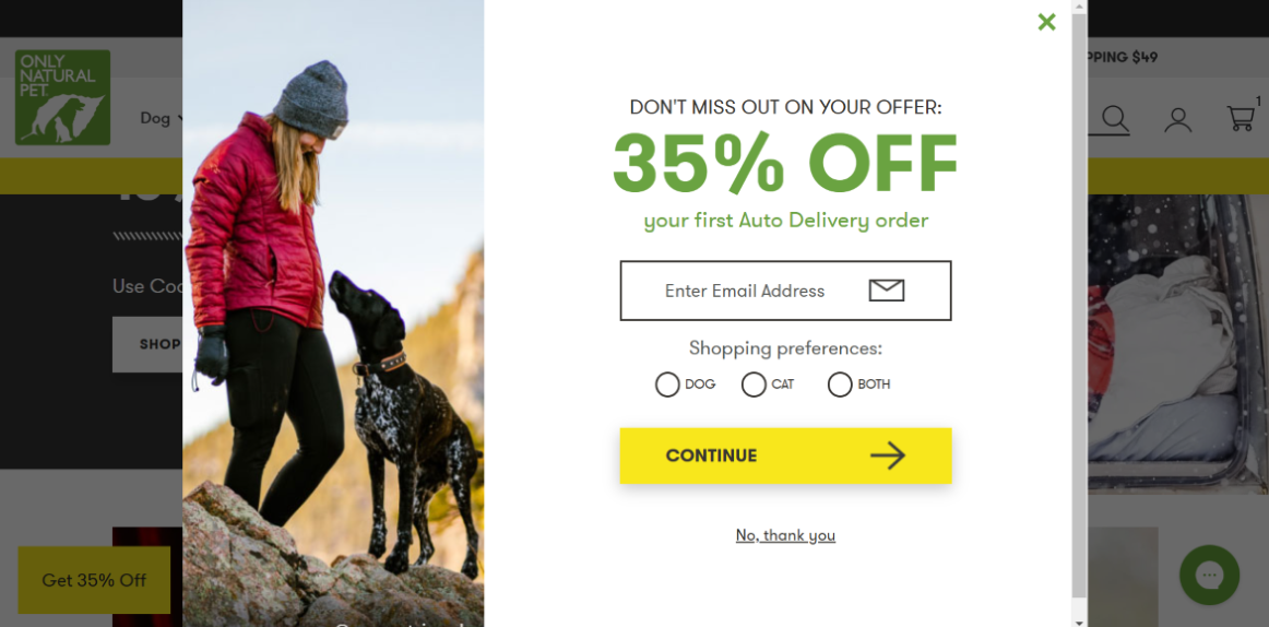
Only Natural Pet, a pet food shop’s welcome popup, makes signing up intuitive by offering 35% off your first Auto Delivery order in exchange for just an email and pet type.
The option to choose dog, cat, or both immediately makes the offer feel personalized, showing you will get relevant content and offers. The image and the offer make it emotional and tailored, nudging you to subscribe.
Why This Works:
- 35% discount delivers substantial upfront value, lowering signup resistance.
- Pet preference selector personalizes the experience right from the pop-up.
- Auto-delivery tie-in suggests convenience and savings, increasing long-term appeal.
- Emotive imagery creates trust and connection, especially with pet owners.
- Minimal fields + bold CTA make subscribing feel quick and effortless.
9. Nora
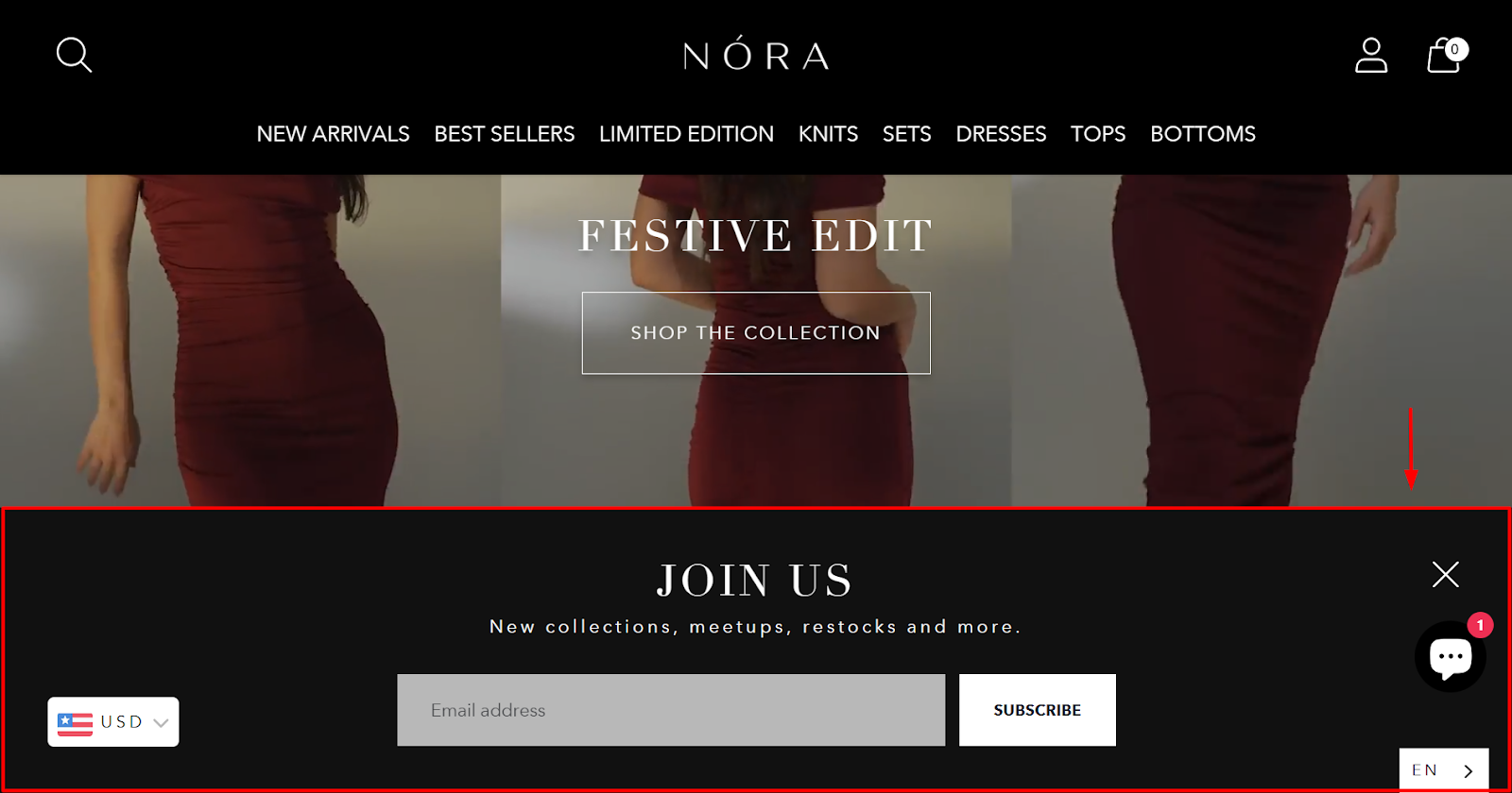
Nora’s bottom banner gently nudges visitors to subscribe for updates on new collections, restocks, and meetups—perfect for such a fashion-forward brand. Its sleek black design blends in and attracts newsletter signups without disrupting the shopping flow.
I really like the single email field and bold “Subscribe” button, as they make signing up effortless.
Why This Works:
- Non-intrusive scroll banners respect the user experience while remaining visible.
- Clear promise of value (restocks + new drops) appeals to returning shoppers.
- Minimal input field reduces friction, making it easy to convert on impulse.
- Stylish design aligns with brand aesthetics, increasing trust and legitimacy.
10. Olipop
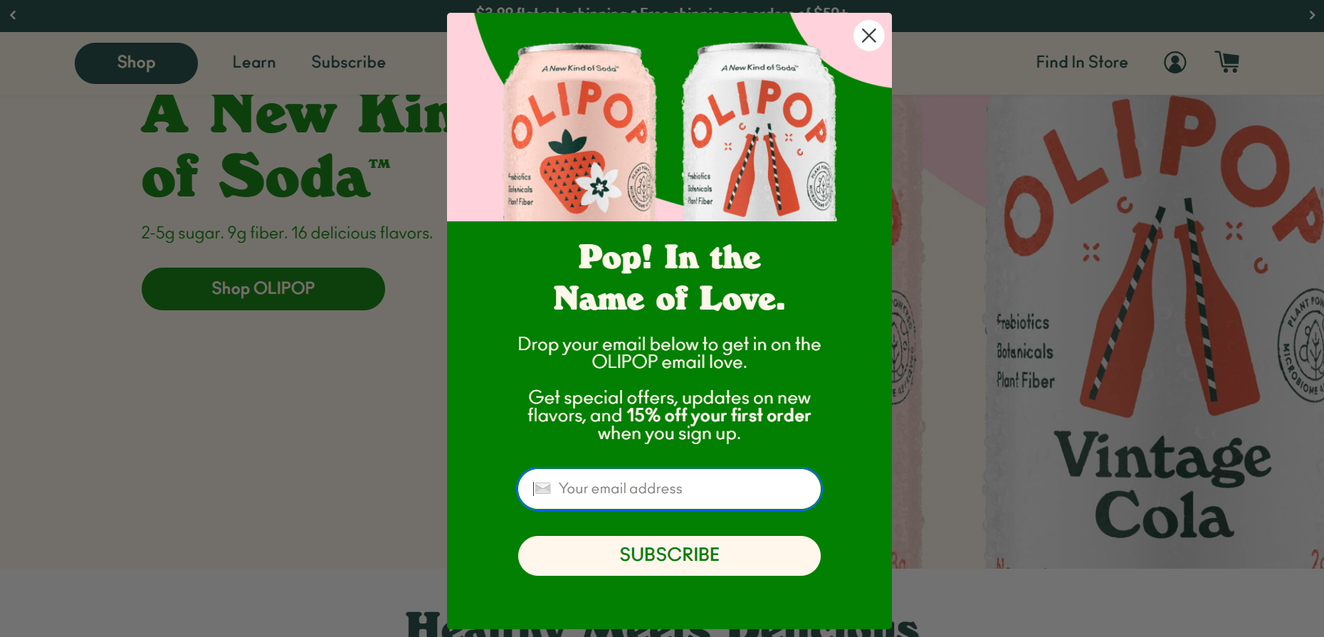
Olipop’s newsletter signup example charms you with a big, bold “Pop! In the Name of Love” and a bright visual of their top-selling soda flavors.
The quirky copy makes the newsletter signup pitch enjoyable. Offering 15% off as you discover flavors creates the perfect timing to convert curiosity into email signups. It feels like a brand welcome, increasing the chances for visitors to sign up.
Why This Works:
- Cheerful headline and tone make the ask feel light and inviting, lowering emotional resistance to signing up.
- Product visuals at the top remind users what they’re about to save on, increasing the perceived value of subscribing.
- A 15% off offer tied to an email entry gives a clear, no-string reward that drives instant opt-ins.
- Delayed timing ensures users are already engaged, so the message reaches them when intent is highest.
11. Gangsta Group
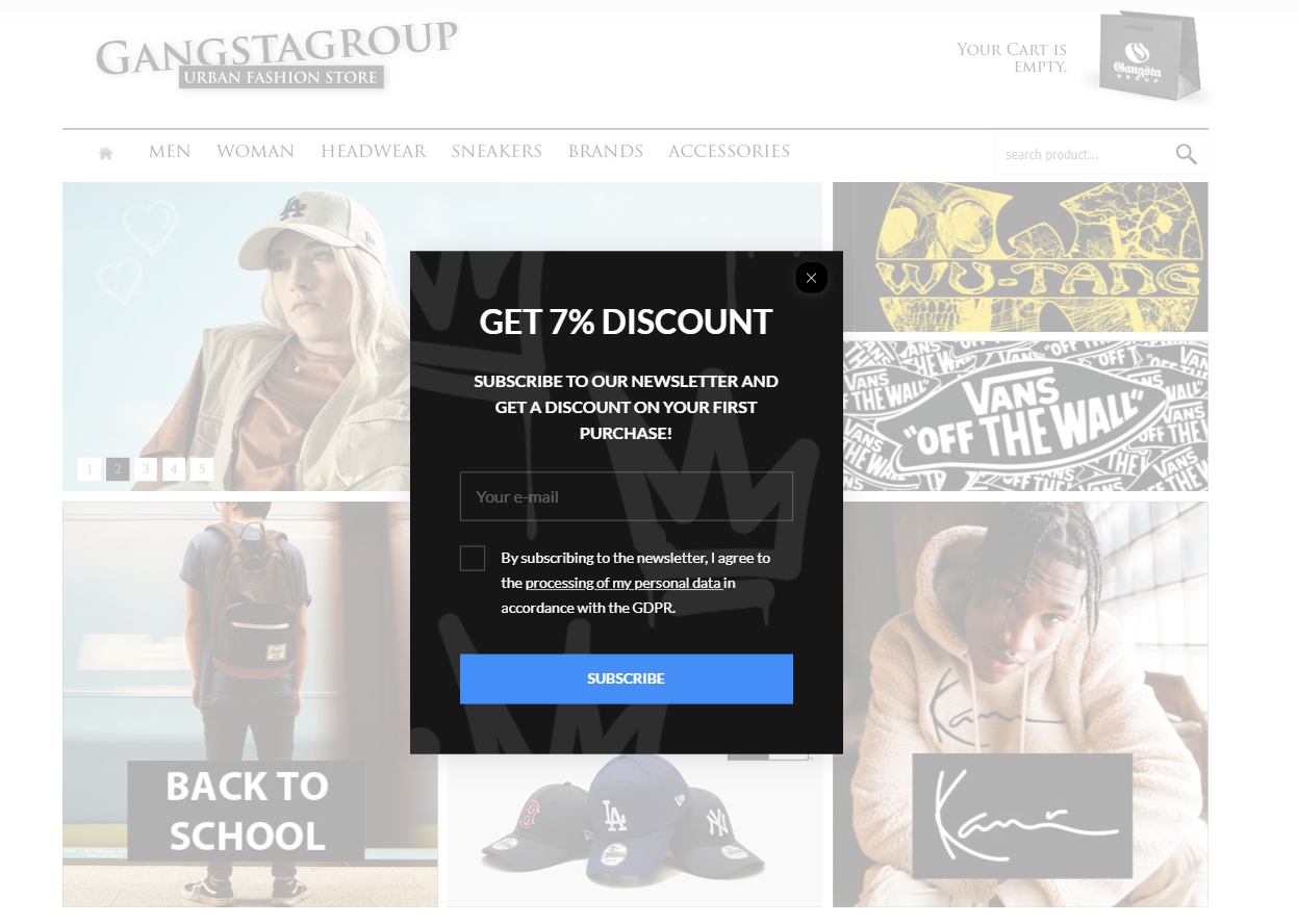
Gangsta Group, an urban fashion retailer, has nailed the newsletter pop-up. Their uncomplicated pop-up offers a seven percent discount for an email address.
The pop-up has only around 30 words, including the text in the email field. This pop-up is effective because it tells people exactly what they need to know: what they get and what they give in return.
Why This Works:
- Blunt, no-fluff messaging pushes urgency and speeds up opt-in decisions.
- Immediate discount turns casual browsers into first-time customers via email.
- Single-field form lowers cognitive load, making signups feel effortless.
- Focused layout prevents drop-off by keeping attention exactly where it matters.
12. The Pool Factory
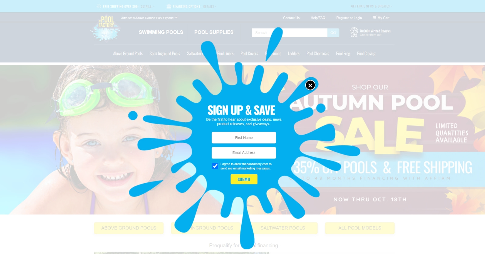
The Pool Factory’s splash-shaped popup instantly grabs attention and visually reminds users why they’re here: pools and fun. Instead of overexplaining, the simple “SIGN UP & SAVE” headline makes the offer clear in seconds.
The added benefits, like early access to deals, new products, and giveaways, sweeten the newsletter signup. It’s memorable, on-brand, and turns casual browsers into subscribers by making signup feel refreshing, not forced.
Why This Works:
- Splash shape grabs attention fast, pulling users in with brand-relevant visuals that stand out.
- Minimal headline reduces friction, making the offer digestible at a glance.
- Perks like early access and giveaways create real incentive to subscribe, not just save.
- Playful tone keeps it engaging, boosting signups by making users smile instead of skipping.
13. SwissWatchExpo
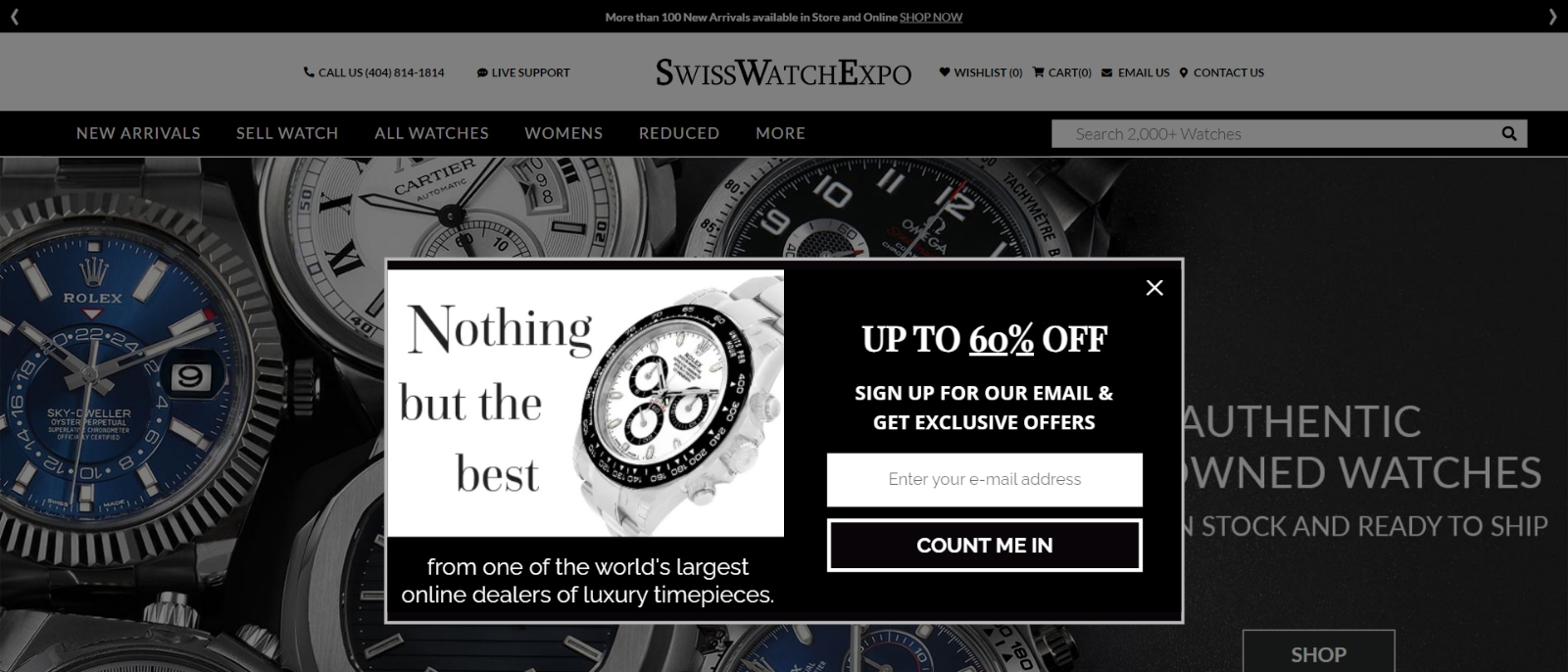
SwissWatchExpo, a popular online luxury watch retailer, employs a popup overlay to entice visitors to join its exclusive insiders club by subscribing to its newsletter.
By displaying a beautiful image of a timeless wristwatch, the brand reinforces its luxurious and elegant image. Moreover, the headline attracts visitors with the promise of insider access to exclusive deals.
Why This Works:
- “Up to 60% Off” grabs attention fast and gives a strong reason to sign up.
- “Nothing but the best” builds trust and appeals to high-end buyers.
- Black-and-white design feels premium, boosting brand credibility.
- “Count Me In” CTA adds confidence and encourages quick action.
- A clean layout keeps the product visible while smoothly nudging signups.
14. PCMag
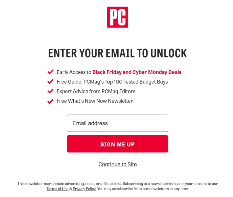
PCMag captures the full attention of its site visitors with a noticeable full-page popup that effectively highlights its latest and most important content right away.
It also highlights their top offer, “Black Friday and Cyber Monday Deals,” and the CTA in a way that perfectly aligns with their brand colors.
This newsletter signup example ensures users can quickly access valuable material, improving their experience and keeping them engaged with PCMag.
Why This Works:
- “Enter Your Email to Unlock” creates a clear action-reward structure that encourages instant engagement.
- Bullet list of benefits highlights exactly what users get—deals, expert advice, and exclusive content.
- Red accents and CTA buttons draw the eye and increase click motivation through urgency and contrast.
- Trusted brand logo (PCMag) at the top reinforces credibility, making users feel safe sharing their email.
- Option to continue to the site reduces pressure, creating a frictionless experience that respects user control.
15. Varley
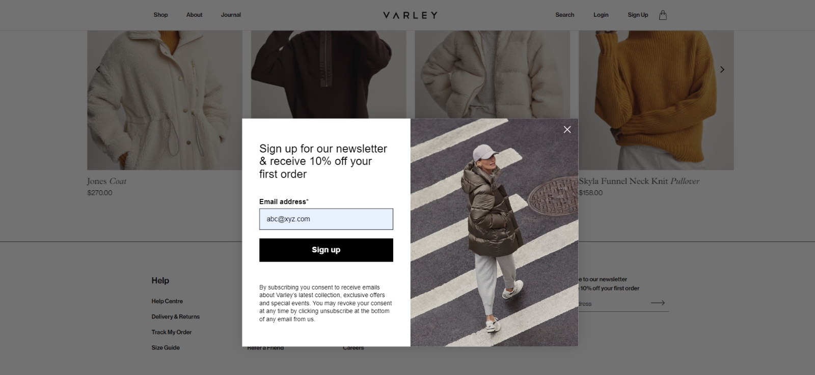
Varley is an activewear brand that greets visitors with a lightbox popup. The pop-up is elegant and attractive, with an easily noticeable black-and-white color scheme.
The choice of a black-and-white theme and a well-placed image occupying the right half complements the simple design and makes it stand out.
The pop-up message extends a straightforward yet compelling incentive: a 10% discount on your initial order in exchange for subscribing to their newsletter.
Why This Works:
- 10% off incentive provides instant value, encouraging first-time shoppers to subscribe.
- Minimalist design keeps the focus on the offer and form, reducing distractions.
- Fashion-forward image reinforces brand identity and connects emotionally with the target audience.
- Clear, bold CTA (“Sign up”) drives immediate action without overcomplicating the decision.
- Transparent fine print builds trust by explaining what users can expect from the emails.
16. Your Guitar Academy
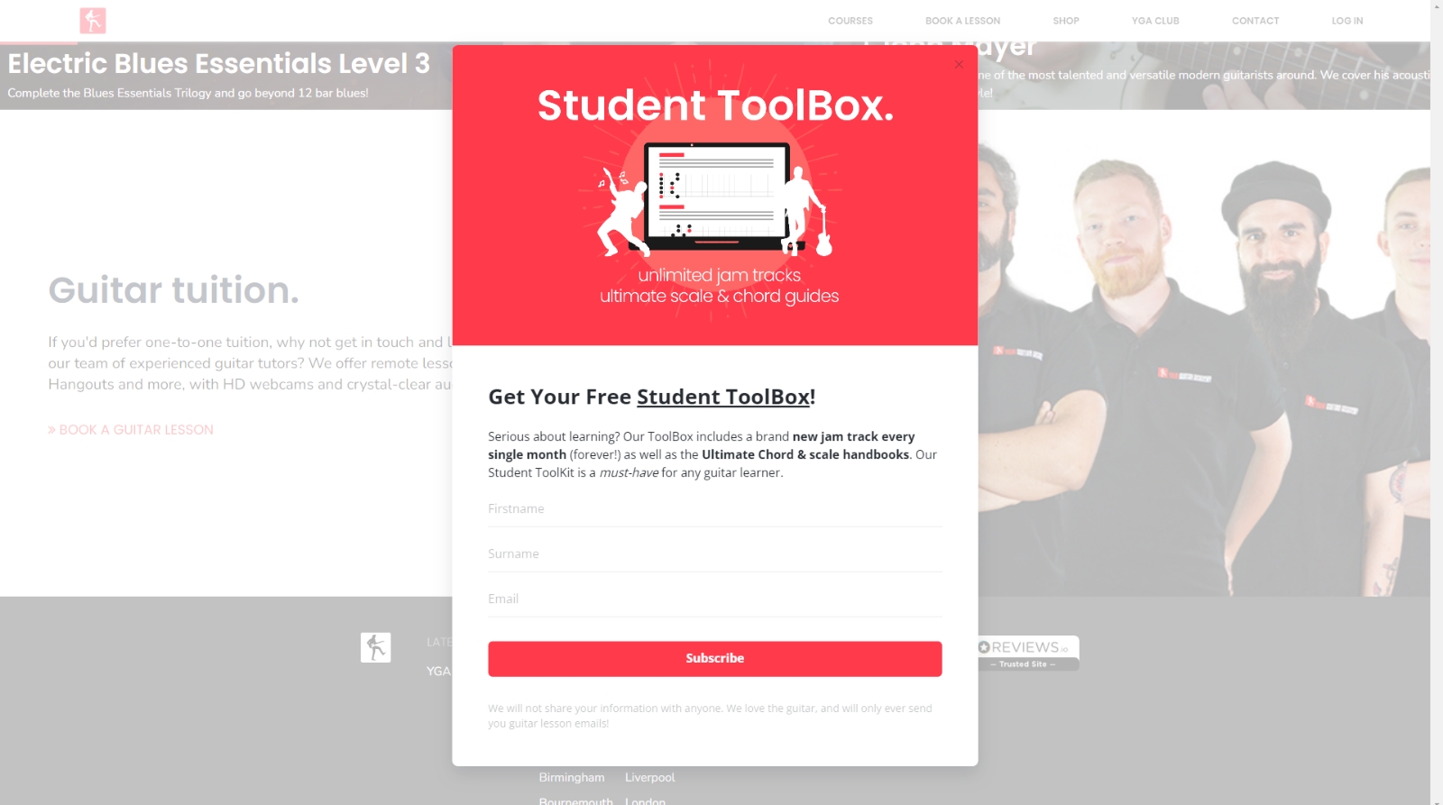
Your Guitar Academy’s pop-up boosts signups by offering real value upfront—two free guides and monthly jam tracks, perfect for aspiring guitarists.
The offer taps into user goals: improving skills and getting fresh content regularly. Its clean red-and-white design builds trust by matching the brand’s look, making it feel official and safe to engage.
Why This Works:
- Free learning resources attract signups by offering immediate, skill-boosting value.
- Ongoing jam track incentive builds anticipation and encourages long-term engagement.
- Simple layout + brand-aligned colors create a sense of trust and professionalism.
- Headline focuses on benefits, not hype, making the offer feel authentic and useful.
17. Tim Ferris
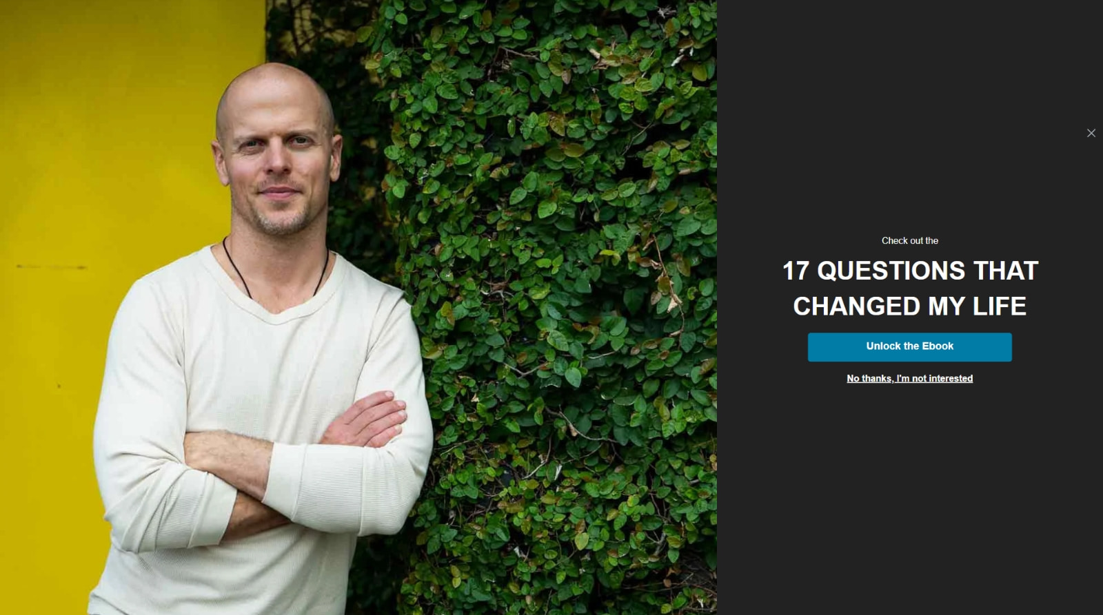
American author and lifestyle guru Tim Ferriss shows a bold, full-screen pop-up with a colorful design and focused message. Offering the best ebook in the popup gives users an apparent and valuable reason to sign up.
The headline highlights personal transformation, which hooks curious readers fast. Featuring Tim’s photo builds trust, making visitors feel like they’re getting direct insight from someone they admire.
Why This Works:
- Full-screen format removes distractions, keeping users focused on the offer.
- Free ebook creates strong incentive by offering immediate, high-perceived value.
- Headline promises transformation, sparking curiosity and emotional engagement.
- Featuring Tim himself builds authenticity and trust, boosting signup confidence.
How To Design a Newsletter Popup: Step-by-Step Tutorial
“Building a newsletter popup means coding headaches, clunky plugins, and popups that drive people away.” True or false?
If you didn’t scream “False” immediately, you’ve definitely been using the wrong tools.
In reality? If you pick the right platform, you can launch a clean, branded, high-converting newsletter popup design in under 15 minutes—no developer, no drama.
I’ll show you how to do it with Picreel. It actually makes creating newsletter popups doable.
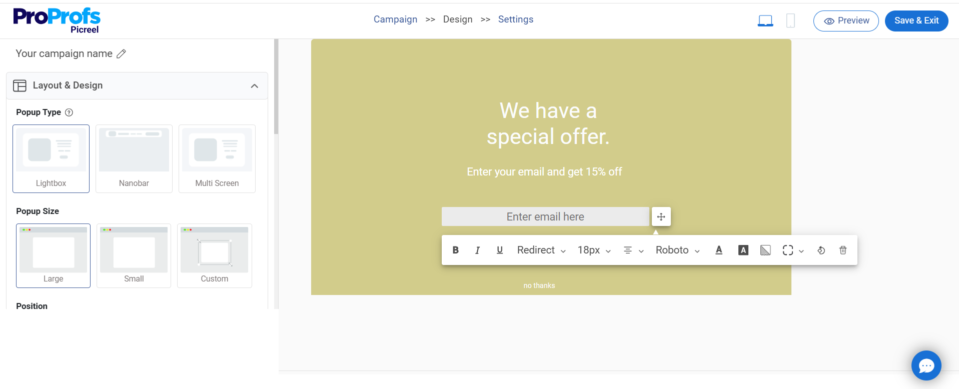
Step 1: Create a New Campaign
Once you’re inside the Picreel dashboard, click on “Campaigns” in the menu on the left side.

Step 2: Choose a Template or Build From Scratch
Next, click the small arrow next to “New Campaign” in the top right corner. Select the goals option and click “collect email” to find a massive variety of newsletter pop-up ideas as templates.

Step 3: Customize the Selected Design
You can change the layout, design, fields, text, options, and fonts. I recommend adding interactive elements like timers, images, and videos, as such popups have an average conversion of 4.74%.
Step 4: Set Targeting & Triggers
Go to the campaign settings section and set up targeting and trigger options to decide when and where your website pop-ups will be displayed.
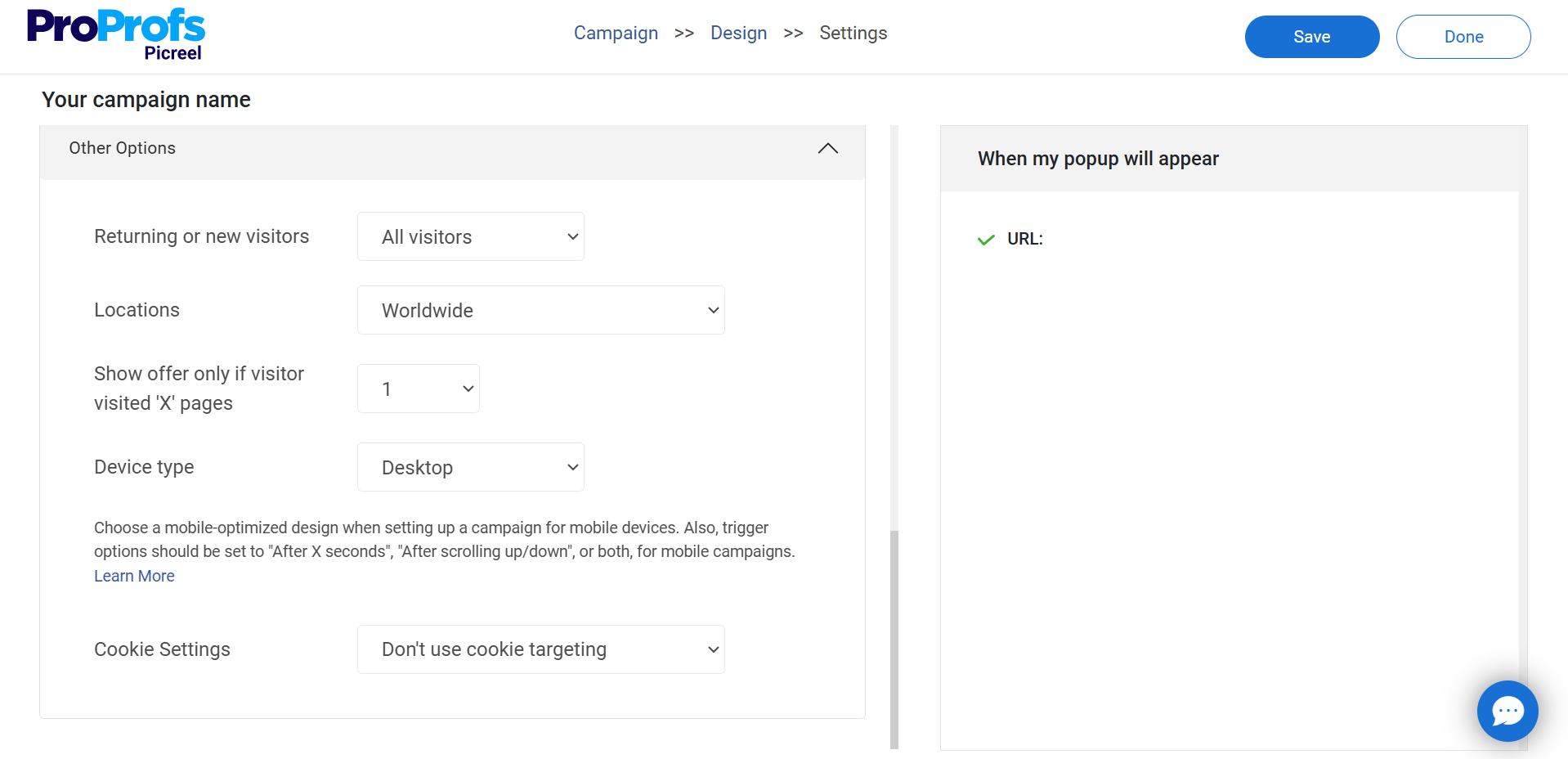
Based on my experience and research regarding newsletter signup popups, here’s how you should target your visitors:
- Target by Audience: Set “Visitor Type” to New Visitors and enable Geo Location to target high-converting regions like the U.S. and Canada.
- Set Display Timing: Use “Display Schedule” to run popups during sales, holidays, or product launches, ideally setting them to appear during peak traffic hours (e.g., 9 AM–3 PM).
- Show by Behavior: In “Trigger Settings,” set pop-up to show at 40% scroll depth, after 10 seconds on page, or on exit intent to capture high-intent users.
- Optimize for Mobile: Enable “All Devices” to keep your newsletter signup popups responsive for the 63% of traffic on mobile.
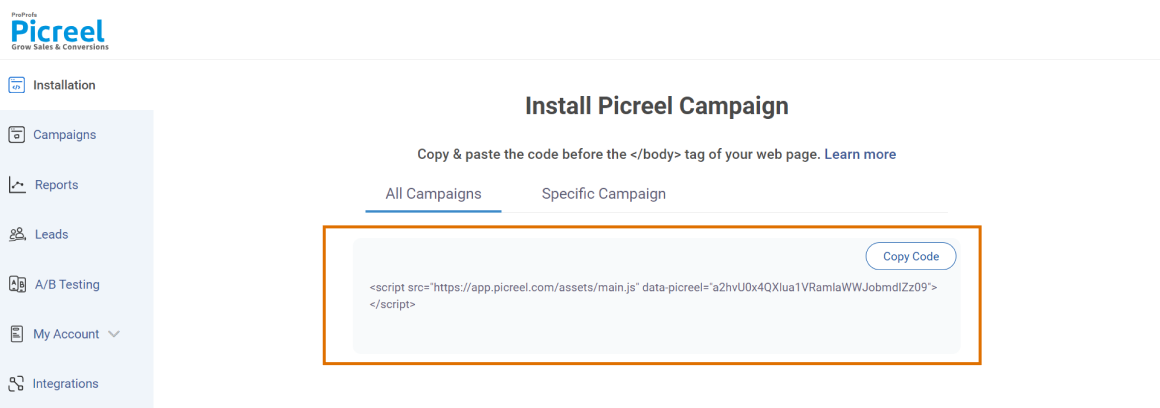
Step 5: Preview, Save & Publish
Once you’ve designed your pop-up, click “Save,” then head to the “Install Campaign” section to copy your JavaScript snippet. Paste it into your website’s HTML, and your pop-up will go live!
Step 6: Analyze & Optimize With Data
After a few days of publishing your pop-up, go to the “Reports & Analytics” dashboard in the sidebar to track your pop-up’s performance.
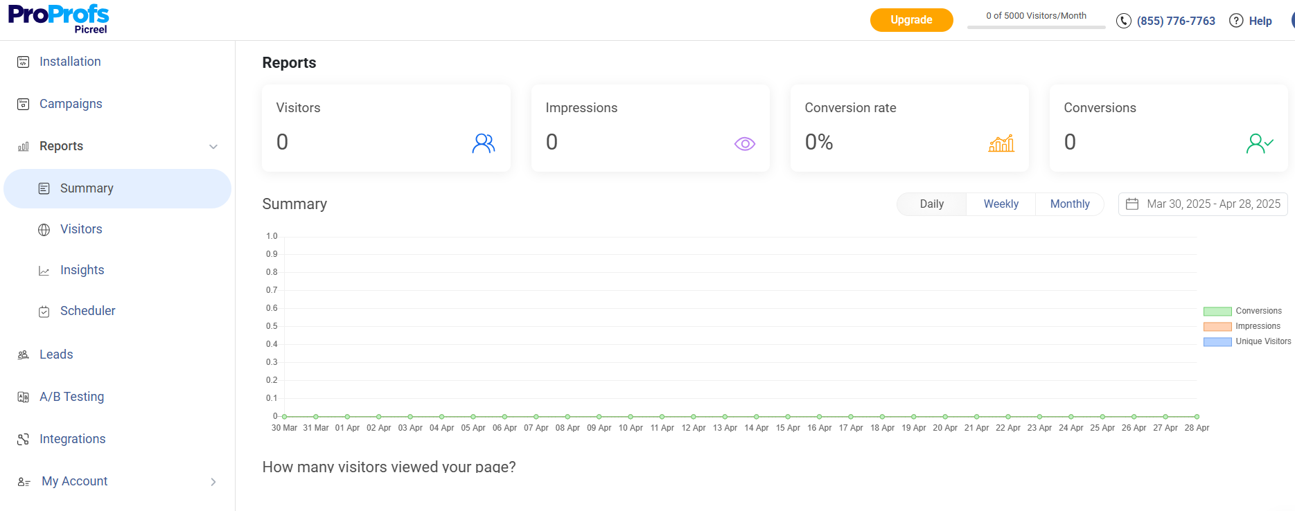
On average, with optimized targeting, expect a 2–5% conversion rate, 4–8% CTR, and 200–500 new signups per 10,000 views in the first month.
If you don’t achieve these numbers, don’t be disheartened. Improve these results by leveraging the built-in A/B testing feature to test and tweak CTAs, offers, or designs based on real-time insights.
8 Best Practices to Build Converting Newsletter Signup Popups
Want your newsletter pop-up to convert? Here are some best practices I have been following for years to drive more signups in a limited time for my clients. Feel free to tweak it according to your specific needs and industry.
1. Keep the Design Clean & On-Brand
Overloaded or misaligned designs reduce trust. Match your brand tone and keep it simple.
Examples:
- Use bold text + 1 CTA: “ Get one marketing growth idea every Monday.”
- On-brand design: Use your site’s font, colors, and tone.
- Add visuals: Include a thumbnail of the lead magnet or newsletter preview.
2. Add Minimal Fields
Less is more. Asking for a name and phone number just to send an email? No thanks.
Examples:
- 1-field form: “Enter your email to receive weekly leadership tips.”
- Optional second field: “Your name (optional) — we’ll use it to personalize your emails.”
- Add microcopy: “No spam. Just practical stuff you can use.”
3. Ensure GDPR Compliance for EU Visitors
Use pop-up tools with GDPR compliance features like cookie consent, customizable opt-in text, and clear data usage disclaimers.
Always enable these settings to stay compliant and build trust when targeting European audiences.
4. Make It Easy to Close or Dismiss
Pop-ups that trap users cause frustration and high bounce rates.
Examples:
- Always include a visible “X” in the corner.
- Add a dismiss link: “No thanks, I prefer to miss out”
- Mobile-friendly design: Ensure easy tap to close without zooming.
5. Use Social Proof
Over 52% of businesses report that online reviews have been key in boosting customer loyalty.
People want to know they’re not the only ones subscribing and that it’s worth it. Social proof popups can help you do that easily.
Examples:
- “Join 32,000+ developers who love our tech updates.”
- “Featured in TechCrunch, Wired, and The Verge.”
- Add a testimonial to your social proof popup: “Best newsletter for actionable ecommerce strategies!” —Jessica R.
6. Add a Small Incentive
Generic discounts don’t always work for newsletter signups. Instead:
- Make sure your incentive is clearly stated in the CTA, like “Get 10% Off + Tips You’ll Actually Use,” so visitors know exactly what they’re getting.
- Offer a weekly “insider” tip, checklist, mini-course, or PDF guide
- If you’re a product-based site, offer “email-only discounts” instead of public coupons
7. Geo-Target Smartly
Combine Geo-targeting with behavior signals:
- US visitor reading a blog on SEO?: “Get the best SEO tips every Monday”
- UK visitor on a pricing page?: “Join our UK list for product updates & insights”
Use Picreel’s Geo + URL filters to hyper-personalize pop-ups based on blog category or product interests.
8. Make It Interactive
Spin-to-win popups are great, but not for every niche. Here are some gamified newsletter signup pop-up ideas:
- Use a “Quiz-to-Subscribe” format: e.g., “Answer three questions to get your personal weekly SEO tip”
- Reveal a content score or persona type and gate the result behind an email form
- Add microcopy: “Your results + a weekly tip will be sent to your inbox.”
FREE. All Features. FOREVER!
Try our Forever FREE account with all premium features!
Increase Your Newsletter Engagement With Powerful Popups
There is no one-size-fits-all solution for newsletter pop-ups. You can use different strategies, such as timing, exit intent, images, and design, to make your pop-ups more effective. What works for one brand may not work for you, so you should experiment with various formats and offers.
Whether you want to use a simple lightbox popup, a slide-in, a full-screen overlay, or a floating bar, the newsletter signup examples I’ve shared in this post can inspire you.
But before you start creating your newsletter pop-ups, choose a pop-up tool that suits your needs and goals. One of the best options available is Picreel.
It lets you easily create custom pop-ups for any purpose. With 100+ email & newsletter popup templates and features, such as exit popups, advanced targeting, and on-site messages, you can engage and convert your visitors.
Frequently Asked Questions

Will they hurt SEO?
Newsletter popups don’t hurt SEO if used correctly. Make sure they don’t cover the main content, especially on mobile.
Will newsletter popups slow down my website?
Most modern popup tools are lightweight and optimized not to affect page load speed. Choose one with good performance ratings and async loading, like Picreel.
Can I run popups across multiple websites I manage?
Yes, many tools like Picreel allow multi-site control so that you can manage popups across different domains from one dashboard.
FREE. All Features. FOREVER!
Try our Forever FREE account with all premium features!
 We'd love your feedback!
What did you like & how can we make it even better?
 Thanks for your feedback!
 Ask Your Question
Have a question? Get expert help to make your decision easier.