Let’s be honest, most people find popups annoying.
And they’re not wrong.
We’ve all clicked away from those cluttered, in-your-face designs that break the browsing flow.
But here’s the truth: when done right, popups don’t frustrate users — they convert them.
Well-designed full-screen popups can lift conversions by over 14% because they capture attention with clarity and intent.
Now, when it comes to full-screen popups in WordPress, the game has changed completely.
Modern plugins make it simple to create responsive, behavior-based popups without touching a single line of code.
It’s all about understanding when and how to engage visitors — not stopping them mid-scroll, but giving them a reason to take action.
Let’s look at how to do that with real examples that prove it works.
What Is a Full-Screen Popup in WordPress? (+ Why Use It)
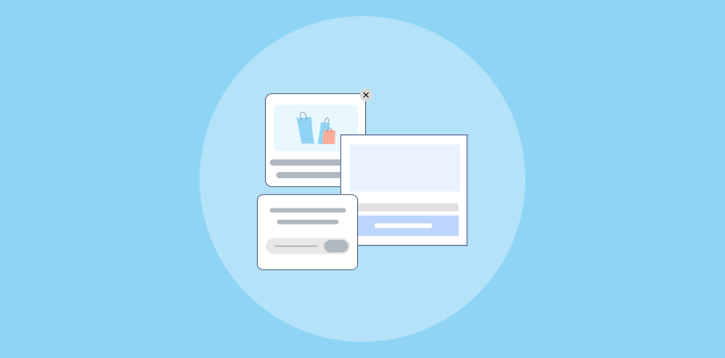
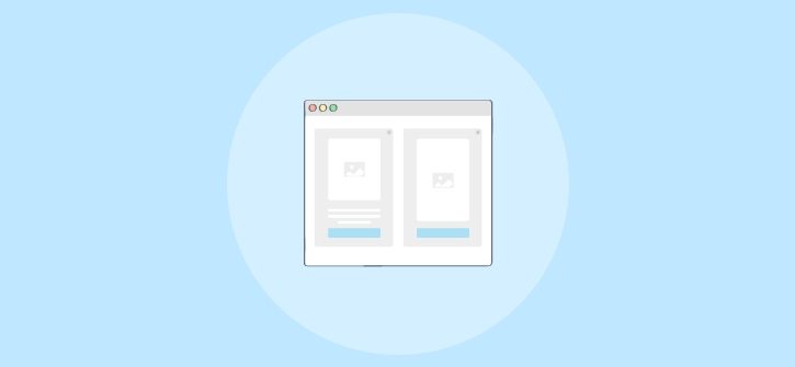
A full-screen popup covers the entire screen, focusing the visitor’s attention on a single, clear message or action. Here’s an example:

You can use full-screen popups for many purposes, such as:
- Announcing a new product or feature
- Collecting emails or newsletter signups
- Showing exciting offers through full-screen exit intent popup WordPress
- Displaying age verification or disclaimers
- Promoting an eBook or special campaign
Here’s why they work so well:
- Maximum Visibility: They grab full attention without distractions.
- Higher Conversions: A single, clear call to action drives better results.
- More Storytelling Space: You can use visuals, short copy, and brand colors effectively.
- Personalized Targeting: Modern plugins let you trigger popups based on location, behavior, or device.
- Mobile-Friendly: Most tools today are responsive and adjust perfectly to any screen.
10 Full-Screen Popup Examples That Convert
Let’s explore how brands are using full-screen popups creatively to boost engagement and conversions. These real-world examples show different ways to capture attention, deliver value, and drive action, all without disrupting the browsing experience.
1. Product Launch Popup

Images can boost click-through rates by up to 28.69%, and Huda Beauty uses that power brilliantly in its full-screen popup for the launch of two new color corrector shades — Cherry Light and Peach Light. The design instantly draws attention with bold visuals, clean typography, and soft peach tones that reflect the product’s aesthetic.
Every inch of the screen is used purposefully, showcasing the shades beautifully while a clear “Shop Now” button invites visitors to take action. It’s immersive without being intrusive, relying on stunning product photography and thoughtful design to make the message irresistible.
Why It Works:
- The full-screen layout stops the scroll and makes the special announcement impossible to miss.
- Minimal text and one strong CTA keep visitors focused on taking action.
- The colors, fonts, and imagery align perfectly with the brand’s style.
- It looks great on any device, creating a smooth experience whether someone’s browsing on mobile or desktop.
2. Email Capture Popup

A small design choice can make a big difference — adding just one extra step in a popup can lift conversions by 43%. SNOW captures that idea beautifully with its full-screen email popup. Rather than overwhelming visitors, it opens with a friendly offer, “You’ve got 15% off,” and follows it up with a casual question about their teeth-whitening experience.
The clean, icy blue layout feels calm and approachable, perfectly matching the brand’s identity. The large “YES” and “NO” buttons turn the exchange into something conversational, making the interaction feel easy, not transactional.
Why It Works:
- The interactive format invites participation, turning a static popup into a simple two-step experience.
- The gentle tone and clean email popup design help reduce resistance while keeping the focus on the offer.
- The color palette reinforces brand consistency and evokes trust and freshness.
- By using a question instead of a form field, SNOW captures attention and curiosity — two key drivers of engagement.
3. Exit-Intent Discount Offer

Just as you’re about to close the tab, PRESS steps in with a friendly reminder that feels more like a favor than a pitch “Don’t leave without a discount!” The soft, neutral background, paired with fresh visuals of soups and juices, immediately draws your eye to the bright green button that reads, “Yes, gimme a discount!”
It’s casual, warm, and persuasive without being aggressive. The copy hits the right note too — short, clear, and perfectly timed to catch that last bit of attention before the visitor leaves.
Why It Works:
- This full-screen exit intent popup in WordPress feels natural, like a helpful nudge rather than a disruption.
- The inviting visuals make the offer feel authentic and connected to the brand’s clean, health-focused image.
- The CTA has personality, creating a light, conversational tone that encourages clicks.
- It strikes a balance between urgency and friendliness, turning 15% of almost-lost visitors into potential customers.
4. Event Promotion Popup

EasyWebinar nails the art of promoting an event with this full-screen popup that feels confident and professional right from the first glance. The headline, “How to Create, Test, and Scale High-Converting Webinars Now & Into 2026,” instantly communicates value — it’s specific, time-bound, and benefit-driven.
The left side features a friendly, real photo that humanizes the offer, while the right side keeps the message clear and actionable with a bright red Register Now button that pops against the dark background. It’s the kind of design that speaks to credibility and clarity rather than flash.
Why It Works:
- The clean two-column layout balances visual warmth with a strong, results-focused message.
- A real human face helps build trust and connection instantly.
- The large, contrasting CTA button draws the eye and creates urgency.
- The copy promises practical value, making registration feel like an opportunity, not a sales pitch.
5. Free Shipping Popup

ThredUp keeps things fresh and irresistible with this bold, full-screen popup that promises both savings and convenience. The bright mint-green backdrop instantly pulls you in, while the offer — “Get up to 50% off + free shipping” — hits the sweet spot between urgency and value.
There’s no fluff here, just a clean design with a single email field and a sharp black “Sign Up” button that makes it easy to act on impulse. This e-commerce popup feels modern, upbeat, and perfectly aligned with the brand’s sustainable, fashion-forward tone.
Why It Works:
- The vibrant color and minimalist design grab attention without overloading the screen.
- Pairing a discount with free shipping gives shoppers two strong reasons to sign up.
- The copy is straightforward and confident, appealing to deal-seekers who want instant value.
- The seamless layout removes friction, making it effortless for users to subscribe in seconds.
6. Gamified Popup

Darn Good Yarn turns an ordinary discount offer into something fun and interactive with this “Spin to Win” popup. Instead of just handing out a coupon, it adds a little excitement — visitors can spin the wheel to win up to 15% off their order. This tactic can increase conversions by 13%.
The bright, colorful design instantly grabs attention, and the spinning element taps into that natural curiosity we all have to see what we might win. It’s quick, playful, and perfectly on-brand for a creative, craft-focused business.
Why It Works:
- The gamified design makes engagement feel like a reward, not a task.
- The spinning wheel creates anticipation, which keeps users from closing the popup too quickly.
- It’s visually vibrant, making it stand out without feeling cluttered.
- The interactive gamified popup element builds a positive emotional connection, turning a discount into an experience that people actually enjoy.
7. eBook / Resource Download

Aviso’s full-screen popup grabs attention right away with a strong, benefit-driven headline — “Know what truly happened on your last sales call.” Instead of pushing a generic download, it offers something instantly valuable: a free call summary that helps users understand their buyer insights.
The mix of purple gradients, real dashboard visuals, and a bold orange CTA button gives it a clean, data-smart feel that resonates with sales professionals. This e-book popup is not flashy — it’s confident, practical, and speaks directly to what the target audience cares about: results.
Why It Works:
- The popup doesn’t just offer content; it promises actionable insight tied to real user pain points.
- The clear visual preview of the “Buyer Interest Score” builds curiosity and credibility.
- The strong color contrast between the purple background and orange CTA ensures instant visibility.
- By showing exactly what users will get, it removes guesswork and drives qualified sign-ups.
8. Cart Recovery Popup

When visitors move to exit, this Porcobrado’s cart recovery popup quietly steps in, reminding them of what’s still waiting in their cart. The tone is friendly and calm, paired with a subtle discount that makes finishing the purchase feel worthwhile.
The design relies on warm colors and clear visuals, keeping the focus entirely on the offer without crowding the screen. It’s a smooth re-engagement moment that feels natural instead of salesy.
Why It Works:
- The exit timing feels intuitive and well-tuned to user behavior.
- The language sounds human, giving a gentle nudge rather than a demand.
- The visuals keep attention anchored on the CTA.
- It turns indecision into action by framing checkout as a benefit, not an obligation.
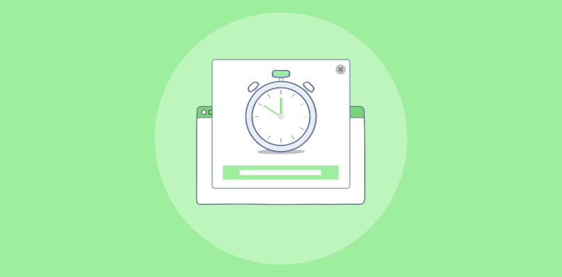
9. Limited-Time Sale Popup

Timers don’t just create urgency; they also deliver results. In fact, timer-led triggers (4.42%) outperform scroll-based ones (2.64%) by 67.42%, with six seconds being the sweet spot for grabbing attention.
That’s why using a strategy like Journeys can bring you the desired conversion boost. The sleek design centers on a live countdown that instantly builds anticipation without shouting for attention. Paired with clean typography and a bold, high-contrast button, it feels fresh and time-sensitive, like discovering a flash sale right before it ends.
Why It Works:
- The live countdown timer keeps users visually engaged from the start.
- The tone stays upbeat and approachable rather than aggressive.
- Simple visuals make the popup feel premium and focused.
- The balance between time pressure and clean design builds trust while motivating quick action.
10. Redirect / Cross-Site Campaign

TOMS makes smart use of its full-screen popup by blending promotion with navigation. Instead of just offering a discount, it encourages visitors to check out a featured product — in this case, the Maude Oatmeal Suede Wedge Boot. The popup highlights the item visually on one side and includes a “Shop This” link that redirects directly to the product page.
On the other side, it offers a 15% off incentive for first-time buyers who sign up. The layout is clean, balanced, and perfectly in sync with TOMS’ understated brand style.
Why It Works:
- The product link turns the full-screen popup into a cross-site driver, moving users from discovery to purchase seamlessly.
- Combining an exclusive offer with a direct product CTA increases both clicks and conversions.
- The clean typography and neutral colors keep the focus on the product and the discount.
- It serves dual purposes, promoting a specific product while building the brand’s email list.
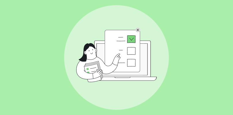
How to Create a Full-Screen Popup in WordPress (Step-by-Step)
Let’s walk through how you can set up a full-screen popup in WordPress from scratch. I’ll be using Picreel as an example here since it’s one of the simplest tools to demonstrate the process clearly.
Step 1: Create Your First Full-Screen Popup Campaign
Once you sign up, go to the Campaigns tab and click on “Add Campaign” to start creating your first wordpress full-screen popup.

Step 2: Choose the Design for Your Full-Screen Popup
You’ll find a library of over 100+ popup templates. Now scroll through and find a design for your full-screen popup. Once you’ve picked one, click “Customize” to start tailoring it to your needs.

Step 3: Edit the Full-Screen Popup Design
Now that you’ve selected your template, it’s time to make it your own. There are several customization options available to personalize your full-screen popup in WordPress:

- Design: Select the background (image, solid color, or GIF). Choose the background color, text color, and popup size. Keep the close button visible to give them control over their experience and build trust.
- Fields: Edit the overlay text. Add your unique message, CTA, and links. Include fields to collect visitor information like their name, email, or phone number.
- Options: Choose an animation for your popup (fade, slide, etc.). Then set the position on the screen where you want your popup to appear. Decide when to hide the popup and how curved the corners should be.
- Custom Fonts: Pick the font style, size, and weight for the overlay text. If you need a custom font, you can upload a CSS file.
- Personalization Settings: Personalize the popup using data from your CRM (visitor name, location, etc.). You can also pull dynamic text like cart items or recently viewed products. Once you’re happy with the design, click “Save” to store your changes.
- Multimedia Elements: You can also experiment with multimedia layouts. For example, a full-screen video popup WordPress setup can showcase tutorials, campaign highlights, or product launches in an engaging way while still guiding users toward a CTA.
Step 4: Configure Full-Screen Popup Campaign Settings
With the design ready, it’s time to fine-tune when and who will see the full-screen popup in WordPress. Here’s how to do it:

A. Basic Settings: Enter the website URL where you want to display your WordPress full-screen popup. You can add multiple web pages here.
B. Popup Timing (When Overlay Appears): Choose Schedule if you want the popup to show at specific dates. Otherwise, select the timing from the options below:
- Trigger Options: Set the popup trigger based on these actions:
- Exit Intent: Show the popup when visitors try to leave the site.
- Time Spent on Page: Display the popup after visitors stay on your site for a certain time.
- Scroll Percentage: Trigger the popup once visitors scroll a percentage of the page.
- On Click: Show the popup when users click certain elements on the site.
C. Impression Frequency: Choose how often the popup should appear to the same visitor (e.g., once per session or a certain number of times).
D. Targeting Rules: This will help you reach the right audience at the right time.
- Returning or New Visitors: Show the full-screen popup in WordPress to new visitors, returning ones, or both.
- Visitors’ Source: Trigger WordPress full-screen popups based on the source of visitors (e.g., search engine, referral, etc.).
- Geo-Targeting: Display popups for visitors in specific locations.
- Number of Pages Visited: Only show the popup after visitors explore a certain number of pages.
- Device-Based Targeting: Set up popups for specific devices like desktop, mobile, or tablet. Or simply select all devices to keep make your popups responsive for all devices.
- Prioritization: Choose which campaign to prioritize if multiple popups are running.
- Cookie Targeting: Show the popup based on specific cookies or past behaviors.
Once you’ve set up the targeting rules, click “Save”, and your campaign will be ready to go live.
Pro Tip: Personalize your popups by offering tailored incentives, like a “10% off your first order” for new visitors, loyalty discounts for returnees, free shipping for cart abandoners, or location-based offers to boost relevance and drive conversions.
Step 5: Analyze & Optimize with Data
Once your WordPress full-screen popups are live, track their performance using Picreel’s Reports & Analytics dashboard. Here you can monitor:

- Views, clicks, conversions, and form completions.
- Key patterns like which CTAs perform best or which trigger rules drive the most conversions.
To optimize performance, use Picreel’s A/B testing feature to test different designs, messages, or offers. By refining your campaigns based on data, you can continually improve and boost sales from every popup.

Turn Popups Into Conversions, Not Disruptions
Full-screen popups can be a powerful tool for boosting conversions when used with intention. By grabbing your visitor’s attention with a clear message and call to action, they can effectively guide users toward key actions, whether it’s signing up, making a purchase, or engaging with an offer. With modern WordPress plugins, creating personalized, mobile-friendly popups has never been easier.
Remember to test different approaches, from popup timing to personalization, and use A/B testing to see what resonates most with your audience. By continuously optimizing, you can maximize your results and make sure your popups are enhancing, not interrupting, the user experience.
Ready to create your first full-screen popup? Use Picreel to get started and start availing of the benefits of full-screen popups. Sign up today and begin increasing conversions on your site with smart, engaging popups!
FREE. All Features. FOREVER!
Try our Forever FREE account with all premium features!
 We'd love your feedback!
What did you like & how can we make it even better?
 Thanks for your feedback!
 Ask Your Question
Have a question? Get expert help to make your decision easier.