You don’t need more traffic—you need more signups.
Over the past 8+ years, I’ve worked with hundreds of marketers, founders, and growth teams, and one thing is clear: most visitors leave without taking action.
The fix isn’t more CTAs or redesigns. It’s a smart, well-timed signup popup that adds value.
When done right, popups can double your opt-ins without annoying users. I’ve seen a simple scroll-triggered popup offering a free guide to boost conversions in under a week without dev help or disruption.
But here’s the problem. Most popups still miss the mark. They interrupt, feel irrelevant, and push offers that don’t connect.
In this post, I’m sharing proven signup popup examples that actually work, along with tips on what makes them effective and how you can apply the same tactics to your site.
Let’s dive in.
15 High-Converting Signup Popup Examples
Signup popups come in various forms, each designed to engage visitors differently. I have added five signup popup categories with 15 examples by businesses that drove a massive amount of leads!
As a free bonus, I have added signup popup templates for each example so you can implement your favorite design easily.
- Exit-Intent Signup Popup
- Gamified Signup Popup
- Hello Bar Signup Popup
- Newsletter Signup Popup
- Discount Signup Popup
Exit-Intent Signup Popup
An exit-intent signup popup appears when visitors signal they’re leaving—closing the tab, switching, or moving toward the browser bar. Because it triggers only at departure, it feels less intrusive yet lets you convert 7% leaving visitors into email subscribers without heavy dev work.
1. TOMS
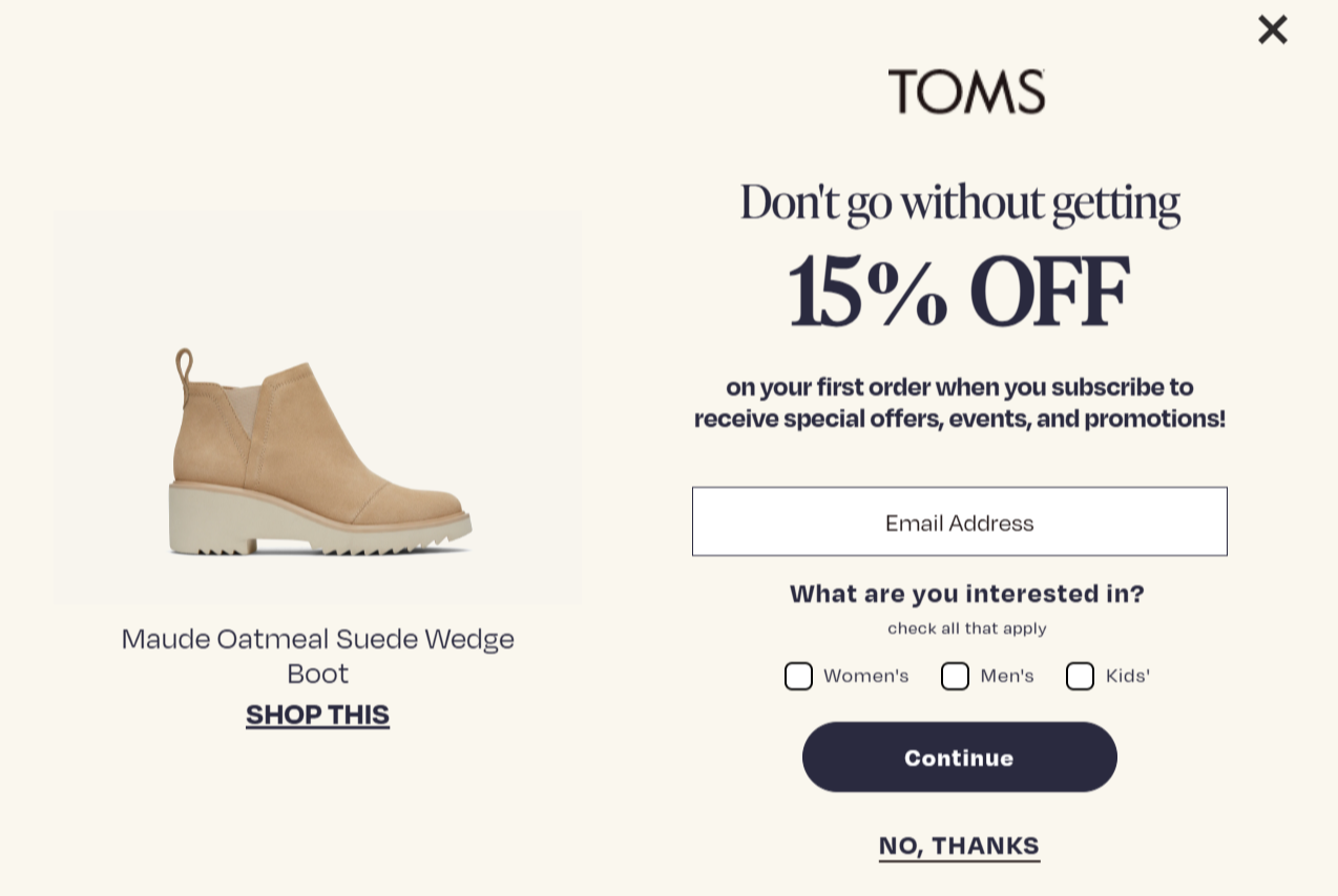
You’re going to love this one. When a visitor tries to leave the TOMS site, this clean and elegant popup slides in, gently nudging them to snag 15% off just for subscribing. The use of such non-intrusive designs and discounts shows that TOMS understands its audience.
As they don’t like popups but love personalized product recommendations and discounts, this exit intent signup design is easily the best way to change their minds.
Why This Works:
- The 15% OFF headline grabs attention fast and gives a clear reason to stick around.
- The “Don’t go without it” copy creates urgency right when the visitor is about to leave.
- A simple email field keeps friction low and makes signup feel effortless.
- The interest checkboxes personalize the experience, making the offer feel more relevant.
- Showing the product image reignites buying intent by reminding visitors what caught their eye.
2. KissMyKeto
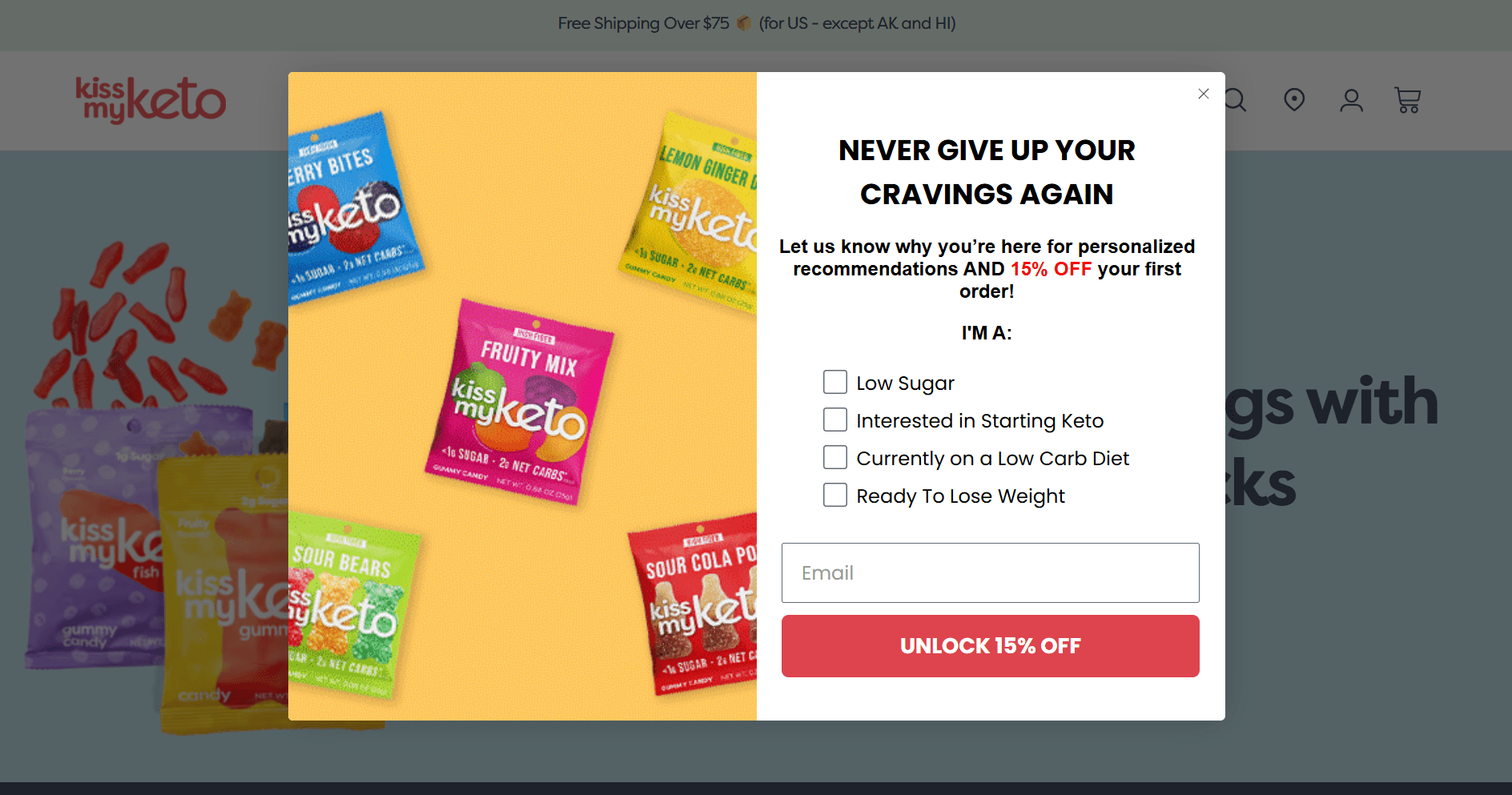
KissMyKeto leans into personalized marketing, knowing that 60% of shoppers are more likely to return after a tailored experience. When someone’s about to bounce from the KissMyKeto site, they’re met with a vibrant popup asking for visitors’ interests such as “low sugar”, “keto options”, “low carb diet”, or “weight loss”.
This shows that they are respectful of the visitor’s choice and experience. The additional discount acts as a cherry on top and gently nudges them to sign up.
Why This Works:
- The headline speaks to cravings, making it instantly relatable and lowering resistance to opt in.
- Quick checkbox options help segment visitors in seconds, making the follow-up emails feel way more personal.
- The playful candy-colored layout grabs attention and keeps the vibe light even during exit.
- The offer “15% off” is prominent, giving visitors a real reason to stay.
- The clean form with just one field makes signing up easy, unlike a chore.
3. Press
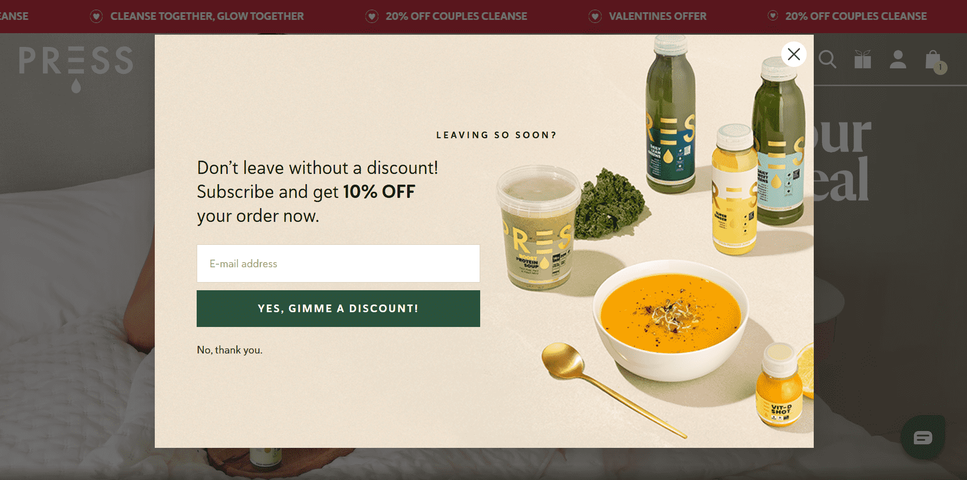
Press’s popup is a great example of a soft, earthy-toned exit intent signup popup. I like how it gently pulls attention without being pushy. Did you notice how clearly it showcases the full range of products?
That instantly tells visitors what they’re signing up for, which is key. Of course, no one would hand over their email unless they knew what they’re getting. When a visitor is about to leave, a clean 10% off offer appears. This makes signing up feel like a reward, too.
Why This Works:
- The headline sparks urgency by making visitors feel they’re missing out on a deal.
- A clear “10% OFF your order now” offer reduces hesitation and speeds up decision-making.
- The centered email field and powerful CTA make signing up feel effortless.
- Product visuals build trust and desire by showing exactly what’s on offer.
- The subtle opt-out link adds a gentle nudge to choose the discount instead.
Gamified Signup Popup
Gamified signup popups turn the usual email form into a fun little experience, like running for rewards, taking quizzes, and spinning the wheel. This is the right type of signup popup if you often struggle with low visitor engagement.
That’s not all, retail businesses have unlocked up to 700% more customer signups by adding an element of play. To help you achieve higher engagement and signups, I have brought you these converting gamified subscribe popup examples.
4. Track Brewing Co.

Track Brewing Co. knows how to make signups feel like a party. Their gamified popup doesn’t just ask for visitors’ email; it kicks off a loyalty adventure. Visitors get beer tokens for every purchase, which instantly makes it feel rewarding and, honestly, kind of fun.
It’s an innovative design backed by good old behavioral psychology. Instead of a boring form, it makes visitors feel like they’re unlocking perks. Gamified popup isn’t just collecting leads. It’s starting relationships and giving folks a reason to return for more.
Why This Works:
- The bright, cheerful design instantly grabs attention and pulls visitors in.
- Friendly, casual language makes the offer feel personal and builds instant trust.
- The promise of beer tokens creates a clear reason to sign up immediately.
- The “Join now” button is simple, obvious, and makes taking action feel easy.
- The gamified reward system makes people curious and excited to start collecting.
5. Casper

Casper invites its visitors to take a cozy little quiz, promising to match them with their perfect mattress. This interests the visitors. Instead of the usual “Give us your email” approach, Casper flips the script by asking questions first, building value, and easing users into subscribing as part of a fun, guided experience.
And once they’ve answered, Casper smoothly collects their email before showing results, turning warm intent into qualified leads primed for tailored follow-ups.
Why This Works:
- The quiz rewards visitors upfront and boosts engagement before asking for anything.
- A highly targeted headline builds instant relevance, making users feel it’s made just for them.
- Time clarity with “Takes 45 sec” lowers hesitation and encourages quick participation.
- Curiosity about the result keeps users moving forward and emotionally invested.
- A friendly CTA like “Take the quiz” feels low-pressure, increasing click-throughs and opt-ins.
6. Elaina Gisele Collection

The Elaina Gisele Collection taps into good old-fashioned fun with a spin-the-wheel popup that feels more Vegas than vanilla. Instead of asking shoppers to “just drop your email,” it gives them a shot at winning real perks like 10%, 20%, even 40% off.
It’s gamification done right for people who love a deal and a little thrill of chance. That spinning wheel? It taps into FOMO and creates a moment of micro-engagement that makes visitors linger, interact, and convert. For a fashion brand built on excitement and exclusivity, this interactive opt-in mirrors the brand vibe while supercharging list growth.
Why This Works:
- The spinning action sparks curiosity and gives visitors a fun reason to engage.
- Multiple prize options make it feel like there’s something worth winning with each spin.
- Bright colors and motion grab attention instantly and pull users into the experience.
- Simple name and email fields keep the barrier to entry super low.
- A clear consent checkbox builds trust while keeping the flow smooth and user-friendly.
Hello Bar Signup Popup
Hello Bar signup popups are slim, non-intrusive banners that sit at the top or bottom of your site, gently encouraging signups without disrupting the user journey. By staying visible while users scroll and blending naturally into the design, they help you boost email signups.
It’s a smart strategy for passively capturing intent, especially from visitors who aren’t ready to engage with a full-screen popup.
7. Zendesk

The moment someone lands on Zendesk’s homepage, a slim floating notification bar quietly grabs attention before anything else loads. This isn’t just clever placement. It’s a calculated move to drive signups without interrupting the user journey.
By promoting their AI Masterclass 2025 in this fixed top bar, Zendesk uses a subtle popup format to convert curious visitors into leads. Unlike flashy popups that demand action, this Hello Bar earns interest by leaning on relevance, perfect timing, and quiet confidence instead of pressure.
Why This Works:
- Bold black bar stands out instantly, making sure the message gets seen.
- Hyper-specific headline builds trust and makes the offer feel legit.
- “Register now” adds a soft push that encourages quick action.
- Prime placement above the nav grabs attention before anything else.
- Fixed position keeps it in view no matter where the visitor scrolls.
8. Burberry
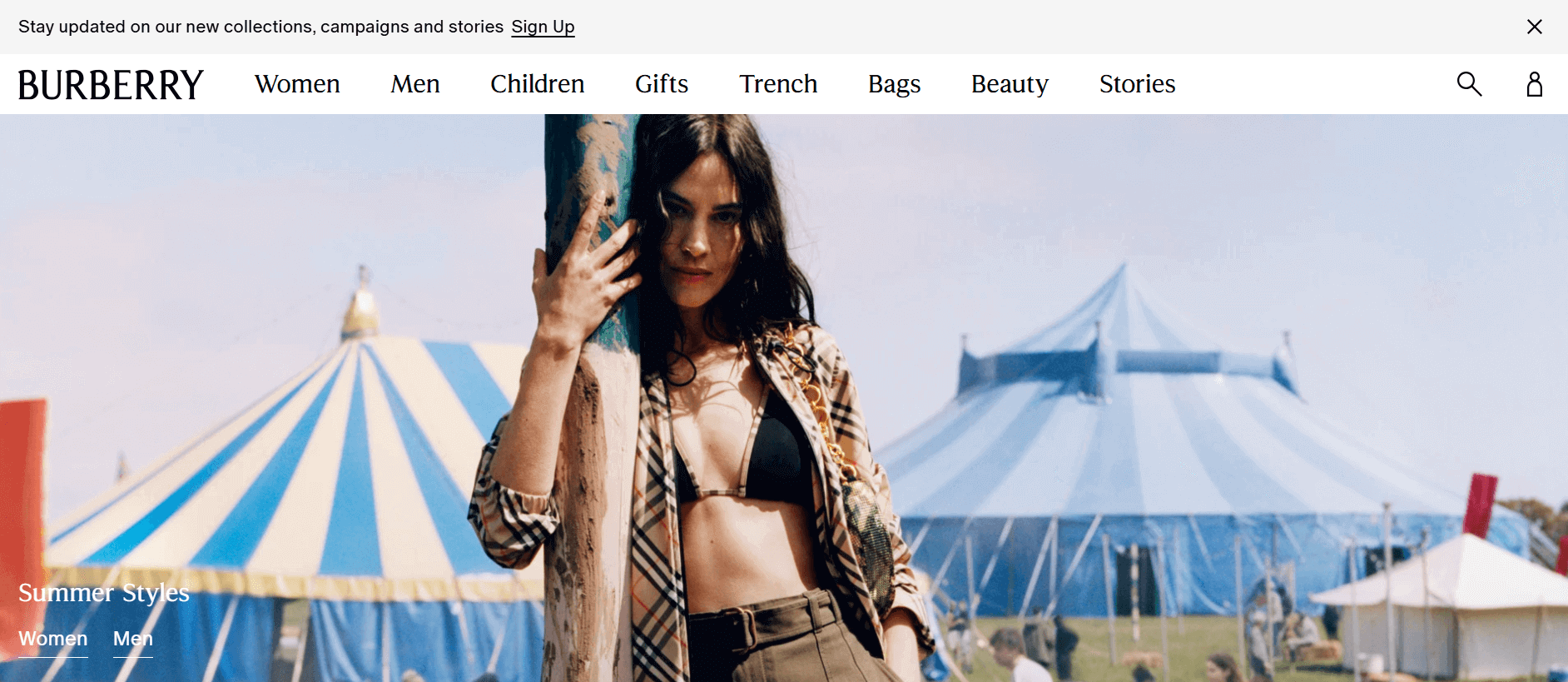
Burberry uses a floating hello bar as a subtle but strategic move to capture signups without disturbing the browsing flow. Placed right at the top, it leverages high-visibility real estate while maintaining the brand’s refined, non-intrusive aesthetic.
This is perfect for luxury shoppers who expect sophistication. The bar blends into the experience, offering value (“new collections, campaigns and stories”) and framing sign-up as joining an insider circle. It’s clearly designed for visitors in discovery mode, keeping them engaged while quietly nudging them toward conversion without overwhelming their first impression.
Why This Works:
- The floating bar sits quietly up top, always visible and gently reminding visitors to take action.
- Luxe-sounding copy makes the signup feel like an exclusive invite, not a sales pitch.
- Its top-of-page placement catches attention early, before users even scroll.
- The simple “Sign Up” CTA removes friction and nudges instant clicks.
- It blends into the site design so well that visitors stay engaged and more open to subscribing.
9. The Children’s Place

The Children’s Place doesn’t go for the dramatic popup that jumps in your face. Instead, they play it cool with a floating hello bar that sits snugly at the bottom of the page, offering a clean 30% off just for signing up. It’s there the moment you land, and it stays, so visitors notice it sooner or later.
This isn’t just about collecting signups with a popup. It’s about adding a built-in value reminder that blends in with the website’s environment. And that’s the real genius here.
Why This Works:
- Stays fixed as you scroll, keeping the offer visible without interrupting the experience.
- Leads with an emotional hook—“Smile! 30% OFF”—that grabs attention instantly.
- Uses calm, trustworthy colors that feel safe and reassuring for parent shoppers.
- Keeps the form simple with just one field, reducing friction and boosting completions.
- Speaks in a cheerful, kid-friendly tone that aligns perfectly with the brand’s personality.
Newsletter Signup Popup
A newsletter signup popup is a small, attention-grabbing form that appears on a website prompting visitors to subscribe to email updates or newsletters.
This popup helps grow your email list by converting website visitors into subscribers without needing them to navigate elsewhere. It also encourages repeat engagement and drives conversions through follow-up campaigns.
10. SwissWatchExpo
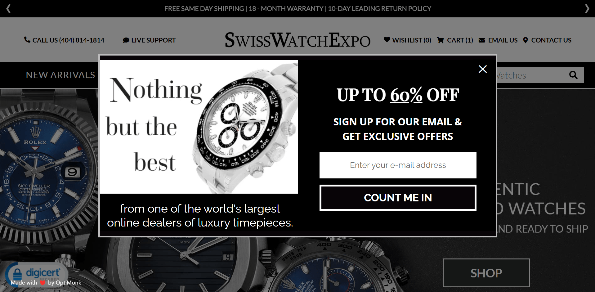
The second a visitor hits the SwissWatchExpo site, this slick popup offering up to 60% off plus exclusive offers shows up. And no, this isn’t your everyday “Hey, give us your email” kind of thing.
It lures visitors by showing off their luxury watch collection upfront and hooks them with a discount on those timeless pieces.This is the best way to get quality leads before folks even start window-shopping those high-end pieces.
Why This Works:
- “Up to 60% off” gives instant value that’s hard to ignore.
- The Rolex visual builds trust and instantly signals luxury.
- The phrase “Nothing but the best” appeals to high-end buyers.
- “Count Me In” feels warm and exclusive, not salesy.
- Pops up early to catch attention before browsing even begins.
11. Versace
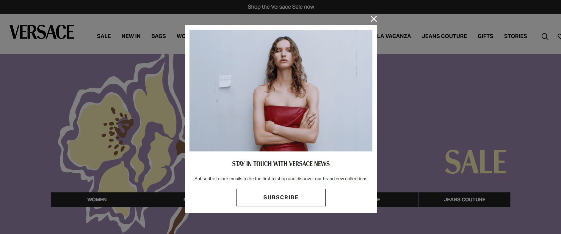
Versace has crafted an experience here by showing this two screen popup. After a visitor taps subscribe, a small signup form shows up describing what they can expect, how their data will be used, and an email field to type the email.
The minimalist layout, editorial-style image, and subtle messaging all scream premium. Versace knows their audience values exclusivity, not coupons. So instead of begging for emails, they invite visitors into their world. Blending visual storytelling with strategic timing and offer can help you build a list of high-intent subscribers.
Why This Works:
- The editorial-style image instantly hooks fashion-conscious visitors and anchors attention on the brand.
- The exclusive-sounding headline makes subscribing feel like a VIP invite, not a sales pitch.
- Short, benefit-led copy reduces cognitive load and teases early access to collections.
- A clean, bold CTA makes the next step obvious and frictionless, increasing clicks.
- The minimalist design removes distractions and keeps the experience aligned with luxury branding.
12. Valentino

Look how Valentino are curating a brand experience that begins the moment visitors show interest. The popup doesn’t chase conversions with discounts or urgency. Instead, it plants a seed of belonging. It’s a carefully crafted touchpoint that says: “If you’re here, you’re already part of something elegant.”
The newsletter sneek peak, single email field, consent checkbox, and gender selection makes subscribing easy, safe, and personalized.
Why This Works:
- Editorial-style visuals instantly signal luxury, pulling in the right audience emotionally.
- No discounts or urgency tactics builds trust and aligns with high-end shopper expectations.
- Gender selection makes the signup feel personal, increasing the chance of relevant follow-up engagement.
- Visible privacy policy and consent checkbox reduce hesitation, boosting signup confidence.
- The whole experience feels exclusive, making users want in—not out.
Discount Signup Popup
Who doesn’t love a good deal? Everyone does. That’s why a discount signup popup grabs attention quickly. It offers instant value in exchange for an email. It’s the perfect win-win—users save money, and you grow your list!
Plus, it nudges hesitant shoppers to buy now rather than later. Even if they don’t buy now, you get a chance to attract them by running email drip campaigns.
13. Nora
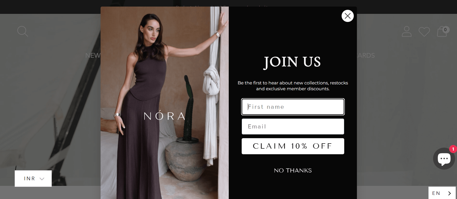
NÓRA doesn’t just sell fashion, it sells an experience. That’s why their discount signup popup isn’t just about offering 10% off; it’s about capturing attention at the perfect moment and turning casual browsers into loyal insiders.
This popup appears seamlessly as part of the brand journey, inviting visitors to join an exclusive circle where new drops, restocks, and perks come first. I love how the clean design reflects NÓRA’s luxe vibe.
Why This Works:
- Creates a sense of exclusivity that motivates loyal shoppers to subscribe.
- Promotes a special offer that feels like a premium perk, not a sales tactic.
- Uses elegant design to build trust and reflect brand quality.
- Keeps the form short and simple, making it easy to complete.
- Adds a soft opt-out that respects choice while encouraging action.
14. Sunbasket
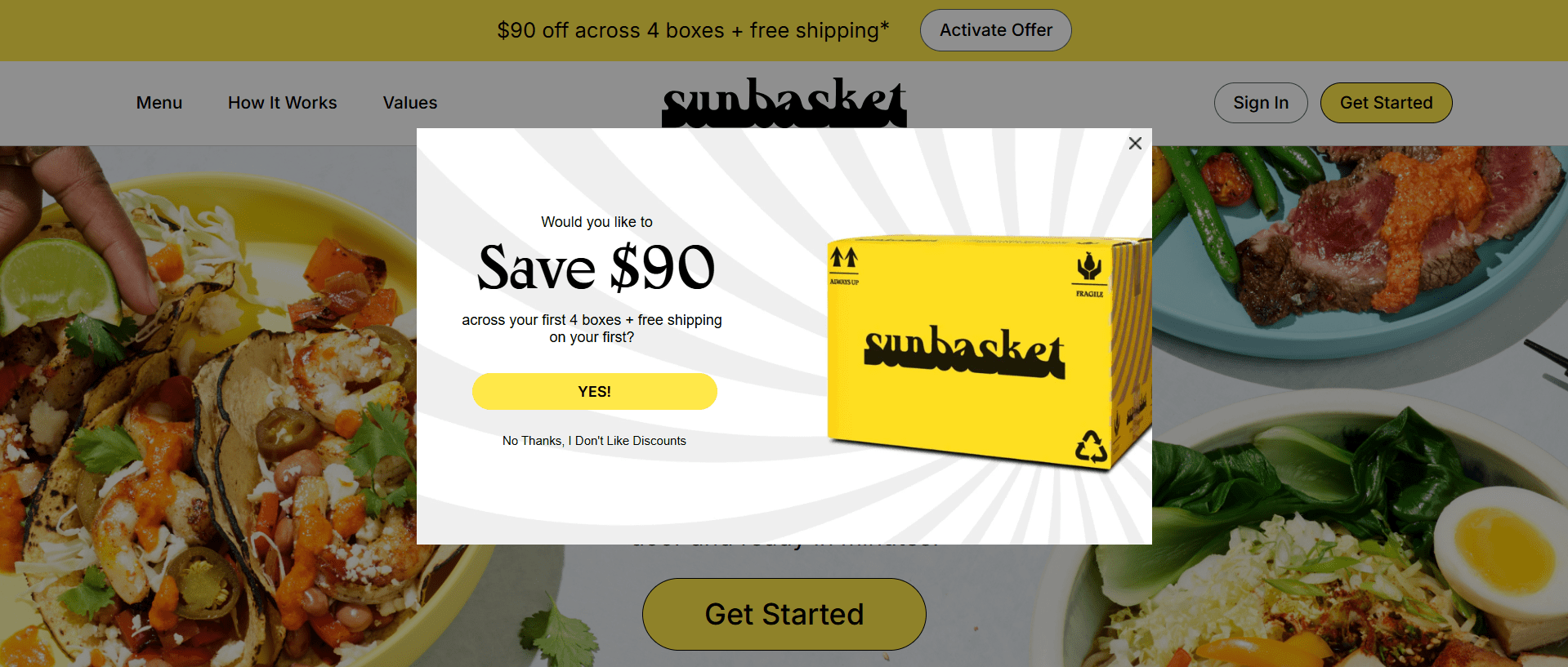
This one’s unique. See how Sunbasket shows a bold, time-sensitive offer that sets the tone for value and convenience. I like how it doesn’t just give $90 off; it anchors perceived savings upfront to hook price-sensitive and value-hungry shoppers.
The multi-box deal and free shipping are just enough to drive commitment. It’s a classic example of blending incentive, timing, and visual impact into one high-performing entry point.
Why This Works:
- The bold “Save $90” headline grabs instant attention with clear, high-impact value.
- Multi-box discount creates a sense of long-term savings, encouraging repeat purchases.
- The yellow Sunbasket box image builds trust by showcasing a tangible, branded product.
- Bright visuals against a clean background naturally draw focus to the offer.
- The clear YES button and witty opt-out text create urgency while reducing decision friction.
15. Nuoo

Nuoo knows that skincare buyers often need a little nudge before trying a new brand, so they lead with a discount on some products. The popup hits right when the visitor’s curiosity peaks, offering real product samples in exchange for just an email.
It’s smart psychology: the perceived value of a gift builds trust, removes friction from the first purchase, and frames the brand as generous. Plus, showcasing the gift visually right in the popup reinforces instant gratification, exactly what drives more signups.
Why This Works:
- “Gift” framing builds trust and makes the offer feel thoughtful, not salesy.
- Product visuals eliminate guesswork and spark immediate interest.
- Conversational copy feels natural and invites action without pressure.
- Minimal fields make signing up quick, easy, and friction-free.
- Split layout guides attention to the CTA without overwhelming the eye.
How to Create a Perfect Signup Popup
After checking out those 15 irresistible, real-world email signup popup examples, you’re probably thinking—sure, that all looks great in theory, but in the real world? Creating, targeting, and managing popups is a total hassle.
Blame it on clunky old-school tools. But with Picreel, that’s history. In under 15 minutes, you can pick a mailing list signup template, customize it, launch it, and connect it to your CRM or email platform for further nurturing.
I’ll show you how to do it in detail.
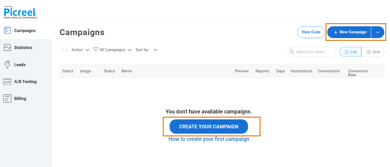
Step 1: Create a New Campaign
Once you’re inside the Picreel dashboard, click on “Campaigns” in the menu on the left side.
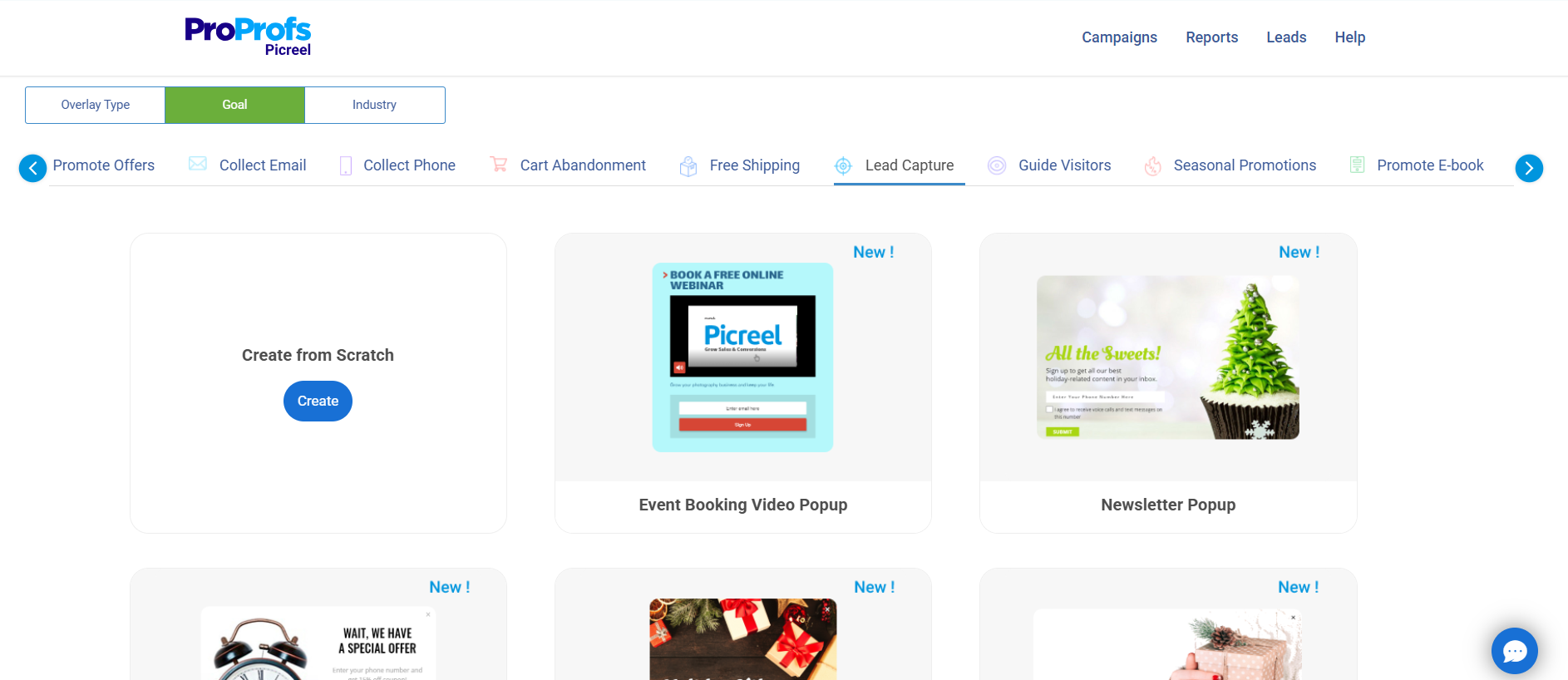
Step 2: Choose a Template or Build From Scratch
Next, click the small arrow next to “New Campaign” in the top right corner. Select the goals option and click “lead capture” to find a massive variety of signup popup ideas as templates.
Step 3: Customize the Selected Design
Tweak the layout, design, fonts, fields, and copy to match your brand.

Here’s a breakdown of creating an appealing popup design:
- Layout: Use a centered lightbox popup layout to keep attention on the signup offer.
- Design: Stick to clean, brand-aligned colors with high contrast for visibility.
- Fonts: Choose readable fonts like Open Sans, Roboto, or Lato for clarity.
- Fields: Limit to 2 fields – Name and Email – to reduce friction and improve completion rates.
- Copy: Write a short, benefit-driven headline (e.g., “Get 10% Off + Exclusive Content”) and a clear CTA like “Sign Me Up”. You can use this ChatGPT prompt to create a popup copy in seconds: “Write a persuasive popup copy to [achieve specific goal] for [target audience], offering [incentive or value], using a friendly and action-oriented tone.“
- Interactive Elements: From the elements section, add a countdown timer. Set relevant date and time to create urgency and encourage quick action.
- Visuals: To boost engagement, use free high-quality images from Unsplash or videos from Pexels or Vimeo. You can also add engaging GIFs using Tenor or GIPHY.
Step 4: Set Targeting & Triggers
Go to the campaign settings section and set up targeting and trigger options to decide when and where you want to display your signup popup.
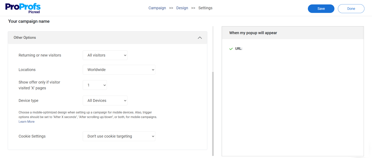
Based on my experience and research regarding signup popups, here’s how you should target your visitors:
- Target by Audience: Set “Visitor Type” to New Visitors and enable Geo Location to target regions that bring you the most sales.
- Show by Behavior: In “Trigger Settings,” set popup to show at 40% scroll depth, after 10 seconds on page, or on exit intent to capture high-intent users.
- Optimize for Mobile: Enable “All Devices” to keep your signup popups responsive for the 63% of traffic on mobile.
Step 5: Preview, Save & Publish
Once you’re done designing your popup click “Save”, then head to the “Install Campaign” section to copy your JavaScript snippet. Paste it into your website’s HTML, and your popup will go live!

Step 6: Analyze & Optimize With Data
A few days after launching your signup popup, go to the “Reports & Analytics” section in the sidebar to monitor its performance and uncover insights for improvement.

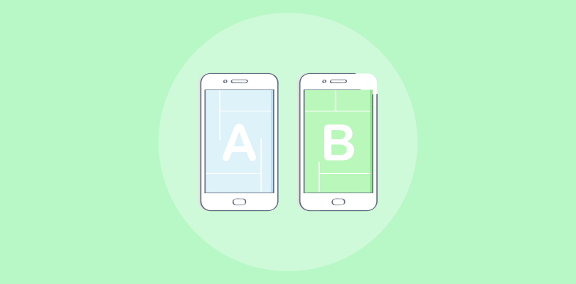
Don’t overthink the numbers too much; rather, focus on improving these results by leveraging the built-in A/B testing feature to test and tweak CTAs, offers, or designs based on real-time insights.
For more clarity, watch this quick video to see the full process of creating a signup popup from start to finish.
5 Proven Best Practices for High-Converting Signup Popups
To make the most of your Picreel signup popups and avoid the common pitfalls that frustrate users, follow these best practices grounded in real user feedback and modern marketing expectations:
1. Make Popups Helpful
Poorly timed or overly aggressive popups can disrupt the user experience. To keep visitors engaged, head to Picreel’s settings and adjust these points:
- Set frequency limits to once per visitor to avoid annoyance. Change popup timing or frequency only for time-sensitive, high-value offers.
- Set Cookie Name as “signup_popup_shown”, Cookie Compare as “=”, and Cookie Value as false to show the signup popup only to users who haven’t seen or submitted it.
- Add a visible close button. Also, enable “Close Lightbox on Overlay Click” to allow dismissal by clicking outside the popup, giving users complete control.
- Avoid triggering popups immediately; instead, use smart timing, such as 10+ seconds on page, 40% scroll, or exit intent.
2. Craft a Truly Irresistible Offer
Generic discounts won’t cut it anymore. Create offers that feel personal and valuable to your audience:
- Use tiered offers: For example, “Sign up now and get 10% off. Refer a friend for 20%.”
Set up two separate Picreel campaigns: one for first-time visitors using “Contains” or “Equals” with general page URLs, and another for referred users that triggers only on a unique referral success URL. Adjust impression frequency so each offer is shown only once per user.
- Personalize your incentive: Use “New/Returning Visitor” filters under “Other Options” and apply “Contains” in URL rules to target traffic from sources like /utm_source=facebook.
- Offer more than discounts: Customize copy and visuals in the popup editor and link buttons to gated assets, eBook downloads, or reward pages.
3. Build Trust with Compliance and Transparency
Privacy matters especially in regions with strict data laws. To be on the safer side, it’s important to be upfront about how you’ll be using the collected data.
- Include a GDPR-compliant consent checkbox. Find it in the input fields of the popup editor dashboard.
- Link clearly to your privacy policy to show how user data is handled.
4. Support Global Reach
If your business operates across regions or websites, consistency and localization matter:
- Create variants of the same popup in different languages for international users.
- Customize per domain if managing multiple sites with unique audiences.
- Serve offers tailored to geographic regions using built-in geo-targeting.
5. Ensure Seamless Third-Party Integration
I understand marketing teams need the freedom to launch without waiting on tech teams. Picreel helps you stay agile:
- Use one-click integrations for WordPress, Shopify, BigCommerce, and more.
- Add popups using a simple JavaScript snippet as discussed in the previous section—no deep coding required.
- Enable the desired CRM or email marketing service in the integrations section of the Picreel dashboard, and follow the promoted steps. This will help manage and nurture the upcoming leads automatically with zero effort.
Turn Browsers Into Leads With Sign-up Popups
Signup popups are an effortless way to capture visitors’ contact information and connect with them directly. They also help you grow your email list and drive sales. You can turn casual browsers into loyal customers by presenting irresistible offers and making it easy for visitors to sign up.
If you want to create your first signup popup form for your website, consider drawing inspiration from email signup popup examples and following the best practices listed in this blog. Doing so will help you design popups that capture attention and deliver results from day one.
For a hassle-free creation process, you must opt for easy-to-use popup builders like Picreel. With ready-to-use templates, advanced triggers, and seamless integration options, creating high-converting popups is simple.
And the best part? It offers a forever-free plan, so you can start building your popups today without any upfront cost.
Frequently Asked Questions
What’s better: discount popups or value-based offers like ebooks?
It depends on your audience and goals. Discount popups work well for e-commerce and first-time conversions, especially during sales or product launches. Value-based offers (like eBooks, guides, or exclusive content) are better for long-term lead nurturing, especially in SaaS, education, or B2B. To find out which is best, test both using A/B testing in Picreel and see which resonates more with your audience.
How do I create a non-intrusive popup that doesn't annoy users?
To keep popups user-friendly, use smart triggers like exit-intent, scroll depth, or delayed display instead of showing them instantly. Limit how often they appear with frequency caps, and ensure users can easily dismiss them with a close button or by clicking outside. Keep the design clean and avoid full-screen takeovers to maintain a smooth browsing experience.
FREE. All Features. FOREVER!
Try our Forever FREE account with all premium features!
 We'd love your feedback!
What did you like & how can we make it even better?
 Thanks for your feedback!
 Ask Your Question
Have a question? Get expert help to make your decision easier.