Popups work. An analysis of 1.24 billion popup displays found that the average email popup converts about 2.1% of visitors, with well-optimized campaigns reaching 5% or higher.
Yet when I speak with founders, marketers, and e-commerce operators, most of them are stuck around 1%. And the reason is almost always the same.
Popups themselves are not the problem. The way they are used is.
Most brands show them too soon. They offer too little. They fire the same popup to every visitor regardless of where that person came from, what page they are on, or how close they are to buying.
Then they wonder why their opt-in rate never moves. This guide takes the opposite approach.
Inside, you’ll see:
- 10+ real email popup design examples.
- Trigger logic behind each one
- Design elements that actually drive mobile conversions
- Incentive strategies that convert visitors
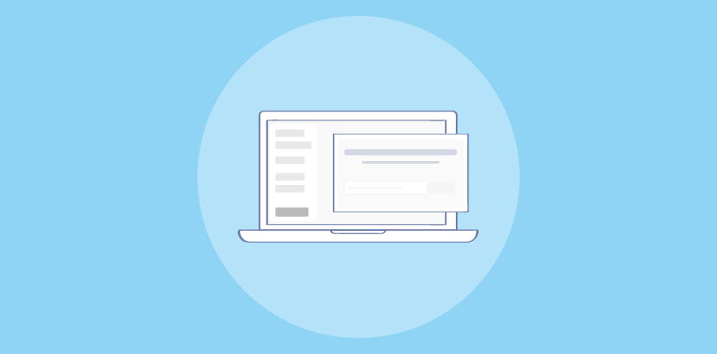
What Is an Email Popup?
An email popup is a message that appears on your website with one clear purpose: to capture a visitor’s email address in exchange for something valuable. It can take many forms, such as a center-screen modal, a slide-in panel, a sticky hello bar, a full-screen takeover, or even a gamified spin wheel.
While the high-converting popup design may vary, the goal is always the same. You present a meaningful offer, the visitor shares their email, and that interaction opens the door to an ongoing relationship.
What makes modern email subscription popups different from the intrusive versions of the past is how intelligently they’re triggered. Instead of appearing randomly, they respond to behaviors such as exit intent, scroll depth, traffic source, or return visits. That targeting precision transforms them from interruptions into timely, relevant conversion opportunities.
What Are Some Email Popup Examples That Actually Work?
I am sharing the best email lead capture examples because they convert. Each one includes what makes it work and exactly what you can apply to your own popups.
- Exit-Intent Email Popup Examples
- Email Capture Popup Examples
- Discount and Urgency Email Popup Examples
- Gamified Email Popup Examples
- Slide-In and Hello Bar Email Popup Examples
- Lead Magnet Email Popup Examples
Exit-Intent Email Popup Examples
Exit-intent popups fire only when a visitor signals they are leaving. Zero interruption for engaged browsers. Pure upside if even a fraction of those bounces convert.
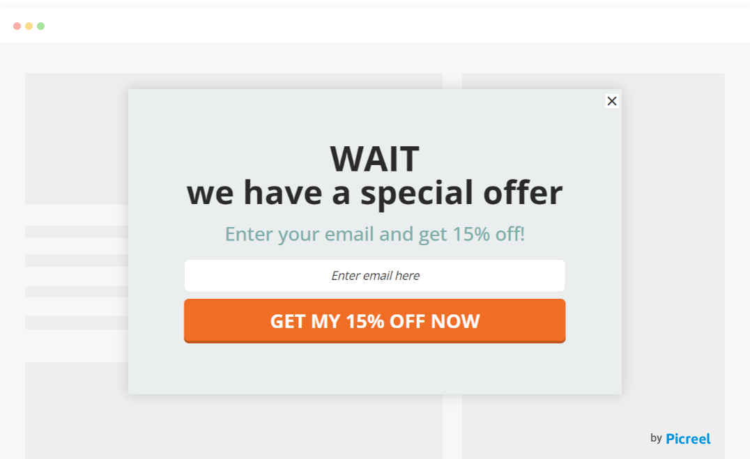
1. StackCommerce
What makes this popup effective is how clearly it answers the visitor’s unspoken question: Why should I give you my email? The headline immediately promises access to deals up to 90% off, which feels substantial enough to justify subscribing. The value is front and center, so visitors do not have to read through explanations to understand the benefit.
The design also helps. The bold number grabs attention, the single email field keeps the action simple, and the bright “Get the Deals” button makes the next step obvious. Instead of feeling like a generic signup form, it feels like a gateway to insider discounts.
If you are interested in exploring how you can launch such high-converting popups in a few minutes, check out our guide on “Exit intent popups“.
How to Apply This to Your Popups:
- Trigger: Exit-intent only
- Offer: A discount framed as exclusive to subscribers, not a sitewide sale
- Copy tip: Use “leaving already?” or “only for subscribers” to tie the offer to the opt-in action
- Design rule: One headline. One field. One button. Nothing else.
- Best for: E-commerce and DTC brands where a first-purchase discount is the primary conversion lever
2. Foundr
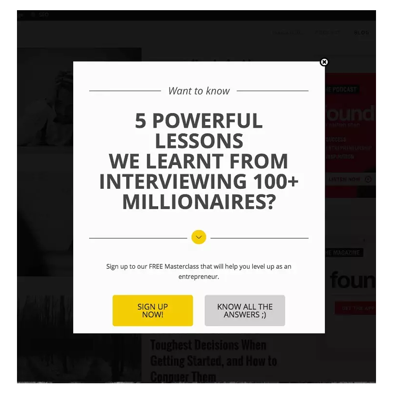
The incentive is what separates this from most exit popups. A free masterclass is not a coupon. It is something Foundr’s audience, aspiring entrepreneurs and business builders, would actively seek out and pay for. That perceived value does the heavy lifting.
The exit-intent trigger and single CTA simply make sure nothing gets in the way once a visitor decides the offer is worth it.
How to Apply This to Your Popups:
- Trigger: Exit-intent
- Offer: One piece of content your audience would actively search for or pay for
- Headline rule: Name the benefit directly, not vaguely (“Free 30-min masterclass on scaling to $1M” beats “Exclusive content”)
- Best for: Education, coaching, content-heavy brands

3. MVMT
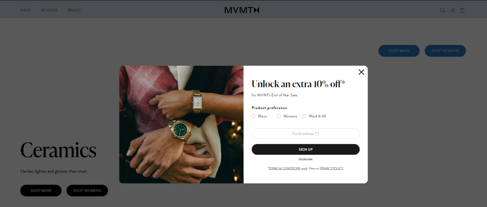
Look closely at what this popup is doing. It is not just asking for an email. It is inviting the visitor into something that feels slightly more exclusive. The “extra 10% off” is framed as something you unlock, not something everyone automatically gets. That small shift makes the offer feel earned.
Then comes the clever part. Before the email field, it asks what the visitor is shopping for. Mens, womens, or everything. That tiny choice pulls the visitor into the interaction. By the time they reach the email field, they have already started engaging with the popup, which makes completing the signup feel like the natural next step.
How to Apply This to Your Popups:
- Trigger: Exit-intent
- Offer: Exclusive subscriber discount, not a standard sitewide code
- Copy reframe: Replace “10% off” with “your exclusive offer is ready” or “subscriber discount unlocked.”
- Best for: Considered purchases where visitors research before buying (watches, electronics, furniture)
4. Hello Fresh
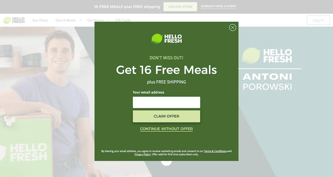
In the HelloFresh example above, the exit popup works because it directly addresses the hesitation visitors feel before subscribing. Many people abandon the page when they are unsure if the service is worth the cost.
The popup counters this by offering 16 free meals and free shipping, which removes both the financial risk and the delivery cost. By appearing right as users are about to leave, it turns that moment of doubt into a low-risk opportunity to try the service.
How to Apply This to Your Popups:
- Trigger: Exit-intent
- Offer: Remove the biggest first-order barrier (samples, free trial, free shipping)
- Ask yourself: What makes a first-time buyer hesitate? Answer that in the popup offer
- Best for: Subscription businesses and services where commitment risk is the main objection
Email Capture Popup Examples
Clean message. Real incentive. These grow lists with subscribers who actually want to hear from you.
5. Mala The Brand
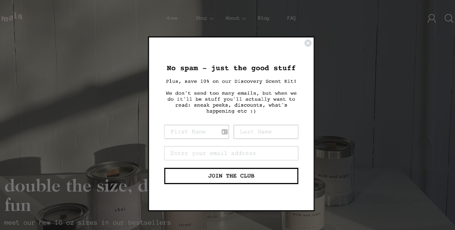
The first thing this popup does is remove doubt. Instead of pushing a big offer, it starts with a simple line: No spam, just the good stuff. That speaks directly to the biggest reason people avoid sharing their email.
Then it calmly explains what people will actually receive, like sneak peeks, discounts, and updates. It even says they do not send too many emails. That honesty makes the brand feel real. By the time visitors see the form, signing up feels more like joining a small club than giving away an email.
How to Apply This to Your Popups:
- Trigger: Exit-intent after meaningful browsing time
- Design rule: Lead with one strong product image. Let it sell the brand.
- Copy rule: One line max. The image is the hook, copy just closes it.
- Best for: Lifestyle, beauty, wellness, home goods
Discount and Urgency Email Popup
Urgency only works when the cost of waiting is real. These popups attach a consequence to leaving, which moves people from “I’ll think about it” to “I’ll do it now.”
6. Nuoo
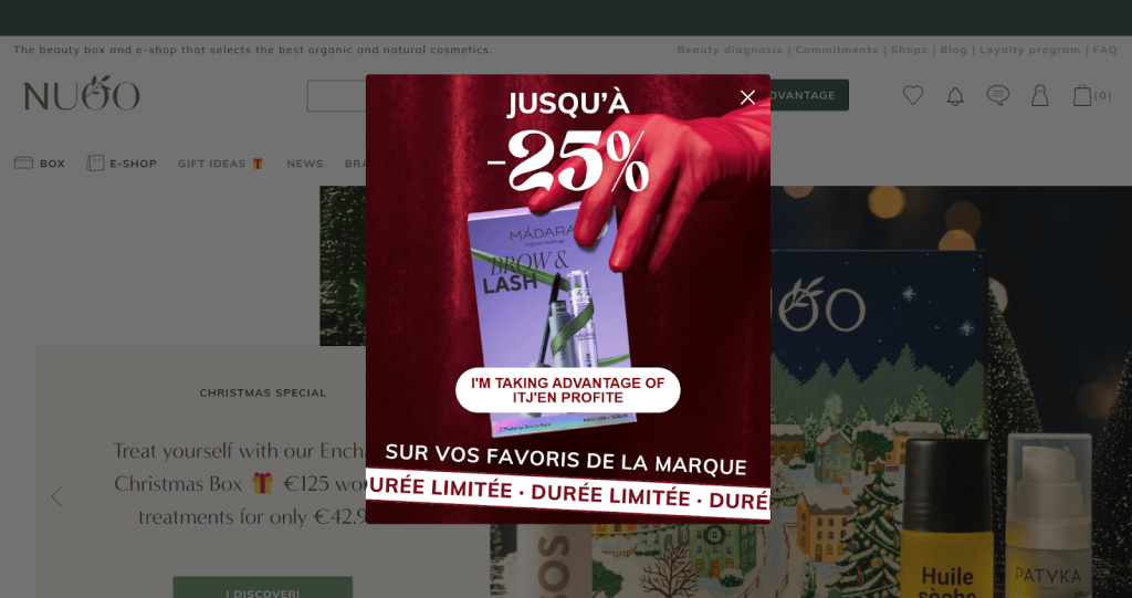
Nuoo keeps things refreshingly simple. The moment the popup appears, you know exactly what it’s about: 25% off, right now. No paragraphs to read, no choices to overthink. Just a bold offer and a single button.
The “limited time” cue quietly raises the stakes, turning a casual browse into a small moment of decision. When the message is this clear and quick to grasp, visitors are far more likely to click than close the tab.
How to Apply This to Your Popups:
- Trigger: Exit-intent or timed (30–45 seconds)
- Offer: A genuine time-limited discount, not a permanent one dressed up as urgent
- Design audit: Remove every element that is not the discount, the deadline, or the CTA
- Urgency rule: Set a real expiry date and display it visibly. Fake urgency destroys trust.
- Best for: E-commerce stores with first-purchase hesitation
Gamified Email Popup Examples
Gamification removes the “I’m giving something away” feeling. Visitors are no longer opting in. They are playing. That psychological shift is why completion rates jump.
7. Press (Spin-to-Win)
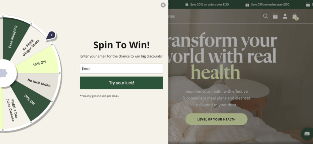
Most visitors ignore a typical “subscribe for a discount” popup. This one changes the dynamic by turning the signup into a quick challenge. The “Spin to Win” wheel instantly draws the eye, and the mix of rewards like discounts, free shipping, or bonus products makes the interaction feel worthwhile.
Entering an email becomes the price of participation rather than a data request. That small shift, paired with the visual pull of the wheel, makes visitors far more likely to engage.
To execute fun ideas like these, check out our guide to gamified popups!
How to Apply This to Your Popups:
- Trigger: Homepage or product pages for cold traffic
- Set up rule: Email field must come before the spin, not after
- Prize rule: Every outcome must be genuinely useful. No “try again” slots.
- Best for: First-time visitors from paid traffic who have not yet decided if the brand is worth their attention
8. Blue Apron
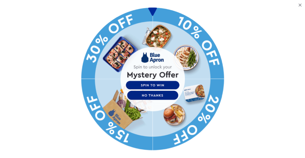
Variable rewards are more compelling than fixed ones. Blue Apron understood this. Not knowing whether you will land on 10%, 20%, or 30% off triggers the same curiosity that drives people to open mystery boxes or click on teaser subject lines.
The uncertainty makes the outcome feel earned, which increases its perceived value. The subtle “No thanks” option rounds it off well. Giving visitors a graceful exit actually makes them more likely to trust the brand, whether they spin or not.
How to Apply This to Your Popups:
- Trigger: Browsing visitors without clear purchase intent
- Reward range: Wide enough to feel exciting (10%–30%), tight enough that every outcome is of real value
- Design tip: Keep “No thanks” visible but subtle. Respecting the opt-out increases trust in the brand.
- Avoid: Dummy prizes. If visitors feel tricked, they unsubscribe and lose brand trust.
- Best for: E-commerce and subscription brands targeting mid-funnel visitors who are browsing but not yet ready to commit
Slide-In and Hello Bar Email Popup Examples
Non-intrusive. Always visible. Built for mobile, long-scroll pages, and returning visitors who need an invitation, not a sales pitch.
9. Sage x Clare
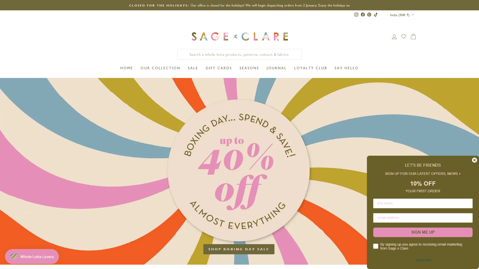
Look closely at how this popup fits into the page. It does not try to dominate the screen or shout for attention. Instead, it sits neatly in the corner with a simple message: Let’s be friends and a 10% welcome offer.
That small, friendly tone lowers resistance. It feels less like a sales push and more like an invitation. The colors and style also match the rest of the site, so it blends naturally with the brand’s design. When a popup feels this familiar and low-pressure, sharing an email becomes an easy decision.
How to Apply This to Your Popups:
- Trigger: 30–45 seconds of active time, or after 50% scroll depth
- Design rule: Match the popup color palette and font to your site. Native feels curated. Generic gets closed.
- Offer: 10% first-order discount
- Best for: Engaged browsers who are warming up but haven’t committed
10. Nora
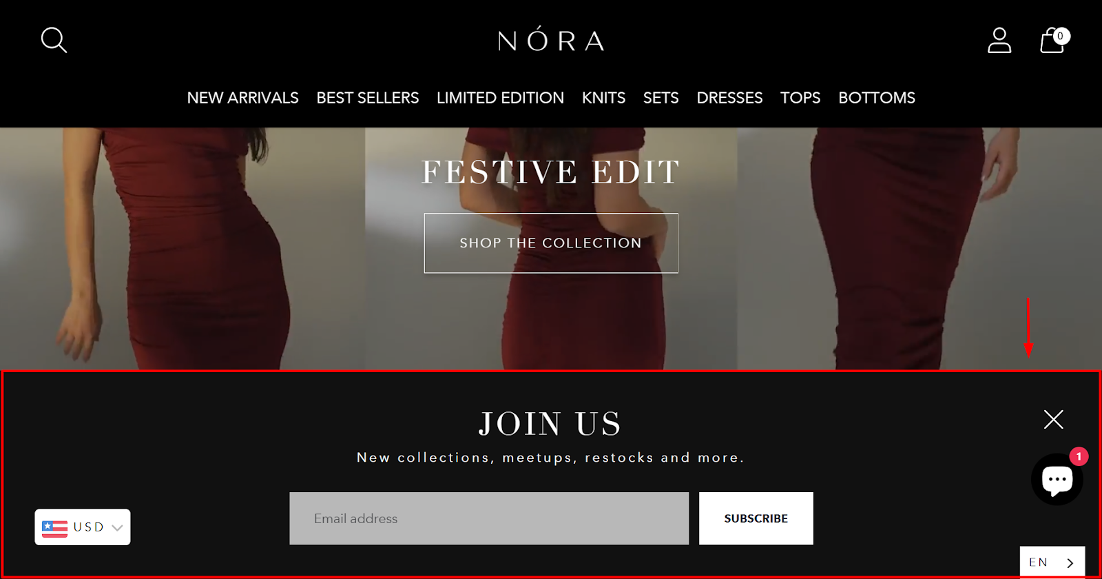
This popup works because it feels calm and intentional rather than pushy. Instead of flashing discounts or urgency, it simply invites visitors to “Join Us.” The message focuses on what the audience actually cares about: new collections, restocks, and exclusive updates. That makes the signup feel like access rather than a transaction.
The clean black bar also blends naturally with the site’s premium aesthetic, so it does not interrupt the browsing experience. For visitors already interested in the brand, that quiet invitation is often enough to capture the email.
How to Apply This to Your Popups:
- Trigger: Returning visitors or brand-aware traffic (social, referral)
- Design: Black bar, two words, one email field, one button. That is it.
- Audience rule: Save discounts for cold paid traffic. Use restraint for warm audiences who already trust the brand.
- Best for: Premium and lifestyle brands where simplicity is part of the brand identity
Lead Magnet Email Popup Examples
The popup is just the delivery mechanism. If the asset is genuinely desirable, email capture stops feeling like a hurdle and starts feeling like a fair trade.
11. Sienna Sauce
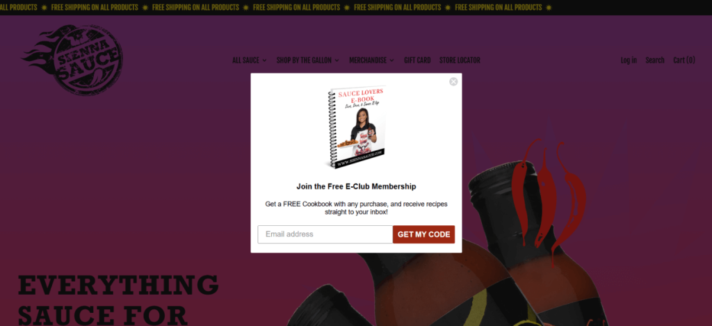
A cookbook is something people buy. Offering it free in exchange for an email completely shifts the dynamic of the opt-in. Instead of asking for something, Sienna Sauce is giving something, something tangible, immediately available, and genuinely useful beyond the brand.
That turns the first interaction into a value exchange rather than a data grab, and the relationship that follows starts from a very different place than a standard discount signup.
To adopt a similar popup, explore some interesting lead magnet ideas in our guide.
How to Apply This to Your Popups:
- Trigger: Homepage or product pages
- Lead magnet test: Would someone Google this and be satisfied paying for it? If yes, it is strong enough.
- Asset types that work: Recipes, templates, guides, toolkits, mini-courses
- Headline rule: Name the asset specifically. “Free sauce cookbook” beats “exclusive content.”
- Best for: Food, lifestyle, CPG brands with existing content they can package
12. RDPUSA
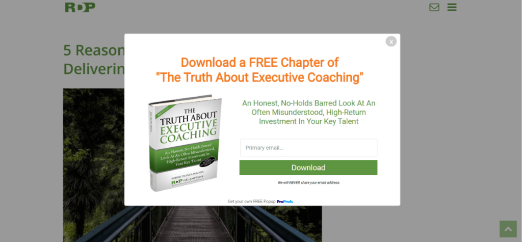
Executives do not hand over their email for generic content. They opt in for things that match how they see themselves professionally. RDPUSA gets this. A free chapter from a coaching book aimed at decision-makers is not a promotional giveaway.
It is a signal that the brand understands its audience at a deeper level. That specificity is what makes the opt-in feel relevant rather than opportunistic, and it is why this kind of lead magnet outperforms a one-page PDF guide every time.
How to Apply This to Your Popups:
- Trigger: Blog posts or landing pages targeting decision-makers
- Audience exercise: Define your highest-value subscriber by how they see themselves, not just demographics
- Asset tip: A book chapter signals authority in a way a one-page PDF often does not. Repurpose existing depth content.
- Framing rule: Position the asset as insight, not promotion. Executives opt in for value, not vendor pitches.
- Best for: B2B, coaching, consulting, and high-consideration services
What Popup Design Elements Improve Mobile Conversions?
Mobile is where most popup strategies fall apart. Over 60% of website traffic now comes from mobile devices, yet most popups are still designed desktop-first and then squeezed onto smaller screens. That scaling creates friction, and friction kills conversions. If your popup feels awkward on a phone, it will not convert no matter how strong the offer is.
Here is what consistently improves mobile conversion rates across campaigns.
1. Single-Field Forms: Single-field forms convert dramatically better on mobile. Name plus email feels minor on desktop, but on a phone keyboard, every extra field increases drop-off. Ask for the email. Secure the opt-in. Collect additional details later in the welcome sequence.
2. Touch-Friendly Close Buttons: Close buttons are non-negotiable. If the close icon is too small, visitors mis-tap and trigger frustration instead of engagement. That frustration does not increase conversions. It builds resistance. A properly sized close button protects both UX and brand trust.
3. Bottom-Anchored Slide-Ins: Bottom-anchored slide-ins outperform center modals on mobile. They respect how people hold their phones and sit naturally within the thumb zone. Instead of blocking content, they feel more like a notification. That subtle positioning increases interaction without feeling disruptive.
4. Delayed Triggers: Immediate popups risk both SEO penalties and high bounce rates. Visitors who see a mobile-responsive popups before reading a single line of content simply leave. Delay the trigger by at least 15 seconds or tie it to scroll depth to ensure intent is present.
5. Short, Scannable Copy: Mobile users scan quickly. A tight headline, a single-line value statement, and one clear CTA are enough. This is where popup CTA optimization matters most. If the popup requires explanation, the offer needs refinement.
6. Countdown Timers: Countdown timer mobile-responsive popups perform well for urgency campaigns on mobile. A visible ticking timer communicates scarcity instantly without requiring heavy text. On a small screen, visual urgency often works better than long persuasive copy.
What Are the Best Popup Incentives?
The incentive is what prompts a visitor to share their email. Get it wrong, and your popup turns into background noise. Get it right, and your list grows faster than most ad campaigns running on the same budget. Here’s what consistently works.
| Incentive Type | Best For | Why It Converts |
|---|---|---|
| First-order discount (10-20%) | New visitor acquisition, high-AOV stores | Removes the price hesitation that keeps first-time buyers from committing |
| Free shipping threshold | Stores where shipping cost causes abandonment | Addresses the #1 reason people abandon carts without reducing perceived product value |
| Spin-to-win / mystery discount | DTC brands with younger, social-traffic audiences | Curiosity and game mechanics drive completion rates higher than static offers |
| Free product sample or trial | Beauty, food, supplement, and SaaS brands | Tangible product in hand beats a code in an inbox for high-consideration categories |
| Exclusive early access | Product launch, limited edition, waitlist campaigns | Scarcity and exclusivity signal status, which motivates opt-in without discounting |
| Free resource or guide | Content-led brands, consultants, educational products | Positions the brand as the expert before asking for any purchase commitment |
| Loyalty points on signup | Brands with an existing points or rewards program | Adds value without discounting, and immediately enrolls the subscriber in your retention loop |
FREE. All Features. FOREVER!
Try our Forever FREE account with all premium features!
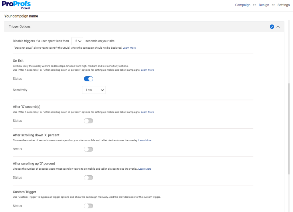
How Should You Trigger Email Capture Popups for Maximum Conversion?
The trigger is more important than the design. I say this constantly and I mean it. You can have a beautiful popup with a strong offer and still tank your conversion rate by firing it at the wrong moment. Here is the trigger framework I recommend.
| Trigger Type | Best For | Timing Recommendation |
|---|---|---|
| Time delay | General email capture on blogs and product pages | 30 to 45 seconds after page load |
| Scroll depth | Engaged readers, long-form content, product pages | 50 to 60% down the page |
| Exit intent | Cart abandonment, bounce prevention, last-chance offers | When cursor moves toward close or back button |
| Inactivity | SaaS pricing pages, high-consideration product comparisons | After 10 to 15 seconds of no mouse movement or scroll |
| UTM or URL rules | Campaign-specific traffic, multi-domain operators | On page load for specific landing pages or traffic sources |
| Click trigger | Voluntary opt-in, content upgrade downloads | On click of a specific element or CTA |
| Loyalty points on signup | Brands with an existing points or rewards program | Adds value without discounting, and immediately enrolls the subscriber in your retention loop |
The rule I never break: do not show a popup on checkout pages. Ever. The highest-intent moment in your entire funnel is when a visitor is completing a purchase. Any interruption at that point introduces doubt and breaks momentum. Let them buy. Talk to them after.
What Mistakes Kill Email Popup Conversions?
Even strong offers fail when basic strategy mistakes creep in. Most low-performing email signup popups are not broken because of design. They are broken because of timing, friction, or overuse. Here are the mistakes that quietly destroy conversions.
Instant page-load triggers: Visitors who see a popup before reading a single word will close it reflexively and form a negative impression of your brand before you have offered them anything.
Too many form fields: Every field beyond the email address reduces your completion rate. Name and email are already noticeable drops. Name, email, phone, and birthday is a list you will never build.
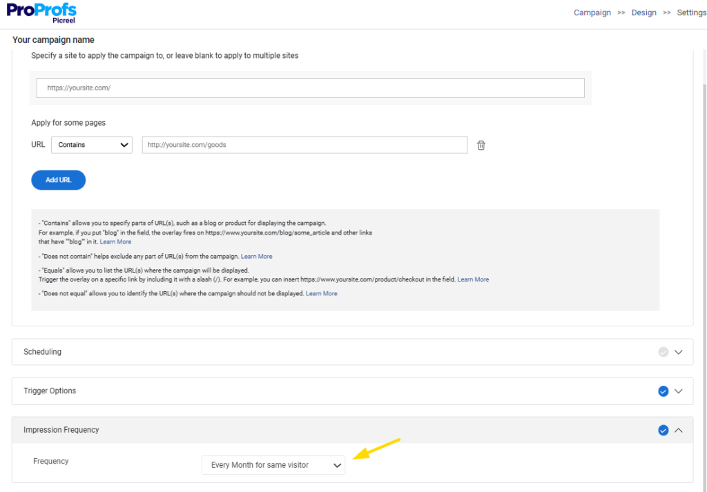
No frequency capping: Showing the same popup on every page of every visit builds resentment. Cap frequency to once per session. Suppress for known subscribers.
Guilt-trip dismiss copy: “No thanks, I hate saving money” is not clever. It is coercive. Give people a clean, respectful way to decline. Trust compounds over time. Manipulation destroys it.
Over-designed mobile popups: Animations, background videos, and multi-column layouts that look impressive on desktop are conversion killers on mobile. Simplicity wins on small screens.
Which Email Popup Best Practices Separate Good from Great?
The difference between an average email signup popup and a high-converting one usually comes down to small decisions. Timing, wording, layout, and restraint matter more than flashy design. Here are the popup UX design principles that consistently move conversion rates.
1. Use a Compelling, Benefit-First Headline: Visitors are not there to read your popup. Your headline must communicate value instantly. “Get Your Free Shipping Code” will always outperform “Join Our List.”
2. Keep Form Fields to a Minimum: Every extra field reduces completion rate. Email alone converts best. Name plus email performs lower. Collect only what you will use immediately.
3. Design for Mobile First: Design for a 375-pixel screen before desktop. Use touch-friendly close buttons at least 44 pixels wide. Favor single-field forms and slide-ins or hello bars that avoid mobile interstitial penalties.
4. A/B Test Offers Before Design: A/B testing “10% off” versus “free shipping” will move numbers more than testing button colors. Offer strength drives conversion.
5. Personalize Based on Traffic Source: Match your popup to UTM intent. If someone comes from a Google Ad for “minimalist watch brands,” reflect that in the headline and offer instead of showing a generic subscribe prompt. You can do this using cookie popups.
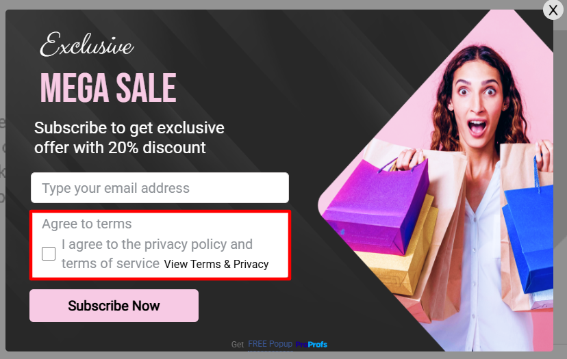
6. Ensure GDPR Compliance Without Killing Conversions: For EU traffic, include a visible privacy policy link, clear language explaining how the email will be used, and a double opt-in confirmation flow when required. Keep the GDPR popup tone trust-focused, not legal-heavy.
7. Set Frequency Caps Without Exception: Cap popups to once per session or once per day and suppress known subscribers. Allow exit-intent to reappear across sessions, since the trigger is behavior-based rather than repetitive.
What Types of Email Popups Get the Highest Conversions?
Not all popup formats convert equally. Some are built for attention. Others are built for subtlety. The right choice depends on your goal, your brand, and where in the funnel you’re intercepting the visitor. Here is a breakdown of the highest-converting formats and when each one earns its place.
| Popup Format | Best For | Conversion Strength | UX Risk | When to Use It |
|---|---|---|---|---|
| Modal Overlays | Lead capture, discounts, announcements | High | Medium | When the offer is strong enough to justify center-screen placement |
| Slide-In Popups | Newsletter signups, upsells, reminders | Medium-High | Low | Long-form pages where subtle beats loud |
| Fullscreen Overlays | Major promotions, seasonal campaigns | High | High | Only when the reward outweighs the interruption |
| Exit-Intent Popups | Cart recovery, bounce prevention | Very High | Low | Your lowest-risk, highest-reward trigger — shown only on exit |
| Gamified Popups | Discounts, list building, DTC deals | Very High | Medium | When the prize feels meaningful and on-brand |
| Multi-Step Popups | Segmented email capture, Klaviyo routing | High | Low-Medium | When you want interest-based segmentation without heavy dev work |
| Hello Bars / Nano Bars | Announcements, free shipping, small offers | Medium | Very Low | Mobile and repeat traffic where subtle repetition pays off |
FREE. All Features. FOREVER!
Try our Forever FREE account with all premium features!
Start With One Popup, One Goal, One Real Offer
Email capture popups are not about adding another widget to your site. They are about timing, intent, and value. The email lead capture examples above show that format alone does not drive results. The offer has to match the moment.
Exit intent works because it intercepts abandonment. Slide-ins work because they respect the browsing experience. Gamified popups work because they shift engagement from passive to active. On mobile, simplicity and friction reduction win every time.
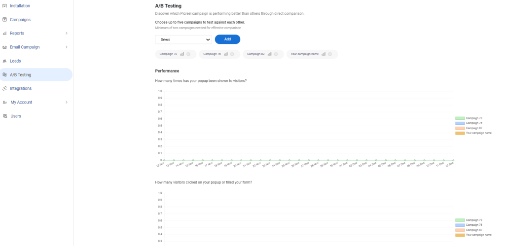
If you are managing multiple campaigns, traffic sources, or domains, the real advantage comes from targeting precision and centralized control. That is where a tool like Picreel makes sense. It allows you to combine behavior triggers, UTM-based personalization, mobile-optimized formats, and multi-domain management without heavy development work.
Start with one goal, one trigger, and one strong incentive. Test. Refine. Let data guide your next iteration.
Frequently Asked Questions

What happens when someone clicks on an email signup popup?
When a visitor clicks the CTA, they are either submitting their email, revealing a form, or being redirected to a landing page. If configured properly, their data is instantly sent to your email platform for automation or segmentation.
How long should an email popup stay visible?
It should stay visible until the visitor interacts with or dismisses it. However, avoid aggressive reappearance during the same session. One controlled impression per session is usually best.
Are email popups bad for SEO?
They are only harmful if they block mobile content immediately on page load or slow page performance. Behavior-triggered, delayed, or exit-intent email popups are SEO-safe when implemented correctly.
What is the best time delay for an email popup?
For blog or content pages, 30 to 45 seconds works well. For e-commerce product pages, scroll-based triggers around 50% engagement often outperform fixed delays.
Can email popups work without offering a discount?
Yes. Lead magnets, early access, loyalty points, or exclusive content often convert just as well, especially for brands that want to protect margins.
How many email popups should a website run at once?
Ideally one primary campaign per visitor session. Running multiple popups without strict targeting and frequency logic creates fatigue and reduces trust.
What is a POP email, and is it related to popups?
POP email refers to Post Office Protocol, a method for retrieving email from a server. It has nothing to do with website popups. The similarity is only in the word “pop.”
Do popups work on returning visitors?
Yes, but they should be personalized. Showing the same new-visitor discount to someone who already subscribed reduces credibility and conversion potential.
How do I measure if my email popup is successful?
Track conversion rate, assisted revenue, subscriber quality, and bounce impact. A popup is successful not just when it captures emails, but when those emails generate engagement and revenue downstream.
FREE. All Features. FOREVER!
Try our Forever FREE account with all premium features!
 We'd love your feedback!
What did you like & how can we make it even better?
 Thanks for your feedback!
 Ask Your Question
Have a question? Get expert help to make your decision easier.