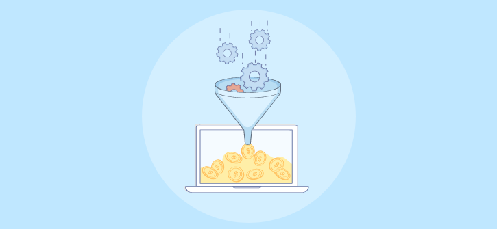
Here’s a hard truth: the average website conversion rate in the U.S. is just 2.35% and for most businesses, it’s even lower.
You spend weeks driving traffic through SEO, ads, and social media… but if your site isn’t converting, 98 out of 100 visitors leave without action.
I’ve seen this happen with startups, founders, and even established brands. Their websites often buzz with traffic but leak revenue like a broken funnel.
And here’s what I’ve learned after working with dozens of businesses:
People don’t leave your site because they’re “just browsing.” They leave because:
- The experience doesn’t match their intent
- Popups are clunky, distracting, or irrelevant
- There’s no trust, no personalization, and no clear next step
The good news? You don’t need more traffic to make more sales.
In this guide, I’ll walk you through proven, battle-tested CRO strategies that have helped businesses like yours:
- Turn casual visitors into paying customers
- Boost conversions without burning ad dollars
- Create seamless, trust-driven user journeys
If you’re ready to turn clicks into customers and traffic into revenue, let’s dive in.
10 Proven Ways to Increase Conversions on Websites
If you’re struggling with low conversion rates and abandoned carts, you’re not alone.
The good news is that with the right strategies, tools, and optimizations, you can overcome these hurdles, capture more qualified leads, and deliver a seamless, personalized experience that drives results.
Here are the top 10 strategies you must consider to increase conversions on your website:
1. Collect and Analyze Visitor Data
If you want to boost conversions, you first need to understand what your visitors are doing and why. Start with tools like Google Analytics to track bounce rates, time on page, and navigation paths. If you see people leaving quickly, it’s a sign that your content, offer, or page layout isn’t hitting the mark.
To uncover why users are exiting, add an exit-intent popup using tools like Picreel. These can be designed with on-brand, non-intrusive layouts and set to trigger for specific visitor segments (e.g., new vs. returning, location-based, or language preference). This gives you one last chance to improve website conversion rate, offer tailored incentives like discounts or free trials, or collect quick feedback before they go.
By implementing Picreel exit-intent popups, Foundr captured 20,000+ extra leads for its free live training, achieving a 10% conversion rate from 200,000+ impressions. The tool’s seamless integration, ease of use, and advanced targeting allowed them to deliver relevant offers, boost sign-ups, and convert both free and paid product traffic.

Step-by-Step Implementation
1. Set Up Tracking First: Install Google Analytics (or similar) to collect key metrics like exit pages, bounce rate, and device breakdowns.
2. Identify High-Exit Pages: Review your analytics to find which pages lose visitors most often.
3. Design Targeted Exit Popups: For each high-exit page, create a tailored, value-focused popup message (e.g., “Still deciding? Here’s 10% off today only”) using a popup tool like Picreel that integrates with your CRM and email marketing platforms like BIG Contacts and MailChimp.
4. Integrate With CRM/Email Tools: Connect popup form submissions to CRM tools like BIG Contacts for instant follow-up and segmentation.
5. Test and Refine: A/B test different messages, offers, and triggers, then re-check analytics to confirm what’s reducing exits and increasing conversions.
By combining analytics with targeted, behavior-driven popups, you go beyond reacting to exits. You address the root causes and create personalized touchpoints that boost your conversion rate.
Here’s what an exit popup looks like:
2. Define a Clear Conversion Funnel
A conversion funnel represents the stages a potential customer goes through before making a purchase or completing a desired action. It visualizes the journey from awareness to conversion and helps you understand and optimize the customer’s path to improve website conversion rate.
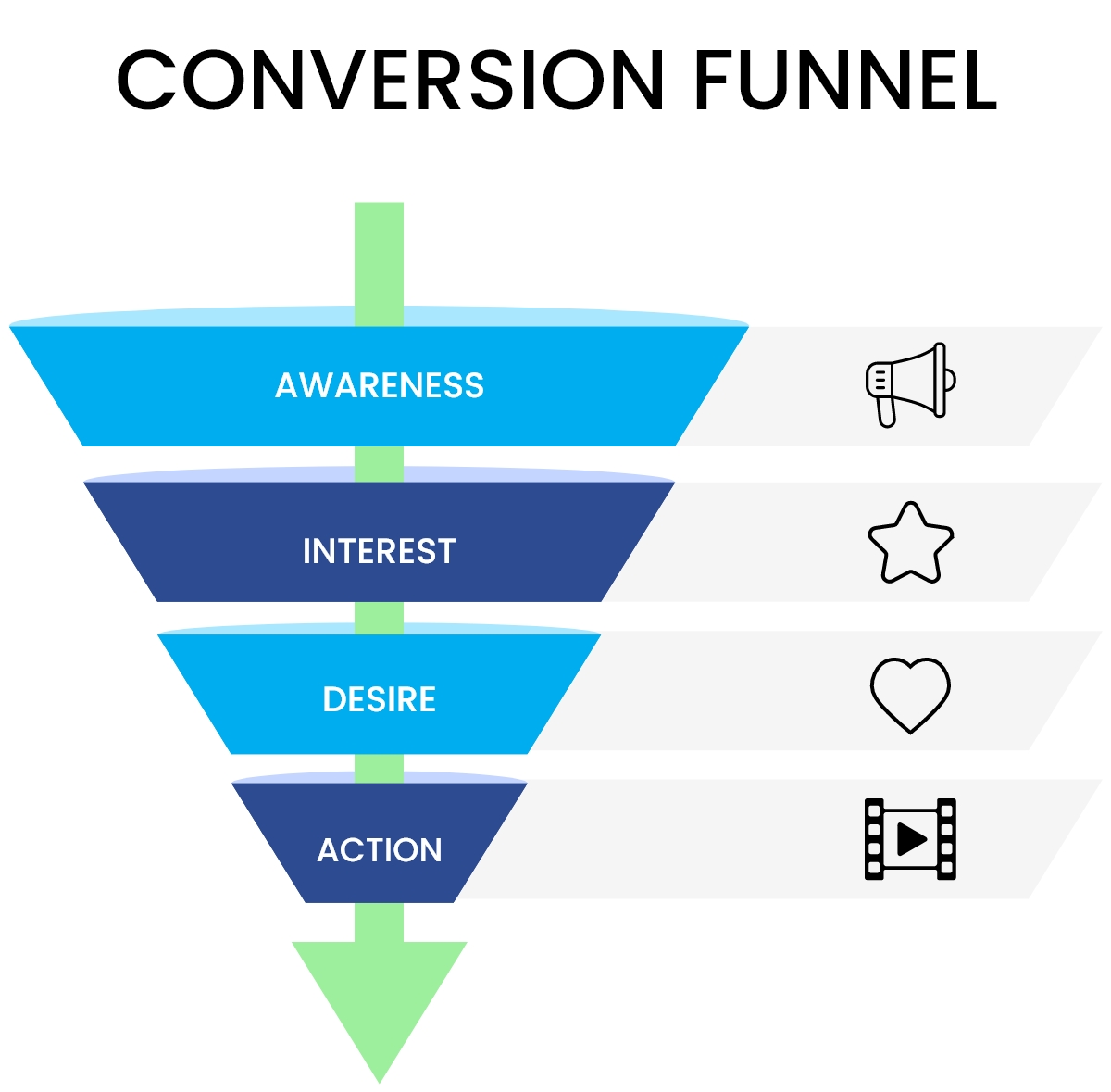
Image Source: Oberlo
I’d recommend you to start with deciding on the end goal, whether it’s making a purchase, filling out a form, or downloading an eBook. Along the way, consider segmenting visitors (new vs. returning, location, device) so your website can guide each audience through a path tailored to their behavior and needs. Your website should clearly guide visitors through the various stages of conversion.
Here’s how to define a clear conversion funnel:
Step-by-Step Implementation
1. Set Your Goal: Define the key action you want users to take (purchase, signup, download). This goal becomes the final stage of your funnel and shapes all preceding steps.
2. Map the Journey: Use tools like Funnelytics, Lucidchart, or even Google Drawings to outline every touchpoint from first visit to conversion.
3. Track Behavior: In Google Analytics or Matomo, set up event tracking for key actions, such as page views, clicks on CTAs, form starts, and completions. If using popups for lead capture, integrate them with your CRM (HubSpot, Klaviyo) so those interactions are part of your funnel data.
4. Establish Baselines: Monitor bounce rates, load times, and device-specific performance for 2–4 weeks to identify normal behavior patterns. This creates a reference point to measure improvements after optimizations.
5. Identify Drop-Off Points: Use funnel reports to see where users abandon the process. Then address those issues directly — rewrite unclear CTAs, improve page speed, streamline mobile layouts, simplify form fields, and remove distracting elements.
6. Test & Iterate: Run A/B tests for changes at specific funnel stages and compare results to your baselines. Keep what works, discard what doesn’t.
3. Use Clear CTAs
A clear and compelling call-to-action (CTA) is one of the fastest ways to increase conversions, yet unclear or poorly placed CTAs remain a common drop-off point, especially on slow-loading or mobile-unfriendly pages.
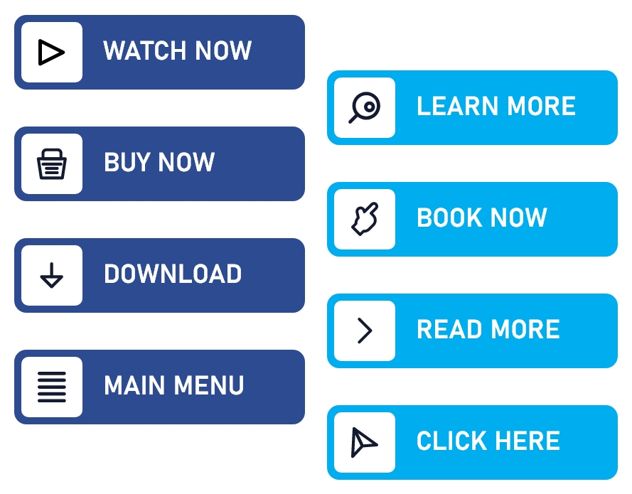
Image Source: Freepik
Use CTAs like “Add to Cart“, “Buy Now“, and “Sign Up Here” that prompt users to take action. Place them where users naturally engage, in a prominent color, and with a clear label, and ensure they stand out in both desktop and mobile views.
Step-by-Step Implementation
- Set Your Objective: Define the single action you want (e.g., “Add to Cart,” “Sign Up Here”).
- Write Action-Oriented Copy: Use direct, benefit-focused language like “Sign up now,” “Shop the sale,” or “Get started today.”
- Design for Visibility: Choose contrasting colors, readable fonts, and ensure GDPR compliance for any data capture.
- Optimize for All Devices: Reserve button space in your CSS to ensure buttons are thumb-friendly on mobile, i.e., at a minimum 44px height, load quickly, and don’t shift during rendering.
- Place Strategically: Position CTAs above the fold, after key benefits, and at decision points in the content.
- Create Urgency or Exclusivity: Use phrases like “Limited time offer” or “While supplies last” to prompt quicker action.
- Personalize When Possible: Show tailored CTAs based on behavior, location, or whether the visitor is new or returning to increase relevance and engagement.
- Test & Refine: Track the performance of your CTAs before and after changes using analytics tools. Analyze click-through rates, conversion rates, and user behavior to refine and optimize your CTAs over time. Here’s how to analyze the campaign statistics on dashboard.
By implementing these tips, you can create clear and compelling CTAs that guide your website visitors toward the desired actions, ultimately improving conversion rates and user engagement.
4. A/B Test Everything
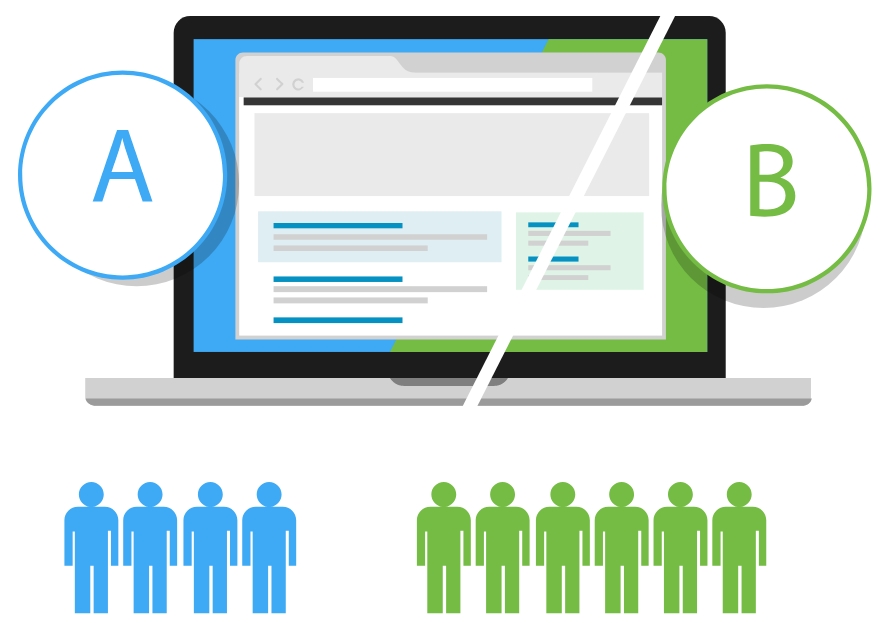
A/B testing helps you identify which campaign is bringing in traffic and converting customers. By comparing two variations of a single element, such as a headline, CTA button, or landing page layout, you can see which version performs better and make data-driven changes to increase website conversion.
Some time back, we had an opportunity to work with a team of conversion rate optimization (CRO) specialists on multiple websites. Here’s what we found one can do to conduct A/B testing successfully:
Step-by-Step Implementation Guide:
- Start With the Right Tool: Choose an A/B testing platform like VWO, Optimizely, Convert, or a CRO tool like Picreel that integrates with your analytics. Make sure it can create variations, split traffic evenly, and track conversions.
- Set a Clear Objective: Define the exact outcome you want to improve (e.g., increase form submissions by 15% or boost click-through rate by 10%).
- Choose One Variable: Test only one element at a time (e.g., headline text, button color, placement) to clearly attribute results.
- Segment Your Audience: Run tests on different visitor types (e.g., new vs. returning users, mobile vs. desktop) to uncover segment-specific insights.
- Determine Sample Size & Duration: Use a statistical significance calculator to avoid premature results; run tests for at least 1–2 business cycles.
- Run the Test: Ensure both versions are shown randomly and evenly to the audience to avoid bias.
- Analyze Results: Review conversion rate, CTR, and engagement metrics. Confirm results meet statistical significance before making changes permanent.
- Iterate & Test Again: Apply winning variations, then test the next most impactful element.
5. Set a Clear Value Proposition
Your value proposition tells your users why they need your product and how it is different from your competitors. Make use of clear taglines, product images, and customer reviews to tell your users how your product solves their problems and helps increase website conversion.
Keep it simple, avoid jargon, and use compelling, emotional language that sets you apart. Show the outcome they can expect through taglines, visuals, and reviews, and refine your message using feedback and market research.
For example, Apple’s value proposition is “Think Different,” and it creates an emotional connection with its users.

Image Source: Wikimedia
How to set a clear value proposition:
- Customer Research: Use Picreel popup surveys to collect in-site feedback in real time, then complement it with tools like ProProfs Survey Maker for structured surveys or quick polls on social media. Review competitor messaging and customer reviews to uncover pain points and motivations.
- Draft: Create 2–3 value proposition variations using a formula like “We help [audience] achieve [benefit] by [unique feature]”. Reference your research findings to ensure relevance.
- Test: Use A/B testing tools (e.g., Google Optimize, Optimizely) or email split tests to compare versions. Gather qualitative feedback from loyal customers or beta testers.
- Deploy: Publish the winning version in high-impact areas like homepage hero, landing pages, and product descriptions, ensuring it’s visually highlighted and easy to read.
- Refine: Track performance via analytics tool and run follow-up surveys to see if your message continues to resonate, adjusting as needed.
6. Recover Abandoned Carts
Did you know that the average documented eCommerce cart abandonment rate is 69.57%? It can increase by 75% if there’s poor visitor experience on your site, like slow loading. An abandoned cart is when a user adds something to their cart and then leaves the site without making a purchase.
Use CRO tools like email campaigns or popups to motivate users to take action and increase website conversion.
Here’s how an abandoned cart recovery popup looks like:
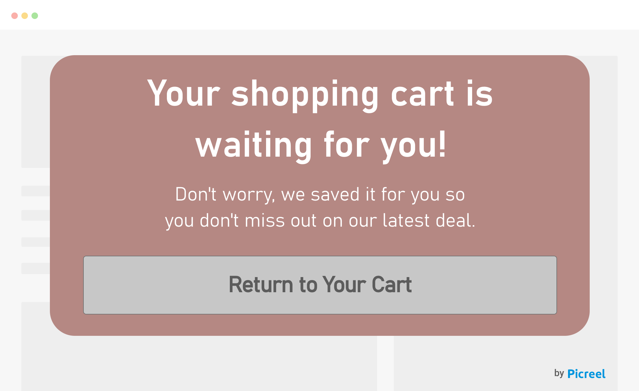
Here’s a step-by-step guide on how to recover abandoned carts:
- Install Picreel: Sign up, copy the tracking code from your dashboard, and paste it into your site’s <head> section or integrate via CMS plugin (Shopify, WordPress, Magento, etc.).
- Create an Exit-Intent Popup: In Picreel, set the trigger to fire when visitors move the cursor toward the close or back button.
- Design Your Offer: Use templates to promote an incentive like “10% off” or “Free shipping today only.”
- Add a Lead Capture Form: Include name and email fields, keeping it short to reduce friction.
- Integrate With CRM & Email Tools: Connect Picreel to BIG Contacts, Klaviyo, Mailchimp, or ActiveCampaign for instant lead syncing.
- Set Up Automated Recovery Emails:
Email 1 (1 hr): Cart reminder + incentive
Email 2 (24 hrs): Social proof + urgency (“Only 2 left”)
Email 3 (48 hrs): Final reminder with stronger discount
- Enable Cart Tracking: Activate in Shopify, WooCommerce, or Magento to link emails back to the saved cart.
- Test the Flow: Simulate an abandoned cart, submit the form, and confirm CRM integration and email triggers.
- Track & Optimize: Monitor popup conversion rate, email open/click rates, recovered cart revenue, and aim for a 10–15% recovery rate in the first 30 days.
Want to see this strategy in action? By using Picreel’s onsite retargeting popups at checkout, Kitchen Cabinet Kings achieved a 26.57% cart recovery rate, adding 137 new monthly customers. This approach boosted sales, improved conversions, and strengthened their brand value.

7. Create a Sense of Urgency
“The idea of scarcity or urgency triggers a fear of missing out, which motivates a user to take immediate action.” This is one of the significant lessons you can learn in the online marketing and search engine optimization (SEO) space.
This makes it yet another way to increase online conversion rate.
Here’s how you can implement this on your website:
- Choose Your Urgency Type: Decide whether you’ll use a countdown timer, stock limitation, limited-time coupon, or flash sale.
- Select a Tool or Plugin: Use tools like Picreel to add urgency elements to product pages, pop-ups, or banners.
- Set Clear Deadlines: For timers, set a visible expiration time (e.g., “Offer ends in 02:15:33”) and ensure it’s synced with your campaign end date.
- Display Urgency Prominently: Place countdowns or low-stock alerts above the fold on product pages and near CTAs to ensure they’re immediately seen.
- Integrate Across Channels: Repeat urgency messaging in emails, popups, and remarketing ads to create a consistent experience.
- A/B Test Placement and Copy: Test variations like “Only 3 left in stock” vs. “Selling fast – order now” to see which drives more clicks.
- Automate Campaign Removal: Configure your tool to hide or update urgency elements automatically once the deadline passes to maintain trust.
For example, Amazon uses limited-time deals to encourage users to convert quickly. These deals are time-sensitive and typically last for a short duration, encouraging customers to make a purchase within a specified time frame to take advantage of the discounted prices.
8. Upsell or Cross-Sell Products
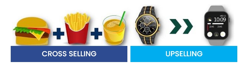
Image Source: Keydifferences
Cross-selling and upselling can significantly boost order value and improve conversion rates when presented strategically. Upselling means offering a higher-value version of the product like suggesting a premium smartwatch when a customer is viewing a basic one. Cross-selling campaign involves recommending complementary products, such as earbuds or a charger with that smartwatch.
To implement these strategies, identifying high-margin or frequently paired products. Place upsell offers on product or checkout pages, and cross-sell offers in the cart or through post-purchase follow-up emails. Use product recommendation apps or popup tools like Picreel to deliver personalized suggestions based on browsing behavior or cart contents.
A dedicated upsell campaign can be a quick win for increasing revenue. Later, you can refine your approach with proven cross-sell tactics to capture even more value from each transaction.
9. Perform Competitor Analysis
“Competition is not only the basis of protection to the consumer, but is the incentive to progress.” – Herbert Hoover

Image Source: Freepik
To gain an advantage over competitors, assess their strengths and weaknesses using tools like Semrush to review their website traffic, keyword rankings, pricing, and product features. Use these insights to emphasize your unique selling points (USPs) and strengthen areas where they fall short.
Since consumers often compare options before purchasing, put yourself in their shoes by visiting competitor sites, checking their offers, and noting gaps or opportunities. Apply these findings to refine your own site, improve product range, and adjust messaging so your offering consistently outperforms others.
You can use a competitive analysis template to record key metrics, highlight opportunities, and track progress over time.
10. Optimize Critical Page Layouts

Image Source: Freepik
Optimizing website page layout can improve user experience, shoot up engagement, and increase website conversion.
Start by strategically placing conversion elements, including CTA buttons, testimonials, and product images. Optimize load time, make the site mobile-friendly, and choose between the right font, size, and color.
Here are some additional points on how to best optimize website page layout:
- Use a Grid System: A grid system is a tool that provides a visual guide for arranging your website content. It’s about creating a well-structured layout that is both aesthetically pleasing and easy to navigate.
For example, a 12-column grid system could help you design a layout for a blog page with a header, two columns of posts, and a footer. - Prioritize Content: High-priority content should be placed in areas that easily catch the visitors’ eye.
For example, placing your CTA button above the fold makes it visible without having to scroll down.
A great example of this is Airbnb, which uses a prominent button to show prices and encourages users to book accommodations on its platform.
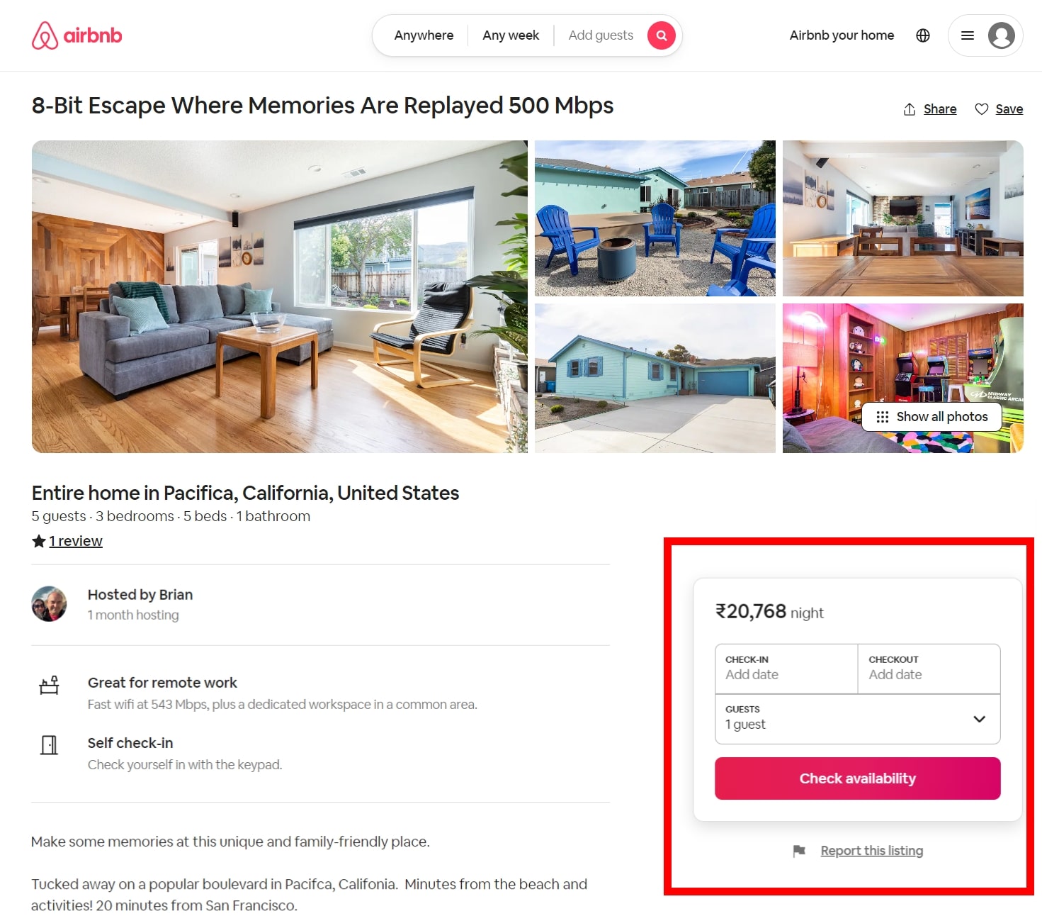
Image Source: Airbnb
- Perform Keyword Research: This will help you identify the relevant words, phrases, and questions that people are entering into search engines to find information. You can understand what content topics are popular and in high demand, allowing you to prioritize them on your website.
- Apply the 80-20 Rule: Focus on the top-performing articles or content that drive the most impact in terms of traffic and conversions. By doing so, you can optimize its placement and visibility on your website to maximize conversions.
- Align High-Priority Content With Business Goals: Determine what content supports your current goals and objectives, and focus on prioritizing that content on your website.
- Perform A/B Testing: Evaluate different placements and formats for high-priority content. This will help you determine the most effective placement and design for maximizing conversions on your website.
Along with this, you can use consistent visual hierarchy and streamline the navigation.
Remember that the best placement for high-priority content may vary depending on your specific website and target audience. Continuously monitor and analyze user behavior using analytics tools to refine your content placement strategy and further enhance conversions.
11. Improve Targeting and Personalization
Targeting and personalization involve tailoring content, offers, and product recommendations to each visitor based on their behavior, location, or purchase history. This creates a more relevant experience, which increases engagement and the likelihood of conversion.
To execute, use tools like Picreel to create personalized popups triggered by browsing behavior or location. To go a step forward, you can include location-specific banners, swapping hero images based on viewed categories, or offering discounts on products left in the cart.
Furthermore, integrate it to CRM platforms like BIG Contacts to deliver tailored product recommendations or messages synced with purchase history.
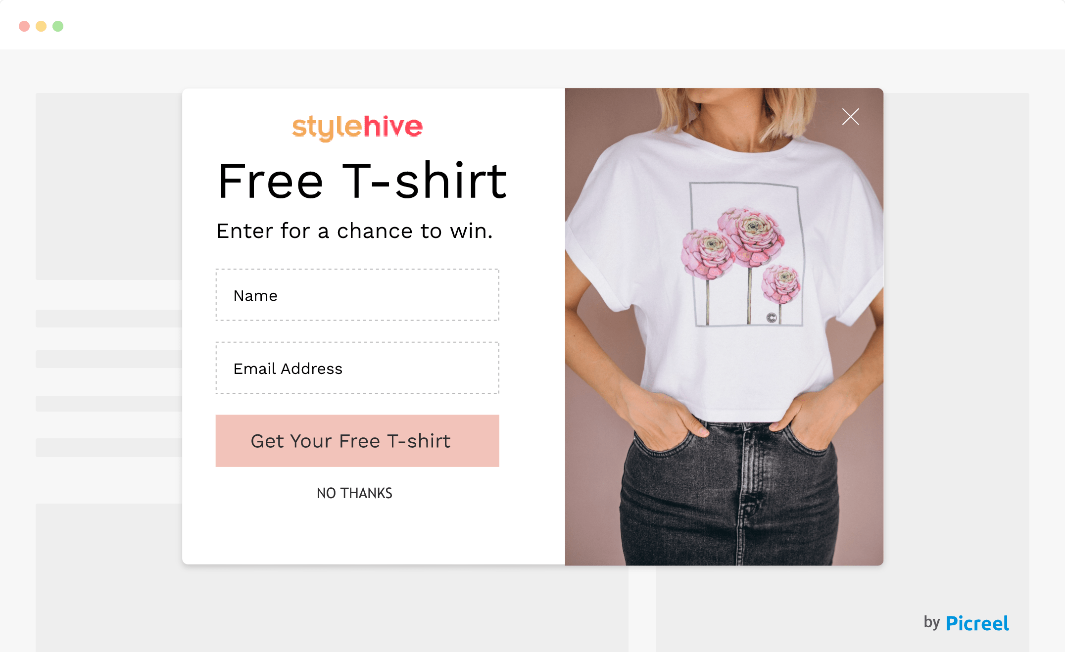
12. Build Trust With Social Proof and Guarantees
For many shoppers, the hesitation to hit “buy” comes down to trust — not seeing enough genuine reviews, feeling unsure about guarantees, or questioning checkout security. Social proof, like verified reviews, star ratings, and real customer photos, builds confidence by showing that others have had great experiences.
Clear promises, such as a money-back guarantee or free returns, help remove risk and nudge customers toward completing the purchase.
To make this work, use well-timed popups at key decision points or hello bars with a testimonial, rating, or guarantee reminder through platforms like Picreel.
Here’s how you can create a social proof popup within 10 minutes:
You can also integrate them with email marketing tools to follow up with automated emails showcasing customer stories or reviews of the product they viewed to keep trust high until the sale is done.
13. Streamline Forms and Checkout Process
A clunky checkout is like hitting a speed bump right before the finish line—it slows people down and can cost you the sale. Start by checking your checkout flow with tools like Google Analytics or Hotjar to see where shoppers drop off. Then, strip out any extra fields, turn on guest checkout, and make things faster with auto-fill for shipping and billing.
Offer quick payment options like Apple Pay, PayPal, or Shop Pay, and test everything on different mobile devices to make sure it’s smooth. If you sell worldwide, add multilingual checkout with tools like Shopify Translate & Adapt or Weglot, and pop trust badges right next to the “Place Order” button. Still losing shoppers?
Set up a Picreel exit-intent popup with a small incentive, keep it on-brand, sync those leads to your CRM, and follow up with recovery emails—one within the hour and another the next day to nudge them back.
Start Turning Clicks Into Conversions
Improving your website’s conversion rate isn’t about a single quick fix — it’s about combining smart strategies, the right tools, and continuous optimization. From tracking visitor behavior and defining clear conversion funnels to crafting compelling CTAs, running A/B tests, and personalizing user experiences, every tactic plays a role in guiding visitors toward action.
Adding urgency, recovering abandoned carts, building trust with social proof, and streamlining checkout further remove barriers to purchase. By implementing these proven methods and refining them over time, you can capture more qualified leads, reduce drop-offs, and turn your website into a consistent revenue driver.
Take these insights and transform your website into a conversion powerhouse. Start implementing these strategies today, and watch your website thrive!
FREE. All Features. FOREVER!
Try our Forever FREE account with all premium features!
 We'd love your feedback!
What did you like & how can we make it even better?
 Thanks for your feedback!
 Ask Your Question
Have a question? Get expert help to make your decision easier.