We’ve all seen popups, some that capture attention perfectly and others that instantly make us close the tab. Yet, despite their mixed reputation, learning how to add a modal popup in WordPress is still one of the most effective ways to engage visitors and boost conversions when done right.
I’ve watched marketers transform their lead flow simply by improving when and how their modals appear. In fact, well-timed popups can increase conversions by nearly 42.5%, proving that timing and design matter more than ever.
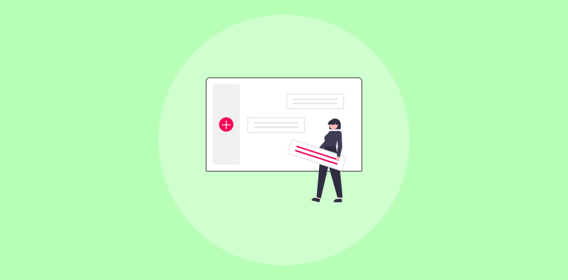
The challenge? It’s a struggle to deal with bloated WordPress modal popup plugins, messy code, or popups that slow the site and frustrate visitors. It doesn’t have to be that way.
If you’ve been trying to figure out an easier way to create modal popups without touching a single line of code, you’re in the right place. To help you out, I’ll show you a simple, no-code method to build clean, reliable modals that enhance user experience, not interrupt it.
What Are Modal Popups in WordPress
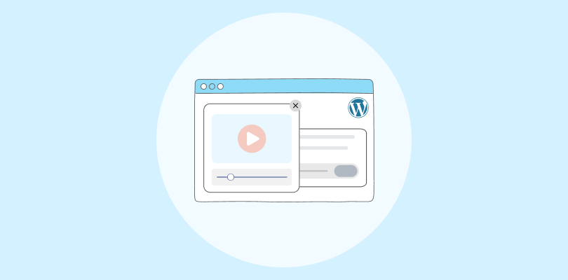
Modal popups are focused windows that appear on top of a page to grab attention without disrupting the browsing experience. Unlike standard popups that slide in or cover the whole screen, modals dim the background and highlight a single message or action.
Here’s what it looks like:

Here are the primary goals of a typical modal popup:
- Lead capture and exit-intent forms to collect emails before visitors leave.
- Promote or offer discounts or new launches using discount popups in a modal format.
- Compliance notices, such as GDPR compliance or age verification messages.
When designed well, modal popups guide visitors naturally instead of interrupting them. Before we get into how to create one, let’s see what makes a modal popup truly effective.
What Makes a Great Modal Popup in WordPress
A great modal popup feels seamless and natural. It doesn’t interrupt the visitor’s flow but adds to it by delivering the right message at the right time. The best ones share a few simple traits that make them both effective and user-friendly.
1. Speed and Adaptability: A high-performing popup loads quickly and looks perfect on every device. If it lags or breaks on mobile, users lose interest instantly.
2. Smart Timing: The right popup shows up when visitors are most likely to act — on exit, after scrolling, or once they’ve spent time on a page. Relevance turns attention into clicks.
3. Smooth Integrations: Popups that connect easily with tools like Mailchimp, HubSpot, or Klaviyo keep leads moving straight into your marketing flow without manual work.
4. Respect for the User: Great modals don’t push too hard. With frequency controls and behavior-based rules, they appear only when useful, keeping the experience positive and engaging.
How to Create a Modal Popup in WordPress (The Easy, No-Code Way)
You’re probably here because you just searched for “How to Add a Modal Popup in WordPress” and got buried under complicated tutorials filled with code and confusing steps. I get it — I’ve seen too many marketers waste hours trying to make a simple popup work.
The good news? You don’t need to touch a single line of code. Whether you want to capture leads, promote an offer, or display an announcement, you can set up a sleek modal popup in minutes using the right WordPress modal popup plugin.
I’ll use Picreel as an example since it lets you design, launch, and manage professional modals right from your WordPress dashboard. Let’s walk through it step by step and get your first popup live fast.
Step 1: Choose a Lightweight, Reliable Popup Tool
Install your chosen WordPress popup plugin (like Picreel) from the WordPress dashboard by going to Plugins → Add New → Search → Install → Activate.

Once activated, log in to your account and open the Picreel dashboard.

Step 2: Build and Customize Your Modal Popup
Once you’re inside the dashboard, click Create New Campaign or Add Popup. Choose a modal-style popup template that centers on the screen and dims the background — this helps your message stand out while keeping the experience clean.

Here’s how to set it up effectively for modals:
- Select a template based on your goal like lead capture, discount, announcement, or feedback.
- Add simple form fields like name and email. Modal popups perform best with minimal input.
- Keep the copy short and purposeful. For instance, a clear headline and one CTA button such as “Get Offer” or “Join Now.”
- Use contrasting colors for the button to make it easy to notice, and ensure the close icon is visible to maintain user control.
- Limit visuals to one strong image or icon — modals already command attention; they don’t need heavy design.
Here’s what your dashboard will look like when customizing your modal popup:

Step 3: Set Up Smart Triggers and Targeting
Timing is everything with modals. They interrupt the experience by design, so smart triggers make all the difference.
Here’s what works best:

- Exit Intent: The most effective trigger for modals. Display it when visitors move their cursor toward the close button or back navigation.
- Time Delay (7–10 seconds): Good for informational modals or limited-time announcements. Any longer, and visitors may scroll past the key moment.
- Scroll Depth (40–60%): Use this for blog or content-heavy pages to reach engaged readers.
- On Click: Ideal for “Learn More” or “See Offer” buttons that open a modal on demand.
Then, fine-tune how and to whom the modal appears:

Show once per session: In your Picreel dashboard, go to Other Options → Cookie Settings. Choose “Show on cookie like” and set a custom cookie name such as modal_shown. Keep Cookie Compare as = and Cookie Value empty. This tells Picreel to display the modal only once per session for each visitor.
Target by device type: Under Device type, select Mobile Only for smaller, screen-fitted modals or All Devices if your design is responsive. For mobile, use triggers like “After X seconds” or “After scrolling” to keep timing natural.
Geo-targeting: In Locations, select “Show campaign in selected countries,” pick your desired Country and State, then click Add. Perfect for showing modals only in regions where an offer applies.
Step 4: Automate Follow-Ups and Track Results
Once your modal is live, focus on integrating marketing tools to automate follow-ups. Tools like Mailchimp or HubSpot can automatically send thank-you messages, discount codes, or resources right after submission.

Then, monitor how your modals perform. In your dashboard, check:

- Views and Conversion Rates: See which designs or triggers capture the most leads.
- Engagement Analytics: Track which CTAs or offers perform best.
A/B Tests: Try variations in copy, button color, or delay time to refine results.

6 Real-World Examples of Modal Popups That Convert (+Templates)
Modal popups can look similar on the surface, but their design and purpose change completely depending on what you’re trying to achieve. Here are some common types that businesses use — each with its own style and goal.
1. Discount or Offer Modal
This one’s a classic and proven conversion booster. It usually uses bold, high-contrast design and clear value messaging like “Get 10% Off Your Next Purchase.”

The Zappos example shows how a side popup can feel inviting instead of intrusive, combining icons, short text, and one strong CTA. It works best for new visitors or ad-driven traffic, turning casual browsers into leads fast.
2. Exit-intent Lead Capture Modal
Exit intent popup is your last shot before a visitor leaves. When someone moves their cursor to close the tab, a simple, well-timed popup appears with a free guide, newsletter signup, or offer. It’s visually striking and emotionally timed to win back attention.

Look how Kiss My Keto starts a mini conversation instead of shouting for attention: “Tell us why you’re here and get 15% off.” The quick checkboxes make it personal and effortless, while the clean layout keeps it friendly. It’s persuasive without feeling like a hard sell.
3. Product or Content Detail Modal
You can use content detail or product recommendation modal to educate or inspire action without pulling users away. It shows a sneek peak of the product so users are hooked and compelled to sign up

CoSchedule uses it cleverly, instead of listing endless features, it shows a quick visual of the tool in action with a short note on how easy it is to get started. The warm color palette draws attention, while the single CTA invites users to sign up effortlessly.
It’s a great example of how subtle design and focused messaging can drive conversions naturally.
4. Survey or Feedback Modal
Survey popups are great for learning what visitors think without breaking their browsing flow. They work best when they feel light, quick, and worth answering.

On the Colorescience website, the modal immediately draws you in with a friendly tone and a question that feels natural, not scripted. The simple age-based options make it effortless to respond, and the clean design keeps focus on the interaction itself.
It turns a quick survey into a guided, almost human experience that feels helpful rather than transactional.
5. Newsletter or Resource Signup Modal
A newsletter popup helps keep your brand in touch with visitors even after they’ve left the site. The best ones focus on building ongoing relationships by offering value right away.

I know that building lasting relationships can be tough. But newsletter modals like Ramp’s can make it easier. Look at how it’s perfectly minimal, focuses on what subscribers gain, and leads with clarity. The message feels professional yet inviting, listing product updates and exclusive content upfront.
A bright “Get updates” button adds a clean finishing touch that draws attention without breaking the calm, modern design.
6. Announcement or Update Modal
Announcement modals are ideal for highlighting something newsworthy in a fun and visual way.

If you want to highlight something exciting like a new milestone or media feature, take a cue from Flaus. Their popup celebrates being part of Oprah’s Favorite Things with bold visuals and a playful design that’s impossible to miss.
The short copy focuses on pride and exclusivity, while the bright sign-up button keeps the energy high. It’s the kind of announcement that not only informs but also makes visitors want to be part of the moment.
FREE. All Features. FOREVER!
Try our Forever FREE account with all premium features!
Build Smart, Engaging Popups Without Coding
Modal popups, when done right, can turn a casual visitor into a loyal customer. The key is to design them with intent — keep them lightweight, well-timed, and focused on one clear goal. Whether it’s an exit-intent offer, a feedback prompt, or a quick newsletter signup, the best modals feel like a natural part of the user journey.
Tools like Picreel make it easy to create and manage these experiences across your WordPress sites without slowing things down or relying on code. I suggest starting small — test one popup, track the results, and refine your approach.
Over time, you’ll see how thoughtful modals can increase engagement, capture more leads, and strengthen your connection with visitors. Ready to experiment? Sign up for Picreel and create your first modal popup today.
FREE. All Features. FOREVER!
Try our Forever FREE account with all premium features!
 We'd love your feedback!
What did you like & how can we make it even better?
 Thanks for your feedback!
 Ask Your Question
Have a question? Get expert help to make your decision easier.