
Popup banners appear everywhere on WordPress sites. Site owners add them using a floating popup WordPress plugin, often with good intentions. But in practice, they rarely make an impact. Engagement stays flat. Conversions don’t move. Over time, visitors begin to ignore the banner altogether.
From what I’ve seen, popup banners aren’t the problem. When you use them with intent, they can influence decisions at key moments. The real issue lies in execution. Poor timing, generic triggers, and limited control turn a useful tactic into a distraction rather than support.
Here, I focus on building WordPress popup banners that align with user intent rather than interrupt it. You’ll learn how to create popup banners that convert, set them up correctly from day one, and avoid common mistakes that quietly hurt both user experience and results.
This guide is for:
- Business owners and CEOs looking to improve conversions from existing WordPress traffic
- E-commerce teams focused on reducing cart abandonment
- SaaS and subscription businesses using WordPress for acquisition or upgrades
- Marketing and growth leaders optimizing on-site performance without increasing ad spend
- Teams managing popup banners across multiple WordPress sites
How to Create a Banner Popup on WordPress Easily
You don’t need advanced design skills or complex setups to build a banner popup that works. What you need is clarity on what you’re building and why. Let’s walk through that process.
Step 1: Define the Goal of Your Popup Banner
Before thinking about design, triggers, or tools, get clear on one thing: what exactly should this popup banner achieve for your business?
Most WordPress popup banners fail not because they look bad, but because their purpose was never defined. When a popup tries to capture leads, promote an offer, and announce something all at once, it usually ends up doing none of them well.
One popup should serve one goal.
In practice, WordPress popup banners usually fall into one of these categories:
- Email signups: Useful when you want to grow a list from existing traffic. Keep the content minimal. An email or simple signup popup works best.
- Redirects: Ideal for product launches, announcements, or moving traffic to a specific page without collecting personal data.
- Cart recovery: Best for ecommerce sites where visitors are close to buying and need a small nudge to complete the action.
- Announcements: Useful for updates, promotions, or time-sensitive messages that need visibility without blocking content.
If the goal is not obvious to you, it will not be obvious to your visitor. Define the outcome first. Everything else becomes easier after that.
Step 2: Choose How You Want to Create Your Popup Banner (AI vs Templates)
Once you’re clear on the job your popup banner needs to do, the next decision is how you want to create it.
At a high level, there are two practical ways to build WordPress popup banners today:
- Using AI for speed and iteration
- Using ready-made templates for control and consistency
Both approaches work well when used in the right context. The key is knowing when to use which.
Option A: Creating a Popup Banner With AI
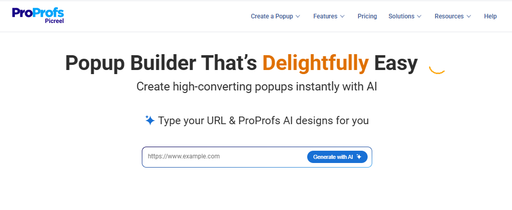
AI works best when speed matters or when you are still testing what will resonate with your audience.
In most WordPress setups, like Picreel, AI-based popup creation follows a simple flow. You provide your site URL or page context, choose a goal such as email signup, redirect, announcement, or engagement, and answer a few short prompts. Based on that input, the AI generates a banner layout, copy, and call-to-action aligned with the selected goal.
This approach is especially useful when you want to:
- Test ideas quickly without starting from scratch
- Get copy and layout direction fast
- Deploy similar banners across multiple WordPress sites
- Iterate and refine based on performance data
Option B: Using Ready-Made Popup Banner Templates
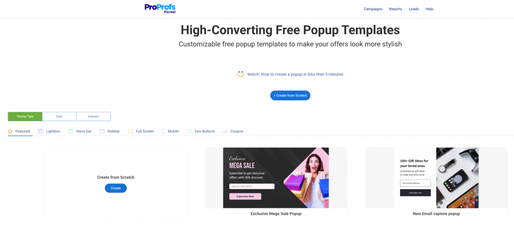
Templates work best when you already know what you want to show and need consistency across your WordPress pages or campaigns.
Most popup banner wordpress plugins offer ready-made templates like sticky top or bottom banners, slide-ins, lightboxes, full-screen overlays, mobile-friendly banners, and simple two-button layouts. These are built for common conversion use cases and save setup time.
Templates are ideal when you want a clean popup banner without worrying about layout or styling. You can focus on the message, timing, and targeting instead.
Keep templates simple. Avoid over-customizing, stick to one clear action, and use them as a framework rather than a space for multiple messages.
Step 3: Design the Banner for Conversions
A popup banner does not need to be clever or visually complex. It needs to be clear and easy to act on.
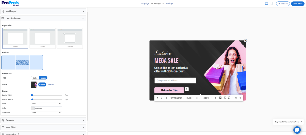
- Start with short, specific copy that tells visitors exactly what they gain. Avoid generic phrases. Clarity builds trust and speeds up decisions.
- Use one clear call to action. Multiple buttons or messages split attention and reduce conversions. Decide on the single action you want and design everything around it.
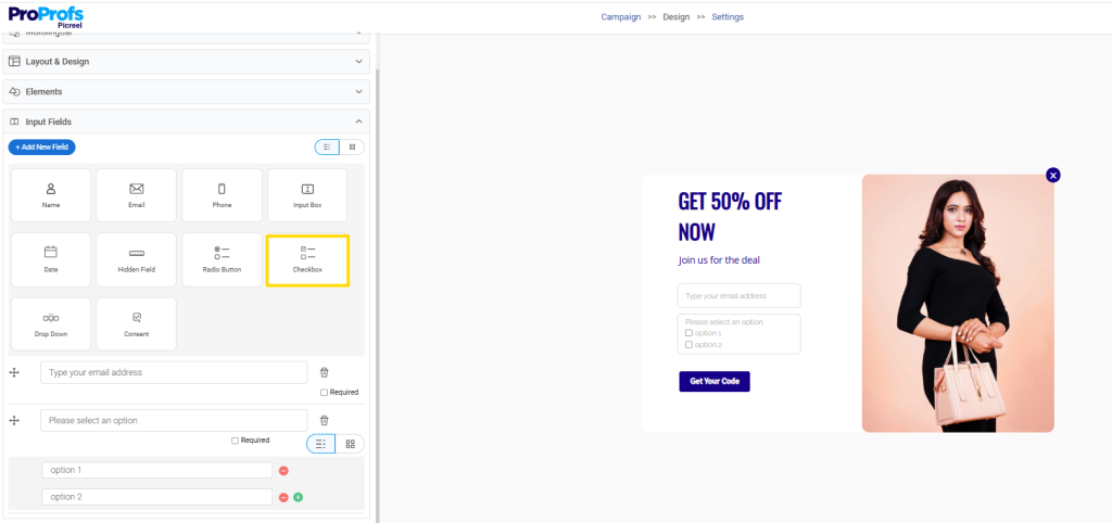
- Keep input fields to a minimum. Every extra field lowers completion rates. If you need more context, use checkboxes to understand intent without adding friction.
- Make dismissal easy. A visible close option reassures visitors and reduces frustration.
- Finally, design for mobile first. Most traffic is mobile, and banners that look fine on desktop often break on smaller screens.
Good design here is not about aesthetics. It is about removing friction so the decision feels effortless.
Step 4: Decide Where and When the Popup Should Appear
Even the best-designed banner will fail if it shows up at the wrong moment. Timing and placement matter more than most people expect.
Before launching, decide who should see the popup and at what point in their journey from the campaign settings.

Focus on:
- Page-level targeting so popups appear only where they support the visitor’s intent
- URL-based rules to align banners with campaigns or traffic sources
- Scroll-based triggers to engage visitors after they have shown interest
- Time-based triggers to avoid interrupting too early
- Exit-intent for ecommerce to recover abandoning buyers
- Device-specific behavior so mobile and desktop experiences feel intentional
- New vs returning visitor logic to tailor messages based on familiarity and stage in the journey
Avoid site-wide popups. They ignore context, feel repetitive, and often hurt conversions.
The goal is simple. Show the right message, to the right person, at the right moment.
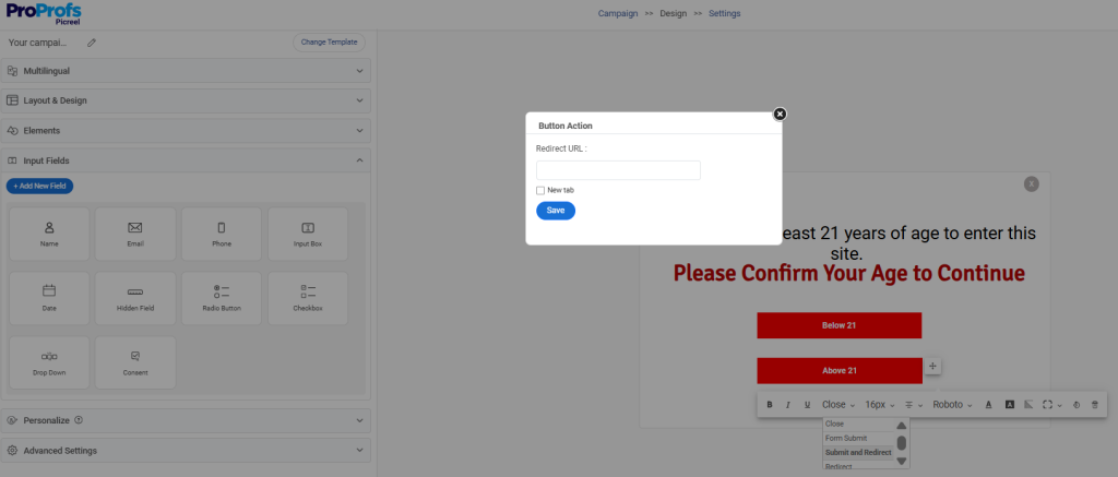
Step 5: Set Up Redirects or Lead Capture Based on Your Goal
Not every popup banner needs to collect an email. The setup should match the business outcome you defined earlier.
- Use redirect-based banners when the goal is awareness or action, such as product launches, announcements, or moving traffic to a specific page. This keeps friction low and works well when personal data is not required.
- Use email capture banners when building a list or nurturing future demand, such as newsletters, early access, or special offers.
- Avoid collecting personal data unless it directly supports the next step. Extra fields often reduce engagement.
- If you need more insight without adding friction, use checkboxes to understand visitor intent while keeping the form simple.
The rule is simple. Choose the lowest-friction path that still moves the business forward.
Step 6: Connect the Popup to Your Existing Tools
A popup only creates value when its data flows into the systems your team already uses. Otherwise, it becomes another manual task.
Make sure your popup banner connects with:
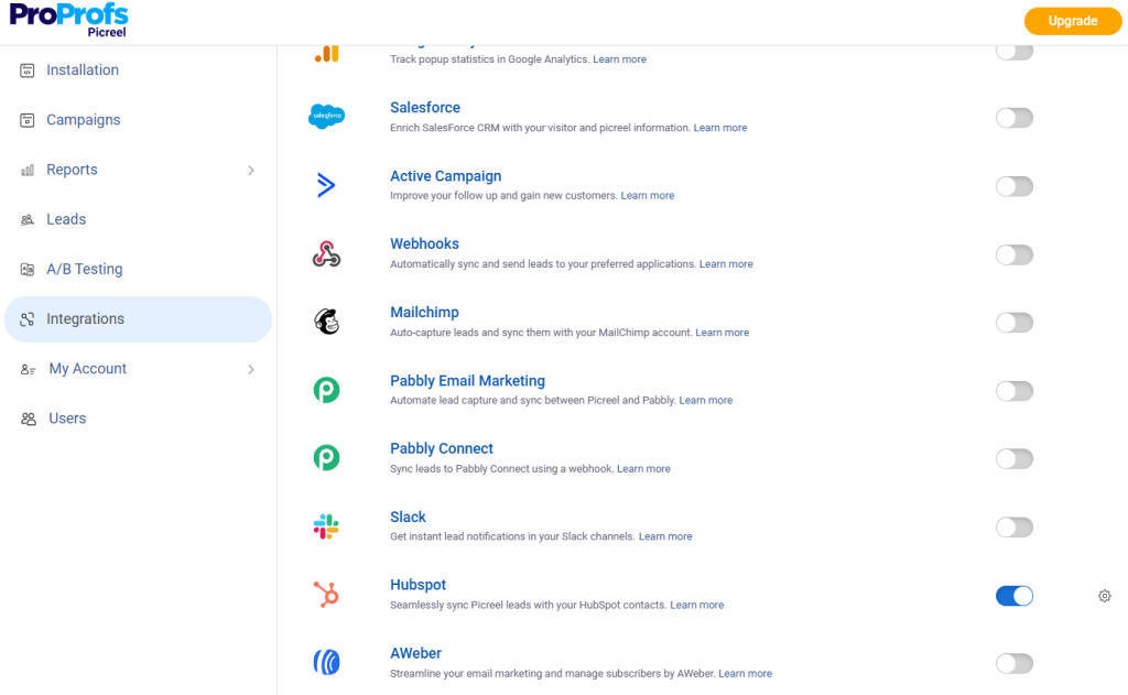
- Email platforms like Klaviyo to capture and route signups automatically
- CRMs and automation tools like HubSpot so leads enter the right workflows without delay
- Segmentation rules based on how users interact with the popup
Avoid setups that require exporting lists or manual follow-ups. Automation ensures speed, consistency, and scale.
For business leaders, the goal is simple. Popups should feed your growth engine, not add operational overhead.
Step 7: Test Before You Go Live
Before launching any popup banner, take a few minutes to validate the experience. Small issues can quickly turn into lost trust or missed conversions.
Check for:
- Desktop and mobile behavior to ensure the popup displays correctly across devices
- Targeting rules so the right visitors see the message at the right time
- Redirects and integrations to confirm actions work as expected
- Performance impact to avoid slowing down your site
Testing is not a technical detail. It is a safeguard for brand experience and revenue.
Step 8: Track Performance and Optimize With Data
Once your popup banner is live, the focus shifts from setup to impact. What matters is whether the banner is actually influencing conversions, not just getting views.
Use data to decide what to keep, improve, or remove.
Key metrics to monitor:
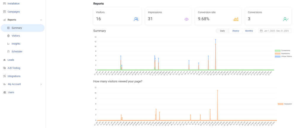
- Conversion rate to see how many visitors take the intended action
- Assisted conversions to understand whether the banner supports later signups or purchases
- Bounce rate changes to catch timing or targeting issues early
Pro Tip: Iterate when engagement exists but conversions are low, and replace when the popup consistently underperforms or increases bounce rates.
Also, keep optimization simple by:
- A/B testing one change at a time
- Adjusting messaging, timing, or targeting before redesigning
- Focusing on steady improvements, not constant rebuilding
Test before you scale:
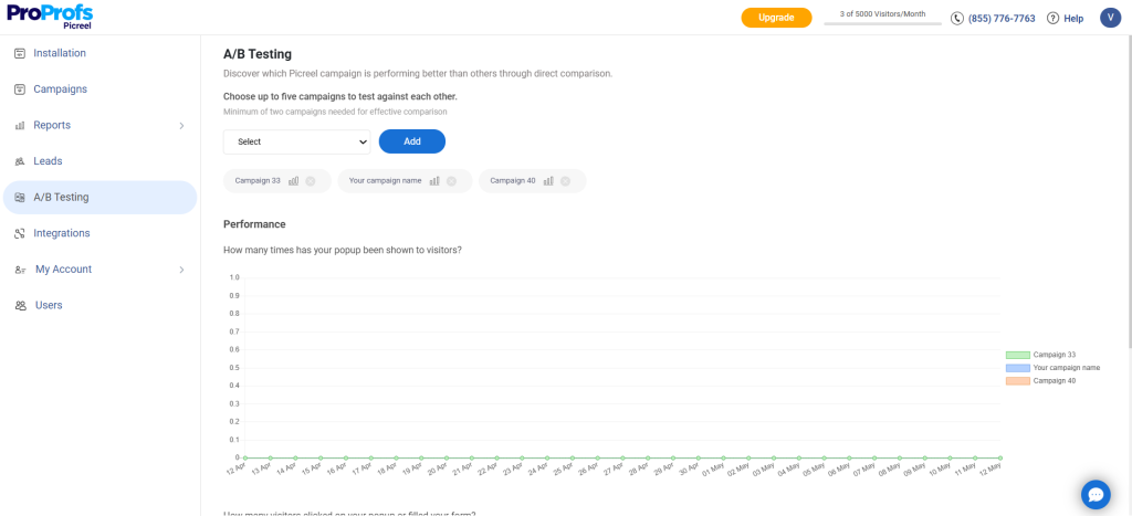
- Compare different messages
- Adjust trigger timing
- Test CTAs or offers
Small, focused changes often deliver better results than full redesigns. The goal is steady improvement, not constant rebuilding.
How Different Businesses Use WordPress Popup Banners Effectively
Popup banners work best when they support how your business actually grows. The use case should align with revenue, pipeline, or engagement goals, not generic visibility.
| Business Type | Primary Use Cases | What Works Best |
|---|---|---|
| E-commerce | Exit-intent banners to reduce cart abandonment
Sticky banners for limited-time offers Product-level popups on category pages |
Behavior-based triggers
Short, urgency-driven copy No popups during checkout |
| SaaS & Startups | Redirect banners for feature launches
Email capture for waitlists or early access Educational banners linking to demos or case studies |
Traffic-source-based targeting
Redirects instead of long forms Clear, value-driven messaging |
| Blogs & Content Businesses | Email signups tied to content topics
Redirects to lead magnets or newsletters Scroll-based banners on long-form content |
Contextual messaging
Simple layouts Respect for reading flow |
| Service Businesses & Agencies | Appointment or consultation redirects
Seasonal announcements Light lead qualification using checkboxes |
Page-level targeting
Intent capture before lead capture Clean, professional design |
| Multi-Site Operators & Growth Teams | Cross-site traffic redirection
Unified messaging across domains Launch banners during migrations |
Centralized control
Consistent branding Flexible targeting rules |
Using Popup Banners Across Multiple WordPress Sites
Many WordPress site owners and business leaders I know manage more than one site, and popup banners need to scale without adding operational complexity.
When you manage multiple WordPress sites, popups should simplify execution, not multiply effort. The goal is control, consistency, and speed.
So, I suggest using popup tool like Picreel to:
- Manage popups across 5–7+ domains from a single setup to avoid duplicated work
- Centralize control so updates, pauses, or changes apply everywhere instantly
- Ensure consistent messaging across sites to maintain brand and campaign clarity
- Launch and migration scenarios, such as redirecting traffic during site updates or rollouts
How to Reduce Cart Abandonment with Popup Banners
I’ve included this section because e-commerce businesses lose close to 75% of potential sales to cart abandonment. And I think popup banners can be a high-impact tool for last-moment recovery.
Their role is to support a decision that is already in progress by removing last-minute hesitation and reinforcing confidence at the right moment.
For that, you must focus on:
- Exit-intent done right, triggering popups only when buyers are about to leave, not mid-decision
- Timing over aggressiveness, showing one well-placed message instead of repeated interruptions
- Offers that protect margins, such as free shipping reminders or limited-time incentives instead of heavy discounts
- What not to show during checkout, including unrelated promotions or additional asks that increase friction
Used correctly, popup banners help close the gap between intent and action, instead of becoming another obstacle.
FREE. All Features. FOREVER!
Try our Forever FREE account with all premium features!
Common Mistakes That Kill Popup Conversions
Most popup banners fail not because they are added, but because of how they are used. The good news is that these issues are easy to fix once identified. Doing so often improves results faster than launching new campaigns or features.
1. Too Many Banners
Showing multiple popups at the same time creates noise and leads to banner blindness.
Solution: Limit active banners and assign one clear role to each.
2. No Targeting Rules
Site-wide popups ignore visitor context and reduce relevance.
Solution: Use page-level, behavior-based, or traffic-based targeting options.
3. Overcomplicated Designs
Long copy, multiple CTAs, and heavy visuals slow decisions.
Solution: Keep the message short, focused, and action-driven.
4. Ignoring Mobile Users
Popups that break or overwhelm on mobile hurt conversions silently.
Solution: Design and test popups with a mobile-first popup mindset.
5. Choosing Tools Based on Popularity
Popular tools are not always the best fit for your business needs.
Solution: Choose a popup software based on targeting, scalability, and ease of management.
Final Takeaway: Build Intentional, Not Intrusive Popups
Adding a WordPress popup banner is not about installing another plugin. It is about making intentional decisions that support how your business grows. When popups are built around a clear goal, timed correctly, and shown only to the right audience, they become a practical conversion tool instead of a distraction.
The strongest results come from keeping things simple. One goal per popup. Clear messaging. Thoughtful targeting. Continuous testing based on real data. Whether you are managing one site or several, the focus should always be on reducing friction and supporting decisions already in progress.
If you are looking for a way to manage WordPress popup banners without adding operational complexity, a tool like Picreel can help centralize setup, targeting, and optimization.Start small. Test intentionally. Let data guide what you improve next.
FREE. All Features. FOREVER!
Try our Forever FREE account with all premium features!
 We'd love your feedback!
What did you like & how can we make it even better?
 Thanks for your feedback!
 Ask Your Question
Have a question? Get expert help to make your decision easier.