E-commerce conversion rate optimization (CRO) is the process of increasing the percentage of website visitors who complete a purchase, not by driving more traffic, but by fixing the friction that stops existing visitors from buying.
If you’ve ever looked at your analytics and thought, “The traffic is there, but the sales aren’t,” you already know the problem. You keep pushing ads, tweaking SEO, and bringing in more visitors, hoping something clicks. But most of them leave without doing anything.
The real issue isn’t getting people to your store. It’s what happens after they land there — where they hesitate, what makes them doubt, and why they abandon a cart they already filled.
This guide covers 15 tested strategies to fix those moments, plus a framework for building a CRO system that compounds over time.
What is E-commerce Conversion Rate Optimization & How to Calculate the Rate?
Now that you know what e-commerce conversion rate optimization is, let’s see how to calculate the rate using a simple formula:
Conversion Rate = (Total Conversions / Total Visitors) x 100
If 1,000 people visit your store and 25 buy, your conversion rate is 2.5%.
The goal of CRO is not to get more visitors. It is to get more value from the visitors you already have. Moving from 2% to 4% on the same traffic doubles your revenue without touching your ad spend, your SEO, or your team size.
15 E-commerce Conversion Rate Optimization Strategies That Work
If you want to increase e-commerce conversion rates above the average, follow these tested strategies. In-depth explanation is mentioned below the table.
| Strategy | What It Does | Best Suited For |
|---|---|---|
| AI-Powered Product Recommendations & Search | Shows the right products based on real-time behavior | All e-commerce, especially large catalogs and high-SKU stores |
| Optimize Checkout | Reduces abandonment from friction-heavy flows | All ecommerce |
| High-Quality Visuals | Builds trust by replicating the in-store experience | Fashion, furniture, electronics |
| Free Shipping | Removes the surprise cost that kills purchase intent | Mid to high AOV stores |
| Product Descriptions | Answers buyer doubt before it becomes a bounce | Tech, subscriptions, digital goods |
| Mobile Optimization | Captures conversions where 60%+ of traffic comes from | All ecommerce |
| Live Chat Support | Prevents abandonment by resolving questions instantly | Electronics, high-ticket items |
| Social Proof | Builds trust through reviews and real customer content | Fashion, health, consumer goods |
| Clear CTAs | Guides visitors to act without hesitation | All e-commerce |
| Email Capture | Turns exiting visitors into nurturable leads | D2C, subscription brands |
| Easy Navigation | Keeps shoppers moving and reduces bounce | Large catalogs |
| Return Policies | Removes the perceived risk of buying | Fashion, footwear |
| Personalized Popups | Shows the right offer to the right visitor at the right moment | D2C, global stores |
| Security Signals | Reassures buyers that their payment is safe | All e-commerce, especially new brands |
| Guest Checkout | Removes the biggest friction point for first-time buyers | All e-commerce |
1. Use AI-Powered Product Recommendations and Search
If your store is still showing the same products to every visitor, you are leaving money on the table that your competitors are already collecting.
AI-powered recommendation engines analyze browsing behavior, purchase history, and real-time intent signals to surface the products each individual visitor is most likely to buy.
The result is a shopping experience that feels intuitive rather than generic, and one that converts significantly better than a static “Best Sellers” section ever will.
Here is how to put it to work:
- Enable AI product recommendations: Tools like Nosto, LimeSpot, or Shopify’s built-in recommendation engine place the right products in front of the right shopper at the right moment, whether that is on the homepage, product page, or cart. This is where cross-sells and upsells actually work.
- Upgrade your site search with AI: Traditional keyword search fails the moment a shopper types something slightly off. AI search tools like Searchanise or Boost Commerce understand intent, not just exact matches, and surface relevant results even from vague or misspelled queries. Stores with strong AI search convert two to three times better than those relying on basic search.
- Add a conversational shopping assistant: A well-configured AI shopping assistant does more than answer “Where is my order?” It asks qualifying questions, narrows down options, and guides hesitant shoppers toward a decision, functioning like a knowledgeable sales associate available at every hour. Platforms like Tidio AI or Gorgias AI make this straightforward to deploy without a development team.
- Bundle complementary products: AI engines can automatically group products bought together and display them as bundles on the product page, lifting AOV without any manual curation.
- Add tiered incentives alongside recommendations: “Buy 2, save 10%” placed next to AI-suggested products turns a single-item browse into a multi-item order.
AI is now a core CRO lever, not a future consideration. If your competitors have it and you do not, the gap shows up directly in your conversion rate.
2. Optimize Your Checkout Process
If you do nothing else on this list, fix your checkout first.
According to Baymard Institute in 2026, nearly 24% to 26% of online shoppers abandon their carts when they are forced to create an account during checkout, making mandatory account creation a major source of friction in the buying process. That is nearly half your lost sales coming from a process you fully control.
Here is how to fix it:
- Shorten the steps: If checkout takes more than 3 screens, merge shipping and billing into a single page. Add a progress bar so shoppers know exactly where they are.
- Simplify the forms: Use standard field labels like “First Name” and “Email” so browser autofill works correctly. Autofill alone reduces checkout time for returning users.
- Offer one-click payment: Activate Apple Pay, Google Pay, and PayPal through your payment settings. These are especially effective on mobile, where typing card numbers is painful.
- Show costs early: Do not reveal shipping fees for the first time at the final step. Show them on the product page or, at a minimum, on the cart page.
- Surface last-minute upsells at checkout: A single, relevant add-on shown during checkout, priced under $20, converts at a surprisingly high rate because the shopper is already in a committed buying mindset. Shopify’s checkout extensibility and tools like Zipify OCU make this easy to implement without disrupting the flow.
Checkout is the single highest-leverage page in your store. Every friction point you remove here has a direct and measurable impact on revenue.
3. Use High-Quality Visuals for Products
Shoppers cannot touch or feel your products online. Your images are doing the selling.
Low-resolution photos or generic stock shots create doubt. Detailed, multi-angle visuals help customers move from “I think I want this” to “I am buying this.”
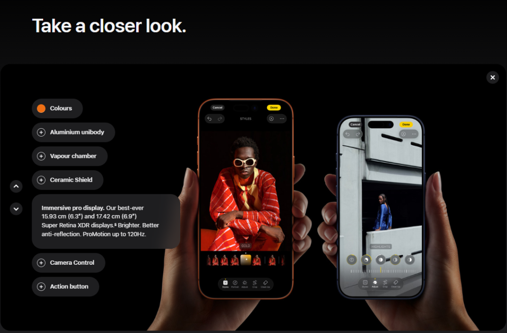
Apple is the obvious benchmark. Their product pages show multiple angles, lifestyle shots, and interactive views. The message is clear: what you see here is exactly what you will get.

Here is how to apply the same thinking to your store:
- Show four to six images per product: Covering front, back, sides, close-ups, and at least one lifestyle shot showing the product in real use.
- Add short product videos: A 30 to 60-second clip showing the item in action converts better than static images alone for high-consideration purchases.
- Enable Zoom: Let shoppers inspect details before committing. This is especially important for fashion, jewelry, and electronics.
The closer your product page experience gets to a physical store, the fewer reasons a visitor has to leave.
4. Offer Free Shipping Strategically
“Free” is one of the most powerful words in e-commerce. According to Dynamic Yield in 2025, around 55% of shoppers abandon their carts due to unexpected fees such as shipping costs, making hidden charges one of the biggest friction points in the checkout experience.
Here is how to make it work without hurting margins:
- Set a threshold: If your average order value is $45, test a free shipping minimum at $60. This nudges shoppers to add one more item rather than abandon.
- Gate it behind email capture: Sunbasket does this well. They offer a free shipping code in exchange for an email address. You get a lead; the shopper gets an incentive. Tools like Picreel make it easy to trigger this kind of offer at the exit point.

- Show it early: Highlight the offer in your header, on product pages, and in the cart so shoppers know about it before they reach checkout.
- Use a real-time cart reminder: A popup that says “You are $10 away from free shipping” at the right moment can push a hesitant shopper to cross the threshold.
- Layer in a bundle discount at the threshold: When a shopper is $15 away from free shipping, a popup or cart nudge that says “Add any 2 items and save 10%” gives them two reasons to keep shopping rather than one. This combines free shipping motivation with a tiered discount, and it meaningfully lifts AOV on orders that were already close to converting.
5. Provide Detailed Product Descriptions
When someone cannot hold your product, your words do the work. A vague description full of specs leaves buyers guessing. A benefit-driven description gives them the confidence to commit.
The difference between “16GB RAM” and “Run multiple apps without slowdown, thanks to 16GB RAM” is not just copywriting. It is the difference between a feature and a reason to buy. Apple does this consistently well across its top product listings.
Here is the framework:
- Lead with benefits, not specs: What does this feature actually do for the buyer?
- Use a structured format: Organize into: Overview, Key Benefits, Full Specs, FAQs. This works for electronics, apparel, subscriptions, and digital products alike.
- Answer the objections upfront: Compatibility, return policy, sizing, shipping time. Cover the hesitations before they become reasons to leave.
- Make it scannable: Short sentences, bullet points, bold highlights. Most people read on a phone.
6. Work on Mobile Optimization
According to Worldmetrics study in 2025, mobile commerce accounted for approximately 78% of global e-commerce sales. If your store is not built for mobile, you are losing conversions on the majority of your traffic.
The most common mobile problems are speed and usability, not design.
- Benchmark your load time: E-commerce sites that load quickly see higher conversions than slow loading sites. Use Google PageSpeed Insights and aim for under three seconds on mobile.
- Compress your images: Product images are usually the heaviest assets on your pages. Tools like TinyPNG reduce file size without visible quality loss.
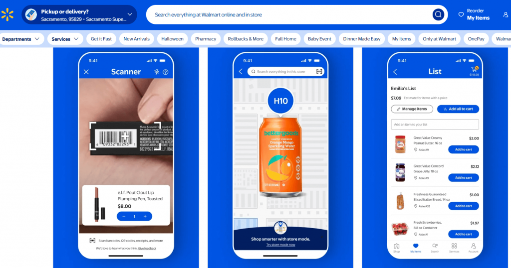
- Design for thumbs: Larger tap targets, simplified menus, sticky “Add to Cart” buttons. Walmart’s mobile layout is a strong reference point. They prioritize the path to purchase above everything else.
- Test on real devices: Desktop previews do not catch what actual iOS and Android users experience. Run through your checkout on a real phone before assuming it works.
7. Provide Live Chat Support
A visitor on your product page with an unanswered question is a visitor who is about to leave. Live chat prevents that moment from becoming lost revenue.
A hybrid setup handles this without requiring a full-time support team:
- Use AI for common questions: “Where is my order?” and “What is your return window?” can be handled instantly by a chatbot.
- Route complex queries to a human: High-ticket items or custom orders often need a real person. Make the handoff seamless.
- Use proactive triggers: If someone lingers on the checkout page for 90 seconds, a prompt that says “Need help completing your order?” feels helpful rather than intrusive.
Platforms like ProProfs Chat, Intercom, or Tidio connect chat directly into your customer data so conversations do not fall through the cracks.
8. Add Social Proof
According to Clutch Reports in 2026 nearly 96% of consumers read online reviews before making a purchase, underscoring the critical role of social proof in influencing buying decisions. If your store lacks visible, credible social proof, you are asking visitors to trust you without any evidence.
Here is how to build it in:
- Enable product reviews: Show social proof popups directly as a Hello Bar at the top or bottom of the website.
- Use user-generated content: Encourage customers to share photos or videos with your product. Whoop’s homepage is full of real customers in real contexts, and it converts far better than studio shots alone.

- Add trust badges: SSL seals, Norton Secured, Verified by Visa. Display them near the “Add to Cart” button and at checkout.
- Test placement: Use A/B testing to find whether reviews work better at the top of the product page or closer to the CTA. The answer is often not what store owners expect.
- Launch a simple loyalty program: Points and rewards give repeat buyers a reason to choose you over a same-price competitor. Smile.io works for most mid-size stores without custom development.
- Add referral incentives: Existing customers convert new ones at a higher rate than any paid channel because trust is already built in.
- Nudge repeat purchases at the right moment: For consumables, a well-timed email just before a customer is likely to run out converts because the timing matches real need.
9. Use Clear Calls-to-Action
A call-to-action is the one thing you want a visitor to do next. If it is unclear, hidden, or competing with five other elements on the page, conversion drops.
A lot of carts are abandoned before checkout. A meaningful portion of that comes from visitors who simply did not know what to do next.
Here is how to get CTAs right:
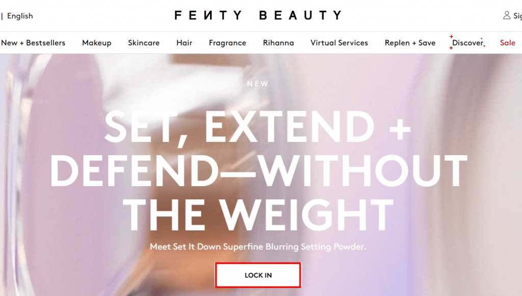
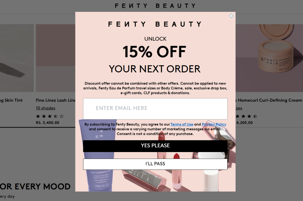
- Place the main CTA above the fold: Visitors should not need to scroll to find “Add to Cart” or “Buy Now.” Fenty Beauty does this well with their product launches.
- Use action-driven language: “Get Started Today,” “Add to Cart,” “Claim Your Discount.” Avoid vague words like “Submit” or “Click Here.”
- Keep them consistent: Same color, size, and copy style across product pages, banners, and popups. Consistency removes decision fatigue.
- Add urgency only when it is real: “Only 3 left in stock” works when it is accurate. Fake urgency damages trust and is not recoverable.
10. Work on Email Capture
Most visitors will never return once they leave. Email capture is how you turn a one-time visit into a relationship you can convert over time, and exit-intent popups are the most effective tool for catching that moment.
And when stores stop at capture, the real revenue is in the sequence that follows. A three-email abandoned cart flow at 1, 24, and 48 hours recovers orders that would otherwise be lost.
Post-purchase emails, a cross-sell, and a review request turn one transaction into two. Win-back campaigns for shoppers who have been inactive for 6+ months reactivate an audience you already paid to acquire.
Here is what actually works:
- Offer something worth the email: A discount code, free shipping, a product guide, or early access. “Subscribe to our newsletter” is not an offer.
- Use behavior-based triggers: A visitor who has been on a product page for two minutes and is about to leave has already shown intent. An offer specific to what they were looking at converts far better than a generic popup.
- Segment at the point of capture: Add one optional field like product category interest so your follow-up emails are relevant from the first send.
- Keep the design clean: Fenty Beauty, the makeup and skincare brand, sets a good benchmark here. The popup matches the site aesthetic, the offer is clear, there is one CTA, and the close button is easy to find.
- Connect to your email platform: Whether you use Klaviyo, HubSpot, or MoEngage, captured emails should flow directly into your nurture sequences without manual exports.
Picreel is built for this kind of behavior-based capture. You can trigger popups based on exit intent, time on page, scroll depth, traffic source, or geographic location. Someone arriving from a Facebook ad can see a different offer than someone coming from organic search.
This is exactly why brands like MVMT have used Picreel to consistently grow their email lists and convert high-volume traffic into real opportunities.

11. Easy Navigation
A confusing site structure loses shoppers who were already moving toward a purchase.
Here is how to fix it:
- Limit your top menu to five to seven categories: Use dropdowns for subcategories. Best Buy manages thousands of products while keeping navigation to a two-click path for most categories.
- Put search front and center: A visible search bar at the top of every page is essential for large catalogs. Enable autocomplete so products surface as users type.
- Add filters and sorting: Price, color, size, rating. Stores with strong on-site search convert two to four times better than those without it.
- Use breadcrumbs: They help shoppers track where they are and backtrack without leaving the site.
12. Show Transparent Return and Refund Policies
Unclear return policies are quietly killing conversions. Shoppers who are not sure how easy it is to return something will hesitate, and hesitation often becomes abandonment.
Here is how to turn your policy into a conversion asset:
- Put it where people look: Add return and refund details on the product page, in the footer, and at checkout. Wayfair places this directly under the product description, not buried in a support doc.

- Use plain language: “30 days to return, no questions asked” is more reassuring than three paragraphs of policy jargon.
- Remind shoppers at the point of commitment: A simple “Free 30-day returns” note near your “Buy Now” button can tip a hesitant buyer over the edge.
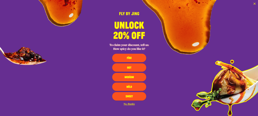
13. Leverage Personalized Popups
Generic popups get closed. Personalized popups convert.
The difference is relevance. A popup that reflects what a visitor has been browsing, where they came from, and when they are about to leave delivers a message that feels helpful rather than intrusive. Fly By Jing does this well.
Their exit-intent popups are product-specific and timed to appear when a visitor is about to leave, not the moment they arrive.
Here is how to do personalization that works:
- Trigger on behavior, not just time: A visitor who has spent three minutes on a product page is very different from someone who bounced after ten seconds. Target the engaged ones.
- Customize by traffic source: Someone who came from a Google Shopping ad has different intent than someone who arrived from your Instagram bio. Show them different messages.
- Use two-step popups for higher intent capture: Lead with a teaser (“Want 10% off your order?”) then show the email form on click. This micro-commitment increases form completion rates.
- Match the offer to the funnel stage: Someone on a category page needs help discovering products. Someone on the cart page needs a reason to complete the purchase.
Picreel’s targeting lets you layer multiple conditions, traffic source, page, device, inactivity period, and geographic location, to show a specific offer to a specific type of visitor. That kind of precision is what turns a website popup campaign from a nuisance into a genuine revenue tool.
14. Highlight Security and Compliance
Most people abandon their cart because they do not feel safe entering payment details. Trust signals at checkout are not optional.
Here is what to put in place:
- Enable SSL (HTTPS): Most platforms like Shopify, BigCommerce, and WooCommerce include this by default. If you are on a custom build, your hosting provider can install a certificate.
- Display trust badges at checkout: Norton Secured, McAfee Secure, Verified by Visa reduce hesitation at the exact moment of payment.
- Highlight your payment methods: PayPal, Apple Pay, Google Pay, Stripe. Show their logos prominently. Shoppers trust these brands even if they do not fully trust yours yet.
- Add plain-language reassurance: A single line near the checkout button that says “All payments are encrypted and secure” does more conversion work than most store owners expect.
- Ensure your popups are GDPR compliant: If you capture emails through popups and serve EU visitors, your consent flow needs to be clean. A well-configured popup tool like Picreel has GDPR compliance built in.
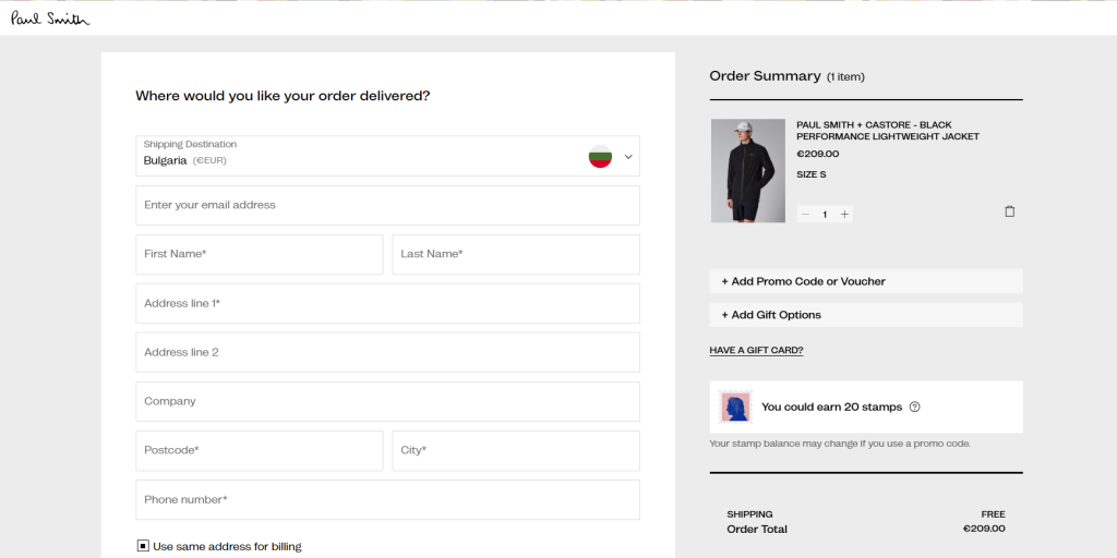
15. Enable Guest Checkout
Shoppers would be more likely to complete a purchase if they did not have to create an account. Forced registration is one of the clearest conversion killers in e-commerce, and one of the easiest to fix.
Shoppers do not want another username and password. They want to buy and move on.
Here is how to handle it:
- Enable guest checkout in your platform settings: On most platforms, this is a simple toggle. Paul Smith aces this. Their checkout immediately asks “Where would you like your order delivered?” and gives guest checkout equal prominence to account login.
- Capture the email without blocking checkout: If list growth is a goal, use a post-purchase prompt rather than a pre-checkout gate.
- Offer account creation after the purchase: The order confirmation page is the right moment. Pre-fill their details so creating an account takes one click.
What Is a Good E-Commerce Conversion Rate?
According to Dynamic Yield in 2025, the average e-commerce conversion rate ranged from 2.5% to 3%, but performance varies widely across industries, making category-level benchmarks more meaningful for evaluation.
Industry-wise Conversion Rate Benchmarks
| Industry | Average Conversion Rate |
|---|---|
| Fashion and Apparel | 1.5% to 2.5% |
| Electronics | 1% to 2.5% |
| Health and Beauty | 3% to 4% |
| Home and Garden | 2% to 3% |
| Food and Grocery | 3.5% to 5% |
| Sporting Goods | 1.5% to 3% |
| Jewelry and Luxury | 0.6% to 1.5% |
If you are below your category average, you have a clear friction problem to solve. If you are already above it, you have an opportunity to build a genuine competitive moat before competitors catch up.
Why Visitors Leave The Website Without Buying
Now that you know the tactics, it helps to understand where you are actually losing people. Most store owners assume the problem is pricing or product fit. In most cases, it is friction at a specific stage of the funnel.
Here is where e-commerce funnels most commonly break down:
| Website Page | Common Drop-off Reason | What It Tells You |
|---|---|---|
| Landing Page | Slow load speed, unclear value prop | Visitors do not understand what you sell or why they should care |
| Product Page | No social proof, poor visuals, vague descriptions | Visitors have doubt and want reassurance before committing |
| Cart | Shipping cost surprise, no urgency | The unexpected cost kills intent that was already there |
| Checkout | Forced account creation, long forms | Every extra step is a door some visitors will not walk through |
| Exit | No recovery mechanism | You let visitors leave with nothing, no email, no offer, no second chance |
Use this table as a diagnostic. If your drop-off is heaviest at checkout, start there. If you are losing people at the product page, fix your visuals and social proof first. Google Analytics 4 and Hotjar can show you exactly where your funnel breaks.
FREE. All Features. FOREVER!
Try our Forever FREE account with all premium features!
How to Build a CRO Testing System
The stores that consistently outperform on conversion are not the ones who ran one big optimization project. They are the ones running two or three experiments at all times.
CRO is a loop, not a list.
Step 1: Measure
Identify where your funnel breaks using Google Analytics 4. Look for pages with high traffic but low click-through, or high add-to-cart rates but low checkout completion. Those gaps are your starting point.
Step 2: Hypothesize
For each drop-off, write a specific hypothesis. “If I add a trust badge near the checkout button, more visitors will complete payment because their hesitation is about security, not price.” Every test needs a reason behind it.
Step 3: Test
Run A/B tests on your highest-traffic pages first. Two weeks is the minimum test period. Less than that and your data is not statistically reliable.
Step 4: Scale What Works
When a test shows a clear winner, roll it out. Document what you tested and what you learned. That knowledge compounds over time.
What to test first, in order of impact:
- Checkout page
- Product page hero section (headline, image, CTA placement)
- Email capture timing and offer
- Mobile navigation and load speed
- Trust signals and social proof placement
The most common mistake is testing too many things at once or starting with low-traffic pages where results take months to reach significance. Start where your traffic is concentrated and fix the biggest drop-off first.
Build a Conversion System, Not a List of Fixes
If there’s one thing to take away, it’s this: you don’t need more traffic, you need to convert the traffic you already have. Most stores lose customers because of small friction points like confusing navigation, unexpected costs, or a clunky checkout. Fixing these areas, one step at a time, can have a direct impact on your revenue without increasing your ad spend.
Start by identifying where users drop off, test simple changes, and double down on what works. If you want a quick win, begin with personalized popups. Tools like Picreel help you capture exiting visitors, recover lost leads, and turn missed opportunities into conversions.
Try setting up your first exit-intent campaign today and see how many potential customers you can bring back.
Frequently Asked Questions

What is the difference between CRO and UX optimization?
UX focuses on making your site easy and enjoyable to use. CRO focuses on getting more people to take action, like buying or signing up. In reality, they work together. A better user experience naturally leads to higher conversions when backed by data.
Can small ecommerce stores benefit from CRO?
Yes, and often more than large stores. When traffic is limited, every visitor matters. Even small fixes like faster load time, better product images, or a simple popup can make a big difference in how many people convert.
How many A/B tests should I run at once?
Keep it simple. Running one or two tests at a time is usually enough. If you test too many things together, it becomes hard to know what actually worked. Focus on high-impact areas first and test changes one step at a time.
Does page speed really affect ecommerce conversion rates?
Absolutely. People don’t wait for slow sites. Even a one-second delay can lead to fewer conversions. Faster pages feel more trustworthy and make it easier for users to browse and buy without frustration, especially on mobile.
What is the best way to reduce cart abandonment without discounting?
Start by removing friction instead of cutting prices. Show shipping costs early, simplify checkout, and offer guest checkout. You can also use reminders or popups to bring users back. Most of the time, people leave because of friction, not price.
How do I capture emails without annoying visitors?
It comes down to timing and relevance. Don’t show popups instantly. Trigger them when someone is about to leave or has spent time on a page. Pair it with a real offer, and it feels helpful instead of intrusive.
FREE. All Features. FOREVER!
Try our Forever FREE account with all premium features!
 We'd love your feedback!
What did you like & how can we make it even better?
 Thanks for your feedback!
 Ask Your Question
Have a question? Get expert help to make your decision easier.