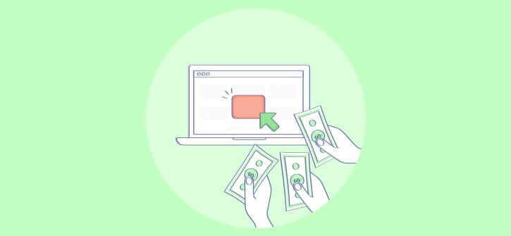
So, you’re looking to convert visitors to your site from window shoppers to customers, but don’t know how?
Well, we have the answer for you:
Use Better Images
In this post we’re going to turn what you think about using images on your website upside down. And show you how to effectively use your images to instantly convert more readers than ever before.

Real Images or Expensive Stocks?
Okay, so when I say ‘real images’, I don’t mean using your latest holiday photos. Lying on the beach with a Margarita isn’t going to convert anybody to your product.
What I do mean is images that don’t count as stock photos. For example: images of yourself, your team or people using your product.
Stock Photo’s would be the polar opposite of that. They’re detached; generic images of people not involved in any way, shape or form with your product. But – they look super professional.
But which should you choose?
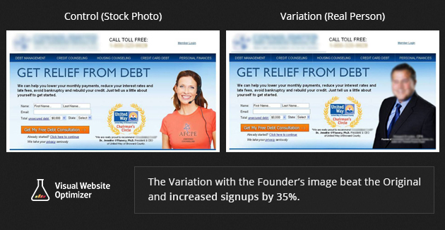
Almost all of you reading this are already leaning towards stock photos. I know that I was at first, but the research says that real images are the way to go.
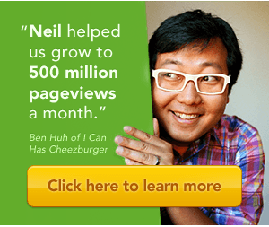
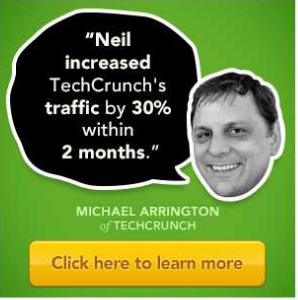
The Visual Website Optimizer’s research concluded that using an image of someone associated with the product created a connection that increased conversion rates up to 35% almost instantly.
The same goes for customer images. Pictures of someone engaged and using your product, even if they don’t know them, can elicit the same reaction. It helps create a real-life bond with your product that consumers really want to feel.
Here’s how Neil Patel used Ben Huh of I Can Has Cheezburger to take his product testimonials to another level.
Also, if your product comes under the ‘How-To’ category, try getting the people who do use your product to submit images of what they created. Whether it’s a million dollar business or a new blog, use images that create a connection to the product and the readers at home.
Show Your Product In A Different Light
For your site, it sometimes feels a little easier to just find a featured image, set it, and be done with it. After all, it’s only a product image right?
Wrong.
Showing your product in different lights: from different angles, in different positions and environments can have a brilliant effect on conversion. It creates depth to your product and presents it in a way that means it’s taken a lot more seriously.
If you want to take everything a step further, it’s proven that not just different angles – but showing normal, everyday people using your product can increase your conversion.
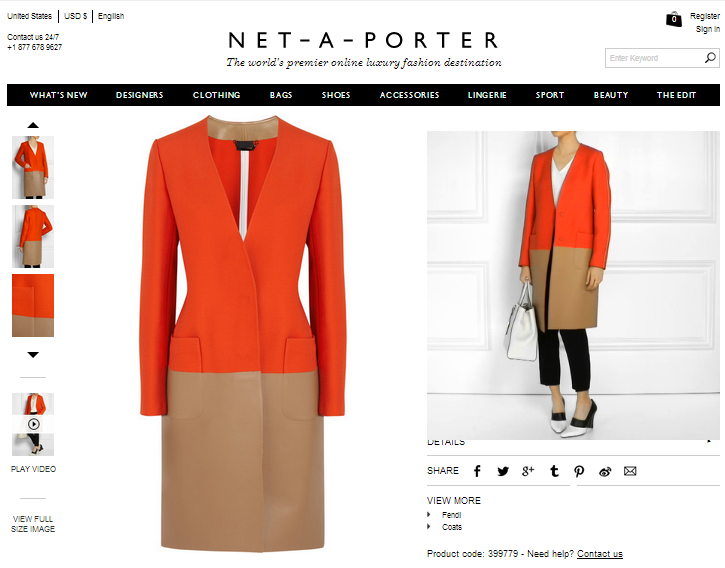
In this example below, Net-A-Porter haven’t just used a Size 6 model strolling down the catwalk to show their product. They used a real sized model, in a short video, walking around in their product so you can get a look and feel of it. Clothes might look better on super models, but they’ll sell better if they’re on real people.
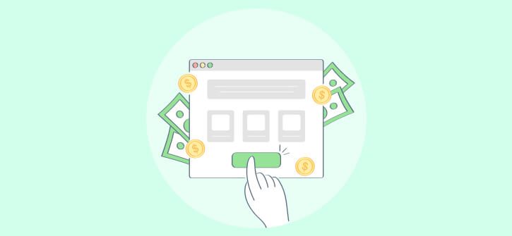
Call To Action: The Smart Way To Convert
The most important button on your site isn’t the ‘add to cart’ button at the bottom of your sales page. It isn’t the About Page or the Tweet This button.
It’s the CTA button.
The one where you get your consumers and readers involved. Where you give them a reason to join your mailing list, read your newsletter or become a part of your movement. This is the button that is free for the customer to click, to gives your something more valuable than their money – it gives you their permission.
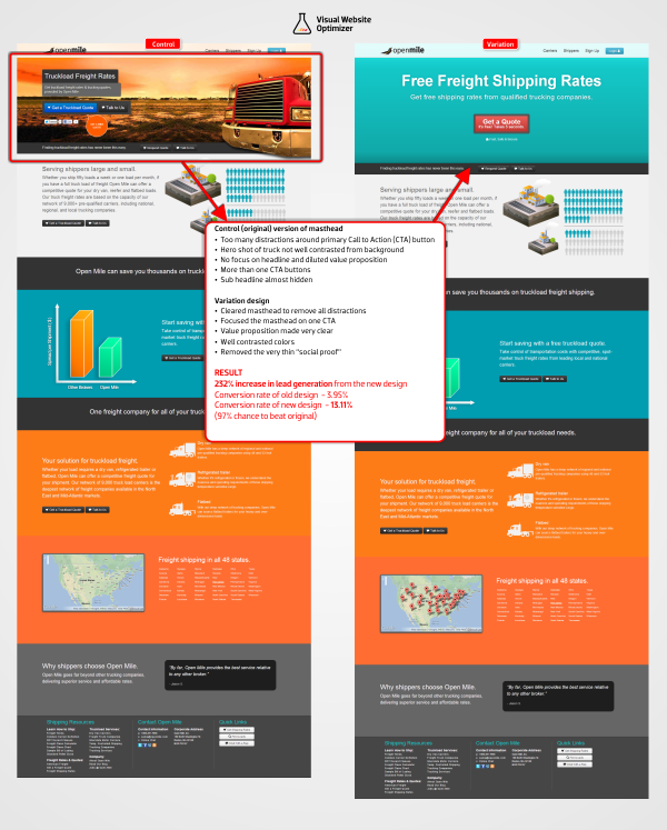
Open Mile put the CTA’s button to the test on one of their high-traffic landing pages. They adjusted their layout, created their Call To Action and made it the focal point of their page.
The result?
They increased their lead generation by 232% – which is a lot of people to talk to.
What would you do with 232% more leads?
The key point to remember when creating your CTA is this:
You need to add value to the customer.
An e-mail address is something the consumer holds dearly to their heart. And, they don’t want to give it up for free. So, you need to add as much value to them as possible.
Be wary of using words like ‘Sign Up Here’ or ‘Subscribe Now’ when it comes to creating your button too. They don’t add value and can deter your reader. Instead, try something product specific, such as: Click Here for 10 Ways To Increase Your Website Traffic or Want to learn how to cook the vegan way? Click Here.
Let Out Your Creative Side
If you really want to stand out from the crowd, try thinking of creative ways to display your images. Different situations, scenarios, back drops and showing them in use. Like we’ve said a couple of times so far in this article – you want to create a connection with you reader.
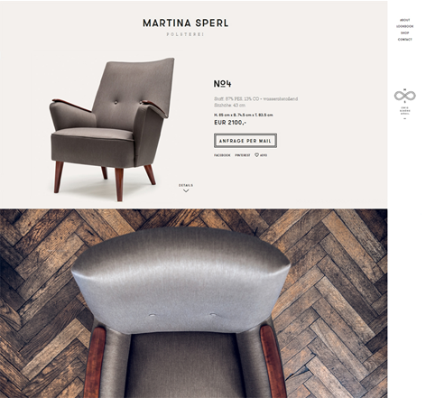
You can do this by creating images that are truly remarkable. Martina Sperl Upholstery created a great example of this, by showing their products in a light that nobody would have ever seen before: hypnotically rotating around in high definition. It’s simple, it’s remarkable and it created a lot of hype about a product you normally wouldn’t think twice about. Check that out here.
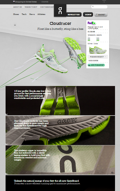
If you want to see a little more action in your images, and create a connection that brings excitement and adrenaline to the table for your readers, take a look at this page for Cloud Racers by On-Running. It shows their shoes in action, everywhere from Mid-Strike Impact to the reaction of their insole. Everything their shoe does, you can feel in their images.
Mega-Images for Mega-Results
Snowboarding isn’t a sport you could ever really consider as boring. It’s high octane, flying down a hill at breakneck speeds and putting your body into incredible compromising positions. But, how do you get that across on a website?
CrazyEgg decided to try and find a way. They took the website of a growing French Snowboarding brand called Soloman and split-test their website. The first part of the split was a clean, normal looking website with standard images. The second, used mega-images as its focal point.
Here’s the ‘control’ page–clean, compelling and pretty easy to take in:
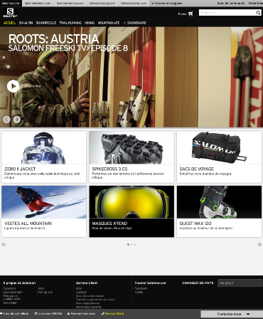
It’s a good looking website, but it doesn’t exactly leave an impression.
So, here’s the second site, using a mega-image at it’s heart:
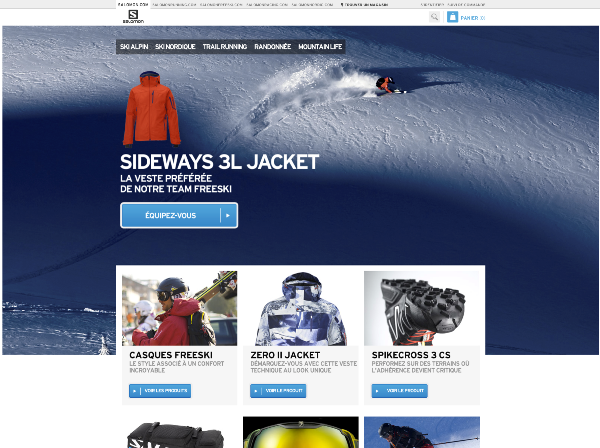
The results?
Using a Mega-Image increased sales by French shoppers by 39.8% and sales by global shoppers by 29.7% – at a 99.9% confidence rate.
Of course, there are other factors at play – a CTA, the use of other mini-images and a complete change in layout.
But, it’s hard to deny that changing the focus of the website to a mega-image creates an awesome emotional response from a reader.
Heatmaps: Guide Attention and Use It Wisely
If you really want to find out where your consumers attention is heading, and how to capitalize on it – try using heat maps.
As humans, we’re drawn to other humans faces. We’re also really drawn to bold text, like a Font-Magpie. So, in order to convert readers to their baby products, what did they do? They used a mega-image of the happiest baby in the world.
![]()
And it put all the attention of their readers into the right place, at the right time. Leading them to where the owner wanted their attention to be. However, following the success, they decided to take it one step further and posed the question, ‘What would happen if we showed the baby looking at the headline?’
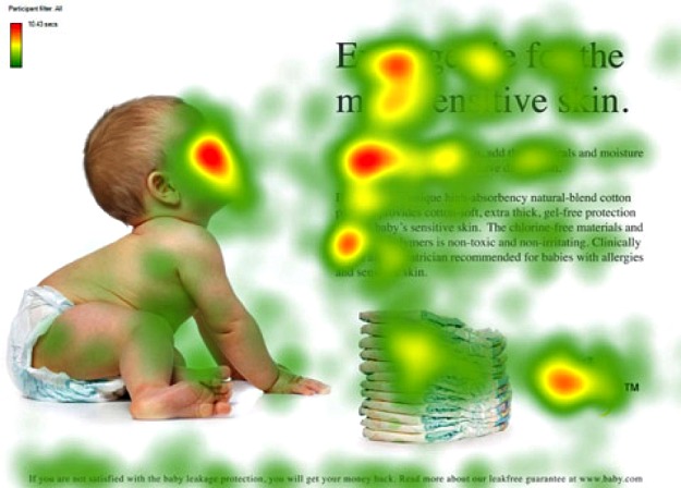
Heat map showing attention and eye-tracking results
The answer? The readers exploded at the cuteness of it. And their attention was directed to all the right places. They recognized the face, decided to look where it was going and the readers spent much longer looking at their content.
So, the question for you is – how are you going to get their attention?
Conclusion
It turns out images are you new best friend when it comes to converting readers. They’re a powerful weapon in your arsenal and deserve more time and attention than you’ve been giving them.
Take your time with your images, do your tests and have fun watching the customers roll in.
Do you want instant 300% growth?
Picreel popups can get YOUR website 300% instant sales growth. See Case Studies.