Have you ever been split testing and knew, beyond a shadow of a doubt, which contender would win? Call it a “gut feeling” or a premonition – but all the A/B tests and best practices have taught you what to look for and how to gauge a winner before the tests have even finished.
Except your “gut feeling” is dead wrong.
Here are four examples of split tests that totally didn’t turn out the way the testers anticipated – and what their results can mean for your own tests.
Does Social Proof Even Matter?
Take a look at this split test from DIYThemes. Which email subscription box would lure you in?
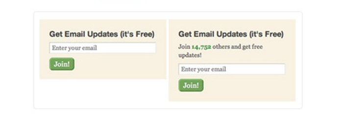
Most people would say that joining nearly 15,000 subscribers is what would convince them to act. After all, if that many people are subscribed, the list and its owner are obviously doing something right!
Right?
Except that’s not what happened. Removing the social proof actually caused an increase in conversions of over 102%. Why would that happen? Don’t people want social proof? It could be that in a time when it’s possible to have hundreds of thousands of friends on Facebook, and millions of Twitter and Instagram followers, that around 15,000 just seems like a drop in a bucket – hardly a number to get excited for.
Or it could be that people just don’t care. They want email updates and it doesn’t matter to them how many other people did too. Perhaps social proof doesn’t really have to prove anything? What do you think?
Do Trust Seals Have an Impact?
Here’s a good one. We’re always told that we should split test security and trust seals to make sure customers understand how safe it is to shop and reach out to us. So have a look at this form: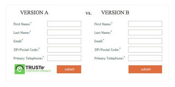
This test pitted a trust seal against no seal – with all other things being equal. As it turned out, Version B got nearly 13% more completions than Version A. Why might that be? We can speculate that upon seeing the trust seal, the concern about privacy and security popped into the user’s mind, when it may not have beforehand (although asking for a phone number and making it required really should make you consider how it’s being used!)
The test reveals that the form may have been used on a checkout page right when people were about to complete their order. Seeing the trust seal may have made them wonder if filling out the form was putting their information in jeopardy somehow. To those of us that work on the web every day, it’s commonplace to see seals like this. To people who may seldom order online, it can present a disconnect in their goal process.
One Simple Change to an Overlay Resulted in a Nearly 400% Conversion Rate Increase
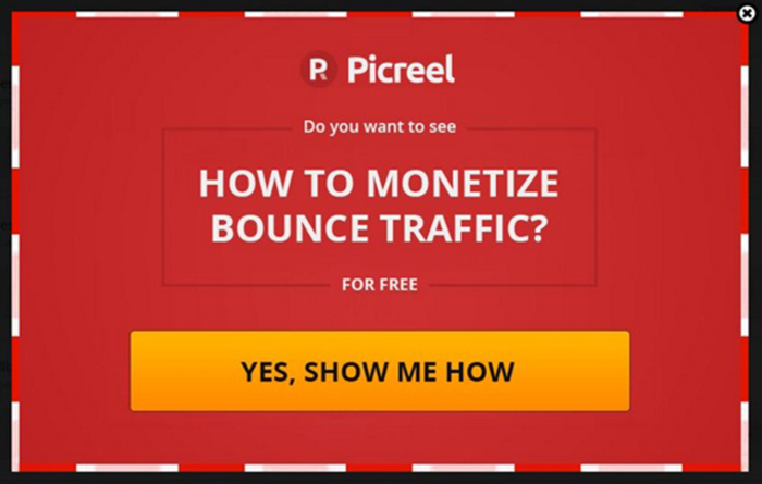
We’ve used the following two overlays on our site at Picreel.com to help people convert more bounce traffic into engaged, paying customers. The first one regularly got a 5% conversion rate – not bad for an overlay. This one in particular was a full screen overlay, hiding the content underneath.
Most people would be content with a decent conversion rate on overlays like this one – but we always strive to do better, which is why we split tested this against another, similarly designed image:
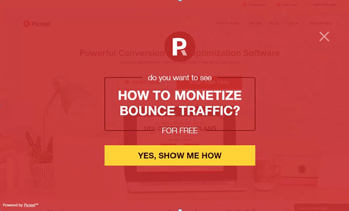
As you can see, the design is slightly different. The message and button are smaller and the opacity of the graphic is lessened so that you can still see some content behind it. Our company name is gone – replaced with just the logo. How do you think the second test did?
We were sure the first one would win. After all, it’s clearer, it says upfront who we are and the images and message are larger. We were surprised to see that our competing overlay unit got a nearly 400% conversion rate increase:
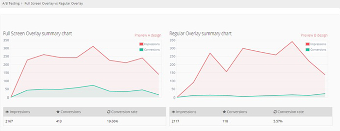
This just goes to show that even with things like message overlays, which are designed to get attention, can have dramatically different effects on people depending on things like their opacity, text size, screen width and height, button size and much more.
Do People Even Read Email Subjects?
Every day you check your email. Sometimes multiple times per day (or multiple times per hour, like me!) You start scanning the subject lines – and then you see this:
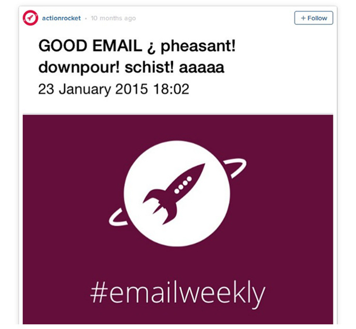
If your first reaction is “Umm…what?” then welcome to the crowd. Subject lines and headlines like these are often the brunt of Clickhole jokes, but this one outperformed the regular email subject 2 to 1.
If you thought the lesson to be learned here would be including truly clickbait headlines (I mean come on, who doesn’t want to see a pheasant downpour?), that’s not quite correct. Perhaps this one converted so well because it’s just plain weird. Unexpected. Or maybe it’s the announcement that it’s a “GOOD EMAIL”. Then again, it could already be whitelisted (since you know the sender) and subscribers don’t pay any attention to the subject line. Who knows?
What Do These Test Results Mean For You?
If these test results teach you anything, it’s that there is no one size fits all when it comes to what to test, or how the test results might look. Always do your own tests independently and gauge your own results to be sure. Just because someone tells you this is a “best practice” means just that – practice. Be prepared for the unexpected and surprising results – even those that go against the grain of what all the conversion rate gurus are out there telling you.
Now we want to hear from you. Have you seen some unexpected results in your own split tests? Or have you had instances where your “gut feeling” on a test went full speed ahead in the opposite direction? Tell us about it in the comments below!
Do you want instant 300% growth?
Picreel popups can get YOUR website 300% instant sales growth. See Case Studies.


Comment