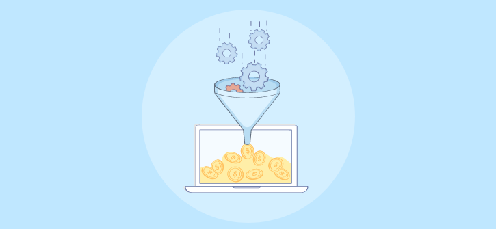
Persuasion is an art. When say some people are naturally persuasive that’s not technically true. What they really do is master the principles behind it.
What are the common characteristics that persuasive people have? They are confident, they talk fast, they swear, they give compelling evidence, and some other traits and habits. But can we possibly influence people to make a decision without even speaking a single word? The straight answer is yes!
Take the “fly in the urinal” experiment, for example.
Because of the common and disgusting problem of pee spillage on male bathrooms, researchers decided to take advantage of a human’s (or at least a male’s) instinct to aim at a target. They put an image of a fly in the center of the urinals of the JFK and Schiphol Airports in New York and Amseterdam respectively, and found out the spillage reduced by as much as 80%!
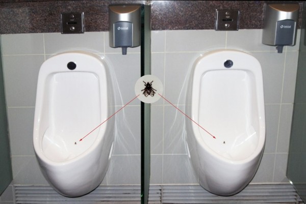
As we can see, sometimes persuasion goes beyond words; it’s a plan in action.
Another study involving the number of organ donors of different countries clearly illustrates the previous point: You can make people decide on something in your favor without even speaking to them!
Take a closer look at the graph. It’s about the percentage of organ donors in these countries.
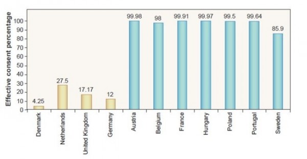
Are the citizens of Denmark, Germany, United Kingdom, and the Netherlands such selfish people? Are Austrians and Hungarians the modern-day Good Samaritans? Not exactly.
What transpired has something to do with the options the drivers choose when getting licenses. The BLUE bars are countries that have opt-out check-boxes that says ‘indicate whether you DO NOT want to be an organ donor’ and because most of them leave it blank, they unwittingly became part of the program! On the other hand, the YELLOW bars have an opt-in option that says ‘check the box if you DO want’ to become a donor. Apparently, people don’t like checking boxes and just go with the defaults.
To show that majority of users simply go with the defaults, UIE’s Jared Spool pointed out that as much as 95% of the people using Microsoft Office have let their settings as is the day it was installed. So unless you’re a web developer or an IT expert, people DO NOT tinker with default set-ups.
The lesson? Make the simple preferred actions default, but then again, do not go to far.
We Do Not Spend Much Time Thinking
Who does, anyway? The truth is people mostly make decisions on automatic pilot—they simply don’t think it through. And when required to make deliberate and slow decisions, the results dramatically change.
The key is knowing the thought process of your audience and catering your marketing strategies in accord with that. Highlight how your product suits people’s needs so the offer reverberates, helping them to make a decision in our favor.
Assuming you already who who your target audience is, keep in mind these five fool-proof principles to improve conversion rate.
1. Clarity and Simplicity
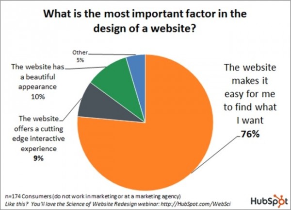
People have their own reasons for accessing your website but as what the graph above shows, it is often because they are looking for something that they want.
The thing is they don’t want to waste precious time so they will be looking for answers quick. That’s why it’s very important that the first thing users see answer these common questions:
– What is this website?
– Will I get what I’m looking for here?
– Will it be useful to me?
In order to provide the answers to these questions, you will have to make an irresistable value proposition. It has to separate you from the pack and in a concise manner, explains why users need to avail from you and not from your competitors.
The first thing that you should ask is: “Is it understandable enough for all users?” Here is an example.
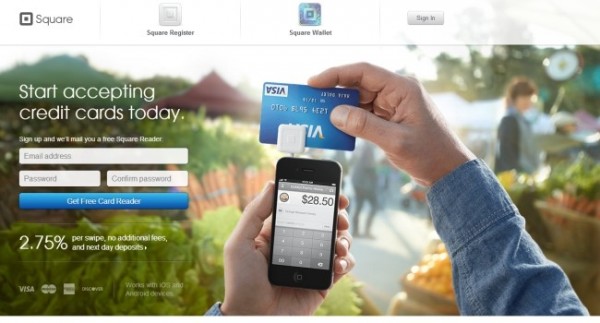
– What is this website: It makes you start accepting credit card payments right away.
– Will I get what I’m looking for here: I’m looking for a free card reader, so yes!
– Will it provide what I need: The card reader itself is free and every swipe is just for 2.75%.
In contrast, does the page above tells you specifically what their website is about? Is it for writers, for publishers, or for just about everyone else?
Another example:
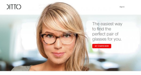
While it clearly conveys what they are selling (glasses), they neglect one thing that deters most people: using superlatives (easiest).
The idea of superlatives is better in literature than it is in sales. People are smart enough to knowthat you aren’t really the best and there are easier ways out there, so sidestep the temptation to be too hypie.
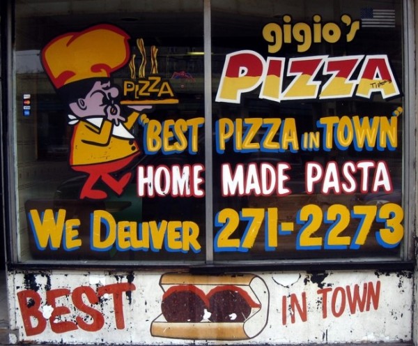
The image above is an amalgam of right and wrong of value propositions. Obviously, he used a superlative (Best Pizza in Town) but on the other hand, “Home Made Pasta” is believable and should be the primary selling point. They could also focus more on “We Deliver” than hyping the product too much.
2. Visual Charm
The principle behind celebrities and politicians hiring stylists and image consultants can also be applied in CRO. The point is, you have to stomp your best foot forward because first impressions do last.
According to a 2006 study, it only takes 50 milliseconds or 0.05 for visitors to from a mental opinion and decide whether you’re worth it or not. That observation agrees with what is said earlier about people making snap decisions instead of slowly thinking it through.
Further research revealed that the foremost stimulant of these decisions is the look of the website. Most people care only about the layout, color, text size, and such while the vast minority pay attention to the content itself.
Making good first impressions by improving your site’s visual appeal are important because a.) it contributes to a high satisfaction rating according to a 2011 study, b.) more users value it more than the ease of navigation, and c.) it can last very, very long.

Take this Jaguar F-type for instance. Most people don’t care about the car’s handling and whatnot, they’ll just conclude its a good car based merely on its looks.
A good first impression makes our job as online sellers easier. We hear people say ‘If it quacks and walks like a duck, then it must be a duck’. Likewise if your website looks shoddy and unprofessional, then your product must be shoddy, too.
A 2012 study by Google gives us an idea what makes a good website design. There are two interrelating visual factors, low complexity and high prototypicality. Simply put, you should make the design less complicated AND familiar with the audience. Either way, even if it’s simple but unfamiliar or familiar but complex, people are going hit the back button and go elsewehere.
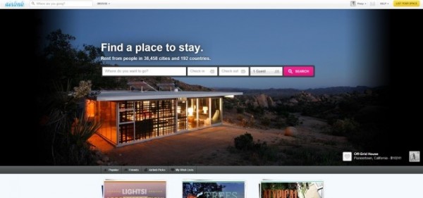
Innovative e-commerce websites like the above don’t normally work. People have conditioned images of what business websites look like and if your site is not– by their standards– an e-commerce website, they’re not going to like it.
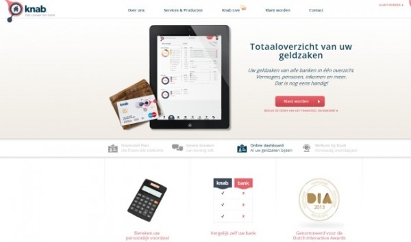
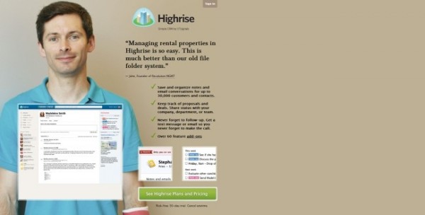
In contrast, even if the website is written on a foreign language (in this case Dutch), users would probably feel inclined because they’ve seen that layout before.
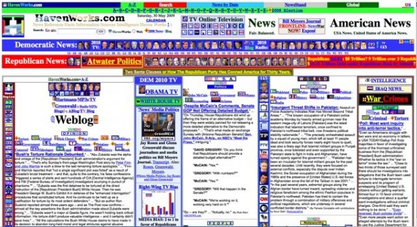
Who would like this busy-looking, cluttered design?
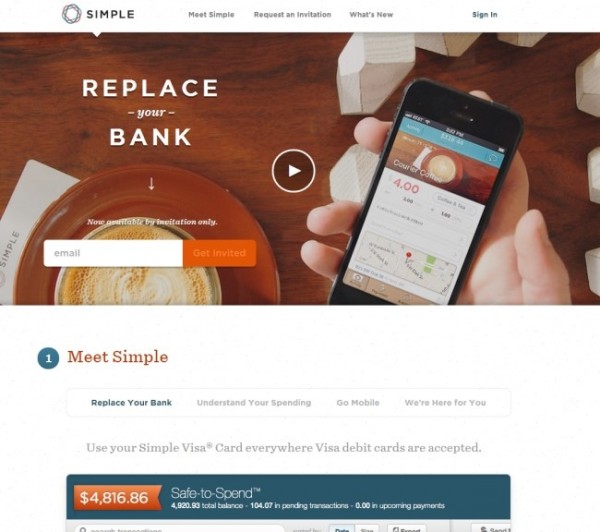
In contrast, look how attractive a simple layout can be. Most people will find designs like these more attractive.
3. Distinct Visual Pecking Order
Can you rank the circles below in terms of importance?
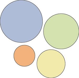
It’s easy, right? The more prominent-looking an image is, the human eyes readily perceive it as the most important. In web marketing, you have to take advantage of this natural tendency by highlighting the more important buttons! Not every button is created equal and so you have to guide the users by using the concept of visual hierarchy.
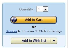
While size is the most obvious method, some successful online entrepeneurs highlight the important buttons by using color. Here is what Amazon did:
The importance of the individual buttons, however, depend on your business objective. If you don’t aim at a target, what will you hit, right? So it’s important to prioritize based on your company goals.
Here’s an example of a good visual hierarchy.
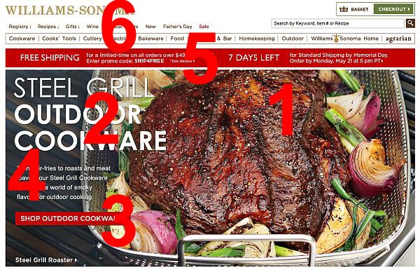
We have ranked the most to least important based on their business goal—selling cookware.
1.) The big piece of delicious-looking meat
2.) The headline teling you what they’re selling;
3.) The CTA;
4.) A small descriptive text about the product;
5.) Free Shipping;
6.) Navigation Buttons.
Compare this on your own site and figure out what other important elements need to be highlighted.
Is it just about color?
Contrary to what most so-called experts claim around the Internet, there is no specific color that converts. Take the image below, for example.
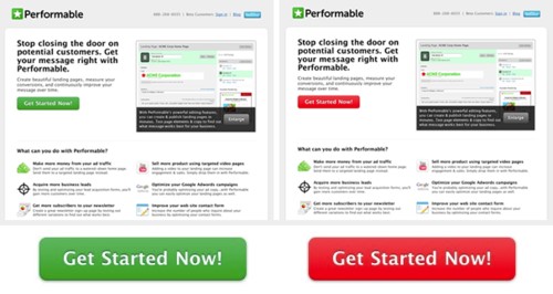
The Red button outperformed the Green by up to 21% but does that mean you should ALWAYS go for RED? Not at all. It’s all about contrast. The website has a predominantly green layout that’s why the red button stands out from the group!
Space Matters
You can also use color to highlight your product. A white space background helps emphasize what matters, as shown by the image below.
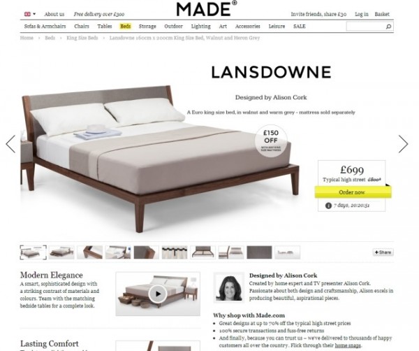
While this layout seems ordinary, it’s a perfect example of how to use white space to emphasize the main product. The text and image around the bed (the main product) is minimal achieving a perfect corporate look.
Remember: In the visual hierarchy, use size and color to highlight the main product and everything else takes a back seat.
4. Keep the Users’ Attention
After luring them in with clarity, appeal and visual hierarchy, it won’t matter much if you cannot hold users’attention for long.
To do this, know where people are likely to read. Studies shoe that 4 out of 5 persons read what’s above the website’s fold and almost 7 out of 10 will read everything on the left side than what’s on the right.
How to Get and Keep Attention
– Images. Let’s start with the most obvious one. Who would want to shop on a bare website unless you’re blind? Make your images clear, larger-than-life and directly raleates to what you’re selling. Here is an example:
You can also uses images of people and choose those that directly look users in the eye.
Another fool-proof attention-getter is a picture that shows contrast. Before and after, then and now—images that show dramatic but realistic contrasts. This will almost surely works on products like dental services, salons, slimming supplements and the like. But if allowed by your creatuve threshold, you can find ways to insert contrast images in any business.

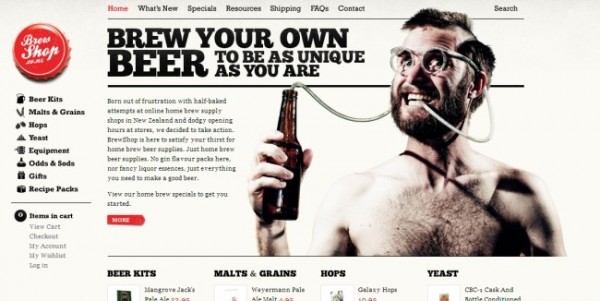
You can also seize customers’ attention by using the element of surprise. Make the image as weird as possible but within the boundaries of sanity that is relevant to your product.
Speaking of surprise, you can also use unexpected copies along with a clear image. Between these two, which one is the likely attention grabber?
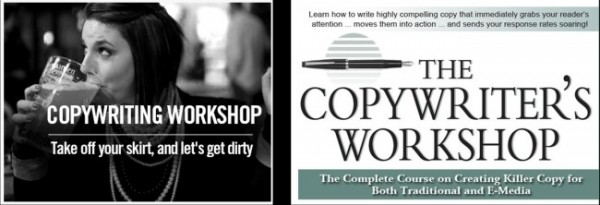
The one on the right is what you would expect out of a website offering a copywriter’s course. But the one on the left? It will make more people curious.
As you may have realized now, it’s not so much about getting attention as sustaining it. Beware of the elements that can immediately kill attention like a boatload of unnecessary text and self-serving jargon.
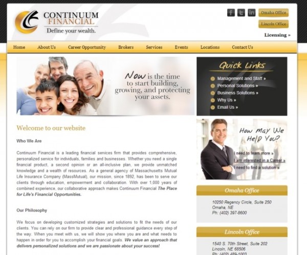
While the need to highlight your product is a must, make it user-centered and avoid the mistakes the above website made. “Who We Are”, “Our Philosophy”, that’s boring egocentric language. The user is here to solve his own problem so logically, he wants to be pampered right away.
The main focus is presenting you product BUT in a way that caters directly to the audience. To be honest, no one gives a crap about you. All customers want is hoe your product can help them and that’s what you should give.
As pointed out above, make use of a familiar layout but add your own twist to it by avoiding patterns.
These two pages have similar basic layout but which looks more interesting? There’s no doubt most people will choose the one on the right.
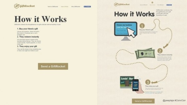
Speaking of interesting, there is also a need to keep your pages fresh. Every time our brain detects a pattern it will ignore it. That is exactly the reason why websites change themes and uses alternate text on their product pages like this:
The right-left-right text pattern is designed to instill novelty in your page and prevents users from boring their brains out.
Helping People Choose and Decide
Your job is an online seller is not limited to showing the products and letting them choose. Most of you sell a number of products and too many choices can potentially kill a sale. That is why you have to narrow it down for them.
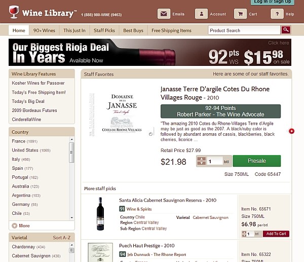
This wine-selling website narrows it down by effectively using filters. On the left side, you can see the filters by country and variety.
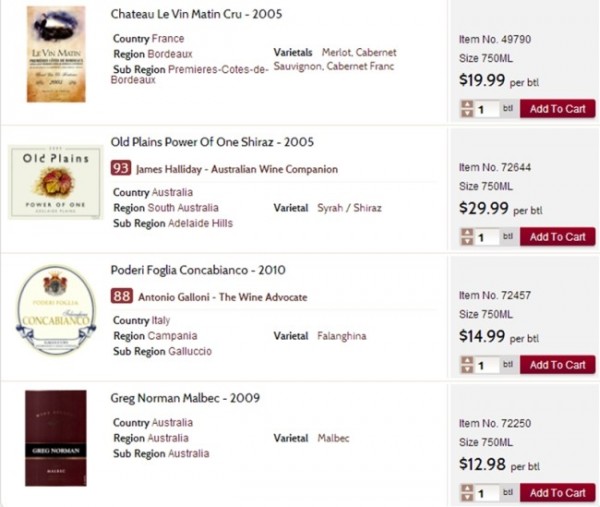
If you don’t want to use filters, you can likewise limit the customers’ choices by making the options stand out. How did the website do it exactly? They did it by indicating the rating done by famous wine critics on the left side. Give your product a badge, then consider it sold.
Product Images
The most common medium of selling products online is through posting the actual photos of the merchandise. If someone like how the shoes or the bags look, he’s going to buy it. But is it really as simple as that?
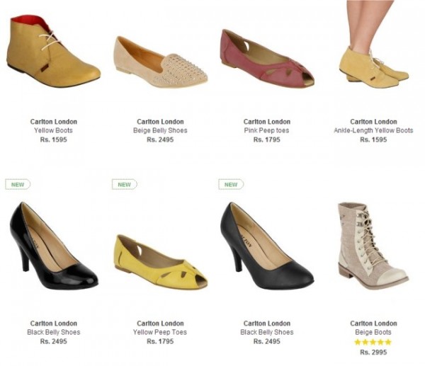
What’s wrong with the image above? While wanting to emphasize variety, too many choices can also be counter-productive. It’s harder for customers to fall in love with any of this product!
But if you keep the choices to a minimum, the easier for customers to choose.
Make the images larger and clearer while keeping the choices down. That way, you are helping the the customers choose without speaking a single word!
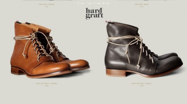
To illustrate how better and larger images that highlight a product’s looks will sell better, consider the tale of two chickens, a study conducted by two researchers at University of Texas-Austin in 2010.

Half of the participants were told that the nice-looking chicken on the left is natural and untasty, but healthier while the one on the right is genetically-engineered, tastes better but unhealthy. Then the other half of the participants were told the opposite.
What did the majority of the participant choose?
Interestingly, both halves show a preference for the better-looking chicken, though for different reasons. The point is, people will convince themselves that one product is better than the other based solely by its looks!
5. Draw Attention to Only ONE Action Per Screen
Applying the first three principles, you have to optimize each page with only one clear necessary action.
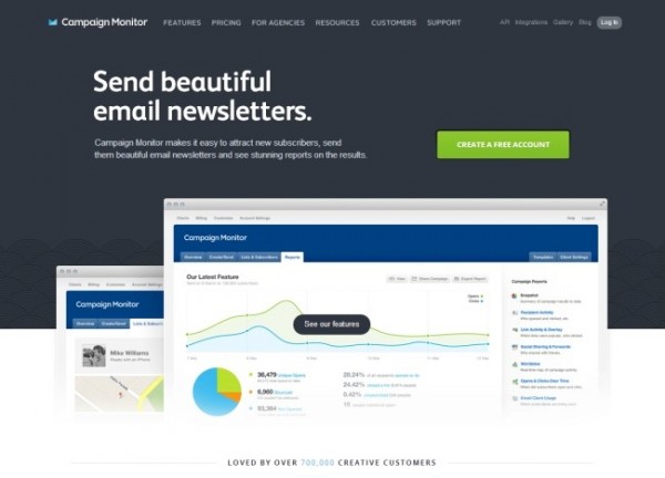
Like the homepage of Campaign Monitor, you wouldn’t have mistaken what they wanted you to do: CREATE A FREE ACCOUNT.
You can also add secondary CTAs and that’s okay, as long as the primary attention goes to the most important action, like what Freckle did to their page.
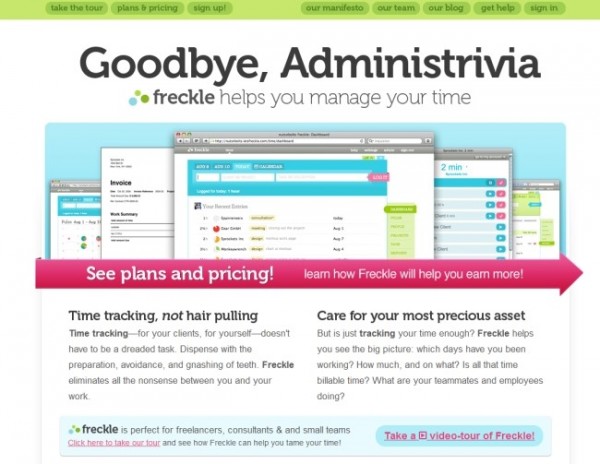
Their primary call to action “SEE plans and pricing!” is very prominent but the other CTA remains in the background (take the tour). That way, visitors will know what action you want them to take.
That’s quite an easy concept to understand but let’s go deeper. When is the right time to ask for an action?
When you’re inside an appliance store checking some cool 3D TV set and the sales guy comes up to you asking for the payment details already, won’t that creep you out? Similarly, asking for an action at the VERY first moment of entering your website is not a good idea. See this one:
This website’s page is already asking you to sign in without even explaining what the product is all about. Will you sign up? I would completely understand if you won’t.
Many people think a call to action button buried below the fold is web marketing’s version of a sucide. But guess what? Experts prove it’s the other way around!
A study done in 2012 to test which leads to more convesions between a long landing page copy versus the short one definitively backs this fact up: The more information your landing copy has the better it is for your conversion rate. Overall, a long landing page copy generated 75% more conversions while our friends at Zurb skyrocketed their conversion rate by 350%!
It’s not literally “burying”, as in hiding, the CTA button. It’s the timing, asking the customers’ collective hand in marriage when they’re ready. Supply as much needed information as you can and the least of your worries will be your conversion rate.
Keep this rule in mind: The more complicated and pricey the product is, you owe a long explanation to the customers.
Stanford University’s Dr. BJ Fogg explains it this way in his bevaior model: Behavior is dependent on three factors—motivation, ability, and trigger. When you can’t influence people to do what you want them to do (behavior), then one of these factors are missing.
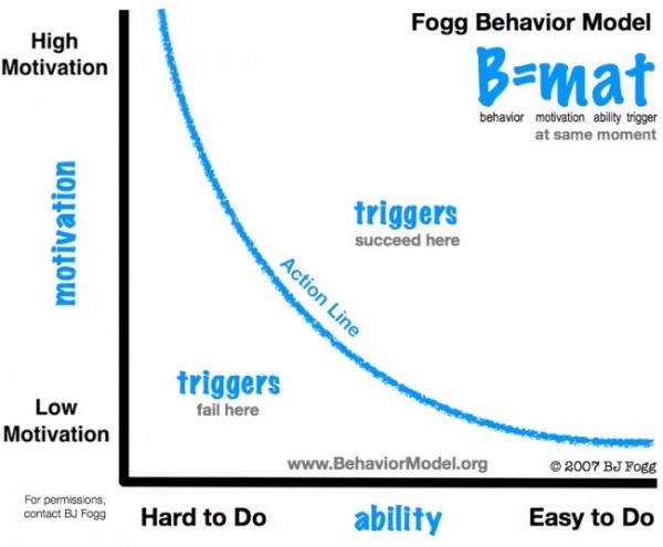
To make the long story short, in order to to increase conversions, you have to help people do (motivation) what they already wanted to do (ability) by giving them the right triggers (trigger). If you motivate but make it hard for them to do it, then no conversions will happen. Give them motivation, a trigger in place, and simplify things for them and you’re looking at real profit.
Bottom Line
Compelling web design is your ticket to better conversions. It just simply works! Execute this five fundamentals and you’ll come up with a persuasive design, one that can help people see the value of your product and makes them want to buy it. It’s a win-win.
Do you want instant 300% growth?
Picreel popups can get YOUR website 300% instant sales growth. See Case Studies.